| Census |
| Wireless | Web Site Maps | Surf Maps | MUDs & Virtual Worlds | Historical |
|
Sorry, the Cybergeography Research web pages are no longer being updated. The project ran from 1997-2004, but my research has moved away into other areas (see my blog for latest). If you have any questions or comments, please email me at: m.dodge (at) manchester.ac.uk. Cheers, Martin Dodge, February 2007. |
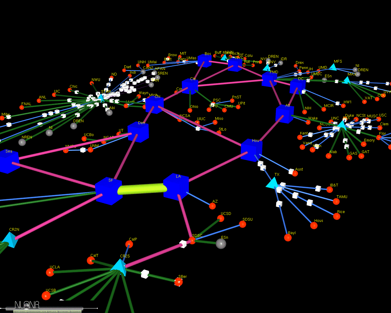
| A screenshot
of a 3D model of the vBNS network which connects universities and
laboratories in the USA. The model was created by Jeff Brown, a
researcher at MOAT, National Laboratory for Applied Network Research
(NLANR), USA, using his Cichlid data
visualisation software. The model is animated to show how
traffic flows over the links.
More information on their work can be found in the paper "Network Performance Visualization: Insight Through Animation" by J.A. Brown, McGregor A.J and H-W Braun. |
 |
 |
|
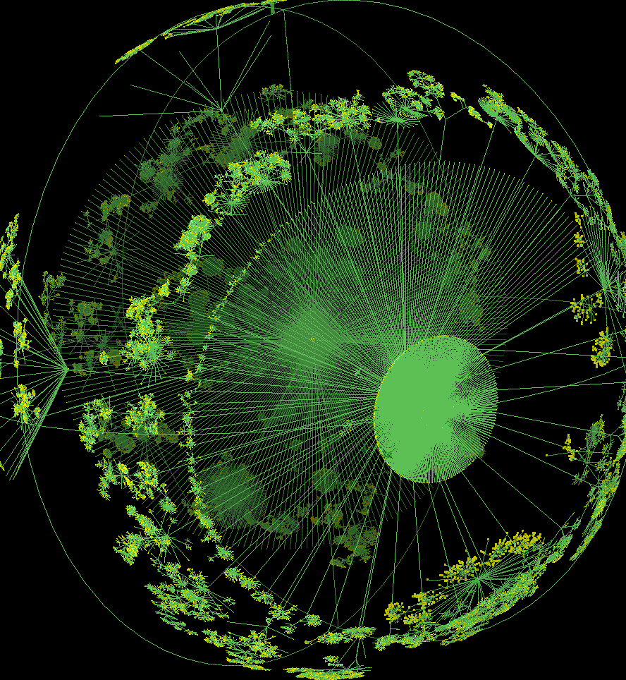
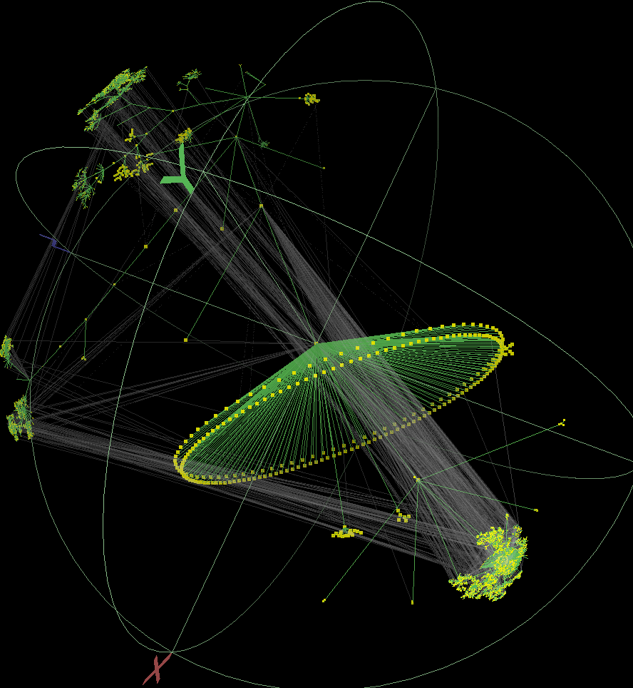
These striking images are 3D hyperbolic graphs of Internet topology. They are created using the Walrus visualisation tool developed by Young Hyun at the Cooperative Association for Internet Data Analysis (CAIDA). The underlying data on the topological structure of the Internet is gathered by skitter, a CAIDA tool for large-scale collection and analysis of Internet traffic path data. |
![]()
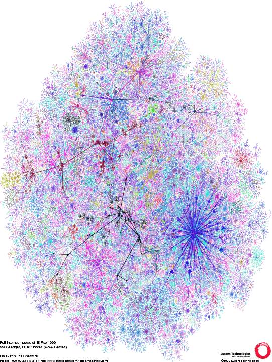 |
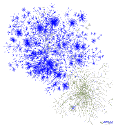
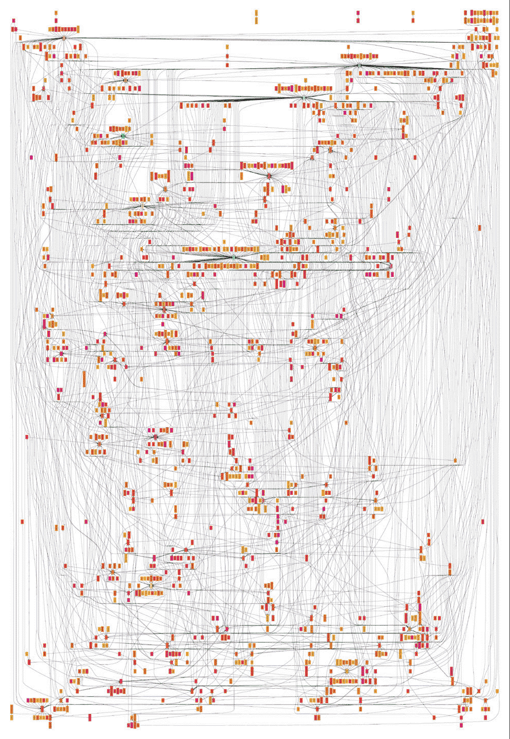
This large graph shows the router level connectivity of the Internet as measured by Hal Burch and Bill Cheswick's Internet Mapping Project. The work is being commercially developed by Lumeta. |
|
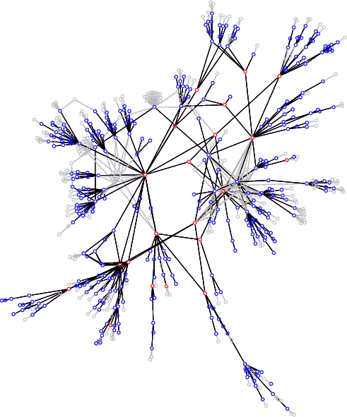
Lumeta are developing network measurement and mapping tools for analysing large corporate intranets. This graph part of this graph show the portion of a corporate intranet that are 'leaking' with the Internet.
For more information see the article "What Can You Do With traceroute?" by Steve Branigan, Hal Burch, Bill Cheswick, and Frank Wojcik, Internet Computing, Sept./Oct. 2001. |
|
![]()
 |
A graph visualisation showing the topology of the core of the Internet from mid-January 2000. A version of this image is available to buy as a large wall poster. |
|
It reveals the peering
relations and geographic locations of Autonomous Systems (ASes), which
are a vital part of Internet infrastructure that represent large ISP
networks for the complex routing of traffic flows. It was created by
researchers at CAIDA
as part of their skitter project.
|
![]()

|
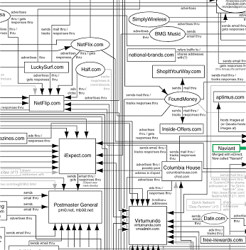
Here is a detailed organisational chart, the Spamdemic Map, showing the complex web of connections in the email marketing industry. The chart looks very much like a circuit diagram. It was created by Bob West, CluelessMailers.org. |
 |
![]()
| A topology map of a core network of a medium-sized ISP. It was created using an automatic network discovery tool called Mercator developed as part of the Scan project by Ramesh Govindan, Anoop Reddy and colleagues, at the Information Sciences Institute, USA. |
|
 |
Netscan is an ambitious project analysing the social structure of Usenet news. It is being developed by Marc Smith, a research sociologist at Microsoft Research. The example opposite is a screenshot of the Crosspost Visualization tool of Netscan which enables you to analyse the connections between newsgroups. While the image below shows the Netscan Dashboard visualisation tool which is used to explore the detailed structure of individual message threads. [For more information see the Map of Month article, "Netscan Project: Mapping the Social Geography of Usenet News".] |

 |
 |
|
|
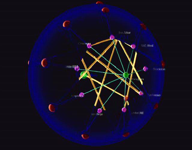
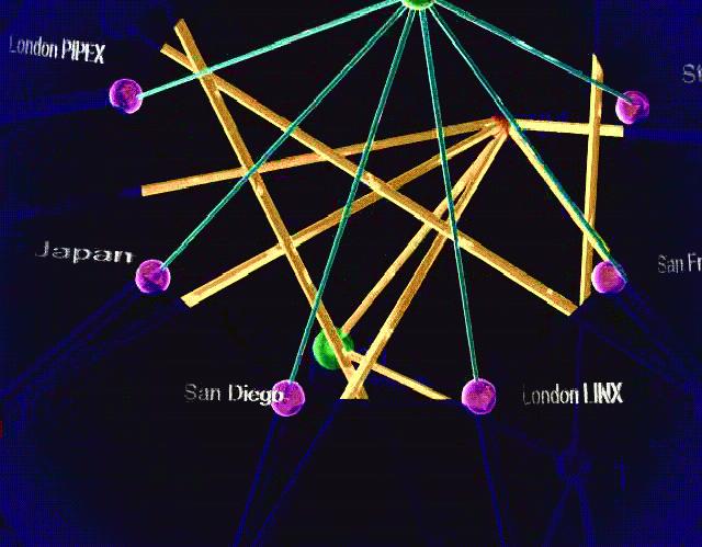
These stills are taken from a video developed by k.c. claffy of the Cooperative Association for Internet Data Analysis (CAIDA) and Hans-Werner Braun of the Measurement & operations Analysis Team (MOAT) at NLANR showing the interconnections of major ISP networks. To see all the glorious details you are recommended to download the whole video. |
 |
 |
|
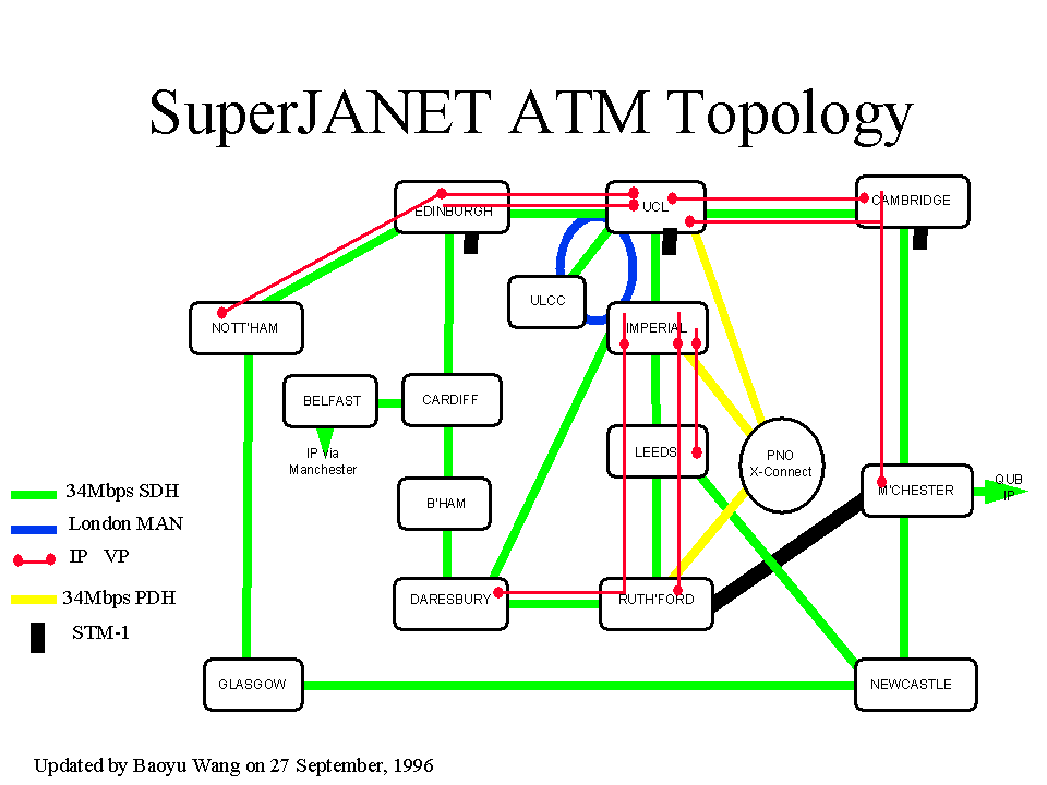
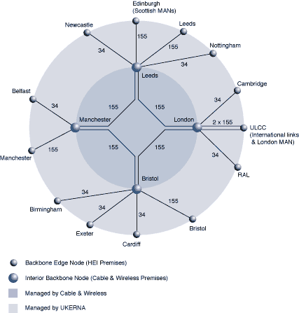
The evolving topology of SuperJANET, the high-speed academic network in the UK. The map above left shows the ATM network circa September 1996, while the map on the right is a schematic map of the backbone topology of SuperJANET III from early 1998. The topology map below shows the new SuperJANET4 backbone, as of March 2001. |

![]()
 |
Each node in the graph is a single player and the colour coding shows their style of communications in terms of speech and actions. The links show which other player they are most connected to in terms of observed interactions. Cobot was developed by Charles
Isbell and Michael
Kearns. |
|
Sorry, the Cybergeography Research web pages are no longer being updated. The project ran from 1997-2004, but my research has moved away into other areas (see my blog for latest). If you have any questions or comments, please email me at: m.dodge (at) manchester.ac.uk. Cheers, Martin Dodge, February 2007. |