| Census |
| Wireless | Web Site Maps | Surf Maps | MUDs & Virtual Worlds | Historical |
![]()
|
|
![]()
|
The work of Stephen Coast in measuring
and mapping the structure and performance of the global Internet.
These are two of his early results.
|
|
![]()
|
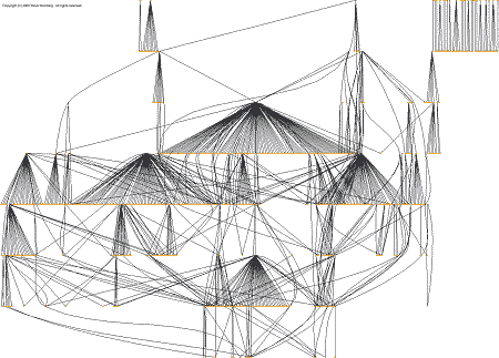
Graphing the structure of the Gnutella network by Steve G. Steinberg. Data on the structure of the network was gathered using a modified Gnutella client to perform the equivalent of traceroute and then the maps were created using Graphviz. |
 |
 |
|
This graph is a snapshot of the local gnutella peer network in my neighbourhood created using the mapping functions of the Gnucleus client. The actual graph layout is drawn using Graphviz. |
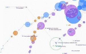
Another graph of the local gnutella network created
with the interactive visualization tool gnuTellaVision.
This is being developed by Rachna Dhamija, Danyel Fisher and Ka-Ping
Yee at the UC Berkeley.
|
![]()
| A map of part of the Internet as seen from Geir E.R. Gundersen's computer. Produced by tracing routes to keys sites and graphing the result in an interactive Java applet. Try out his NetBird topology map. |
|
A map of the topology of the University of Buffalo's backbone network routers. [No longer online] |
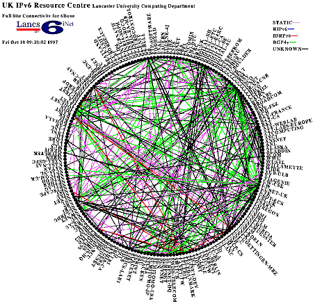
| A diagram of the topology of all the network connections in the 6Bone, an experimental international IPv6 testbed network. A range of 6Bone maps and diagrams tracking the global development of the 6Bone are available from the IPv6 Resource Centre at the Computing Department, Lancaster University, UK. |
|
A topology cybermap of search results from the AltaVista search engine using their LiveTopics system. In example shown, we searched on the term "subway map". Unfortunately, this mapping system is no longer available. More details are given in François Bourdoncle's paper "LiveTopics : Recherche Visuelle dInformation sur Internet". Dossiers de l'Audiovisuel, La Documentation Française, numéro 74 (juillet-aout 1997, 3638). |
|
A graphical view of the domain name structure produced
by the DNS Bajaj
tool. It was developed by bjorn@foobar.tm as a debugging tool to pinpoint
errors in the DNS system. The graph below shows the structure for the
domain name ucl.ac.uk belonging to University College London.
|
![]()
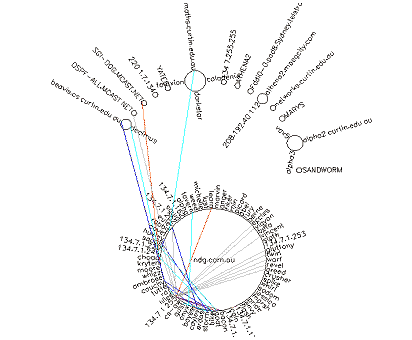 |
An interesting topology map used visualise local Internet traffic is shown below. This map was created by WebBoy, a program from the NDG Sofware that continuously monitors Internet traffic and maps the topological structures in real-time. |
| A map of the MBone topology in August 1996. The map was produced by Elan Amir, Computer Science Division, University of California at Berkeley, USA. [No longer online.] |
| Graphs of the topology of Usenet, produced Naveen Jamal at Reference.com. Graphs at the global scale are available, along with ones for individual countries. [No longer available online.] |
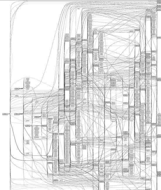
| Plankton visualization of the hierarchical topology of the international web cache. Developed by Bradley Huffaker at the Cooperative Association for Internet Data Analysis (CAIDA). |
![]()
|
WebBrain provides a visual interface to browse the Open Directory to aid users navigating the Web. It is based on technology by TheBrain.com. |
![]()
|
This is an example of a flowchart-type map of
postings on a mailing list. The focus is visualising the temporal
patterns of social interaction on the list. The link map was created
by Eva Ekeblad and
her paper
"The emergence and decay of multilogue: self-regulation of
a scholarly mailinglist." give more details on this research.
|
![]()