| Census | Topology | Info Maps | Info Landscapes | Info Spaces | ISP Maps | Weather Maps |
| Wireless | Web Site Maps | Surf Maps | MUDs & Virtual Worlds | Historical |
|
Sorry, the Cybergeography Research web pages are no longer being updated. The project ran from 1997-2004, but my research has moved away into other areas (see my blog for latest). If you have any questions or comments, please email me at: m.dodge (at) manchester.ac.uk. Cheers, Martin Dodge, February 2007. |
![]()
 |
A visual taxonomy of different modes of communication and interaction created by designer Nathan Shedroff as part of his research into experience design. The position of the individual communications modes within the sphere indicates its particular characteristics. Further examples of Shedroff's communications matrices are here. |
![]()
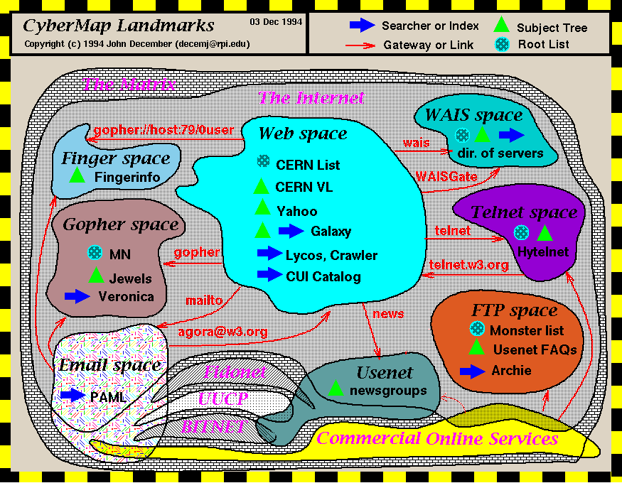
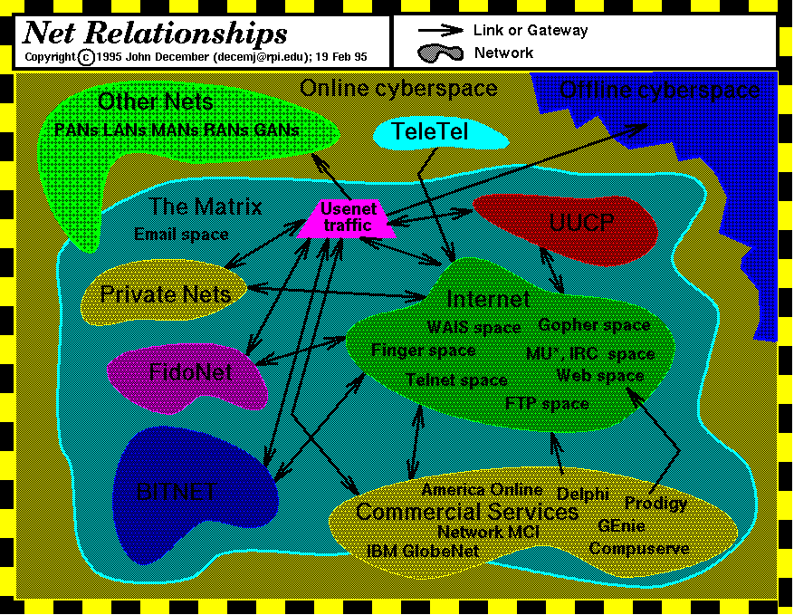
The work of John December in charting cyberspace. These conceptual cybermaps show the key information domains and landmarks of cyberspace, circa 1994/95, and the interrelationships between them.
[For more information see the Map of the Month article "Conceptual Map of Net Spaces" in Mappa.Mundi Magazine.]
![]()
 |
This poster from O'Reilly, entitled "Anatomy of a Linux System", provides a conceptual map to key software components of this significant open source operating system, that powers much of the Internet. The aim is to "... give viewers a concise and comprehensive look at the Linux universe" and at the heart of the poster is a gravity well graphic showing the core software components, surrounded by explanatory text. |
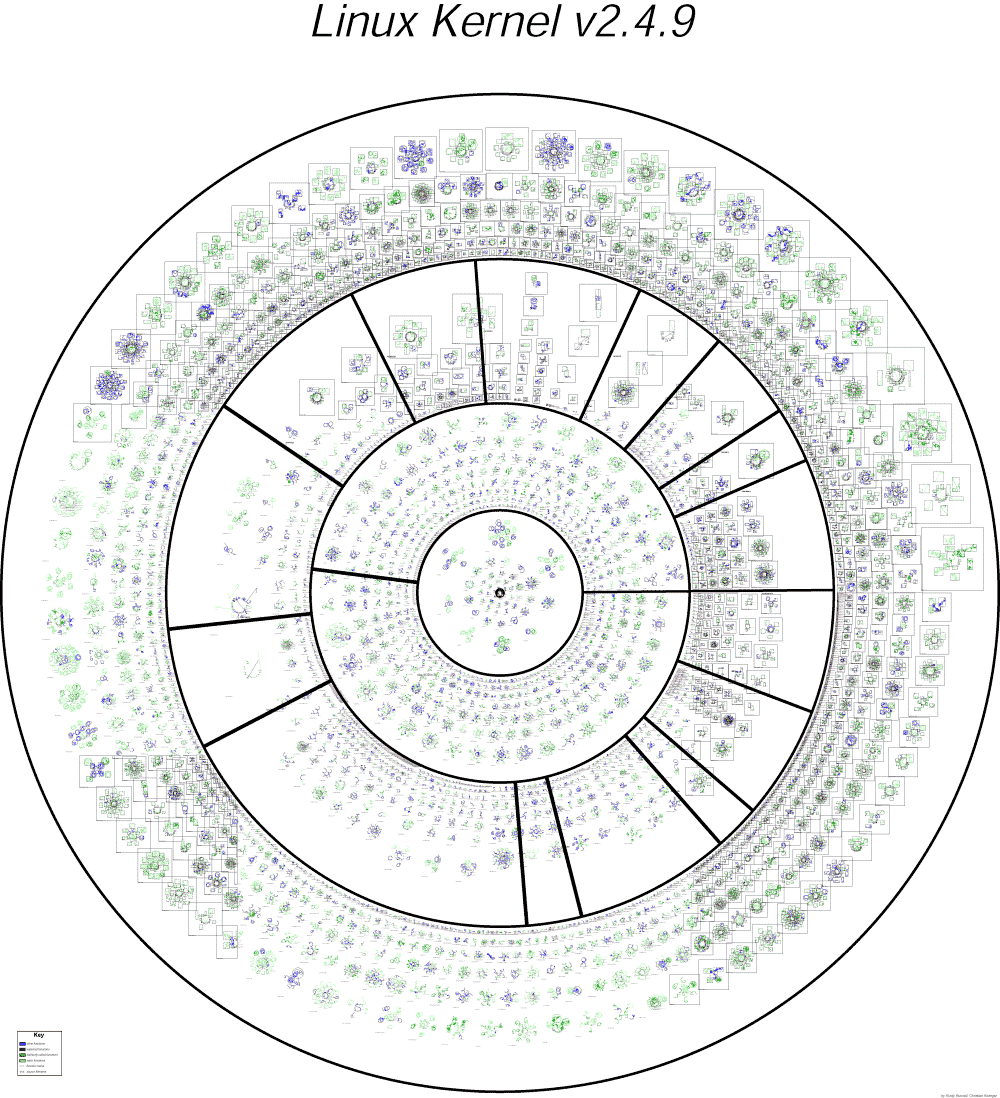 |
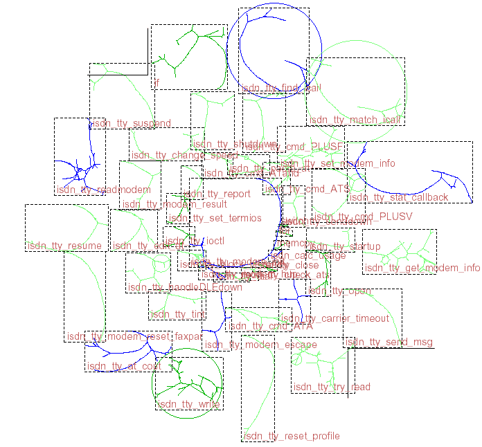
This is a visualization of the structure of the Linux kernel, the core software of the operating system. It shows all the individual files of the kernel and the function calls between them. The visualization was created by Christian Reiniger at the Free Code Graphing Project, based on earlier work by Rusty Russell. A small section showing the code for ISDN drivers is below. (To really see the detail you need to download the large postscript version.) |
 |
![]()
 |
|
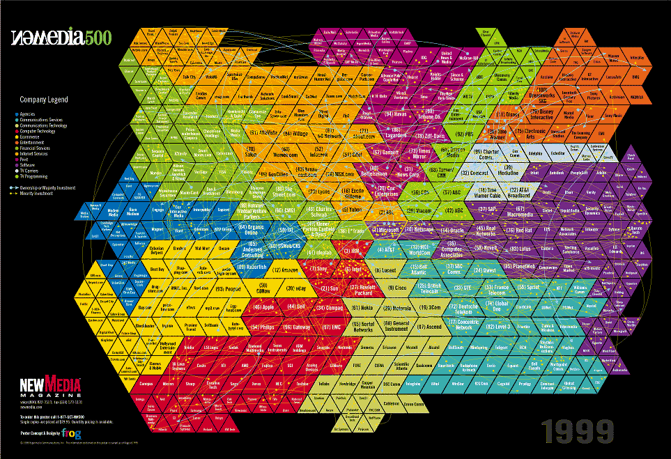
NewMedia 500
is an annually produced map of the new media industry showing 500
hundred different corporations and their financial and strategic
interrelations. It was created by NewMedia,
with design by frogdesign. The research for the map is by Eric Brown.
|
![]()
|
Valdis Krebs is an expert in
organisation network analysis. He has analysed the structure of the
Internet industry, looking at the ownership and alliances between
different companies providing the infrastructure, content and commerce.
Three key metrics were used to understand the structure - control,
access and status.
|
|
|
The results are presented in an interactive graph in the Internet Industry map. The four companies with the most control over the Internet industry were AOL, Microsoft, AT&T and Yahoo!, shown by the large red circles. Check the Orgnet site for the current version. |
 |
![]()
|
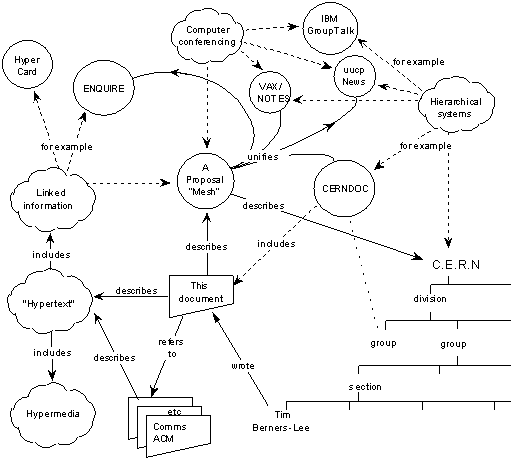
A concept map from Tim Berners-Lee's original World-Wide Web proposal, a hypertext system called the "Mesh", presented in 1989. See the full "Information Management: A Proposal". |
![]()

|
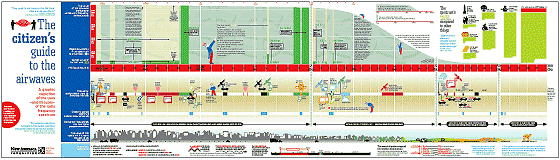
Wireless communications are becoming ever more significant in our lives and the chart above summarises how the finite space of radio spectrum is divided and allocated for a wide range of different uses. The chart was designed by Nigel Holmes and published as "Wireless Spectrum for Dummies" by eCompany Now, December 2000.
|
 |
|
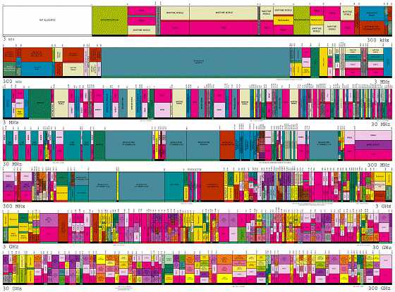
The full of allocation of radio
spectrum is much more complicated, however, as can been seen in map
below. This map
shows the allocations in the US and was produced by National
Telecommunications and Information Administration in March 1996.
|
![]()
|
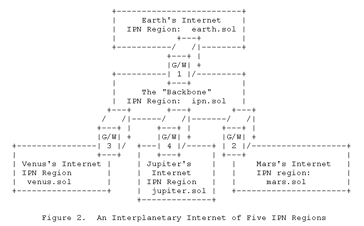
A conceptual sketch of the
possible architecture of the Interplanetary Internet (IPN), as proposed
by Vint Cerf and colleagues. Further details are given in their Internet
Draft.
|
![]()
|
Sorry, the Cybergeography Research web pages are no longer being updated. The project ran from 1997-2004, but my research has moved away into other areas (see my blog for latest). If you have any questions or comments, please email me at: m.dodge (at) manchester.ac.uk. Cheers, Martin Dodge, February 2007. |