|
| Wireless | Web Site Maps | Surf Maps | MUDs & Virtual Worlds | Historical |
|
Sorry, the Cybergeography Research web pages are no longer being updated. The project ran from 1997-2004, but my research has moved away into other areas (see my blog for latest). If you have any questions or comments, please email me at: m.dodge (at) manchester.ac.uk. Cheers, Martin Dodge, February 2007. |

 |
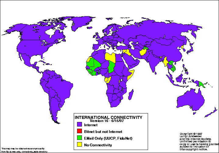
A "census" of Internet connectivity by countries has been undertaken at regular intervals by Larry Landweber, Computer Science Department, University of Wisconsin - Madison, USA. The map opposite shows the differential levels of network connectivity in September 1991. |
| The map on the left shows the connectivity position in
June 1997. The change in connectivity levels is clearly evident,
showing the spread of the Internet. Landweber's maps and data
tables are available.
[For more information on Landweber's maps see the Map of the Month article "Mapping the Global Spread of the Net" in Mappa.Mundi Magazine.] |
 |
![]()
|
A map showing all the Internet interconnections for Hong Kong in December 1999. This comprehensive census map of Internet infrastructure is a project of IDG Communications in Hong Kong. The map is update quarterly.
|
 |
![]()
|
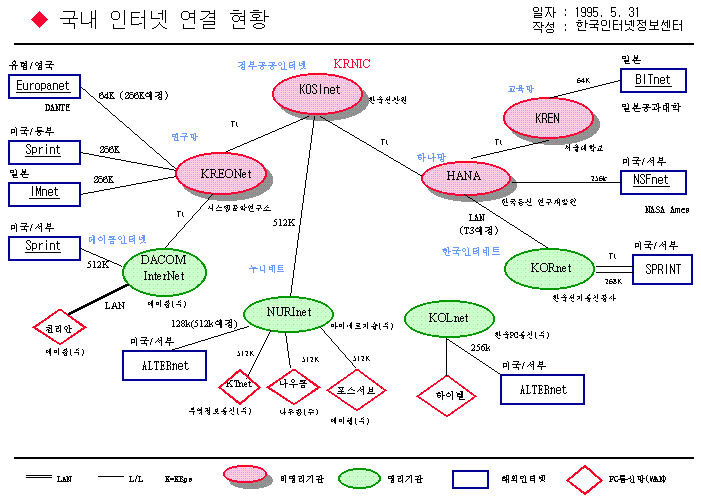
Maps tracking the Internet infrastructure in South of Korea produced by KR Network Information Centre (NIC). A whole series of maps over the past five years were produced using topological graphs creating a useful census of the growing complexity the links between ISPs and their capacity. The top map shows the infrastructure in May 1995 and the bottom one is from October 1999, clearly revealing the tremendous growth in ISPs, connections and capacity. |
![]()
 |
 |
 |
|
Antonio Scarponi created an animated map of the world showing the growth of Internet users from 1993 and predicted to 2015. The three images above are single frames from the animation showing the state of the Internet world in 1996, 2001 and then projected for 2007. The map uses a continuous cartogram representation where the size of the country is based on the number of Internet users rather than geographical area. Cartograms can be a very effective means of visualizing demographic data as they highlight areas based on where most people rather than simply territorial area.
|
||
 |
||
![]()
| An example of the statistical maps of the Internet produced through the 1990s by John S. Quarterman. Many different maps were published in Matrix Maps Quarterly. |
|

|
|
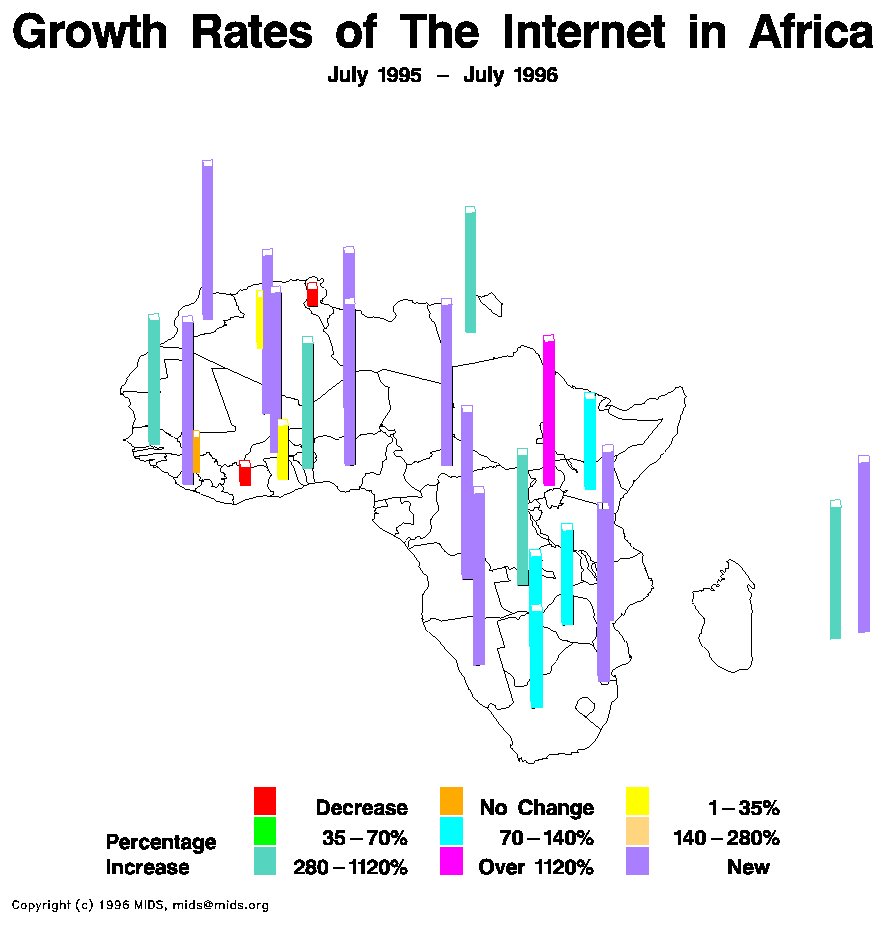
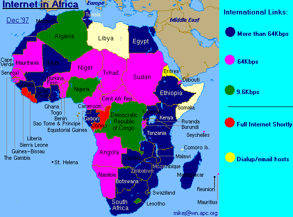
| Mike Jensen is tracking the growth and development of the Internet in Africa, including producing a range of statistical maps and graphs. The two maps above show the changing level of Internet access and international bandwidth between May 1996 and December 1997. |
![]()
 |
![]()
 |
 |
|
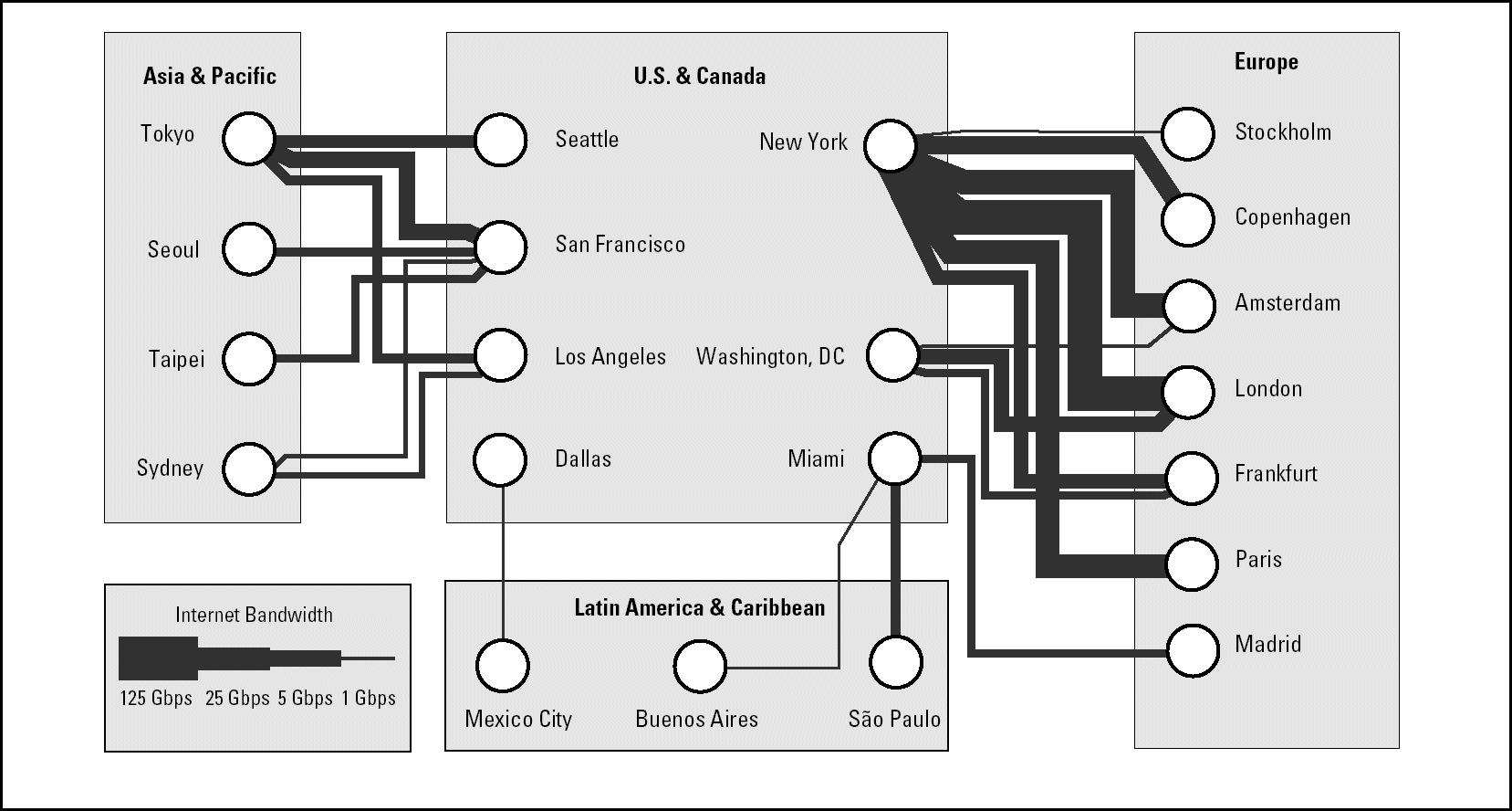
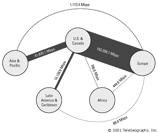
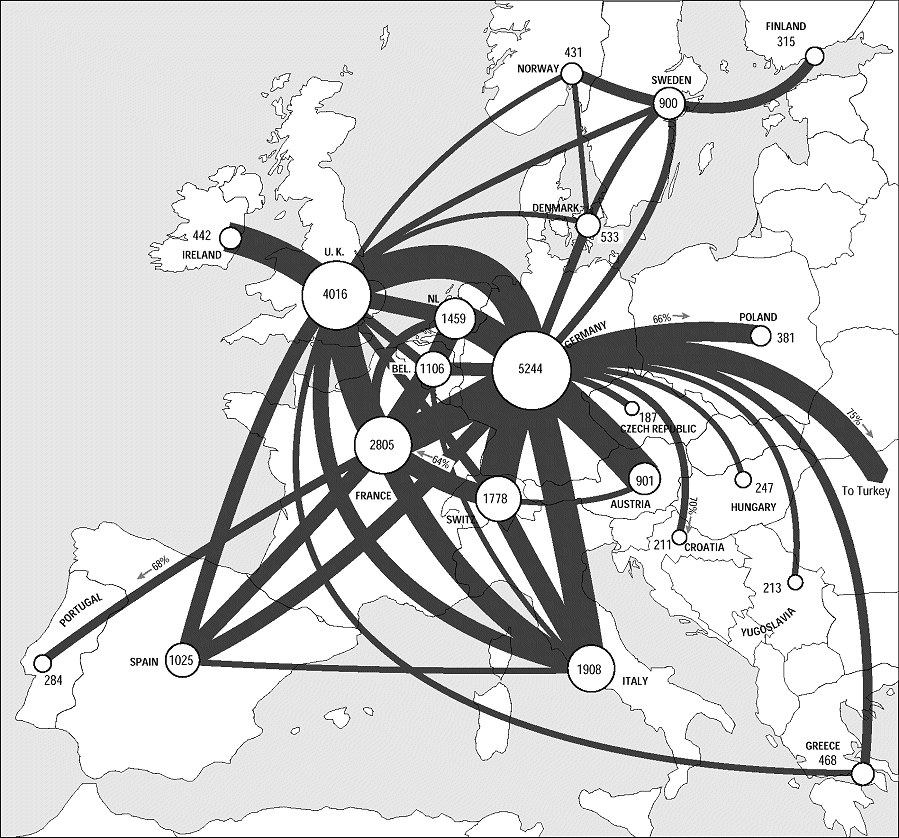
Examples of the statistical maps and diagrams produced by TeleGeography, Inc. The ones above show aggregate international Internet bandwidth between regions from 2001. The map below shows European telecommunications traffic flows in 1995. [For more information see the Map of the Month article "TeleGeography's Traffic Flow Maps".] |
|
![]()
 |
 |
|
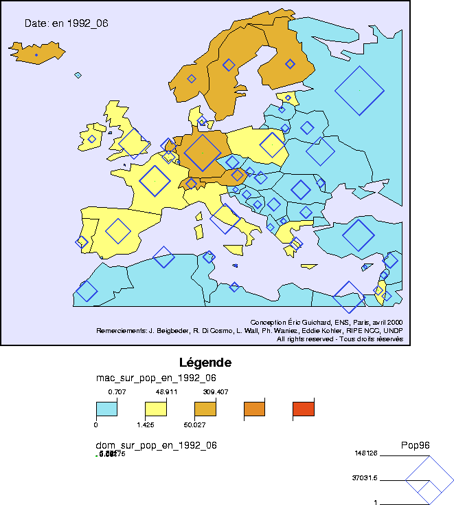
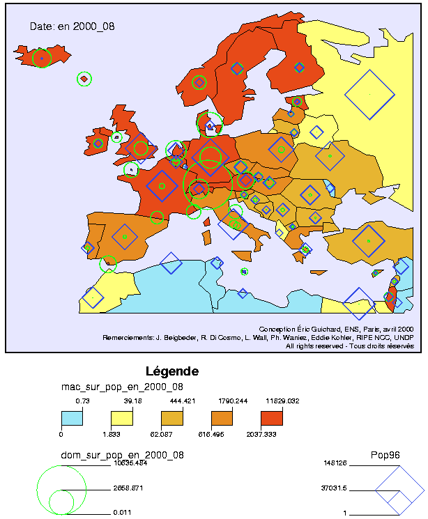
| Example frames from an animated map tracking the growth of the Internet in Europe through the 1990s. Several different map animations were produced by Eric Guichard, at the Ecole Normale Superieure, Paris, using national level data from RIPE. Countries are colour-coded according to hosts per capita and the green circles show domains per capita. (Blue diamonds show the 1996 national population.) | ||
![]()
 |
|
|
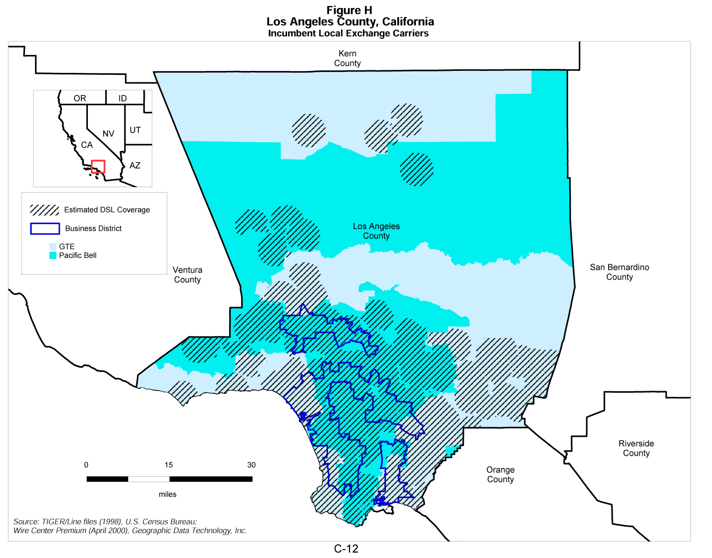
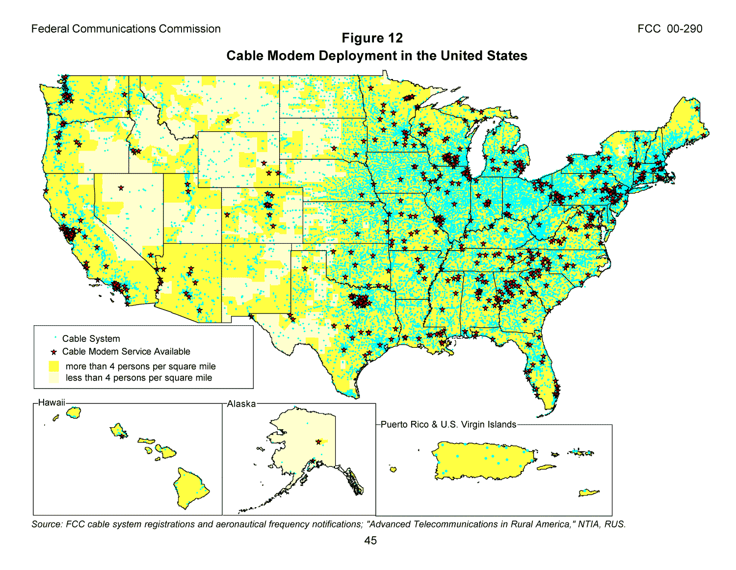
These two maps of the USA show the geographical deployment of high-speed, broadband Internet access technologies. The map on the right looks at Los Angeles in greater detail. The data and maps are compiled by the Federal Communications Commission. For more information see the report, "Availability of High-Speed and Advanced Telecommunications Services" (FCC Order Number 00-290) released in August 2000.
|
 |
 |
|
![]()
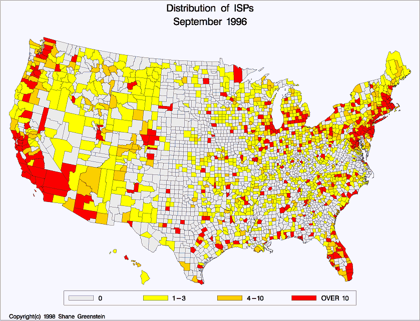
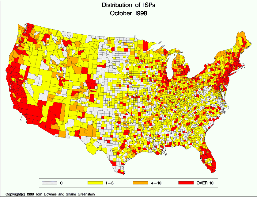
| The changing geographic distribution of ISPs in the USA from September 1996 to October 1998. Based on economic analysis of ISP markets by Shane Greenstein and Tom Downes, Kellogg Graduate School of Management, Northwestern University. |
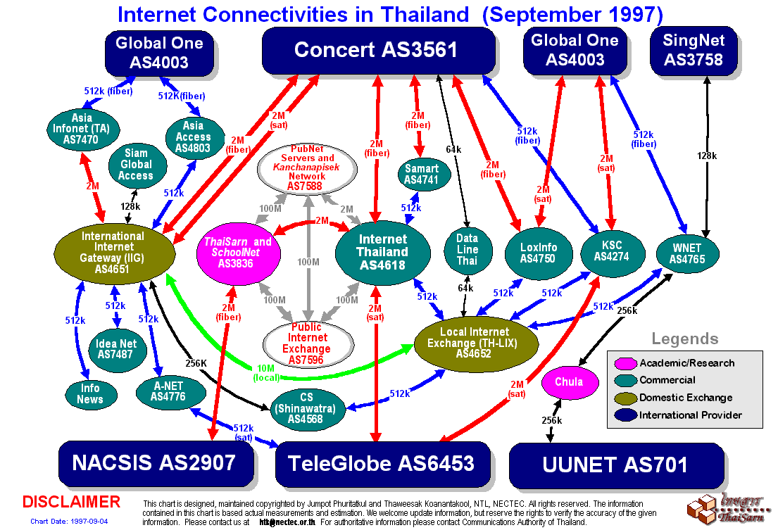
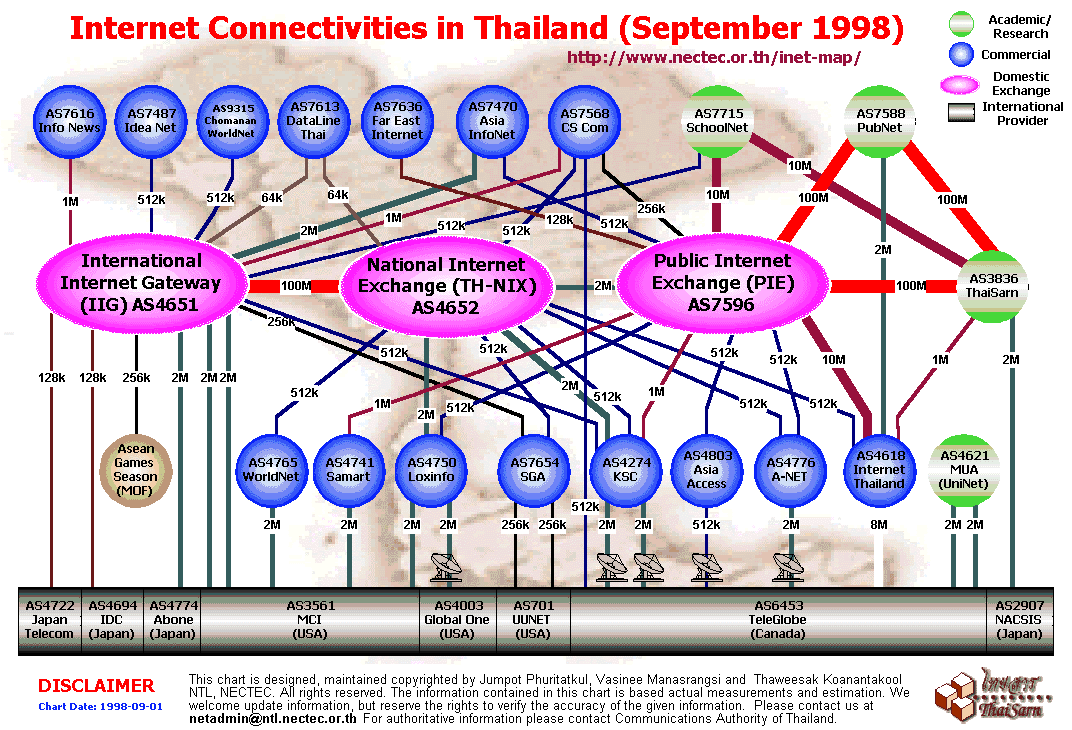
| Diagrammatic maps showing Thailand's Internet Connectivity in September 1997 & 1998, produced by Jumpot Phuritatkul and Thaweesak Koanantakool, NECTEC. Check their website for the latest maps. |
![]()
|
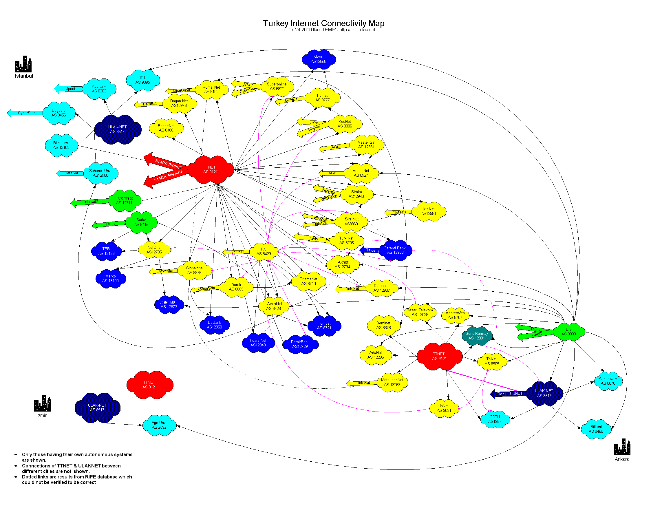
A census map of Internet
connectivity in Turkey, compiled by IIker Temir. It show the
state of connections at the end of June 2000. Check the website for the
most recent version.
|
 |
![]()
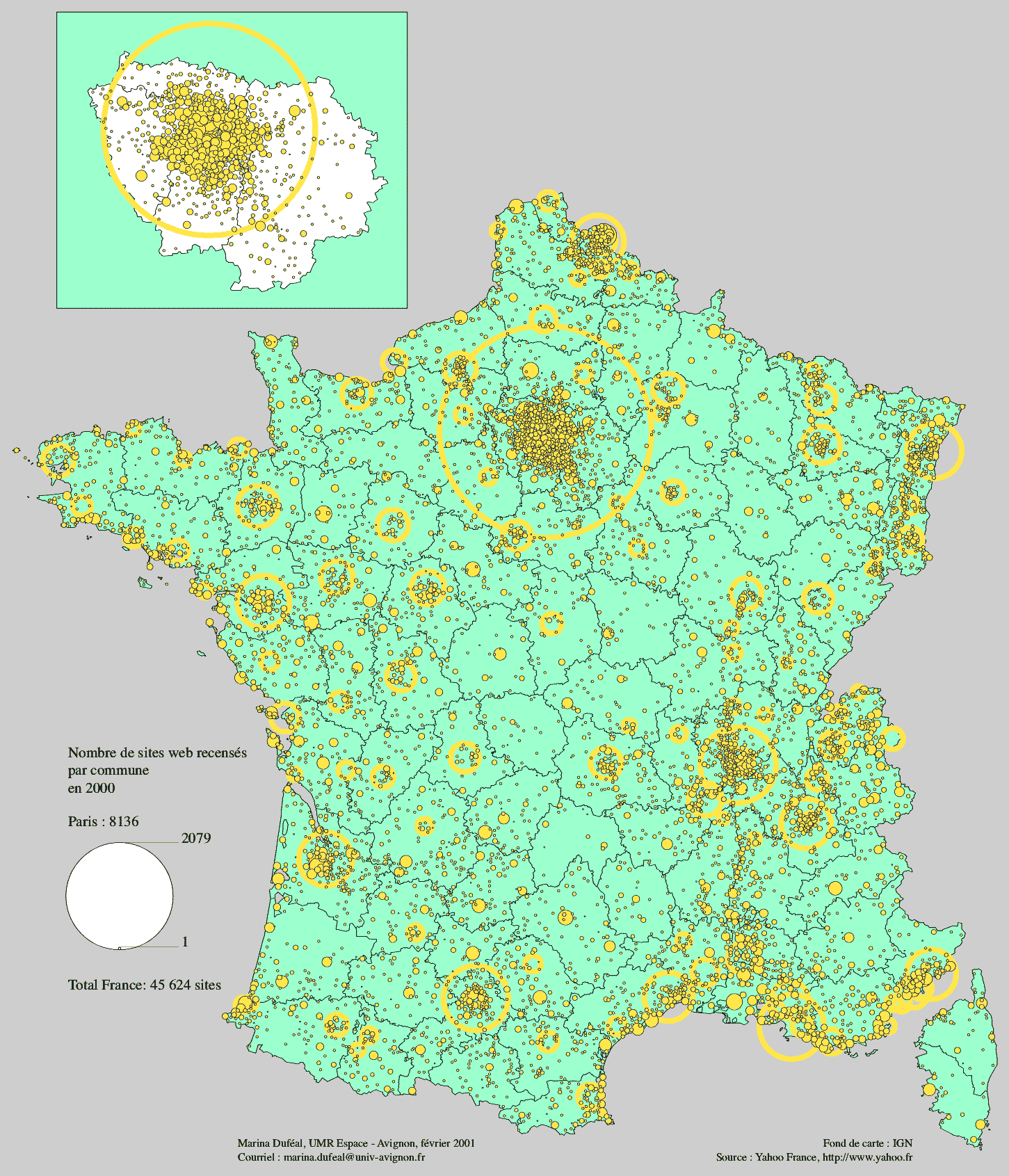 |
A detailed mapping of the geography of websites in France from February 2001. The map was created by researcher Marina Duféal and uses proportional circles to show the number of sites in each commune. |
![]()
 |
|
|
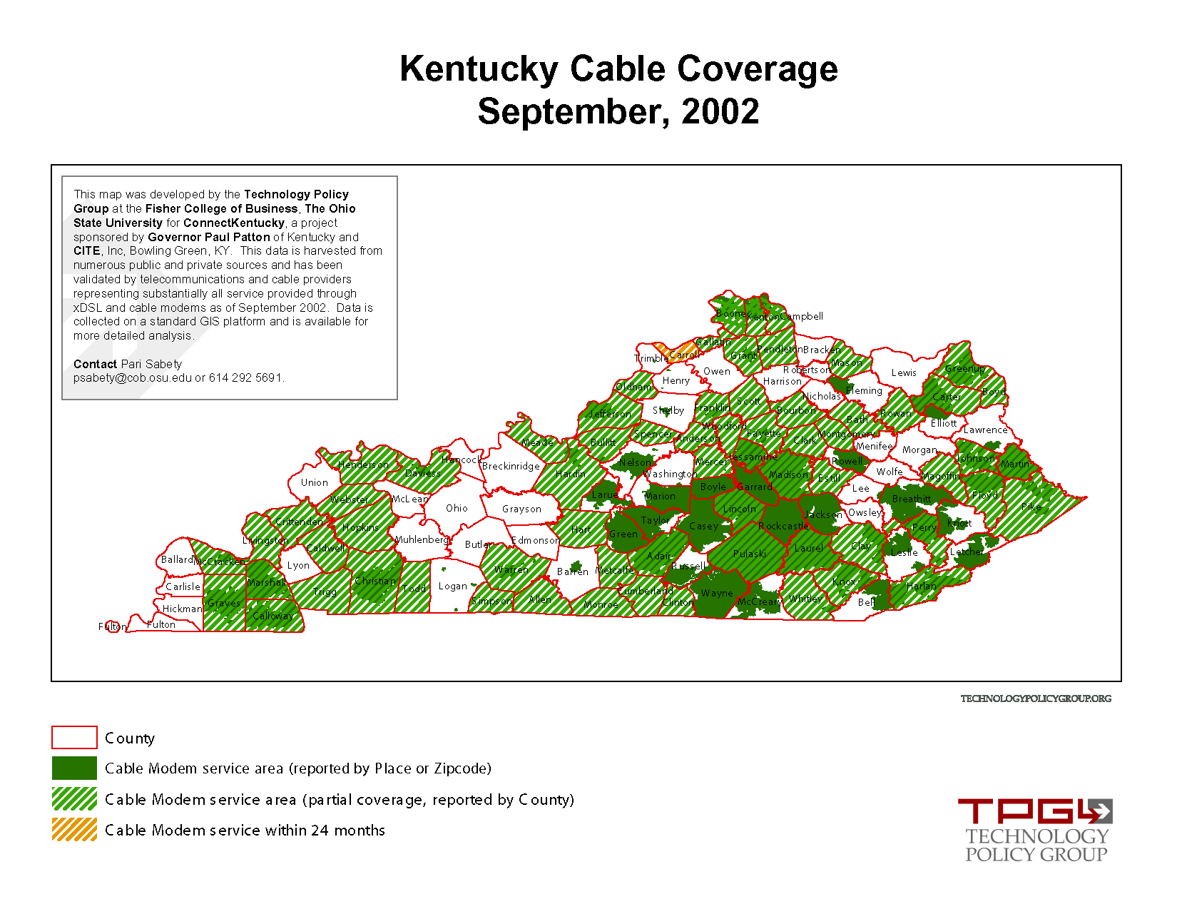
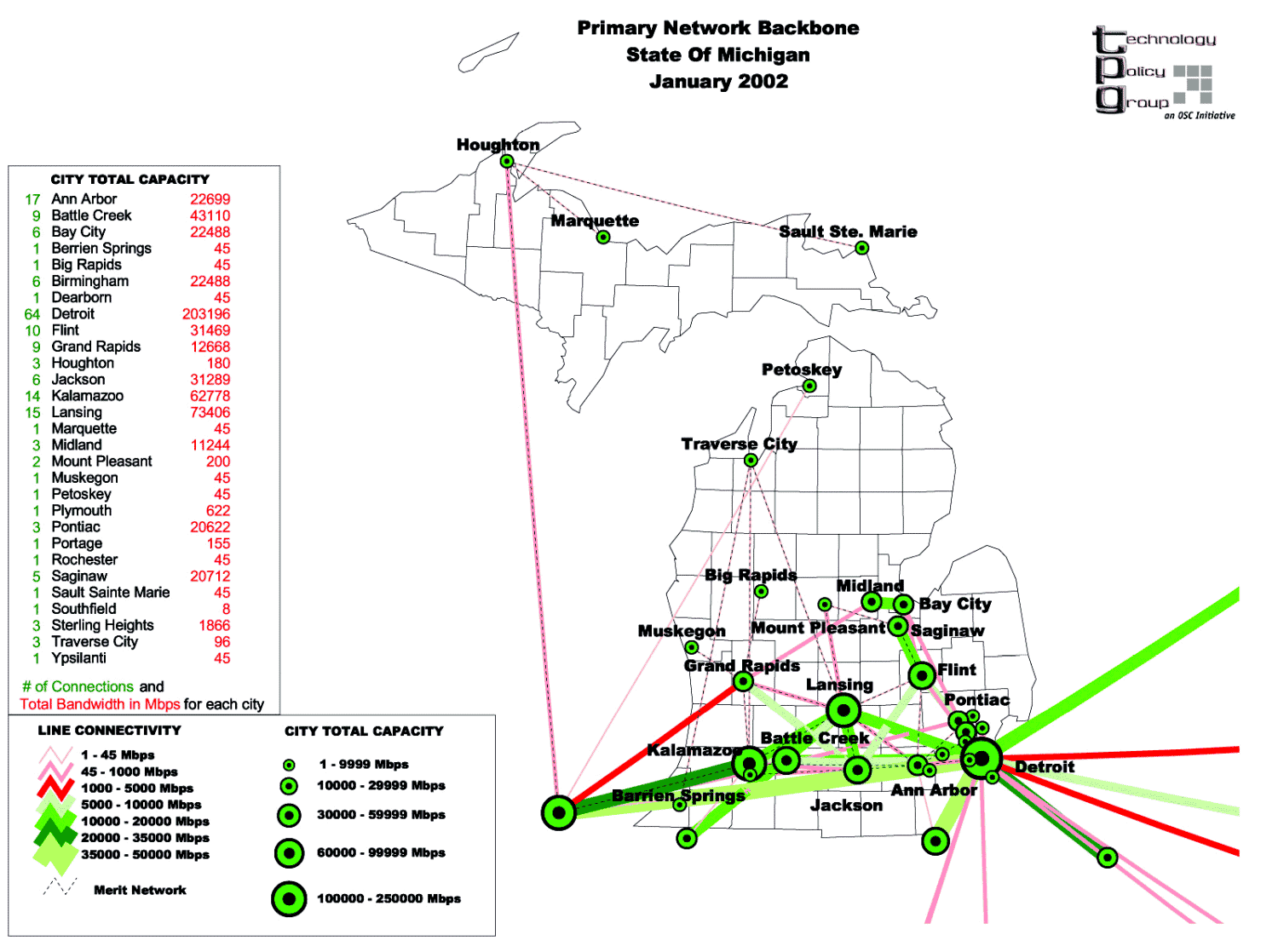
The map above shows the coverage of cable modem Internet service throughout the state of Kentucky, September 2002. It was produced by TGP and ConnectKentucky. The example on the right is map of aggregate Internet
bandwidth capacity between cities in the state of
Michigan, as of January 2002.
|
 |
![]()
|
Sorry, the Cybergeography Research web pages are no longer being updated. The project ran from 1997-2004, but my research has moved away into other areas (see my blog for latest). If you have any questions or comments, please email me at: m.dodge (at) manchester.ac.uk. Cheers, Martin Dodge, February 2007. |