lecture menu |
lecture 7: multiparts
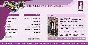
What you are actually looking at here is a series of separate images, designed as one but then "sliced up" in a graphics package and then "glued back together" by means of a table. Proof of this comes if you right-click on parts of this screen and "Copy" the image into a graphics package to see what you have. (Please note these images are © the University of Leeds.) Examples are shown below. Each of these is defined by a separate <img> tag in the code. I have only shown you four of the component images on this page but I hope you get the full picture - so to speak. What looks to be a seamless image is in fact a "jigsaw" of separate bits. 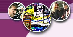     Note also that not every part of this page is made up of an image. The "search" box, for instance, is not an image, nor are the items below the "news" banner. You can prove this by right-clicking on these parts of the screen. The context-sensitive menu which appears is relevant to text, not images. Remember that table cells can include many different things; and that is how this is done. We have a precisely-defined table, with a variety of different cell sizes and contents, all fitting together to render the page as shown. The next slide looks at some more (and simpler!) examples of this technique and lists the reasons why you might want to use it. |