lecture menu
lecture 7: examples II
The best image maps are those where the image itself, and the destinations of the links, are directly related. Remember that many images are themselves purveyors of information, even when "one-dimensional" (that is, just presented on a web page via a single <img> tag. By using the image maps technique it becomes possible to make the informational content of an image very interactive.
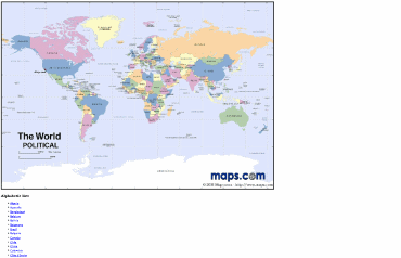
 | This is best illustrated by following this link to a literal image map (as usual, it opens in the second browser window). This is drawn from a web-based version of my old BA dissertation which I drew up to illustrate some multimedia possibilities, but it also serves as a good illustration of how a very large amount of information can be coded into an image using the map "overlay". Although we are still using links, this is not really a navigational tool. Rather, it's a way to get information, almost, "inside" the image. In addition - and this is just visible on the screen shot here - note how there are alternative ways of reaching the same information which do not depend on the image being downloaded. The image map, therefore, is used to present visual and textual information together, in a highly integrated way. As this is the sort of thing atlases are pretty good at doing anyway, it's an example of where the image map technique is extremely well suited to the type of information being presented. |
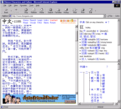
The most amazing image map I've ever seen is used on a site which I've mentioned on other occasions: http://www.zhongwen.com/, a site for the study of the Chinese language. The maps are used on the online texts - follow the links to , say, the Tao te Ching or the sayings of Mao (the "little red book"). I find it amazing enough that every character in these texts is a link to its own definition and etymology - that it's done with an image map is equally amazing in technical terms! In terms of web accessibility this site is a dead loss but as an example of some of the creative and didactic possibilities of this medium, there are few better illustrations. |  |
Both these are very complex image maps, but they stretch the technique to its limits and in doing so give you an idea of what is possible. All sorts of images have potential here; photographs, diagrams, organisational charts... because the map is drawn separately to the actual image the possibilities are limited only by your own imagination and patience. The key is to try and ensure that the image and the map are closely and logically related. How you actually go about creating an image map in the HTML is the subject of the next three slides.
