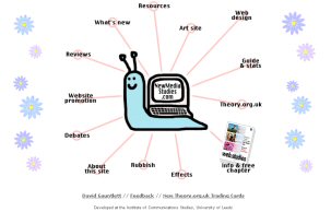
Click to skip over navigation
 

lecture 7: examples I

<< previous slide

return to lesson 7 index

next slide >>


Image maps are almost always used as a means of enhancing navigation. The fact that hot spots inherently act as links is obviously a factor here, although bear in mind that not all links are navigational (something which may become clearer on the next slide).

On the right is the screen shot of a site which you can see at http://www.newmediastudies.com/index2.htm (the link will open in the second browser window). The tips of each of the "rays" is a link to a different part of this site. It's worth spending a couple of minutes browsing this site as it will give you some idea of the potential of image maps to jazz up your navigation.

At this point, however, before we get too deeply into this, I must point out that I'm also using this site to demonstrate the principal way in which image maps are badly used. The screen shot below is taken from the same site and is what someone would see if they did not load images, for whatever reason. Remember that as lectures 5 and 6 noted, a substantial proportion of web users either choose to or are obliged to not load images.

Screen Shot: an example image map
Screen shot of same map with images turned off, showing accessibility failure

The map - and therefore the site - are useless to anyone who does not load images. Rule no. 1 with image maps, then, is to always provide some alternative means of reaching the content. The designer of the "snail" site should really have included a text-based menu as well, for the benefit of visitors who did not load the image.

What's the point, then? Well, go to the next slide and I'll suggest how you can use image maps productively, not just as gloss.


<< previous slide

return to lesson 7 index

next slide >>