Web Design
topic title
main menus
help pages
printer-friendly/text-only version
your account
Use your ACOM account to access the discussion boards, submit course work and check marks and feedback
Page contents
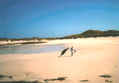
I hope, to a large extent, that the question answers itself. They do say that a picture is worth a thousand words, and its a fair point. I could say that Sanna Bay in Scotland (below) is one of the best beaches in Britain, but no matter how lyrical I waxed, the picture makes my point far better than words ever could.

The most obvious application of images on web pages, then, is as illustrations. Not just pictures or photographs, but also charts, diagrams, maps and logos (like the spider logo which pops up at the top of these pages).
But there are other possibilities, if you use your imagination. Perhaps you could use images to give a jazzier alternative to bulleted lists, as below:
 MONDAY: 70s Retro with DJ Tache
 TUESDAY: Jazzy Jungle with Jammin' Jeffrey Jacob
 WEDNESDAY: "All You Can Take" Gabba Gabba Hey night
Or, get otherwise difficult-to-achieve text effects by the simpler means of using an image, these often being known as banners:

Finally, it is common to see images used as links. Logos, buttons, even photographs can therefore be put to some practical use on the page. rather than just being decoration. Hypertext becomes hypermedia. Examples of all these applications appear on this site, and the majority of other sites you'll see.
Actually placing an image on your page is very straightforward - perhaps surprisingly so. The majority of this lesson is therefore concerned with doing so effectively. Bad images, or badly-used images, are probably the commonest cause of bad sites. Almost all web sites use them somewhere, but please don't think they are obligatory, and if you do use them, try and use them well. Hopefully these pages will give you some hints and tips in that direction.
Acquiring and using images
When you insert images into a document in a package like Word, the image data becomes fully integrated into the rest of the file. If you look at the memory size of a .doc file before and after images have been inserted, you'll see a big difference. (If you don't know how to look at the size of a file, make sure you read the page on image size, as checking the size of images is an important part of using them well.)
In a plain text document like an HTML file, however, you obviously can't incorporate images, just as you can't incorporate any other formatting. On the Web, then, images remain separate data files. What you place within the HTML file is a pointer to this other file. The images are then separately loaded and "slotted" into place by the browser. That is why, when you're surfing the Web (particularly from a slower phone connection), you can quite clearly see the browser loading the text first, and then each image in turn. The "pointers" are, as ever, tags: in this case, <IMG> tags.
Where do image files come from? Well, you have to find them yourself! There are various methods by which graphical information can be digitised:
- by using a scanner. These relatively cheap bits of hardware use a technology similar to that of photocopiers to "scan" photographs or actual objects and convert these into digital information.
- digital cameras. Whereas traditional cameras project the picture onto photosensitive film, digital cameras convert it immediately to bytes of info.
- with graphic design packages. Although it would take a huge amount of talent and time to produce "photographic" artwork completely from scratch on a computer, it's not too hard, with a bit of practice, to produce buttons, logos, diagrams and so on. The star image and the "Naxos" banner above were both produced (in a total time of about two minutes) using Adobe Illustrator. At university, Paint Shop Pro also has a "screen capture" function, which is how all the screen shots on this site were taken.
- copying them from other applications. The Cut - Copy - Paste functions can be used to take, for instance, charts produced in Excel and pasting them into a graphics editor so they can be saved as separate files.
- easiest of all: snaffling them off other web pages. Obviously there are copyright issues involved with some images, but if no copyright warning appears on a page, you can, usually, safely assume the image is in the public domain. If in doubt don't take it. To save an image from the web, use the right-hand mouse button to click over the image. A menu will appear with "Save Picture As..." or "Save Image As..." (depending on your browser). Choose this option and simply save the image wherever you want.
What you must be aware of is that there are many different image types, with a multitude of possible file extensions. Only a very few are suitable for use on the Web. The page on image types goes into detail here, and you should ensure you read it properly.
How not to use them
Most importantly of all, remember that when it comes right down to it, images are padding. HTML, as its very name suggests, is concerned with the manipulation and structuring of text. Image handling was not part of the original intention for HTML. This is why, incidentally, I present this topic after the discussion of tables, which are structural, and therefore more important.
Having said that, of course, the use of images is now central to the Web. Indeed, it's precisely because the WWW can handle images that it has become, by far, the pre-eminent Internet application. To try and hold back the tide of web images is a futile gesture that would have made Canute embarrassed. But this does explain why you need to observe certain conventions with images if you're going to use them well.
The main problem is that not everyone browses the Web with image-viewing capability. There are still text-only browsers out there, whether these are being used on older machines (particularly in poorer countries) or by blind users - or simply by those who want to speed up their web browsing, as the downloading of images can take up to 90% of your phone time. This isn't to say that you have to design only for these users, but giving them some consideration also makes things easier for everyone else as well. Images are fragile; as they take so much download time, they are more likely to break, if phone or server connections go down.

In the first place, please don't do something like this. If you can present information as text, present it as text. There are plenty of HTML techniques available to you if you want lines or images incorporated within text. Sometimes people do this kind of thing when they've scanned in things like lecture notes, or passages from books: but don't. Convert it to HTML instead, after all, that's the whole point isn't it?
At the very least, place a caption by any image, and if you're using an image as a link, have an ordinary text link beside it as well. Better still - and you really should consider this obligatory - use the ALT attribute to provide "alternative text" for all your images (yes, even the little logos). Hover your mouse over any image on this site to view the contents of that image's ALT attribute. It's more than a gimmick, it's an important way of increasing the user-friendliness of your page.
You must watch your image size. Large images - meaning anything over 100KB really - are a no-no. Keep them small and concise. No-one wants to spend five minutes waiting around for a huge image to download; and even one minute can be rather wearing, if it happens on each and every page.
There are many more considerations here, and indeed, many more possible uses of images. I haven't even mentioned image maps yet, for instance, nor rollover images... but I will. Don't run before you can walk, however. This lesson introduces this very important subject, and covers the basics. All other applications of images will be introduced as they crop up.
Summary and exercises
By the end of this lesson you should:
- be aware of which image types are suitable for Web use, and why
- appreciate the importance of checking image size, and keeping it low
- be able to use the <IMG> tag constructively, with particular attention to the ALT attribute, and the HEIGHT and WIDTH attributes
- know how to use images as links, as thumbnails, and as backgrounds.
EXERCISES: Before moving on to the next lesson you should complete the following exercises to check your knowledge:
|
After that, lesson 6 awaits...
Incidentally, here is a link to a page with a wide selection of buttons and icons - in other words, small images you can use to liven up your pages, like the "stars" on the list at the top of this page. They are free to download, but the price you pay for this is that the site has frequent pop-up adverts. The page will open in the second browser window.
