Web Design
images as links
main menus
help pages
printer-friendly/text-only version
It is very common on web pages to encode links into images, rather than text. As with so many techniques involving images, the coding is very simple. It is the issues of good (and bad) usage which are more involved and significant. This page only introduces the topic - there is much more to be done with images as links, but these will come in later lectures (mainly in the Advanced section).
|
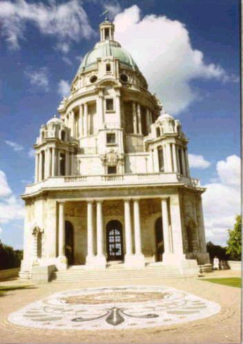
The image on the left is a link, coded as follows (I've omitted the code for the caption, but see below). Note if you follow the link you will need to use your Back button to return to this page. <a href="http://www.lancasterukonline.net/visitors/v-tour/williamson_park.htm"> <img src="memorial.jpg" alt="Image: Ashton Memorial, Lancaster" height="250" width="175"> </a> |
And that's really all there is to it. Instead of text, you simply include an <img> tag within the opening and closing <a> tags and bingo, your image is now an active hypertext link.
Nothing is different about either the <a> tag or the <img> tag. Note how the alt, height and width attributes are all in place within the <img> tag (more is said about the alt attribute below). More significantly, the link is unaffected as well. This is an external link, but it could equally have been an internal link, an anchor link, or even a mail-to or non-HTML link. In other words, the <a> tag is affected not one jot by the fact an image is within it, rather than text.
So far, so simple, but there's more to think about. It is very important that your readers know the image is a link. When images become links, some browsers default to outlining them with a border. However, the colour of this border is unpredictable. Some browsers render it in the colour specified for links in the style sheet, whether visited or unvisited (e.g., as if it were a text link). However, IE seems to return to the default colours, usually blue and purple respectively. In any case, as you can see it's not a very thick border and if it appears in a colour quite similar to the outermost edges of the image (or the background), it could easily be lost.
However, not all browsers even produce the border: Opera does not. You can't therefore depend on a border to make it clear that an image is a link.
What some designers try next is to co-opt the alt attribute to help out. In other words, they include an alt that says something like "click on this image to read more about Ullswater". This is a tempting solution but is again unsatisfactory. There are two reasons for this. The first is that you only see the floating caption when the mouse pointer is over the link. So, if the user both misses the coloured border, and never happens to place the cursor over the image, they may never be aware that the image is a link. The second is that, once again, many browsers will not render alt as a floating caption anyway. In them, the text in the attribute will only appear if the image does not.
Don't forget though that you should still always include an alt. You will notice above that the alt describes the actual image but doesn't mention that it's a link. And there's nothing actually wrong with using the floating caption to do all this anyway - you just can't depend on it all the time. The simplest and best solution to all this is that you should always have some indication in ordinary text that an image is a link; a caption or some other form of accompanying text, like here:
 Click to return to the menu for lesson 5.
It may be that you do not want your image-links to have borders at all. They can make images look rather ugly, particularly logos which you may have designed to blend in to the background colour of your page. If that's the case you can use styles to turn off the border. This site's style sheet has the following entry in its style sheet:
img { border: 0px; }
It's as simple as that, really. I have turned the border back on again (with style attributes) in the two images on this page which have one, to show you what the usual practice is. However, this is what I've defined to normally happen on this site, even for images that are links:
 Click to return to the menu for lesson 5.
Using an image as a link may seem a curiosity, but in fact, it is very common. When you remember that images are not just photographs, but also icons or buttons (like the arrow above), you'll realise the technique's potential. Also, the technique known as image maps, where different parts of the same image can point at different files, is so useful I've made it into a lesson in its own right. The information contained on this page is only the beginning!


