
.gifs are used for images like this...
.jpgs for photographs like this.
As with the other similar pages on this site, this page is designed to be easily printed out and read offline, away from the computer. If you are trying to follow this lesson online you will find it much more convenient to return to the full lesson 5 menu.
You can also go straight to the printer-friendly version of lesson 6 from here.
Contents
It is important that you know which image types are appropriate for use on the Web, and which are not. A wrongly-chosen image type can damage the usefulness of your page, particularly if you use a type which is large in memory terms (see 5.2).
Scanners and digital cameras are very useful objects, as they are the two ways in which you can get images from "reality" into digital form. But they create files which are far too big to use on the Web. The format they use is called .tif (that being the extension of the file type). .tif files record colour information about each and every pixel (as, incidentally, does another image file type, the bitmap with extension .bmp). Look at the two images below: the "grid" on the right is a greatly magnified version of that part of the left-hand image within the box:
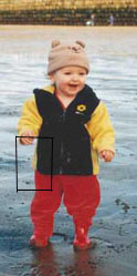

As you can see, however, there is a lot of redundancy here. Only the left-hand side of this section has any real detail: the right-hand side is, basically, two blocks of identically-coloured pixels. The .tif format certainly allows images to be stored in very high quality, and reproduced precisely. But this comes at the cost of very large file size; three bytes for every pixel, to be exact (one for the amount of red, one for the green, and one for the blue - remember your RGB colour codes).
Also, because of the nature of the medium, you simply don't need images on your web pages that are of printable quality. Monitor screens display at a resolution of about 72 pixels per inch. (This varies depending on the screen, of course, but that's a reasonable guide.) Some scanners work at up to 9600 pixels/inch, which makes for marvellous image quality but is, of course, absurdly excessive if all you're going to be doing with that image is looking at it on a monitor screen.
The image types that are most commonly used on the Web meet both these criteria. They can be smaller because they compress information. As an analogy, think of that latest craze, texting.... im sure most of u cld undrstnd this msg... inessential characters have been stripped out to save time (and finger joints), but there is still enough information to rebuild the message. Similarly, returning to the example above, the computer wouldn't need to store every pixel in, say, the toddler's coat or trousers separately. Rather, it could compress the information down to saying, there is a certain area of the picture: and that area is filled with a certain colour. That's only two or three bytes, instead of dozens.
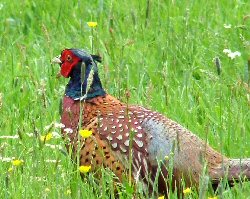
The two image types which work this way are the .gif and the .jpg (pronounced jay-peg). They have different applications, as shown below; .gifs are used for logos, line art, cartoon-like illustrations and so on, whereas .jpgs are best used for photographs:
.gifs are used for images like this... | .jpgs for photographs like this. |
There is a third format, .png (Portable Network Graphic), which has been around for a few years now but though it was specifically designed for use on the Web, it has struggled to gain support. This is more down to inertia than there being anything wrong with it, but do bear in mind many older browsers (and even some that aren't that old - such as IE 4.0) don't support it.
To convert one file type to another, all you'll need to do is load it up into a graphics editing package, like Paint Shop Pro (available on the university network) and use the Save As... option to change the file type. You'll need to use a package like this to change file sizes as well - at least, if you want to make them smaller in memory terms as well as just on the screen (a distinction discussed in 5.2). It's worth becoming familiar with at least these basic graphic editing techniques. (Photoshop offers a "Save for Web" option, which shows you how large your file is going to be, as well as ensuring you get the format right. If you've access to this package it's a good way to begin to explore the issues here.)
As the virtual lecture stated, there are many specialised considerations involved in designing and using graphics on the Web. The average user won't need to concern themselves with them, but if you're going to take things seriously, at the very least you should take the ACOM Graphics option, whether as part of Web Design or another ACOM module. Also have a look at Part III of Niederst's Web Design in a Nutshell, and get yourself a decent graphics package. But at the very least, all web designers should know when to use a graphics package to change file types and size.
While we're on the subject, do be aware that images are not immune from the suggestion that you use mainly web-safe colours (see 2.2). Certainly, logos and banners should stick to these 216 colours unless there is a good reason not to. I could go into more detail here but it is not the aim of this site to explore every nuance of creating graphics for the Web. At a basic level, though, you need to be aware of these considerations, and aim to make your images as small as possible in memory terms.
There are two distinct ways of thinking about image size. The first is, how big is the image on the screen? This is dealt with in section 5.5 below.
The second way is, to be honest, more important. That is, how big is the image in memory terms? On the Web, memory is very important. The larger the image in memory terms, the longer it will take to transfer down a telephone line. Most - up to 90%, or even more - of time spent surfing the Web is spent downloading images. It is therefore very important that you make sure your images are of a reasonable size.
Computer memory is measured in bytes. One byte is, usually, enough to store one character of text. This is a pretty small measure, really, so you will often see the amount expressed in kilobytes (Kb), which is roughly a thousand bytes. (Actually, it's 1024 bytes: computers don't work in powers of 10, remember, but powers of two.) The capacity of computer disks and internal memories is usually expressed in terms of megabytes (Mb) - millions of bytes - or even gigabytes (Gb) - billions.
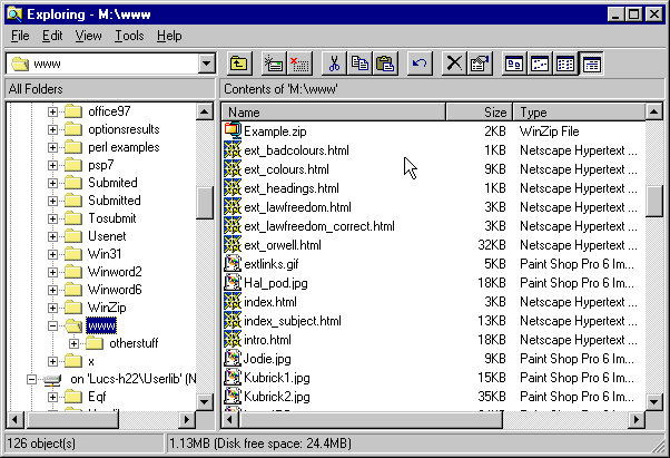
Your average HTML file will be about 5-10 Kb in size. (See the screen shot below, which is based on an earlier version of this site and its actual files.) Most images, however, are larger than this. What you have to ensure is that images do not get too large. That is the point of the image types .gif and .jpg - they are relatively small, in memory terms. But you can't depend 100% on these files always being small enough to use on your site. It's best to check.
Windows has, built into it, a file management utility known as Explorer. At university, it's available on the desktop. If you open it up you will see a window like the screen shot below, and can use the left-hand side to find your directory. Do have a look at your site and see how large your files are:
Anything over about 60KB should be used only with discretion, and over 100KB, the image is really too large for use on a web page. You should use a graphics package to shrink it (as described above). Realise that size in memory terms, and size on the screen, are completely separate issues. Yes, an image that is large in physical size is more likely to be large in memory terms, but there are other considerations as well: an image with large blocks of similar colours will be smaller in memory terms. Compare these two images, for instance:
This image is 43 KB in size.
This image is 64 KB in size - approaching the maximum desirable size for web images.
It is easy to get caught out, if you don't check properly. And very large images are one of the commonest, and most annoying, mistakes made in web design. If you must have a particularly large image on your site, do one of three things to minimise the pain:
As this lesson has already made clear, there are numerous issues involved with the use of images beyond just the tag itself. This page therefore restricts itself only to the tag and the attributes. I've also omitted any discussion of some attributes which are only supported by very new browser versions, or only certain browsers (such as DYNSRC, an attribute supported only by IE). Browser-specific tags are against the spirit of the Web, and I've tried to reflect that throughout this whole site.
The <img> tag places an object on the page, rather than formatting text, so it doesn't need a closing tag. Remember, though, this means it needs the / at the end of the single tag.
Quite a few attributes can be used in the tag, as follows:
Perhaps surprisingly, you can define some style sheet properties for images. I usually find myself defining border-related properties if only to turn borders off (e.g. border-width: 0px;). Why I might want to do this is covered on in section 5.6.
 | How can I align images on the page? There doesn't seem to be anything here which can do it. There are several ways to try and align images on a page. The reason I've not mentioned some of the possible attributes and style sheet properties is that they have either been deprecated from XHTML1.0 or are not very robust (which is why they've been deprecated). The easiest way to lay out images is to use a table and/or a <div> tag. All the images on this site that are centre-aligned but not placed to the side of text are enclosed in <div> tags. If they have text beside or around them they'll be within a table cell: as with the question mark to the left, and the example photographs below. |
<img> is not a block-level tag. Unless you separate the image from the text with text formatting tags such as <P>, you will run the image and surrounding text together in rather unattractive ways, as this example shows:
<p>BRAZIL is the largest
country in South America and
the largest Portuguese-speaking
nation on Earth, with some 120
million inhabitants. Brasilia
is the capital. <img src=
"brazil.gif" /> The flag shows
a blue globe on a yellow diamond,
set upon a green field.</p>
|
BRAZIL is the largest country in South America and the largest
Portuguese-speaking nation on Earth, with some 120 million inhabitants.
Brasilia is the capital. |
<p>BRAZIL is the largest
country in South America and
the largest Portuguese-speaking
nation on Earth, with some 120
million inhabitants. Brasilia
is the capital. </p>
<img src="brazil.gif" />
<p> The flag shows a
blue globe on a yellow diamond,
set upon a green field.</p>
|
BRAZIL is the largest country in South America and the largest Portuguese-speaking nation on Earth, with some 120 million inhabitants. Brasilia is the capital. 
The flag shows a blue globe on a yellow diamond, set upon a green field. |
The fact that <td> tags can contain <img> tags (as you've just seen above) is one of the key factors involved in using tables for page layout. It's much more robust to arrange images and text like this than it is to leave it up to the browser. I hope this site has contained more than enough examples already of this (and will continue to do so) for you to require a specific example of it here. Well, apart from this one anyway, which gives me a blatant excuse to show off some of my baby photos. Dads do that kind of thing.
 |
 |
Again, this is possible without tables - but it's much more robust, and ultimately easier, with them. Here's the code:
<table>
<caption>Joe Whitworth (born March 2003)</caption>
<tr>
<td><img src="joe4.jpg" height="200" width="280"
alt="Image of Joe, no. 1" /></td>
<td><img src="joe5.jpg" height="200" width="280"
alt="Image of Joe, no. 2" /></td>
</tr>
</table>
To repeat once more, please do realise that using images well involves much more than simply bunging <IMG> tags on your pages, so please do ensure you've read and understood the other pages in this lesson.
|
IMPORTANT NOTE. This is intended for those who wish to graduate into any kind of "professional" web design: but everyone might benefit from a look at. The days of the <img> tag are numbered. The W3C (World Wide Web Consortium) have specified that, to be strictly correct HTML, images should now be defined by means of an <object> tag. <object> is a generic tag for placing not just images on the page, but Java Applets, video clips, and objects from other media. The idea is to create a single tag that can cope not just with existing media but unforeseen future ones. Compare then these two pieces of code: they should have an identical effect, but look carefully at how the latter has its elements rearranged from the former:
<p>A photo of baby Joe Whitworth:</p>
<img src="joe4.jpg"
     alt="Image: Joe aged 3 months">

<p>A photo of baby Joe Whitworth:</p>
<object data="joe4.jpg"
        type="image/jpg">
Image: Joe aged 3 months
</object>
This is not therefore a matter of simply replacing <img> with <object>: what was the alt attribute text now becomes an integral part of the page, and there is a closing tag which formats this text, "overlaying" it with the image object. Obviously, one would need to change the type attribute for different object media. For more information, see the official specification at http://www.w3.org/TR/html401/struct/objects.html which will open in the second browser window. Though this is now the official way to render images, browser support for this technique still cannot be depended on. For that reason I have not yet reflected it in this site whether in terms of the site's structure (that is, I still use <img> tags) or its teaching (I still teach them too). I would imagine that within one or two years, though, I will be, once I've convinced myself of its widespread applicability. Anyone with serious intent vis-à-vis web design should be aware of this issue. |
Out of all the tags and attributes of HTML that can be said to be genuinely important, none is less used than the alt attribute. It can seem nothing more than a courtesy, or even an annoyance, easy to dispense with. On the contrary. In fact, its consistent and appropriate use is one of those things that really distinguish the good web sites from the shoddy ones, and in certain cases, forgetting it can make your site literally unusable.
alt stands for "alternative text". It is an attribute which goes in the <img> tag and takes a value of a string of characters. For example, look at this image and its tag:
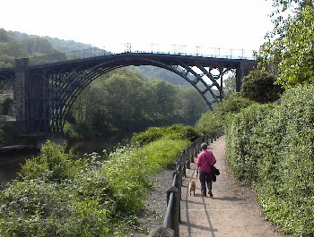
<img src="ironbridge.jpg" alt="Image: Ironbridge Gorge, Shropshire" />
If you are using IE - and only if you are - you can hover your mouse pointer over the image to see this text as a "floating caption". This is a fairly neat trick. However, it has also not been particularly helpful to the correct use of alt because people have begun to use alt as a means of getting information across which is not presented by any other text. The problem is that the contents of alt are not displayed in this way by other browsers.
So why am I saying that alt is so important? Well, it's not just me: it's the World Wide Web Consortium too, who are doing their best to make the alt attribute obligatory. What alts really do is make your page more accessible because they allow it to be more understandable to those who cannot see the images for whatever reason.
Why might images not appear? Two main reasons: the first one being that, as phone and/or server connections are not always reliable, and as the downloading of images can take anywhere between 50% and 95% of telephone time, if your connection does go down in the middle of loading a page it is more likely to do so during the loading of images. "Broken" images are thus a reasonably common phenomenon when browsing the web. The two images specified in tags below, newton.jpg and einstein.jpg, don't exist in this web site's directory - they can therefore be used to mimic broken images. You can see which one has an alt attribute in it, and how much more user-friendly this is. (Exactly what you see here depends on the browser: if in doubt, view the source code of this page.)


More important still, some users browse the web with image loading turned off altogether. Either they are wanting to speed up their browsing, and have set their browsers to ignore images (you can do this through Tools - Internet Options on IE, or Edit - Preferences on Mozilla; though not at Leeds Uni itself, where this kind of thing has been disabled by ISS). Or, they use text-only browsers. Users with sight problems use these as they can render text using braille displays or speech synthesisers, and for browsers like these, images are obviously irrelevant. So the alt attribute's caption becomes a statement of what would have been there had the image been loaded.
It is simply wrong to assume that every user has "up-to-date" browser capability - this certainly applies to advanced web technology such as Java or animations, but it even applies to things like images. The alt attribute is such a simple thing, and should be used; as I've said, the HTML specification now makes it obligatory. The designers of the Sydney Olympics 2000 web site were prosecuted by a blind man for violating disability access laws, as their site (inexcusably, for a professional company designing the official site for the largest sporting jamboree in the world) did not use alts. And don't forget that "images" on a site are not just pictures, but icons, buttons, even sometimes text; all should have alt attributes, just in case. (They can also appear in the <area> tag - see lecture 7.)
It is acceptable to include an empty alt attribute, that is, alt="" (with or without a space inbetween the quotes), but this should only be done for small images that are purely decorative. There are browsers out there that use a speech synthesiser to read out the pages, and if you don't include an alt, these browsers will read out the filename (e.g., "newton.jpg") of the image. With small decorative or "spacer" images, you don't want the filename to be read out - but nor do you want a long alt saying "this is a small image file I have used to pad out the page a bit..." OK, that's exaggeration, but don't go overboard if it doesn't matter. But don't omit them either.
I know that when teachers nag on about how important something is, and it doesn't seem to have immediate benefits for students, you can sometimes turn off, or deliberately not include it out of spite. I could go for the blatant bribe and say that large amounts of marks will be lost in your course work if you omit alts, but I'd rather appeal to your natures as good web designers, interested in including the maximum number of potential readers of your web page. Please use them.
These two attributes are fairly straightforward in themselves, but there are some related issues worth discussing. Therefore, they've been given their own page.
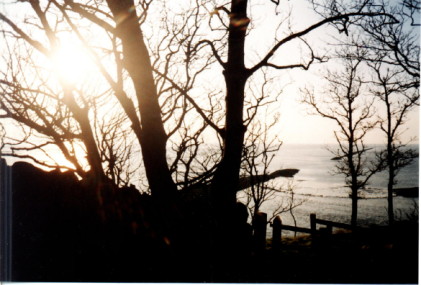
Both attributes take a numeric value that represents a number of pixels on the screen. So, the image below has been produced by the tag which follows it:
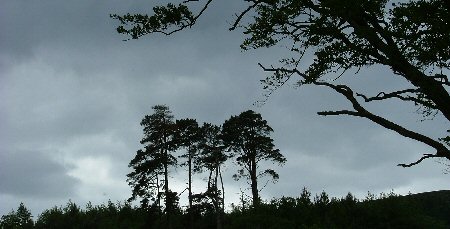
<img src="trees.jpg" alt="Image: trees at dusk" height="150" width="300" />
You might be thinking that's a bit superfluous. Aren't image heights and widths already defined, simply by the size of the actual image file? Well, yes, that's true. But that doesn't mean you always want to go with that pre-defined size. If I use the same tag as above, but without the height and width attributes, the result is as follows:
That's the image's "natural state". A smaller (or indeed larger) image might simply look better on the screen. It might be necessary to change the size in order that the image fit in a table cell (see 4.2 for more details). Or, you might want to distort the image, by stretching it in one dimension relative to the other, like this:
Finally, defining height and width can help a browser lay out a page before the images are downloaded. This is a rather technical point, but it's sometimes better for your readers to not see text "jumping around" while images are being loaded and fitted into place. This particularly applies to pages with a lot of images. If you define these two attributes in all your images the browser will know where to put the text before it loads the images. Although it makes no difference to the functionality of a page, it can make it a slightly friendlier experience to read.
It is very common on web pages to encode links into images, rather than text. As with so many techniques involving images, the coding is very simple. It is the issues of good (and bad) usage which are more involved and significant. This page only introduces the topic - there is much more to be done with images as links, but these will come in later lectures (mainly in the Advanced section). Of course, as this page is designed to be read from a printed version there is a limit to what can be demonstrated, but you can return to the online version (http://www.leeds.ac.uk/acom/webdesign/materials/subj_img_link.html) to see these techniques in practice.
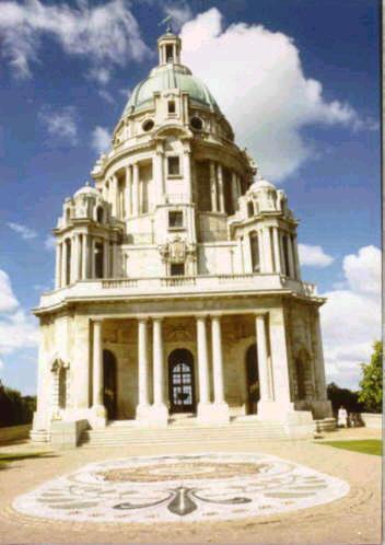 Click on the image to read about this building (the Ashton Memorial, Lancaster) |
I could use this image as a link with code like this (I've omitted the code for the caption, but see below). <a href="http://www.lancasterukonline.net/visitors/v-tour/williamson_park.htm"> <img src="memorial.jpg" alt="Image: Ashton Memorial, Lancaster" height="250" width="175"> </a> |
And that's really all there is to it. Instead of text, you simply include an <img> tag within the opening and closing <a> tags and bingo, your image is now an active hypertext link.
Nothing is different about either the <a> tag or the <img> tag. Note how the alt, height and width attributes are all in place within the <img> tag (more is said about the alt attribute below). More significantly, the link is unaffected as well. This is an external link, but it could equally have been an internal link, an anchor link, or even a mail-to or non-HTML link. In other words, the <a> tag is affected not one jot by the fact an image is within it, rather than text.
So far, so simple, but there's more to think about. It is very important that your readers know the image is a link. When images become links, some browsers default to outlining them with a border. However, the colour of this border is unpredictable. Some browsers render it in the colour specified for links in the style sheet, whether visited or unvisited (e.g., as if it were a text link). However, IE seems to return to the default colours, usually blue and purple respectively. In any case, as you can see it's not a very thick border and if it appears in a colour quite similar to the outermost edges of the image (or the background), it could easily be lost. Nor do all browsers even produce the border: Opera does not. You can't therefore depend on a border to make it clear that an image is a link.
What some designers try next is to co-opt the alt attribute to help out. In other words, they include an alt that says something like "click on this image to read more about Ullswater". This is a tempting solution but is again unsatisfactory. There are two reasons for this. The first is that you only see the floating caption when the mouse pointer is over the link. So, if the user both misses the coloured border, and never happens to place the cursor over the image, they may never be aware that the image is a link. The second is that, once again, many browsers will not render alt as a floating caption anyway. In them, the text in the attribute will only appear if the image does not.
Don't forget though that you should still always include an alt. You will notice above that the alt describes the actual image but doesn't mention that it's a link. And there's nothing actually wrong with using the floating caption to do all this anyway - you just can't depend on it all the time. The simplest and best solution to all this is that you should always have some indication in ordinary text that an image is a link; a caption or some other form of accompanying text, like here:
![]() Click to return to the menu for lesson 5.
Click to return to the menu for lesson 5.
It may be that you do not want your image-links to have borders at all. They can make images look rather ugly, particularly logos which you may have designed to blend in to the background colour of your page. If that's the case you can use styles to turn off the border. This site's style sheet has the following entry in its style sheet:
img { border: 0px; }
It's as simple as that, really. I have turned the border back on again (with style attributes) in the two images on this page which have one, to show you what the usual practice is. However, this is what I've defined to normally happen on this site, even for images that are links:
![]() Click to return to the menu for lesson 5.
Click to return to the menu for lesson 5.
Using an image as a link may seem a curiosity, but in fact, it is very common. When you remember that images are not just photographs, but also icons or buttons (like the arrow above), you'll realise the technique's potential. You can expand on this into image-based menu bars, for instance. Also, the technique known as image maps, where different parts of the same image can point at different files, is so useful I've made it into a lesson in its own right (lecture 7). The information contained on this page is only the beginning!
This is not a section about manicures. "Thumbnails" is the name for the technique of putting smaller versions of images on pages, and making them links to larger versions of the image. Why do this? Because, as has been pointed out in some of this lesson's other pages, the time spent downloading images can amount to 90% or more of a web browser's time (and telephone bill). As a common use of web pages is to present a "gallery" of many images (no smutty remarks about porn, please), it makes sense to find some way to reduce download time in this instance. 50 Kb may be a fair size for an image (see 5.2 above), but if there are thirty of them on a page, that's a long wait to see them all.
A thumbnail is a smaller version of an image, presented as a "taster". If the thumbnail is made into a link to the larger image, the user can choose whether or not to download the full image. Both the images here could be used this way (again, to get the full effect you will need to check the online version of this page).
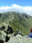 | 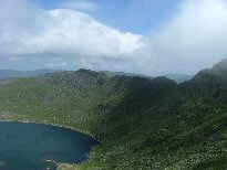 |
View of Helvellyn from Striding Edge (77 Kb) | View of Red Tarn (127 Kb) |
Click on the thumbnails to see the full images: sizes as shown | |
| Can't I just use height and width attributes to do this? It is important to remember that you need two completely separate versions of the image to make this technique worthwhile. Remember that using height and width does not change the memory size of the image, and therefore, does not change the amount of time it takes to download. Producing your smaller "thumbs" only by way these attributes completely defeats the object. I have indicated the size of the full image in kilobytes on the screen (this is good practice by the way), but the two images you actually see here are 10Kb and 15Kb in size. No height and width attributes appear so you can compare their actual sizes with those of the full images if you click on them. |
What you need to do is create a copy of the larger image, load this copy into a graphics application, shrink it, and resave it as the smaller thumb, with a different file name. Look at the code which has produced the two thumbnails above:
<a href="helvellyn1.jpg">
<img src="helthumb1.jpg" alt="Thumbnail: Helvellyn summit">
</A>
<a href="helvellyn2.jpg">
<img src="helthumb2.jpg" alt="Thumbnail: Red Tarn">
</A>
The smaller images on this page are called helthumb1.jpg and helthumb2.jpg; the larger, original images are helvellyn1.jpg and helvellyn2.jpg. Apart from the fact they've got the same basic content, they are in fact entirely separate files.
It may be more helpful to see an example of this technique in action. See the site http://www.users.zetnet.co.uk/gshaw/mountains.htm, a gallery of pictures of Scotland which makes extensive use of thumbnails. It's not the greatest-designed site in the world, but it shows the use of the technique, and it does have some pretty good photos on it.
The final application of images to show you is when they are used as backgrounds. You can turn images into the background for a whole page, or just parts of it, such as individual paragraphs, or table cells.
This is not as straightforward as simply placing an image on your page. There are two important considerations. The first is, will this image make a good background? The second is to do with the size of the image and how browsers handle this with backgrounds.
It is certainly not the case that every image is suitable for use as a background. In fact, comparatively few are. It might seem like a great idea to use your carefully-crafted picture of Mr. Spock as the background to your personal web page, but people haven't come to the page to see a picture of Mr. Spock, they have come to see your words. Bad background images are those where the colours are too bold, or too numerous, and no matter which text colour you choose, it remains unreadable against at least part of the page. Also, don't pick a very large image, in memory terms, for your background, as people will have no choice whether they download it or not.
Were this the online version of this page you could click on the sample tiles below to see how it works. If interested, I advise you read this page online. Offline you might like to think about why the bad ones, particularly, are going to be bad.
Good backgrounds | Backgrounds from hell |
 |
 |
 |
 |
 |
There are lots of pages on the WWW which supply backgrounds. You can just download them with the right-hand mouse button. Have a look around - or start at http://www.webcrawler.com/cgi-bin/WebQuery?backgrounds. However, they're not foolproof: the first of the bad backgrounds above was lifted off a page like this.
You may have more options if you're using a background on only part of the page. Giving table cells or even single paragraphs their own, unique background is possible (see below) and if you're not actually planning to put any text over a particular image then it doesn't matter so much. But if that's the case, why not render it as an actual image (e.g. an <img> tag?). Or you may be thinking of using a single, large background image and cleverly using table tags or something similar to only place the text of your page over the paler parts of the image. That can be a stunning effect if you can carry it off but the problem is, as so often in web design, that you can't be sure what window size someone will use to view your page. What looks perfect in a 1024 × 768 window might be unreadable if the window is smaller (or larger) because the browser may well adjust the table to fit. Or, your image will start tiling (see next section). You have to be careful, but nevertheless this works quite well for one-off pages without much content. See, for example, http://www.leeds.ac.uk/acom/webdesign/materials/treespage.html. It's something you might like to play around with if you're feeling creative. (The background image on this page is large, at 220Kb.)
Use the background-image style property to place an image in any page element. Most commonly this appears in the definition of the <body> tag. For example:
body {background-color: #000000;
      background-image: url(back1.jpg);
      font-family: Tahoma, Arial, sans-serif;
      font-weight: bold;
      color: #90ee90;}
It should go without saying that back1.jpg (or whatever other image) is saved alongside the other files of your web site. I've left the other attributes in to remind you to think about the overall appearance of the page. In the first place, you might be thinking, why define a background colour, if you're going to define a background image? The first reason is that you must remember that images sometimes break. Or, people may simply decide not to view them. You should define a background colour alongside the image to ensure that your words are still visible against that background, if for whatever reason, your reader does not see the background image. All the same applies to other tags, if you define them as having a background image (whether across the whole site, in classes, or in ad hoc definitions via the style sheet.)
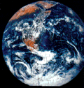
Often no more than this is required. But you should already have noticed that the small background samples given earlier repeated across and down the screen - a phenomenon known as tiling (for reasons which should be obvious to anyone with even a passing knowledge of DiY). This is another thing which makes for a good background image; it's something which, like bathroom tiles, have been designed to fit together properly. That was one reason why the "earth" image was so bad as a background, even apart from its boldness.
However, you can override this, just as you can with any other aspect of style. Tiling is the default setting of the browser and is controlled by the property background-repeat. The default value is repeat, which means the image will "tile" in the default fashion. However, you can also have no-repeat, which means the image will display only once: this is normally used in conjunction with the background-position property, as below. repeat-x means the image will repeat only horizontally, and repeat-y only vertically.
There are two other useful properties here:
background-attachment
The default is scroll which means the background image (whether tiled or not) scrolls with the text. fixed means it will stay in position, which can be quite a nice effect.
background-position
This specifies the position of a background image with reference to the box of which it is a part - whether that's the whole page (<body> tag), a table, an individual table cell, a <p> tag, or indeed any block-level element. Obviously, an image that repeats does not require this to be specified, but single images probably will.
Values taken by this property are a little complicated. They come in horizontal/vertical pairs, and usually as a percentage. The default is 0% 0%, which refers to the top left of the area in question: 100% 100% is therefore the bottom right, and the rest follows logically. But you can also use left | center | right for the horizontal element and top | center | bottom for the vertical.
For an example, you should look at the source code of the "Mirkwood" front page (http://www.leeds.ac.uk/acom/webdesign/materials/treespage.html), including the style definitions at the top (an example of the use of the <style> tag for good measure). Look at how I've manipulated the background colours and image and used a table for added effect. The background image is large at 220Kb but this is also an example of warning readers when they will have a large file to download. Play around with these things to learn more...
Having said all that, I'm personally ambivalent about whether background images are worth it. I have used them on my own pages in the past, but with hindsight, I can't see that even the best background image is better than a carefully-chosen solid colour. It's like someone once said about capers: "there's not a single recipe with capers in that isn't just as nice if you take the capers out". Background images are garnish, really - nice to use at times but by no means essential.
End of lecture 5.