Web Design
Lesson 6: Printer-Friendly version
As with the other similar pages on this site, this page is designed to be easily printed out and read offline, away from the computer. If you are trying to follow this lesson online you will find it much more convenient to return to the full lesson 6 menu.
You can also go straight to the printer-friendly version of lesson 7 from here.
Contents
- 6.1 validation
- 6.2 text-only browsers
- 6.3 non-visual browsers
- 6.4 general accessibility issues
- 6.4.1 general tips
- 6.4.2 keyboard-only browsing
- 6.5 usability
- 6.6 the cache
- 6.7 <meta> tags
- 6.7.1 general information
- 6.7.2 character sets and languages
- 6.7.3 redirection
- 6.8 search engines
6.1 validation
The World Wide Web Consortium - or W3C - are a collection of computer scientists and other interested bods who periodically gather at the Massachusetts Institute of Technology (MIT) to set standards for HTML and other uses of the Web. Their pronouncements do not have the force of law, but are recommendations, and ones sometimes ignored by the manufacturers of web browsers (as doing so provides a means to acquire a commercial edge over competitors). But it is precisely because browser "standards" vary so much that it is important to have some form of central authority to which prospective web designers can refer. If you want a gripping read, check out the XHTML 1.0 standard at http://www.w3.org/TR/xhtml1/; though seriously, anyone intending to take up web design as a profession (or part of their profession) should keep themselves up-to-date with developments at the W3C.
As noted in the virtual lecture, adherence to these standards - or the production of what is known as well-formed code - is the best way to ensure that your page renders properly on diverse web browsers. The trouble is that not everyone (and I include myself in this) is diligent enough to be sure that their handwritten HTML is perfectly well-formed. Checking the pages in diverse browsers is a start, but like when proof-reading an essay, a second pair of eyes is often needed to pick up problems that the author does not see because of over-familiarity.
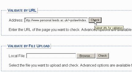
The W3C have, however, provided this "second pair of eyes" via its automatic validation service at http://validator.w3.org/. As you can see in the screen shot below, you can enter the URL of any given web page and have it checked for conformity to standards. This is very helpful, for reasons I'll elaborate on below. The thing is, it can also be rather intimidating at first use, so this page gives you some advice on how to use validation productively.
In the first place, you need to have the correct structural tags in place. Remember that the first lines of the pages on this site are as follows:
<?xml version="1.0" encoding="UTF-8"?>
<!DOCTYPE html PUBLIC "-//W3C//DTD XHTML 1.0 Transitional//EN"
" http://www.w3.org/TR/xhtml1/DTD/xhtml1-transitional.dtd ">
<html xmlns="http://www.w3.org/1999/xhtml" xml:lang="en" lang="en">
<head>
<meta http-equiv="Content-Type" content="text/html; charset=iso-8859-1" />
<meta http-equiv="Content-Language" content="en" />
.... rest of code follows...
These tell the validator (and web browsers also) which version of HTML is being used on the page, and what the character set and language are (see 6.7 for more details). Without them, the validator will not know what it's looking at.
The validator can work with either a URL or by uploading a file; the URL is easier, especially if you're here at Leeds and you've used the www folder. Enter your URL, as you see below, and click on "Check". (Do note that the box here is too small to display the entire URL after it's typed in.)
If there are errors on your page, the validator will find them and tell you what they are. The "formal" description of the error - the bold text in the screen shot below - is often unhelpful, but the italicised comments underneath will usually describe the error in plainer English. Often the errors are the result of typing slips, as these are (can you spot them?). Or, they will be problems with nesting (a block-level tag inside an inline tag, for instance). These can be hard to spot by eye alone, which is why the validator is a useful resource for debugging (the computing term for diagnosing and removing errors) as well as for validation.
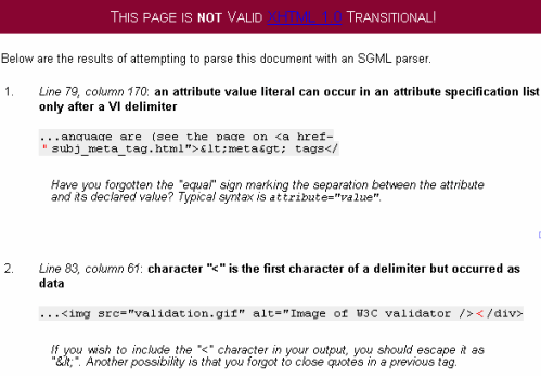
 | WARNING! One reason that this service can be intimidating at first is that a single error in your code can produce literally dozens of error messages. This particularly applies when you don't close a tag properly. A missing </p> tag (or even just a missing / in a closing tag) will often cause every single block-level tag after that to produce an error, because the validator is still waiting for you to close the errant paragraph. The best thing to do is just take one error at a time. Start at the top, check the first error message and correct it. Then revalidate. You may get rid of all the errors in one go. |
The ideal end result is this:
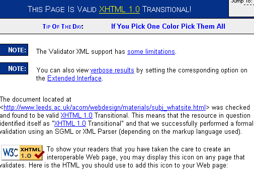
...and if you achieve it you might like to see the notes about how to include the "valid XHTML" icon on your page. You can also validate style sheets, by the way; if you get as far as validating your XHTML properly you should be able to work out how to validate CSS by yourself!
Despite some occasional sillinesses, this is a useful service. It can help tidy up the code produced by HTML editors as well. If you run your page through a validator, and through a text-only browser emulator (see 6.2), and it looks fine in both, you have almost certainly written an extremely robust and correct page that anyone, anywhere in the world will be able to view as you intended. And with web design, that's as much as anyone can ask. Even though, the first time you use the validator, it can be a horribly dispiriting experience to see just how far from acceptability your code actually is, it's worth persevering and learning the rules. You will be a better web designer for it.
6.2 text-only browsers
The majority of people reading this page will have never used a text-only browser. Why would they? It was precisely because the HTML protocol was able to handle graphics and colours that the WWW became the Net's "killer app" in the first place. A look at pages which collect statistics on browser use (try the links on http://www.upsdell.com/BrowserNews/stat_trends.htm) show that text-only browsers like Lynx are fringe applications at best; at worst they are simply invisible. So why should you design your pages to cope with text-only browsing?
Hopefully the virtual lecture has answered that question. It's a matter of access to your information. Some people are obliged to use text-only browsers or their close relatives, non-visual browsers (see 6.3), whether because of disability or the system they are using (remember that the Web is a global medium and in poorer countries or districts the most up-to-date technology is unlikely to be available). Some people freely choose to use them. Both these factors place the obligation on you, the designer, to write your pages in ways which make them look acceptable on text-only browsers. In addition, a text-only browser like Lynx is therefore an excellent test for a web page, because if the page looks OK on that, it will look OK on almost anything. If you like, it's the "lowest common denominator" - though, I'd add, without the usual derogatory connotations of that term.
This doesn't mean you have to abandon all those stylistic flourishes of which you are so proud. The art is, in fact, to have a page which both exploits the capabilities of newer browsers and at the same time renders fine on older ones. This is known as being "backwards compatible": in other words still viewable by older browsers even as they exploit some of the capabilities of newer ones. There are some specific HTML techniques which help here; two, in particular.
The first is the alt attribute. Without alt, images become gaping holes in documents when viewed in a text-only browser. Remember that alt is a compulsory attribute, but you also need to ensure you are using it properly. As the screen shot of the Lynx emulator below suggests, it is also a good idea to make your alt a full description, that is, prefix the text with "Image of..." or "Illustration of..." as when the alt is rendered as normal text, a less effusive description could simply be mistaken for normal text, and cause confusion. If an image is purely illustrative, however, you can include a dummy alt (that is, alt=" ").
The second thing is to make sure, particularly if you've used tables for whole page layout, that the page still looks OK when linearised. In Lynx, tables are no longer rendered across the page. Instead, cells are rendered from top to bottom, following the code order, left to right. That is, if this page were viewed in Lynx (and you can try it via the emulator below), the menus on the left will all come first, then the main text. Not too much of a problem, you'd think, and you'd be right: but some pages are so designed that the information no longer makes sense when viewed like that, usually because the designer had stuck it in table cells in no particular order in the first place. This is one reason why the standard usability recommendations (see 6.5) suggest putting navigation menus on the left of the screen, and also why the use of "skiplinks" is recommended for greater accessibility (6.4). Check both those pages for details.
The easiest thing to do here is show you an example. A Lynx emulator is available at http://www.delorie.com/web/lynxview.html. Enter the URL of your page (as with the validator, to make best use of this you will need a page published on the web already rather than merely being on your local drive) and click the button. You will see a version of your page as Lynx would render it: something like this perhaps (note that the "links" seen below are not real links):
ACOM 1770
what is a web page?
_________________________________________________________
main menus
subject index
a-z index
lecture 1 index
teaching materials home page
_________________________________________________________
help pages
printer-friendly/text-only version
resources page
get help with problems
_________________________________________________________
your account
log in
Use your ACOM account to access the discussion boards, submit course work and check marks and feedback
Valid XHTML 1.0!
what is a web page? | what is HTML? | what is a web site?
what is a web page?
A web page is a data file so in many ways is no different from a Word document or a spreadsheet. The various programs on your PC -- word processors, spreadsheets, video players or anything else -- are properly known as applications. Think of them as like a car, with the hardware being the ground to drive on, and the operating system (which
on most PCs is Microsoft Windows) being the traffic system and rules
of the road. In the case of web surfing (and web design), the
applications are web browsers. You are using one right now to look at
this page and I talk about them a bit more on the page about tools.
Image: Jaguar E-type
But even the smartest car cannot run without fuel...
In case you'd not realised, that is a reproduction of how the first topic page of this site, "what is a web site?" (1.1), would look in Lynx. Notice what I meant about "linearising" the tables; the left-hand cell coming above the others. Also see how the alt attribute is not just some random text but actually says "image of...", and finally, how text formatting (bold, italic and margins) are retained, although most of the rest of the style is lost.
If you write a page that looks acceptable in this format, and it validates properly, you are going to have a very robust page that will certainly render OK on almost any browser. So the "Lynx test" is well worth taking. Overall the aim is to have pages that degrade well; that look good on both the newest and oldest versions of browsers you can find. Not an easy skill to achieve, but worth the effort.
If it really becomes too difficult, simply create a "no-frills" version of the site; as I do here, with all the printer-friendly pages. They also serve as versions of these pages easily accessible with text-only browsers. Make sure that this "parallel" version of the site can be reached from most or all of the full version.
 | Can't I just insist that readers look at my site through a particular browser? After all, isn't it their problem if they don't upgrade their machines?
OK, I will try and answer that question without getting too hot under the collar...
Personally I think the attitude, "stuff those users who can't be bothered to upgrade", stinks - to put it mildly. With an attitude like that it is no wonder there is a "digital divide". What a fantastic waste of a potentially amazing, global resource, if so-called "professional" designers can't be bothered themselves to spend an hour or so extra on their sites ensuring they look reasonable - not perfect, just reasonable - on older technology, and are usable by all. It is very arrogant and short-sighted to assume that everyone is as privileged as you are, and able to get new software the second it comes out. And for those who will retort, "but it's free to upgrade!"... yes, so it often is, but have you tried fitting the newest, bloated version of some application or other on to a five-year old PC with a small hard drive? And if you're not comfortable with IT in the first place, nervous even, you are not going to hang around on a site that says "Upgrade your browser!" before it even says "hello". If we are to ever seriously attend to the "digital divide" we have to combat the disease of "upgradeitis". And that means accepting that not everyone can just upgrade with the click of a finger.
Remember that the reason Tim Berners-Lee's system became accepted in the first place was that he fitted it around the needs of his users, rather than demanding that they change their practices to fit his system. The WWW and HTML have this flexibility built into them. Don't spoil it.
In any case, many people who've tried browsing with Lynx just for the hell of it, in fact find it an improvement. They realise that the 90% of browser time they'd been spending downloading images was, in fact, of no real consequence. That the true "meat" of web pages lies in their words, not their glossy coverings. The "WWW" no longer stands for "World Wide Wait"... the global stock of info is still there, and accessible far faster than it used to be, if the page is well-designed.
Think about it. |
6.3 non-visual browsers
The suggestion that they should design web pages that can be used by the blind is something which most web designers will instinctively feel is beyond them. Surely this is a specialist task, akin to translating "ordinary" text into Braille? Or giving an audio commentary on a visual spectacle like a football match or an art gallery?
However, what you can do is remember that the visual aspects of any web page are essentially separate from the actual text. "Visual" browsers - meaning applications like IE, Opera and Mozilla which the majority of people use - are merely taking some text and markup and interpreting this in one particular way which happens to be the presentation of that information visually. But built into HTML and indeed into the whole idea of markup is the possibility of interpreting the instructions in a radically different way; that is, as sound or, more precisely, speech. In the end, this is little different to reading a book out loud. Same information, and pretty much the same method of delivering that information, but a different interpretation of it (at least for the listener).
There are various different interfaces that can be considered "non-visual" but the most commonly seen - or rather, heard - are "screenreaders". Screenreaders make use of speech synthesis to read a web page out loud for the benefit of users with restricted or absent vision. One of the most common screenreader applications is the package, JAWS. Rather than go into detail about this, you could look at the manufacturer's web site at http://www.freedomscientific.com/fs_products/software_jaws.asp, which gives a good (if naturally biased) introduction. Other products are available, however: have a look at http://www.utoronto.ca/atrc/reference/tech/scread.html which is a summary page on screenreaders. If you want to know what a screenreader looks like, either check out one of the PCs at Leeds which has one fitted (ask ISS for details), or try the simulation at http://www.webaim.org/simulations/screenreader - as you (obviously) need sound, however, you will not be able to use this properly in a university cluster unless you have headphones.
Writing pages that work well with screenreaders does, once again, develop from the general accessibility guidelines presented so far:
- write valid, well-formed code.
- use tags for the purpose for which they were intended. For example, JAWS will prefix each piece of heading text with "Heading level 2" (if it is between <h2> and </h2> tags). If all you've done is restyled a <p> tag JAWS won't consider this any differently from ordinary text, which means its users won't either. Note that for screenreaders, it is more appropriate to use the <em> and <strong> tags for emphasis rather than <b> and <i> as these latter two tags will be ignored by the reader.
- check how your page looks on text-only browsers (see above) as this is the closest visual approximation to how screenreaders will interpret the text. Pay particular attention to how your tables linearise. This is one circumstance in which the summary attribute is useful; for more information see the section on tabulated text in lecture 4.
- use alt on all images. Images without alt will have their filename read out, which sounds ugly. Don't overdo it with alt either, particularly for purely decorative images. If every little green button on your page has an alt attribute which says "Here's an image of a green button which I think is rather nice" your page will quickly become a very wearing experience to hear. Make the alt as descriptive as it needs to be if it matters. If it doesn't matter at all, include a dummy alt=" ". You might also like to consider the longdesc attribute, but I admit I've had no practical experience of this: for information, try http://www.w3.org/TR/WCAG10-HTML-TECHS/#long-descriptions.
- people who use screenreaders are also invariably browsing using only the keyboard. As noted below, when we discuss keyboard-only browsing, you therefore need to ensure that link text makes sense when read out of context and (should you be advancing this far into interactivity) that your forms are accessible as well (see lesson 9 for more details).
There are a couple of issues particular to screenreaders, however. Firstly, do watch out for their interpretation of some common punctuation marks. Many writers will use the ellipsis... for effect. But JAWS will read this out literally as "dot dot dot". That's fine if it's used in moderation but not if it's overdone. Myself, I admit to a tendency to use a lot of (parentheses) when I'm writing. JAWS reads these out as "left parenthesis - right parenthesis", however. Not necessarily a problem but worth bearing in mind.
More interesting, and useful, is the convention of a "skip navigation" link. If you look at the code for the online topic pages you will notice, immediately after each <body> tag, the following code:
<a href="#startcontent" title="Click to skip over navigation" accesskey="2">
<img src="skiplink.gif" alt="Click to skip over navigation" />
</a>
"skiplink.gif" is a tiny, 1 x 1 pixel image filled with the background colour; in effect, it is invisible. But screenreaders have no concept of image size or colour so they still "see" the image and read out the relevant link text: in this case encoded in the title attribute (and note also the presence of an accesskey: explained in the section about keyboard-only browsing). The very first thing a screenreader will read out on these pages is therefore a link that can enable the user to immediately skip to the anchor, "startcontent". This is situated at the beginning of the table cell which contains all the main content of each page - once again you can check this by viewing the source code. So the link does exactly what it says. It allows the reader to skip over all the navigation and get straight to the content.
If you want to know why this is a good idea, have a look at lesson 10 and 11 of the Dive Into Accessibility site at http://diveintoaccessibility.org/. Lesson 10 suggests it is easier to rearrange your pages so that main content comes first, but this does conflict with standard usability recommendations - an example of why this web design lark is not always as easy as you think! And also note - and this is important - that their suggested method for using CSS to "hide" the skiplink from visual browsers will hide it from JAWS as well, which kind of defeats the object. The "invisible image" method works fine, however: or just leave the skiplink there for all to see. I am sure no one will get that offended, except maybe some graphic designers with a minimalist bent.
6.4 general accessibility issues
6.4.1 general tips
Writing this section was helped enormously by the Dive Into Accessibility site (http://diveintoaccessibility.org/), which I would suggest is compulsory reading here. The WebAIM site at http://www.webaim.org/" is also very good.
Making your page more accessible to those who have problems using everyday browsers like IE is not just "political correctness". Anyway, that execrable term is just a substitute for thinking. If you make something in offline life, such as a building, more accessible to those with mobility problems (those in wheelchairs, the elderly, the blind), you make it more accessible to everyone, don't you? Implementing some of the suggestions given on this page can only enhance the quality of your site, and for those with aspirations of "professionalism" in web design, they should be obligatory. Unfortunately, many of the so-called "professional" sites out there ignore them... but that's an indictment of their designers' attitude, not of the techniques to be described. As the virtual lecture noted, "disability" is as much caused by society's failure to deal with diversity as it is caused by an illness. We may also move in and out of states of disability - anyone who breaks their leg skiing will find out about some of the accessibility problems which affect public space. Break your "mouse arm" and you'll discover similar things about the online world.
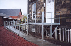
(Image from http://www.mcevoyengineering.co.uk, who construct this kind of thing...)
In any case, if your pages are not accessible to the disabled, you are now breaking the law. The 1995 Disability Discrimination Act (DDA) and the 2001 Special Educational Needs and Disabilities Act (SENDA) - amongst others - have been used to bring civil proceedings against companies whose web sites are not accessible to disabled users. But it's also worth realising that accessibility problems can cover several things, and only the first two are considered "disabilities" offline:
- Users with vision problems, who may use non-visual browsers. Note that many people who are "blind" have some vision, and might be able to read web pages using "everyday" browsers if text size is large - note the condition of colour blindness as well
- Users who cannot use a mouse and are restricted to the keyboard or voice input into a computer (see below)
- Users "handicapped" by unreliable and/or very slow phone or Internet connections, whether because of where they live or the quality of their equipment
- Users who simply choose to use less sophisticated browsers due to personal choice or the age of their computer equipment
- Users for whom English (or whatever other language the page is written in) is not their first language
- Users who lack confidence with information technology generally.
All of the above may have problems reading your web site if you ignore accessibility issues. All of them could potentially be helped to do so.
One thing worth realising is that writing pages accessible to all is really just the same as writing them for diverse browsers. Even if a non-visual browser, for example, would not normally be used by anyone with good vision, it's still just another browser. Therefore, the first step towards accessible web design is to write well-formed code. Code validators will help you out here.
However, well-formed code is only a start. All of the following will also help make your page accessible to one or more of these groups. Most have already been covered elsewhere.
- Keep your pages - and especially your images - small in memory terms.
- Write for as many different platforms as possible. Make your pages cross-browser compatible, including for text-only browsers, and validate your code.
- Don't demand that people upgrade their browser, download some new plug-in, or change their screen settings if they want to view your site. (If you don't agree with this, see the rant at the bottom of section 6.2.)
- Try and avoid long, uninterrupted blocks of text, and try to format your pages so text doesn't extend completely from one margin to the other. Use white space.
- Never remove the users' ability to resize your text. The only possible exception is on page headings and only then if they're already very large (at least 18 points).
- Use alt attributes on every image (but keep the value empty if the image is purely decorative).
- Ensure you include the <!DOCTYPE> declaration and a notification of the page's language and alphabet (via the lang attribute) on all pages.
- Use web-safe colours (see 2.2.1). Choose combinations that read clearly, and avoid red/green together.
- Make sure your <title> tags have meaningful content.
- Don't "fake" one tag with another: for instance, make sure your headings are real <hx> tags, not <p> tags with a different, larger font in them.
- And a couple of things for advanced techniques that we haven't discussed yet, but there's no harm in mentioning them: ensure you have text alternatives for all image maps (lesson 7) and any other advanced navigation techniques, and provide label attributes in all form elements (lesson 9). Also make sure you use frames (lesson 10) properly, which means with great discretion. More details will come in those lessons.
6.4.2 keyboard-only browsing
This topic deserves its own section. When you use a mouse you are able to "focus" on any part of the screen. This gives you a huge amount of flexibility. But not everyone can use a mouse, due either to blindness, or mobility problems in their arms (including RSI). Or people simply choose not to use one, to avoid too much strain on the wrist, thereby helping to avoid the aforementioned RSI. If you want to use the keyboard to focus on a particular bit of the screen, then, you need to have told the browser that is a part of the screen worth focussing on.
There are other options here but allow me to note two ways in which this can be done. The first is to browse by heading: in Opera you can press S to skip forward a heading, and W to skip back one.
The second is by link: in IE, press Tab to "cycle" through all the links on a page, and Return to activate the link on which you're focussed. In Opera, press Ctrl+J to "reduce" a page to a list of its links (a marvellous feature!). This is why you should ensure all text within <a> tags makes sense out of context, giving the readers a good idea where the link is going: avoid "click here!". (This stuff has already been discussed, in the final section of lesson 3 - check back there for more details.)
There is an attribute which can also help out here. This is the accesskey attribute which can go inside <a> tags. accesskey takes a value that represents a key on the keyboard. If the user then presses Alt plus the defined access key, the browser will "focus" on the link where that accesskey attribute appears. (That's the Alt key on the keyboard by the way, nothing to do with the HTML attribute.)
To illustrate: all the links back to the home page on this site are coded as follows:
<a href="index.html" accesskey="1">teaching materials home page</a>
Try it on any online topic page of the site. Press Alt+1 and the browser will focus on the link: you can tell this if you look at the status bar. Then press Return and the browser will then follow the link.
It is now the accepted convention to always code accesskey="1" into links that return you to the home page of a site. Similarly, accesskey="2" is used for "skip navigation" links (see 6.3 above). If you use others, that's fine, but you should write some kind of accessibility document for your site which any interested visitors can access from the front page and in it, note what access keys exist.
6.5 usability
 A prominent landmark: the Parkinson Building, Leeds University | Web site usability is an increasingly important field of study and this page can only scratch the surface. Basically, as use of the WWW and specific web sites becomes a more and more significant source of revenue for the corporate world, money has been found to study how it is that people actually like to use web sites. To put it in its simplest possible terms, how can web browsing be made as easy as possible? What page designs, web site structures and so on are more likely to make people stay on, and come back to, a particular site?
Web sites, particularly very large ones, can be disorienting places in which it is easy to get lost. When we move into any kind of new environment, we usually try and orient ourselves by noting the location of prominent landmarks (I bet most of you learnt the location of the Parkinson Tower very early in your time at Leeds University) or places which are already familiar to us (railway stations, for instance). Online, it's similar. We like to know that we can easily get back to a site's home page, we don't want to hunt around for links, and so on. Working out the best ways to help visitors with this kind of thing is the subject matter of usability studies. |
I will use this page to give some very general guidelines, but be aware of two things. First, that these are only guidelines, and not laws. A book I own called Used 3.0: The Internet Design Project contains a longish essay complaining that some usability guidelines are followed so slavishly that truly innovative web design is being crushed under their weight. I think that's a slight exaggeration, but it's a fair point nevertheless. A usable web site is one that's easy to use, whether it follows the recommendations or not. And on that topic...
...the only real way of finding out whether your web site is easy to use is to ask your users. If you ever get involved in any major web design project (say, something the size of this site), you could gather the opinions of users before, during and after the implementation of the site. Beforehand, you might ask friends or colleagues to try out a draft version of the site as a visitor would and tell you if there are any problems. (Earlier versions of this site were tested out by such a "proxy user" - a student who did not previously know about web design and followed the course materials as a student would. She got paid quite well for it too!) After implementation, you could solicit feedback from visitors by e-mail. More sophisticated techniques are also available, such as monitoring how visitors move around the site using other software, although you'll need specialist technical knowledge (or help) to do so.
The point I'm trying to make is that, in the end, it's your site. Each web site is different, therefore, the criteria by which its effectiveness can be judged are different. With those reservations in mind, however, here are some general guidelines for usability:
- most of all, be consistent with the layout of each page on your site. Don't have your main menu sometimes appearing on the left of the screen, sometimes on the right and sometimes not at all. People don't want to hunt around for "landmarks" on each new page they visit. Don't change styles from page to page either.
- a general recommendation is that menus should be placed on the left. There are other reasons for this - to do with the linearisation of tables (see 6.2 above) - but it has generally become the convention and is worth thinking about.
- keep a good contrast between your text and the background. Some people recommend that you only use black-on-white, but this is, again, rather too restrictive.
- don't underline text that is not a link
- don't force the user to scroll to see important information - remember, keep it all "above the fold"
- have a link back to the home page on every page of the site and remember the "three-click rule"
- DON'T OVERDO THE USE OF ITALIC, BOLD OR CAPITAL LETTERS - which reduce readability (as I hope you can see).
Some usability guidelines are, however, written only with the corporate web in mind, characterised as a viciously cut-throat place where you have about twenty seconds to convince a casual visitor that your site is the bee's knees otherwise they will go away again, never to return. That may indeed be true sometimes but in other cases you know more about your audience. This site is a good example as you guys are something of a "captive audience" and are far more likely to spend time exploring this pretty large and complex site, finding your own "landmarks" and preferred routes to bits of information. This is why I said that the best way to work out whether a site is usable is only by actually implementing it and then seeing what people think.
For more information on usability try the site http://www.usableweb.com/.
6.6 the cache
When explorers travel through the Arctic they often leave stores of food or fuel behind them in strategic spots. That way, when they come past on their way home (or possibly on their next trip, if they are mad enough), they have something waiting for them, without having to shoulder the burden any longer than they have to. A store like this is known as a cache (pronounced "cash").
The same principle, almost, is used by web browsers. You may notice as you surf the web that if you return to a page or - even more noticeably - an image you've surfed in the recent past, it will load much more quickly than a page being viewed for the first time (or the first time in a while). This is because the browser also keeps a cache of images and HTML files. When a page or image is downloaded, a copy is moved into the cache (a folder). That way, when the page is viewed again, the computer doesn't need to go back to the phone line to retrieve it, but can go to the folder on its hard disk; which is obviously much quicker. It also explains why the Back button works.
Pages and images don't stay in the cache forever, but they'll definitely stay there for the length of a browsing session, at least - and usually for a few days afterwards, or even longer, if the user is not a heavy web surfer.
Why do you need to know about this? Because there are ways to exploit it, if you know how browsers work. As I've already said, loading up images can take up 90% or more of the time people spend downloading your web site. If you know of the cache's existence you can save large slabs of time, and make your page more accessible, particularly to those with slow or unreliable Internet connections who, as I said in the lecture, are suffering from a form of "disability" where web browsing is concerned. Not only that but some otherwise useful techniques such as rollover images (see lesson 8) can fail to work properly if the cache's existence is not appreciated.
The main thing to do is be aware that if an image has been loaded up once already in a session, it'll reappear almost instantly. So always re-use images if you can, whether a logo, button or even a photo, rather than using a new one and forcing a return to the phone line. Apart from anything else this helps give a universal "branding" feel to the site.
There's also a clever trick you can perform with the help of the height and width attributes in the <img> tag. Say you have a fairly large image which you suspect might cause a delay when browsing of your page, but for whatever reason, it's hard to reduce the size of that image in kilobytes. Remember that image size on the screen and image size in terms of bytes are two different things, however. So say you also know that before the user would get to a point when they needed to see that image, that they would spend some time on a different part of the page (or even an entirely different page). You could then load the image up in the background, as it were, but set both height and width to 1 (pixel) and thereby make the image "invisible"; but still in its full and complete state in the cache. Then when the image is required it will appear to load instantly.
It's impossible to demonstrate this properly on a printed page, but you could check the online version of this section (http://www.leeds.ac.uk/acom/webdesign/materials/subj_cache.html" to see what I'm talking about.
A more sophisticated way of doing this is by using JavaScript to preload the image, and you can read about that in section 8.2. The disadvantage of the technique as shown here is that you need some place where you can be sure that readers will spend enough time to download the image without their noticing it - and this before, definitely, they look at the full image. But it's a design issue you can think about. Note that whatever happens (and this applies to preloading as well), the image has to be downloaded sometime. Try as you might you simply can't sidestep the time it takes to physically transmit the image down a phone line. All you can do is conceal that time in the background rather than making it up front. The best solution is not to have very large images at all.
In summary, using the cache in tricksy ways like this is a help, but the main reason this page is here is to give you some awareness that it exists at all. Knowing how browsers work is a substantial part of designing sites that fit the user's needs rather than your own. The less you can force the user to spend time downloading stuff, whether by reusing old images or preloading them, the better, faster and more user-friendly (within reason) your site will be.
6.7 <meta> tags
6.7.1 general information
<meta> tags appear in the document header and an HTML file can have any number of them. Their appearance in the header indicates that they define information about the page rather than content. Their primary use is to pass information about the page to search engines and other webpages. That particular application is described in more detail in 6.8 below (and in the virtual lecture). This page covers <meta> tags in general terms. Though they have no obvious effect as far as the reader is concerned (with one exception, detailed below), you should definitely understand these tags if you intend to publish your pages on the Web.
The formatting of <meta> tags is a little confusing. There are two formats:
<meta http-equiv="name" content="content">
<meta name="name" content="content">
For a full listing of <meta> tags, see http://vancouver-webpages.com/META/.
The difference between the two formats is that the first, with the http-equiv attribute, contains information which the server passes to the browser, and which affect the way the browser handles your document. name attributes pass more general descriptive information, which don't bother the browser in the least, but do help your page get detected by search engines (see 6.8). As noted, those applications are discussed on that other page.
The main uses of <meta> tags are as follows; the last two have their own sections in this page so click on the links to read more.
- As stated - to pass information about the page to search engines.
- To specify what generator or editor was used to create the page. Some generators, such as Microsoft Front Page, generate these automatically. To be brutally honest I can see only one reason for this: that via indexing tools such as Google, this passes info back to the creators of the generator regarding their "market penetration".
- To specify the date on which the page expires. Mostly you would use this for pages which announce upcoming events. Note that this in no way helps you with file management - passing an "expiry date" won't lead to any automatic deletion of old web pages. When that yoghurt you've got in the fridge goes three weeks past its expiry date you still need to chuck it out yourself!
<meta http-equiv="expires" content="October 15, 2002">
- To tell the browser which character set and language the page needs: see 6.7.2.
- To cause a page to redirect: see 6.7.3.
6.7.2 character sets and languages
Technically, this section covers things that can be handled in places other than the <meta> tag. You might remember the lang attribute making a brief appearance in the initial page template you were presented with way back in lecture 1. This tells the browser the language of the text within the tags. Normally you would define lang in the <html> tag, which means it applies to the whole page, but you can also define lang within shorter passages, as small as one word perhaps (if you wanted to define a lang in an inline sense, without any other formatting being applied, include it as an attribute in a <span> tag).
Why include this? Firstly because some browsers, used mainly (though not exclusively) by users with vision problems, work by translating your text into sound through a speech synthesiser, and it helps them with pronounciation. See 6.3 above for more details. Secondly, the search engine Google can be programmed to search only for pages or passages in particular languages, and this is how it knows. It also gives a bit of help to you, the designer, as it makes it easier to validate your page.
On the resources page of the main site there is a link to a list of all available two-letter language codes. Incidentally if anyone's actually heard of all the languages on this list (be honest), mail me for a special prize.
This information can also be passed via a <meta> tag, and if so is specifically directed at search engines. And bear in mind that some languages, though they may be transliterated into the Latin alphabet, may require different character sets (alphabets): in fact of the "major world languages" highlighted on the page with the codes, only the European languages and Swahili are normally rendered in the Latin alphabet. For everything else you should tell the browser that it'll need to load up a particular character set. The <meta> tags at the top of this document are as follows:
<meta http-equiv="Content-Type" content="text/html; charset=utf-8">
<meta http-equiv="Content-Language" content="en">
The second content attribute will change whenever the language changes. The value of the first will change only if a character set other than Latin will be needed. We are getting past the scope of this web site here, unfortunately. For more info, try chapter 27 of Niederst's Web Design in a Nutshell: better still, spend another 10 credits and enrol yourself on the module ACOM1075: Multilingual Computing.
6.7.3 redirection
Redirection is performed with http-equiv="refresh". The effect for the user is that the page displays, then after a defined period of time automatically refreshes with new information or is replaced by an entirely new page. This is useful for redirecting readers elsewhere, particularly if you are moving a page to another URL.
You can do creative things with this as well, perhaps creating a sort of "slide show", although to see that properly you will of course need to be looking at the online version of this page. Each of the relevant pages has the following line between the <head> and </head> tags (with the URL of the next page in each case):
<meta http-equiv="refresh" content="5; url=refresh2.html">
Two things: first, the number 5 defines the number of seconds until the page refreshes, and second do check the arrangement of the quotation marks around the content and url attributes. If no new page is specified, the browser simply reloads the current page. (This might seem pointless but for pages that get updated very frequently, like stock market prices for example, it is extremely important.)
Also bear in mind that the exact timing of refreshments depends also on download speed, file size and so on. Don't use it it on pages which contain a lot of text! Remember people may not always read as fast as you, particularly not if their first language isn't English (or whatever language your page is written in), and/or if they use alternative forms of display such as speech synthesisers. It is always best to leave as much browsing as possible in the control of the visitor, and in most cases, get them to decide when they will move on from a page.
The most useful application of this technique is if, for whatever reason, you've had to move your site from one URL to another. Pop one of these in the head of the front page at the old URL and you can redirect people automatically. (Of course, if your URL's changed because you've left a web host - like Leeds Uni - and/or you no longer have access to a given URL, you just have to lump it.) In this case it's a good idea to put a "manual" link in as well, just in case the redirect fails for whatever reason. This site was formerly located at http://www.leeds.ac.uk/acom/html; if you visit that page now you'll see there's a redirect back to the front page of this site which includes an ordinary link, just in case.
6.8 search engines
More information here is available from the W3C's advice on search engines at http://www.w3.org/TR/html401/appendix/notes.html#recs.
There are two main ways by which you can get your page listed on search engines such as AltaVista, Yahoo!, Lycos and Google. The first is - you pay. And the more you pay, the more prominent your listing will be. All very well and good for those large companies which can afford this kind of thing, but they're not the intended "market" of this web site.
So I think it's worth mentioning the second way. Search engines such as Google - which is streets ahead of the competition, really - will, in the first place, return results to the searcher based on the content of the page. Now, technically, you don't need to do anything here. As long as you have used proper text, and not tried presenting text as images (a very good reason not to be guilty of this atrocity), Google should at least acknowledge the existence of your page.
Of course, everyone would like to boost the ranking of their site, as well as just having it seen. The main way Google does this is through links to your site from others, and I've said more about this in the Web Design printed booklet. But you can also use <meta> tags here.
In this case you would use <meta> tags with name rather than http-equiv. You can actually make up your own values for name but the ones shown below are those recognised by search engines. Like other things discussed here, be aware that these are in no way a foolproof way of getting a listing on a search engine, but adding these to your pages won't hurt. This particularly applies if you are using frameset documents (see lesson 10) as these do not have page content. In those cases you must at least include the name="description" version of the <meta> tag or there is simply nothing for search engines to "see".
- description: This provides a brief description of the contents of your web page. Get to the point quickly, as search engines may only look at the first 20 or so words.
      <meta name="description" content="An online tutorial for
      advanced HTML techniques">
- author, copyright: Both should be fairly self-explanatory.
      <meta name="author" content="Drew Whitworth">
      <meta name="copyright" content="ACOM, University of Leeds">
- keywords: These supplement the description. You can provide a list of comma-separated keywords which may help a search engine to index your document. Note there's no upper limit on the number of key words you can include here. The relevant <meta> tags on this site have around forty keywords in them. However, this does lead to some unscrupulous web designers loading hundreds of mostly irrelevant keywords into their pages in the hope that, say, someone looking for information on photosynthesis will be duped into thinking that "http://www.hotbabes.com/" is something to do with the subject. All this does is sow distrust among the browsing community and along the way make you look at bit silly so I hope, as someone who actually wants to make the WWW a better (not more confusing) place, you won't do this sort of thing.
      <meta name="keywords" content="web design, training,
      intermediate">
- rating: This indicates the appropriateness of your page for children. Some browsers or search engines can now be programmed to restrict access to under-age users. The four available ratings are "general", "mature", "restricted", and "14 years".
<meta name="rating" content="general">
Note that Google also has an image search facility. This can return some bizarre results, but this is generally because people don't use the alt attribute properly. If you do, this is another way in which people can find your site in preference to anyone else's.
End of lecture 6.