Web Design |
background images |
||||||||||
main menushelp pagesprinter-friendly/text-only version
|
The final application of images to show you is when they are used as backgrounds. You can turn images into the background for a whole page, or just parts of it, such as individual paragraphs, or table cells. This is not as straightforward as simply placing an image on your page. There are two important considerations. The first is, will this image make a good background? The second is to do with the size of the image and how browsers handle this with backgrounds. good and bad backgroundsIt is certainly not the case that every image is suitable for use as a background. In fact, comparatively few are. It might seem like a great idea to use your carefully-crafted picture of Mr. Spock as the background to your personal web page, but people haven't come to the page to see a picture of Mr. Spock, they have come to see your words. Bad background images are those where the colours are too bold, or too numerous, and no matter which text colour you choose, it remains unreadable against at least part of the page. Also, don't pick a very large image, in memory terms, for your background, as people will have no choice whether they download it or not. It's easier to show you what I mean for both these with examples, so click on one of the background "tiles" below to see how it works. Compare the single image with the tiled background, and note how in the better examples, the text colours have been chosen to contrast well against the background - but not clash.
There are lots of pages on the WWW which supply backgrounds. You can just download them with the right-hand mouse button. Have a look around - start by following a link to some backgrounds in the second browser window, for instance. However, they're not foolproof: the first of the bad backgrounds above was lifted off a page like this. You may have more options if you're using a background on only part of the page. Giving table cells or even single paragraphs their own, unique background is possible (see below) and if you're not actually planning to put any text over a particular image then it doesn't matter so much. But if that's the case, why not render it as an actual image (e.g. an <img> tag?). Or you may be thinking of using a single, large background image and cleverly using table tags or something similar to only place the text of your page over the paler parts of the image. That can be a stunning effect if you can carry it off but the problem is, as so often in web design, that you can't be sure what window size someone will use to view your page. What looks perfect in a 1024 × 768 window might be unreadable if the window is smaller (or larger) because the browser may well adjust the table to fit. Or, your image will start tiling (see next section). You have to be careful, but nevertheless this works quite well for one-off pages without much content. See, for example, this imaginary site front page It's something you might like to play around with if you're feeling creative. (The background image on this page is large, at 220Kb.) properties and tilingUse the background-image style property to place an image in any page element. Most commonly this appears in the definition of the <body> tag. For example:
body {background-color: #000000;
      background-image: url(back1.jpg);
      font-family: Tahoma, Arial, sans-serif;
      font-weight: bold;
      color: #90ee90;}
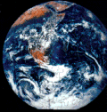
It should go without saying that back1.jpg (or whatever other image) is saved alongside the other files of your web site. I've left the other attributes in to remind you to think about the overall appearance of the page. In the first place, you might be thinking, why define a background colour, if you're going to define a background image? The first reason is that you must remember that images sometimes break. Or, people may simply decide not to view them. You should define a background colour alongside the image to ensure that your words are still visible against that background, if for whatever reason, your reader does not see the background image. All the same applies to other tags, if you define them as having a background image (whether across the whole site, in classes, or in ad hoc definitions via the style sheet.) Often no more than this is required. But you should already have noticed that the small background samples given earlier repeated across and down the screen - a phenomenon known as tiling (for reasons which should be obvious to anyone with even a passing knowledge of DiY). This is another thing which makes for a good background image; it's something which, like bathroom tiles, have been designed to fit together properly. That was one reason why the "earth" image was so bad as a background, even apart from its boldness. However, you can override this, just as you can with any other aspect of style. Tiling is the default setting of the browser and is controlled by the property background-repeat. The default value is repeat, which means the image will "tile" in the default fashion. However, you can also have no-repeat, which means the image will display only once: this is normally used in conjunction with the background-position property, as below. repeat-x means the image will repeat only horizontally, and repeat-y only vertically. There are two other useful properties here: background-attachment The default is scroll which means the background image (whether tiled or not) scrolls with the text. fixed means it will stay in position, which can be quite a nice effect. background-position This specifies the position of a background image with reference to the box of which it is a part - whether that's the whole page (<body> tag), a table, an individual table cell, a <p> tag, or indeed any block-level element. Obviously, an image that repeats does not require this to be specified, but single images probably will. Values taken by this property are a little complicated. They come in horizontal/vertical pairs, and usually as a percentage. The default is 0% 0%, which refers to the top left of the area in question: 100% 100% is therefore the bottom right, and the rest follows logically. But you can also use left | center | right for the horizontal element and top | center | bottom for the vertical. For an example, you should look at the source code of the "Mirkwood" front page, including the style definitions at the top (an example of the use of the <style> tag for good measure). Look at how I've manipulated the background colours and image and used a table for added effect. The background image is large at 220Kb but this is also an example of warning readers when they will have a large file to download. Play around with these things to learn more... Having said all that, I'm personally ambivalent about whether background images are worth it. I have used them on my own pages in the past, but with hindsight, I can't see that even the best background image is better than a carefully-chosen solid colour. It's like someone once said about capers: "there's not a single recipe with capers in that isn't just as nice if you take the capers out". Background images are garnish, really - nice to use at times but by no means essential. | ||||||||||
Material on this site is © Drew Whitworth, 2005 Permission will usually be given to reproduce material from this site for non-commercial purposes, if credit is given. For enquiries, e-mail Drew at andrew [dot] whitworth [at] manchester [dot] ac [dot] uk.