Web Design
image types
main menus
help pages
printer-friendly/text-only version
It is important that you know which image types are appropriate for use on the Web, and which are not. A wrongly-chosen image type can damage the usefulness of your page, particularly if you use a type which is large in memory terms (see the page on image size).
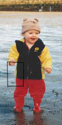
Scanners and digital cameras are very useful objects, as they are the two ways in which you can get images from "reality" into digital form. But they create files which are far too big to use on the Web. The format they use is called .tif (that being the extension of the file type). .tif files record colour information about each and every pixel (as, incidentally, does another image file type, the bitmap with extension .bmp). Look at the two images below: the "grid" on the right is a greatly magnified version of that part of the left-hand image within the box:


As you can see, however, there is a lot of redundancy here. Only the left-hand side of this section has any real detail: the right-hand side is, basically, two blocks of identically-coloured pixels. The .tif format certainly allows images to be stored in very high quality, and reproduced precisely. But this comes at the cost of very large file size; three bytes for every pixel, to be exact (one for the amount of red, one for the green, and one for the blue - remember your RGB colour codes).
Also, because of the nature of the medium, you simply don't need images on your web pages that are of printable quality. Monitor screens display at a resolution of about 72 pixels per inch. (This varies depending on the screen, of course, but that's a reasonable guide.) Some scanners work at up to 9600 pixels/inch, which makes for marvellous image quality but is, of course, absurdly excessive if all you're going to be doing with that image is looking at it on a monitor screen.
The image types that are most commonly used on the Web meet both these criteria. They can be smaller because they compress information. As an analogy, think of that latest craze, texting.... im sure most of u cld undrstnd this msg... inessential characters have been stripped out to save time (and finger joints), but there is still enough information to rebuild the message. Similarly, returning to the example above, the computer wouldn't need to store every pixel in, say, the toddler's coat or trousers separately. Rather, it could compress the information down to saying, there is a certain area of the picture: and that area is filled with a certain colour. That's only two or three bytes, instead of dozens.
The two image types which work this way are the .gif and the .jpg (pronounced jay-peg). They have different applications, as shown below; .gifs are used for logos, line art, cartoon-like illustrations and so on, whereas .jpgs are best used for photographs:
 .gifs are used for images like this... |  .jpgs for photographs like this. |
There is a third format, .png (Portable Network Graphic), which has been around for a few years now but though it was specifically designed for use on the Web, it has struggled to gain support. This is more down to inertia than there being anything wrong with it, but do bear in mind many older browsers (and even some that aren't that old - such as IE 4.0) don't support it.
To convert one file type to another, all you'll need to do is load it up into a graphics editing package, like Paint Shop Pro (available on the university network) and use the Save As... option to change the file type. You'll need to use a package like this to change file sizes as well - at least, if you want to make them smaller in memory terms as well as just on the screen (a distinction discussed on the page about image size). It's worth becoming familiar with at least these basic graphic editing techniques. (Photoshop offers a "Save for Web" option, which shows you how large your file is going to be, as well as ensuring you get the format right. If you've access to this package it's a good way to begin to explore the issues here.)
As the virtual lecture stated, there are many specialised considerations involved in designing and using graphics on the Web. The average user won't need to concern themselves with them, but if you're going to take things seriously, at the very least you should take the ACOM Graphics option, whether as part of Web Design or another ACOM module. Also have a look at Part III of Niederst's Web Design in a Nutshell, and get yourself a decent graphics package. But at the very least, all web designers should know when to use a graphics package to change file types and size.
While we're on the subject, do be aware that images are not immune from the suggestion that you use mainly web-safe colours (see the page on colours). Certainly, logos and banners should stick to these 216 colours unless there is a good reason not to. I could go into more detail here but it is not the aim of this site to explore every nuance of creating graphics for the Web. At a basic level, though, you need to be aware of these considerations, and aim to make your images as small as possible in memory terms.
