Web Design |
topic title |
||||
main menushelp pagesprinter-friendly/text-only version your accountUse your ACOM account to access the discussion boards, submit course work and check marks and feedback Essential related topicsRelated topics |
Image-based menu bars
The fact that you can use images as links has given no end of inspiration to web designers anxious to get that little bit extra visual impact on their sites. I will repeat the usual warning - it is easy to get too distracted by concerns about visual impact and style, and neglect to put any actual substance on your pages. Beautiful-looking links are not of much use if the link they lead to is broken or irrelevant. A page arranged like a "gallery", with many thumbnails leading to larger versions of themselves (possibly accompanied by text detail) is already a sort of image-based menu. But what I want to discuss on this page is more the direct use of images as links - images that have been specifically created to be links. For examples of the sort of effects you can achieve here with just a little bit of thought and a half-decent graphics package, have a look at David Gauntlett's good-looking site at http://www.theory.org.uk. The front page of this site is an image map, and shows you the potential of that technique for navigation. The page reproduced below is at http://www.theorycards.org.uk/. These are thumbnails, sure: but at the same time, they act as a menu to specific content. (Both links in this paragraph will open in the second browser window.) 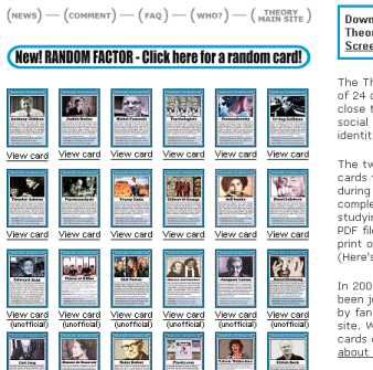 David's icons are just ordinary images as links. However, now you know the image rollover technique, there is no reason why you can't start creating "buttons" or similar effects on your pages:
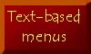
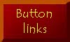
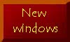
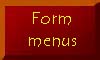
The usual caveats about images and images-as-links apply. Always have an ALT attribute, particularly here. Don't impart information solely with the image; make sure there are other routes for the reader to reach the relevant pages. Macromedia's web design package, Shockwave, has a plethora of button-creation facilities. But it should be simple enough to create buttons like this in any half-decent graphics package. If you're interested, I used Photoshop; simply creating a dark red rectangle, darkening one corner and lightening the other with the Burn and Dodge tools respectively (why is it called Dodge?) before drawing the solid borders. Then I just placed the text on with the Type tool - the font is Tempus Sans ITC, by the way. (See note below about fonts.) These five buttons then got saved as buttonimagen.jpg. Then each in turn was turned into its twin by using the Artistic - Poster Edges tool in Photoshop. I experimented with a few until I found an effect I liked - other graphics packages will have their own. These were then saved as separate files, buttonimagena.jpg. The usual rollover technique was then applied. Instead of an effect like these, you might also try changing the colours of the button or the text upon it. It's really up to you. The advantage here is that you can use any font that your own PC and/or graphics package supports, because once you've turned it into an image, it wouldn't matter if the viewing PC didn't support that font. Of course, you must resist utterly the temptation to start rendering huge swathes of your text as an image just because you desperately want some obscure little font to grace your pages. By all means try specifying it but stick with text and remember to always specify alternatives.
In the end it all comes down to the same old issue - usability. When designing your image-based links and menu bars, always ask yourself, does this make my site easier and friendlier to use?. Visual impact does matter - image-based links stand out from surrounding text. They therefore add emphasis to that most unique characteristic of the Web, the document's links to other points in cyberspace. But as always, if used gratutiously or without thought for the end user, they will more likely obscure and confuse. Tempting though it is to start spreading buttons and other image-links all over your sites, do always sit and think about these issues beforehand. Back to the menu for lesson 10 | ||||
Material on this site is © Drew Whitworth, 2005 Permission will usually be given to reproduce material from this site for non-commercial purposes, if credit is given. For enquiries, e-mail Drew at andrew [dot] whitworth [at] manchester [dot] ac [dot] uk.