Click to skip over navigation
 

lecture 4: design for mood

<< previous slide

return to lesson 4 index

next slide >>


Back in lecture 2 I observed that things like colour and font could be used to establish a mood, or tone, for your site. You wouldn't expect to see this font on a business site, for example, but it's appropriate enough on a site aimed at under-5s.

This is just a subset of the general principle that good graphic design establishes an identity, a feeling, or a mood by nothing more than the design itself. Probably the most famous British graphic designer is Peter Saville (well-known for his work with Factory records and bands like New Order), who said: "When I was at college studying design everyone was doing tricksy things like designing logos for restaurants that looked like plates with bites taken out of them. I hated that. One should be able to express an entire identity through nothing more than colour, layout and typeface."

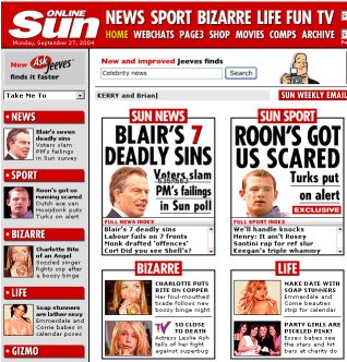
It's the same thing as with the chunks of information - who are your target audience and what do you have to do to attract them? Businesses, especially, may be very keen to put across some kind of "corporate identity", and appealing to different markets through your design is a crucial part of this. This is mainly why I chose the web site of The Sun as one of the examples earlier. Contrast it with The Guardian - not only are they clearly appealing to different audiences but they also reflect the design and style of their "offline" selves, that is, the actual newspapers.

There are no generalisations to make here. The only way you truly know if you've got the design right is through feedback. Do ask people what they think of your site, how easy they found it to use and how pleasant it was to look at. Very few of us get it right first time - but that's what learning is. Ask for feedback and act on it - if the criticisms are fair!

Screen shot from the Sun's web site


<< previous slide

return to lesson 4 index

next slide >>