| |
lecture 4: good and bad layout
PRACTICAL EXERCISE: Turn to your handout and have a look at some of the sites mentioned there. It is not necessary to look at them all; pick those that you think might be a good comparison. Think about how the site uses layout and design to create a mood, to present information, or to assist the user with navigation. Each of these sites may do each of these things well or badly.
On the next few slides I will elaborate on my feelings about these sites, and why I picked them particularly. But I want first to make a general point about how people look at web pages.
Remember that web pages are designed to be read off a computer screen, not a printed page. Printed matter does not produce its own light but reflects whatever's around off the page and into your eyes. Computer screens, on the other hand, do make their own light. This is why it is more of a strain to read off a screen than off a printed page (and why your mother told you that sitting too close to the TV would hurt your eyes). The more we can do to make reading our pages easy rather than a chore, the better.
| The best way to make your pages easier to read is to use plenty of white space. This lecture's pre-reading mentioned that but it's worth repeating. Pages clogged up with text or cluttered with dozens of images are far more wearing to read than ones with plenty of space to relieve the eye. The Guardian's site and some of the Lancaster University site are examples of the good use of white space.
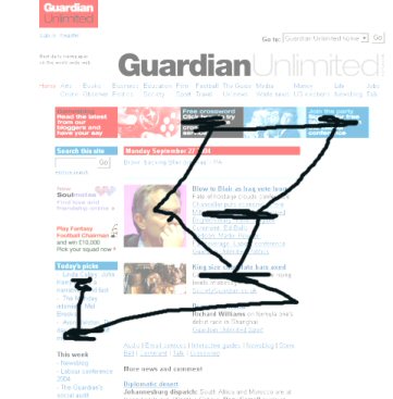
Realise that we do not absorb the information on a screen in a predictable order. With a book, it can be generally (although not entirely) assumed that you will start at the top left of a page and read, row-by-row, to the bottom. But this is not true with web pages. The eyes jump around and build up the complete picture - or rather our personal interpretation of the complete picture - bit by bit. On the left is a crude simulation of how someone might look at this page which is from an online newspaper. Readers' eyes will jump around the screen, looking at headlines, summaries or images which they find interesting or eye-catching. Other parts of the screen might be entirely ignored.
|
Just as good web site structure allows readers to easily find the right page within the site, good page layout to make it easy for readers to find what they want on the screen. No one likes to hunt around for the next link, or to have to read text that is too small and occurs in huge blocks that spread all across the screen!
|