lecture menu
lecture 4: consistency
In the 10 years or so since the WWW really came into the public consciousness, quite a lot of research has been done in the field of usability. This is interested in how people actually use web pages and sites, and how designers can make their sites better for visitors.
One important insight is that each individual web site is, initially at least, an unfamiliar place for visitors. Unless they have a good reason to do so, people are unlikely to spend time exploring a complex, labyrinthine site (it does happen though - for example, you've presumably spent quite a lot of time on this site already, over a period of some weeks - but most sites are engaged with far more briefly). When you enter an unfamiliar place, you tend to look around for landmarks or other things which resemble familiar things from your prior experience. These will allow you to orient yourself. Or, some objects in the environment will be more central to it than others. When you wander in to an unfamiliar pub the first thing you look for is the bar! Or, you're probably far more aware of where the lecture theatres are on this campus than the research labs.
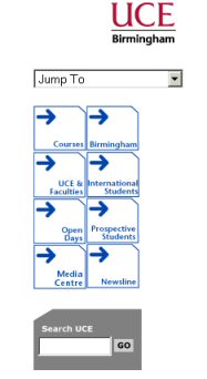
A key recommendation, therefore, is to keep your page layouts consistent. Decide on what your key links are and collect them together in a menu that appears in the same place on every page of your site. I picked the University of Central England as a site for you to assess for two contradictory reasons. I think the front page of that site is not very clear at all; an example of messy, fiddly layout. And I'm really not sure about the "buttons", either. But having said that it is a very consistent site (unusually for a university site as these are often mish-mashes of styles and layouts). The menu pictured here always appears on the right-hand side, so you don't need to hunt around for it or wonder how to get to some of these other parts of the site. You should have noticed that I do the same on this site, although in two different ways I admit: the virtual lectures all have the same layout and menu, and the topic pages a second consistent style and layout. All this makes it easier to design your site too, because you can use a template and single style sheet. You don't have to reinvent the wheel for each separate page. |  |
And while it might seem appropriate to introduce navigation "tricks", don't forget that links are the most important aspect of your site as without them, you have nothing. If you didn't look at the "Coral" web site (see handout), maybe have a look now, and tell me, honestly, whether you think that's a good site or not.
Another important usability recommendation is to keep everything important on your page "above the fold". This means, ensure all navigation menus and important text like headings, company titles and logos, etc. appears on the screen without the user needing to scroll down (and test this on the smallest screen size you can get, i.e. 800 × 600). Keep important stuff at the top of the screen whenever possible!
This link leads to a good, clear introduction to web usability which will open in the second browser window.
