| |
lecture 4: history of graphic design
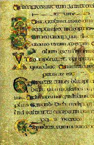
| Mediaeval manuscripts were so elaborate that the design almost swamped the text. So few people could actually read that it was more common to get one's message across through other means such as face-to-face storytelling, song, or religious art. In illuminated manuscripts like this one (the Book of Kells) text and images are heavily intertwined. (As an aside it's worth mentioning that these old works didn't have puncutation or even spaces between all the words - there was no need to use markup to make things more convenient for readers as there were so few of them!). |
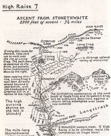
This particular kind of elaboration is rarely seen these days but many books still rely on a mixture of illustration and text to get their message across. I have reproduced here a notable example: a page from A. Wainwright's famous Pictorial Guide to the Lakeland Fells. This series of books was basically hand-written and drawn by the author and as you can see the text and images are again very intertwined on the page. This makes for a very attractive page but it is not a design style suitable for use on the Web. Wainwright had a (literally) free hand with his "canvas": he knew exactly how big the finished pages were going to be and he knew that each of the finished book's pages would exactly reproduce his original draft. You know neither of these things. In any case, how difficult would it be to describe the layout you see here to a computer? | |
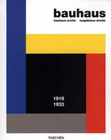
| Until the early 20th century this kind of elaboration was the norm. But around this time movements such as Impressionism then Cubism changed the emphasis of art and design. No longer was it considered necessary to accurately depict the world - cameras could do that. Modernism was born and in the design field the best-known innovators were the Bauhaus school of 1920s Germany. Their design elements were no longer drawn directly from nature but became increasingly abstract - straight lines, regular polygons, primary colours, and mechanised type (e.g. fonts that did not try to mimic handwriting but reflected printing and typewriters). |
For a much more comprehensive run-through of graphic design history and theory than I can give here, follow this link (which will open in the second browser window).
The image of the Wainwright page is from Pictorial Guides to the Lakeland Fells by A. Wainwright, Book Three: The Central Fells, published by Frances Lincoln Ltd. Copyright © the Estate of A. Wainwright (1958). Reproduced by permission of Frances Lincoln Ltd., 4 Torriano Mews, Torriano Avenue, London NW5 2RZ.
|