Web Design
topic title
main menus
help pages
printer-friendly/text-only version
your account
Use your ACOM account to access the discussion boards, submit course work and check marks and feedback
Essential related topics
Related topics
These tags are used to define the "breaking-up" of the browser window. In other words, they define where the lines are drawn between the separate frames. <FRAMESET> is one of the more complex HTML tags, and needs some careful attention.
Frameset documents have <HTML>, <HEAD> and <TITLE> tags as normal, but they don't have a <BODY> tag; instead, following the closing </HEAD> tag come one or more <FRAMESET> tags. These have several uses, and the attributes which apply to each will be introduced in due course, but the most important - and complex - use of the tag is to define where the "divisors" between frames will be drawn. To do that you use one or both of the attributes ROWS or COLS.
Using ROWS in a <FRAMESET> tag tells the browser that you want to divide the window horizontally, COLS says you want to divide it vertically. The values taken by these attributes then define where you want the division to occur. Values come in one of three forms:
- Absolute pixel values. <FRAMESET ROWS="250, 400"> says that you want to divide the screen horizontally - the top frame will always be 250 pixels high, the lower, 400 pixels high. If the window is not big enough to contain these frames you will have to scroll to see the whole page. See below for more examples (this advice applies throughout this section).
- Percentage values. Refer to the total available width. <FRAMESET COLS="60%, 40%"> will divide the screen vertically in a ratio of 6:4, whatever the screen and/or window sizes.
- The asterisk. The asterisk basically says, "take what's left". <FRAMESET ROWS="250, *">, therefore, is a bit better than the first example above, as while the upper frame will remain fixed at 250 pixels high, the lower can vary depending on the screen size. But note that you can have more than one asterisk: if this happens, the browser will use them to divide up the remainder into however many equal portions. So <FRAMESET ROWS="250, *, *"> would result in three horizontal "slices", the latter two being the same size: equal to (roughly) 2 / (the screen height in pixels - 250). (I say "roughly" because things like the bottom and top bars also occupy pixel space).
We're not done yet though! There are even further levels of complication. Firstly, you can have ROWS and COLS specified in the same <FRAMESET> tag. This will divide the screen up into a grid - check out the example screen shots below. But you might have noticed on the example page that I had three frames, not two or four. How was this done?
The answer is to first divide the screen into two horizontally, then take the lower frame and divide that into two vertically. This was done by nesting the <FRAMESET> tags. (One reason <FRAMESET> tags require a closing tag is because of this facility.) You might have already noticed that on the page about the frameset document, when I reproduced the whole code for subj_whatframe.html. I won't repeat it again here, but once again, look below for examples.
Once the divisions are defined, of course, the next step is to fill them. This is done with <FRAME> tags. Frames are generally filled left-to-right, top-to-bottom; the best comparison is with the order you'd see <TD> tags in a table. But once again I'd suggest you have a look at the examples below. In the end, if you get it wrong, you'll soon realise the order they were supposed to appear in.
EXAMPLES. Note that in each case the screen shot has been taken from a fairly small browser window. I have only used relative sizes (percentages or the asterisk) in the examples, as they are meant to show the relationship between ROWS, COLS and <FRAME> rather than anything more precise in layout terms. Look at the screen shot's floating caption (ALT attribute) for a fuller explanation of what's going on. (Opera users: toggle images on and off.) In each case I've shown only the <FRAMESET> tags, but remember that real frameset documents have document headers as well. I've also left frame borders in for clarity, but note that they can be removed: details follow this table.
            <FRAMESET ROWS="*, *"
                <FRAME SRC="a.html">
                <FRAME SRC="b.html">
            </FRAMESET>
|  |
            <FRAMESET COLS="*, *">
                <FRAME SRC="a.html">
                <FRAME SRC="b.html">
            </FRAMESET>
|  |
            <FRAMESET COLS="15%, *">
                <FRAME SRC="a.html">
                <FRAME SRC="b.html">
            </FRAMESET>
|  |
            <FRAMESET ROWS="15%, 60%, 25%">
                <FRAME SRC="a.html">
                <FRAME SRC="b.html">
                <FRAME SRC="c.html">
            </FRAMESET>
|  |
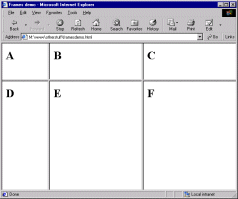
            <FRAMESET ROWS="*, *", COLS="*, *">
                <FRAME SRC="a.html">
                <FRAME SRC="b.html">
                <FRAME SRC="c.html">
                <FRAME SRC="d.html">
            </FRAMESET>
|  |
            <FRAMESET ROWS="25%, *" COLS="20%, *, *">
                <FRAME SRC="a.html">
                <FRAME SRC="b.html">
                <FRAME SRC="c.html">
                <FRAME SRC="d.html">
                <FRAME SRC="e.html">
                <FRAME SRC="f.html">
            </FRAMESET>
|  |
            <FRAMESET ROWS="25%, *">
                <FRAME SRC="a.html">
                <FRAMESET COLS="*, 15%">
                    <FRAME SRC="b.html">
                    <FRAME SRC="c.html">
                </FRAMESET>
           </FRAMESET>
|  |
            <FRAMESET COLS="*, 75%">
                <FRAME SRC="a.html">
                <FRAMESET ROWS="*, *">
                    <FRAME SRC="b.html">
                    <FRAME SRC="c.html">
                </FRAMESET>
           </FRAMESET>
|  |
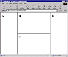
            <FRAMESET COLS="*, 50%, *">
                <FRAME SRC="a.html">
                <FRAMESET COLS="*, *">
                    <FRAME SRC="b.html">
                    <FRAME SRC="c.html">
                </FRAMESET>
                <FRAME SRC="d.html">
           </FRAMESET>
|  |
I think that gives you enough to go on, don't you?
There's still more to say about the <FRAMESET> tag though - we're not yet at the end of the possible attributes! You can also include the following:
BORDER=n where n is the thickness of the border, in pixels, between all frames in the frameset. (If you've turned borders off via FRAMEBORDER, this attribute is of course irrelevant.)
BORDERCOLOR=rgb code or colour name. Fairly obvious. Older browsers don't recognise this attribute.
FRAMEBORDER. One of those irritating attributes where Netscape and IE recognise different values. Even more irritatingly, IE changed from one to another - but the official HTML 4.0 spec may force it to change back! The only answer is to include both values in your <FRAMESET> tags. The first tag, therefore, turns borders on, the second turns them off...
<FRAMESET ROWS="*, *" FRAMEBORDER=yes FRAMEBORDER=1>

<FRAMESET ROWS="*, *" FRAMEBORDER=no FRAMEBORDER=0>
Unwieldy though this is, I'm afraid at the current time you've no choice but to do it this way.
FRAMESPACING=n where n is a number of pixels of additional space between frames. Only works in IE.
OK, that finally is it. Despite the length of this page the <FRAMESET> tag, at a very basic level, is quite simple to use. It offers a lot of depth and control in dividing up your page, though. As usual, practice should improve your understanding and use of it.
Back to the menu for lesson 11
