lecture menu
lecture 3: site structure I
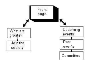
Navigation is what you use to guide visitors through the underlying structure of your site. You may think that very small sites have no need of a structure, but they do: even if it is a very simple one. For example, the "Groat" site has a structure like on the right. As the two "sides " of the site are quite distinct in purpose and intended audience, you would not expect there to be links "across the divide". All pages would be linked back to the front page, but while you'd expect "what are groats?" and "how to join" to be linked to each other, it would be less logical to provide a link from these pages to "upcoming events". |  |
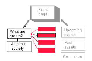
 | But what if one of these pages was itself subdivided? You may decide, for example, that you've actually got a lot to say about what groats are - enough to justify three or four separate web pages in their own right. This diagram is now meant to represent a further level "down" into your site. Hopefully you can see how a hierarchy is starting to develop here. |
A useful parallel is with the "tree" diagrams you see in Windows Explorer when it represents the various folders and subfolders on a drive. Of course, you might actually use folders and subfolders to help you get the hierarchy right (in other words the "red" pages in the diagram above would be in a subfolder); there is nothing wrong with this but it can make coding your links confusing if you go too far down. What is important to realise is that whether you use subfolders or not it is the placing and destination of your links which define your site's structure and not necessarily where the files are saved.
All of this site's files are placed within the same folder but there are obvious levels of the hierarchy:
- at the "top", the two indices (Subject and A-Z) and the Resources page...
- at "level two", the twelve lesson indices (lesson1.html, lesson2.html etc.)...
- at "level three-A", each individual topic page (subj_a_tag.html, subj_attribs.html) which within each lesson can, generally, be followed in any order...
- at "level three-B", these virtual lectures (vlect3b.html, vlect2c.html) which within each lesson are meant to be followed in a specific order.
All of this is controlled only by the arrangement of links on the pages. And that's why links are so important.
By the way, no matter how deep your hierarchy goes, a usability recommendation that is worth remembering is that no page on your site should be more than three clicks away from any other page. That is not a hard-and-fast rule - some pages on this site are four clicks apart from each other - but it can often be done by simply putting a link back to the front page on every other page, and having a good index or menu page. Every click means a file download, so the fewer you can do, the easier your site is to use!
