lecture menu
lecture 3: good navigation I
Good navigation is also about making sure people know where they should go in order to fulfill their particular needs. To an extent this is dependent on your site structure - see the next two slides - although this is less of an issue with small sites. Still, there are things you can do to make it easier.
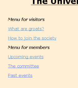
 | This is where your division of the site into "chunks" will help. You may wish to look back two slides, to where I gave you the five chunks of the Groat Society site as an example. They divided into two distinct categories, two chunks for potential new members and three for existing ones. And, as you can see on the left, this has translated directly into the menu. Unlike the bad version of this page, the links are not just peppered through the text (although they are still there in some cases), but have been collected together into categories and - most important - these categories made obvious to the reader. |
As an example of a (much) larger site, you might like to consider this one. On this site there is an implied order, in that you would normally follow the site through from lesson 1 to lesson 12, and within each lesson, look at the virtual lecture, then the reading materials, then the self-test. The Subject Index and each lesson index make this clear - well, I hope they do anyway!
But there is a second way of navigating through the same material - the A-Z index. Often, people come to the site looking for a specific chunk of information (e.g. perhaps when you're doing your course work and you need to use the colour chart). At that point, the Subject Index becomes less convenient, the A-Z index more useful.
Note, then, that the connections between chunks of information are in some ways independent from the information itself. This site has, basically, two ways of arranging exactly the same information. If you can start to get the hang of that, you are much closer to both understanding hypertext and using it to enhance the quality of your web site.
