Web Design
creative use of tables
main menus
help pages
printer-friendly/text-only version
Once you get the hang of tables there are lots of things you can do with them. You may have noticed from the page on whole page layout that I use a very thin table cell to get the "vertical rule" to the left of the main text. I use an image to do so but you can do the same with styles (ad hoc or in the sheet). A bonus with either technique is that the rule is always the same height as the text:
WORLD CUP QUOTES: "You'd think if any team could build a decent defensive wall, it'd be China" (Terry Venables) "I notice that Mexico have players called Gabriel, Garcia and Marquez, do you think that means they play in a literary style?" (ITV commentator) "The conditions suited them more than us" (Mark Kinsella after Ireland's rain-drenched win over Saudi Arabia) |
<table summary="" style: "width: 100%">
<tr>
<td style="width: 15%"> </TD>
<td style="width: 2%; background-color: #0000FF">
</td>
<td style="width: 8%"> </td>
<td style="width: 75%">
<p><b>WORLD CUP QUOTES.... (etc.)
...</td>
</tr>
</table>
It's a short step from there to using tables for whole page layout. The principle remains the same - only the scale differs. You might already have looked at the "Mondrian" page I've put together (it will open in the second browser window). Note that it should retain its structure if and when you resize the browser window or the text. Have a look at the source code to see how it's done. If you can master something like that, the sky's the limit!
Once images enter the picture you can start slotting them into your table cells pretty much wherever you like: although you do need to take account of the size of the image in pixels. See the page on height and width attributes for more information. (The fact these attributes also appear in tables should suggest the close relationship here.) You also make use of tables in the sophisticated technique known as multipart images; that's a more advanced technique, however, and I wouldn't look at it until you've learnt more about images.
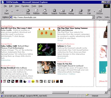
Something I've thought about is whether there's any reason not to design a whole web page based on the idea of horizontal scrolling. Yes, it's seen as bad form - because it's very inconvenient - to have to manipulate two scroll bars in order to see a whole page. But why couldn't pages be based on a sort of "frieze" model? That is, it's the vertical scroll bar which is redundant, because the content never extends down far enough to go beyond the bottom of the screen - rather, it extends off to the right instead. It would have to be a fairly image-heavy site, as you wouldn't be able to uncover text line-by-line, but I'm sure there are occasions when this would work. I've only ever seen one site that comes close to pulling this off: see http://www.showstudio.com (which as ever will open in the second browser window). The one disadvantage of this method is that you can't use anchor links to jump across (rather than down) the page.

http://www.showstudio.com - note scroll bars
Having said that though we're pretty much done with tables; from this point on it becomes a matter of your experimenting with their possibilities, finding out what you can and can't get away with. Essentially, if you can divide your page, or parts of it, into divisions marked only by horizontal and vertical lines, you can use tables. Doesn't matter how complex the divisions: width, colspan, rowspan and the nesting of tables can usually take care of it. As long as you don't try putting in diagonal, curved or irregular lines, you can use tables. They're powerful, important, and worth spending the time mastering. Just remember to close all your tags!
