Argentina | Bolivia | Brazil | Colombia | Ecuador |
 |  |  |  |  |
As with the other similar pages on this site, this page is designed to be easily printed out and read offline, away from the computer. If you are trying to follow this lesson online you will find it much more convenient to return to the full lesson 4 menu.
You can also go straight to the printer-friendly version of lesson 5 from here.
Contents
Browsers work in what is called a "line mode" fashion, following the pattern of the very first browser, programmed by one of Tim Berners-Lee's students, Nicola Pello (unfortunately not a rare instance of gender equality in the Web's creation - Italians give their men names like Nicola, and Andrea). That is, they render things quite simply, line by line, with the top of the HTML file equating to the top of the screen, and so on down to the bottom. Sounds perfectly logical, I know, but the point is that sometimes you want to render things across the screen: objects or paragraphs side-by-side, instead of above-and-below.
Those responsible for HTML realised that there was a need to be able to arrange things side-by-side, for reasons no more complex than being able to offer simple tabulations, like this:
1st Q | 2nd Q | 3rd Q | 4th Q | |
Widgets | 235 | 153 | 552 | 408 |
Oojamaflips | 88 | 101 | 242 | 166 |
This could, conceivably, be done with <pre> tags, but you would lose presentation elements like the bold text. To lay things out side-by-side like this, therefore, something more is needed. The solution was the family of table tags.
Tables turned out to have uses beyond just laying out two-dimensional arrays (or grids) of information. The advantage comes that anything can go into a table "cell". Layouts like this become easy:
Argentina | Bolivia | Brazil | Colombia | Ecuador |
| | | | |
It is, just about, possible to do this without using tables but it's a lot easier with them. More usefully, tables also provide a way to get "white space" on your page and, thereby, start laying out web pages with the same sophistication as printed material (though always with that extra flexibility). "White space" is publishing terminology for portions of a page that have no content. They don't have to be white. If you look to the left of this paragraph you'll see an expanse of "light green space", for instance, but the idea is the same. You very rarely see substantial white space in printed books; magazines might make use of it, but newspapers rarely do (as it's uneconomic - better to bung an advert in there). On the Web, however, white space is very important. It's very wearing to read text that goes all the way from one margin to the other, without a break. This particularly applies if screens are quite high-resolution; a screen width of 1000+ pixels (not so rare these days) might end up displaying 40 or 50 words on each line, if the text size is small. Compare these screen shots:
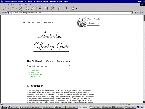
A site with substantial amounts of white space
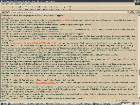
A rather more clogged-up screen
These are shots of pages I'm familiar with, and while I know the information on the second page is of high quality, it's a rather wearing experience to read.
I'm not claiming tables are a doddle - they're not. They're certainly the hardest technique you'll come across in basic web design. But they are necessary, and the work involved in understanding them will be repaid as they can be extremely powerful tools when well used. Once you can use tables properly, you can design for the Web. It's as simple as that.
The other tags we have investigated up to this point are pretty straightforward. You decide what formatting you want to apply to a piece of text and surround it in start and end tags, or you want to insert an object on the page so you just throw in a <br /> or similar tag. Tables are a little more complicated. They are not formed from just one tag, but from at least three different tags which work in conjunction to create the table.
The three compulsory table tags are:
<table>
<tr>
<td>
There are other tags which can be used as well as many table attributes and style sheet properties but let's not worry about them for a while (see 4.2). For now we will just concentrate on how these three tags work together to define the table layout. The easiest way to explain this is to show you by example, so have a look at the table on the left below, which has been defined by the HTML on the right (any attributes used have been removed at this stage for clarity):
|
<table>
    <tr>
        <td>Top left</td>
        <td>Top right</td>
    </tr>
    <tr>
        <td>Bottom left</td>
        <td>Bottom right</td>
    </tr>
</table>
|
First of all note how the whole table is bounded by the start and end <table> tags. Then we set about dividing the table up. Think about how we read text from a book (in English, anyway); we start at the top left, read from left to right, and do not move onto the next line until we have reached the far right of the current line. It is the same with tables - we define one line or row of the table at a time. So this is the next level of division, using <tr> or table row tags. Look closely at the example. Notice how the second level of structure, the <tr> tags, separate the rows from one another rather than the columns.
Once we have separated the rows in this way the last task is to separate each "cell" of the row from each other. This is done with the <td> tags (short for "table data"). The actual contents of any given part of the table always appear between start and end <td> tags. And anything can appear in a table cell - text, images, links, even other tables.
Although there are many more things that can be done with tables they always have this same basic structure. We will see in 4.2 that they do not have to be regular grids and you have a lot of control over the size of table cells. But however complex a table gets the basic structure always remains the same; those three tags always do the work.
 | WARNING! It is very important with tables that you close and nest your tags properly. If your table does not appear as you want (or appear at all), then check all your tags are closed and nested correctly (a code validator can be a big help here). Remember that all the contents of a table go inside the <td> tags. Check that none of the following are true:
"Stray" content that falls outside the table tags may appear elsewhere in the page, or not at all. Missing off closing tags can cause the entire table to vanish in many browsers (unfortunately IE is tolerant of these lapses which is another reason why you must always test your page in a variety of browsers). |
The previous section contained some simple tables that were just straightforward grids. Despite their apparent simplicity there is still a lot you can do with a table that is basically 2 × 2, say, or 4 × 3 or even 1 × 3 (there is no reason why tables must have more than one row, or more than one column within each row: even 1 × 1 tables can be useful). But all we've done so far is define the numbers of rows and columns and let the browser take care of everything else. The real power of tables starts to become apparent with the many ways in which you, the designer, can override the browser defaults and control the size, structure and appearance of tables. This page starts you on that path.
The most familiar way to override browser defaults is, of course, with styles. Like any other tag, the table tags can have styles defined in a style sheet. Bear in mind, though, that there are two distinct consequences of using styles with tables. You can define the appearance of the text which appears within your table, by defining <td> in a similar way to <p> or any other block-level tag. However, bear in mind that if you want more than one block of text within a table cell, you cannot only use <td> to format your text (think about it). In practice I always include <p> tags within <td> tags (this is perfectly acceptable) and leave the text formatting to the <p>. None of this, however, prevents styles being very helpful in laying out the table, and that is what this page concentrates on.
IMPORTANT: I do not claim that this page or even this lecture cover the entirety of what can be done with tables. There is a great deal of formatting which can be applied to tables, and much of it is very advanced. Tables are difficult enough without confusing learners with obscurities like table-row-group. A full specification for table styling is available at http://www.w3.org/TR/REC-CSS2/tables.html but realise that you will only need this if and when you want to progress to a standard greater than this course expects of you.
The first and most useful style property here is width. In its absence, browsers will choose the width for themselves, and will make tables, and the columns (cells) within them, as large as they have to be to fit the contents. The results can be a little unpredictable, and untidy. Using the width attribute gives you more control. (You can also use height, which might seem equally useful but in practice is rarer. It's usually not a problem how tall a table is, and rare to want it any longer (or shorter) than is dictated by the content. It is often used by designers who want to ensure a page fits precisely in a window, but of course the trouble is that you can never be sure how big your readers' windows are going to be. It's there if you need it, though.)
width can take a percentage or relative value, or an absolute value. Make sure you realise what effects each will have. As ever, an absolute value remains the same in all circumstances, whereas a relative value is defined as such-and-such a proportion of whatever page element the defined element lies within. In practice (and though I illustrate this with ad hoc styles the same applies for global definitions in the style sheet):
<table style="width: 75%"> | Table will be 75% of the width of the available space (see below) |
<table style="width: 75px"> | Table will be 75 pixels wide |
<td style="width: 75%"> | The cell will be 75% of the width of the table |
<td style="width: 75px"> | The cell will be 75 pixels wide |
Relative values are always better, but absolute values are quite useful when dealing with images in your tables, as there will sometimes be a need to ensure that a table or table cell is exactly wide enough to contain an image, with no space wasted. This is true when creating multipart images using tables, for example (see lecture 7).
"Available space" for the <table> tag will usually refer to the width of the browser window, but if you nest your tables (see 4.5), it will refer to the width of the table cell inside which the other table is nested. Confused? Well, try reading sections 4.5 and 4.7. I know it can seem confusing at first, but you soon get used to it - in any case, if you get something wrong, it'll quickly be apparent.
The virtual lecture hopefully illustrated the impact that can be achieved by giving table cells different backgrounds (if you need a reminder have a look at http://www.leeds.ac.uk/acom/webdesign/materials/ext_mondrian.html, the "Mondrian" page). Remember that this is a technique that can be applied to any block-level element, but it is with tables (and particularly table cells or <td> tags) that it is most widely used, and most useful. The relevant style sheet property is background-color.
You can also apply background images only to particular cells or tables. Once you get to lecture 5 have a look at section 5.8 for details as there are interesting creative possibilities here.
 | This is all very interesting but do I really need all those ad hoc styles? Fair point. If you looked at the code for the Mondrian page you may have seen ad hoc styles dangerously close to taking over the page. What if, say, you used a table to lay out each page on your site and always wanted the left column to be, say, 15% of the window and blue, but the wider right column a white background? They both use <td> tags, so do you have to use an ad hoc style for one of these tags on every page? The answer is no: you use a style sheet class. I could have introduced these earlier but they are not straightforward and so I waited until we really needed them. Now we do: and it's coming as section 4.3. |
There's one more useful topic to discuss here, however, which again is demonstrated by the "Mondrian" page. Although, as I said, you can do a lot with straightforward grids, you may sometimes want to join two or more cells together and treat them as one. As an example, look at this table:
cell A | cell B | cell C |
cell D | cell E | |
cell F | cell G | cell H |
This is done with an attribute, colspan. Note it is an attribute and not a style property: this is considered structural information. The code for this table is the same as any other table except that the middle row only has two <td> tags instead of three. The first of these tags looks like this:
<td colspan="2"><p>cell D</p></td>
This is exactly how the Mondrian page works. Look at how the "text box" in the middle spans more than one column (compare it to the coloured blocks in the top row). If you want to create a table like this the best thing to do is determine the largest number of <td> tags in any given row and remember that if you ever want fewer than this, you will need to use colspan somewhere.
There is also a rowspan attribute but this can be fiddly. Always include it in the relevant <td> tag of the topmost row of those you want that cell to span. Each subsequent (lower) row has that <td> tag omitted; it has, in effect, already been taken care of. As with many things in web design, you'll soon see if you get it wrong.
Don't get too complex with your rowspan and colspan attributes, by the way. Beyond a certain point - and you reach that point quite soon - it is better to design complex page layouts using nested tables - see 4.5 below.
IMPORTANT: as the lecture tried to make clear, this is not a technique only applicable to tables. Our discussion of tables merely gives an opportunity to introduce it. Classes are not that difficult but you had enough to occupy you in lecture 2 already! We need them now, though, for as 4.2 noted, there are too many things to be done with tables to always have the same style applying to the same tag, and ad hoc styles are cumbersome. Classes are the answer, but please be aware that you can use this technique with any aspect of your HTML and CSS.
There will be many occasions where you want to vary the appearance of individual text elements, whether these be paragraphs you want to right- or center-align, passages of text you want to render in a different colour for emphasis, or other similar effects. The techniques we've discussed so far will do just fine for defining every occurrence of a tag, and ad hoc styles work well for one-off changes. But what about situations between these two poles?
For example, you might have noticed that at the bottom of all these pages is a copyright statement, which I'll repeat here to save you scrolling:
Material on this site is © Drew Whitworth, 2005 Permission will usually be given to reproduce material from this site for non-commercial purposes, if credit is given. For enquiries, e-mail Drew at andrew [dot] whitworth [at] manchester [dot] ac [dot] uk.
Clearly, the text is smaller than the main text of these pages. However, that line is still enclosed in <p> and </p> tags. I have not appropriated some other tag for this purpose. Instead, what I've done is define what is known as a class.
Classes are "subdivisions" of general tag definitions. They are defined in the style sheet (internal or external) using a dot after the name of the element you are altering, followed by whatever you wish to call that class, and then the style definition for that class. So, in the case above, I want that particular paragraph to appear smaller than the main text. I have therefore created a style sheet definition which looks like this:
p.notes { font-size: 70%; }
To "call" this class I need to use an attribute called, predictably enough, class. The value of this attribute is the name of the class (you do not need hashmarks or anything like that). In the example (truncated for clarity):
<p class="notes">Material on this site... </p>
Here is a more involved example:
h3.highlight { border-style: solid;
              border-width: 2px;
              background-color: #ffffff;
              padding: 5px;
              font-family: Times, serif;
              font-size: 14pt; }
Class defintions inherit properties off their main tag definition. The <h3> class definition says nothing about the font color, for example, so this remains as it does for "ordinary"<h3> tags. The <p> class "notes" changes only the text size: everything else remains the same.
Partly because of this you should make sure you always define these classes at the end of the style sheet. Get all the standard tag definitions done first, then do your pseudo-classes for the <a> tag, then these.
Note that it is possible to define classes which are not related to a specific tag type. You do this by simply omitting any tag name from the style sheet but retaining the full stop (.) and the class name. For instance, you might have an entry in the style sheet such as:
.gold { background-color: #cd7f32; }
...and this can now be applied to any tag type by including the class="gold" attribute within it. Have a look at this table:
Normal |
Gold |
Gold |
...and its code:
<table>
    <tr>
        <td><p>Normal</p></td>
        <td class="gold"><p>Gold</p></td>
        <td><>Normal</p></td>
    </tr>
</table>
Hopefully you also remember the example in the lecture with the 2 × 2 table used to lay out a page, using three different shades of blue as background colours. Section 4.7 has further examples. Like everything else in web design, the best way to work these out is to practice! Try defining classes in your own style sheets, and seeing how they work. In the end, there is no right and wrong time to use them, but eventually you will want to break free of the "one style per tag" restriction of basic CSS, and classes are the most sophisticated way of doing this. Remember also the <div> (block-level) and <span> (inline) tags which have no intrinsic formatting of their own but are good at applying styles when combined with the class or style attributes.
One of the things you often want to do with tables is to put more space between the cells than browsers normally allow. Here are two examples. The first is rendered entirely as the browser decides, but in the second, I've added some style information - the exact nature of which is the subject of this page.
No formatting applied |
| |||||||||
Style information included |
| |||||||||
Whether you think that's an improvement is neither here nor there - I was overdoing it a bit but I hope it illustrates what is possible. Basically, the enhancement of the second table was done with three as-yet-unmentioned style sheet properties: margins, borders and padding.
Margins, padding and borders are things that all block-level tags have, whether these be paragraphs, whole tables or table cells, minor tags like <blockquote> or the entire page body. All of these are treated like "boxes". More precisely, they are a series of boxes, one inside the other, like Russian dolls. For example, table cells (<td> tags) are contained within table rows (<tr>) which are contained within tables (<table>). But table cells may themselves have paragraph tags within them (<p>) and/or images.
To complicate things further, every one of these block-level elements is itself composed of four "boxes". The first is the content, which is usually text but may be an image or a series of tags. Around the content come three other boxes, which from the inside out are padding, border and margin. See the diagram:
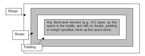
Defining what form the margin, padding and border take is a matter of style. As with everything else stylistic, the browser has its own ideas about how it's going to render these things. Most of the time, it defaults to not assigning any values to these things at all (there is one significant exception which I will mention below). In other words, things are usually rendered without border, padding or margin, as the first table showed. But you can define all of these things if you want, whether as ad hoc styles or to apply to every instance of a tag.
(Note that background elements, whether colours or images, will extend out through the padding but are "stopped" by the border: the margin is always empty space (though will of course reflect the background of more "senior" page elements such as the <body>).
To further complicate matters, padding, borders and margins can also be applied to only some of the four sides of a box. Or, you can define the property with different values for each of the four sides (the order being top-right-bottom-left, if specified all in one tag). Note that the "subdividing" properties given below are not yet supported by all browsers and you are safer using the second method: that is, four different values in one property. In all cases, values can be specified in length units, a percentage of the element's overall width, or as auto, which the browser calculates based on other elements of the page.
I know all this sounds complicated but the sample code given below should make things a bit clearer, and these properties do give you a lot of control over the spacing of your page. For a list of available length units, see the section in the style sheet reference page.
margin
subdivided as: margin-top, margin-right, margin-bottom, margin-left.
Defines the amount of margin around the element, outside the border.
    h1 {margin: 15px}

    h1 {margin: 0px 15px 0px 15px}

    h1 {margin-top: 0cm;
        margin-left: 1.5cm;
        margin-bottom: 0cm;
        margin-right: 1.5cm;}
padding
subdivided as: padding-top, padding-right, padding-bottom, padding-left.
Defines the amount of padding between the element and the border.
    p.special {padding: 10px}

    p.indent {padding-top: 0pt;
              padding-left: 18pt;
              padding-bottom: 3pt;
              padding-right: 0pt;}
border-width
subdivided as: border-top-width, border-right-width, border-bottom-width, border-left-width.
As well as the usual units of length this can also take the values thin, medium or thick. See below for a couple of examples.
border-color
Not subdivided, but as the example below shows, can still have different values for each side; remember the order is top-right-bottom-left. Takes an RGB colour code or colour name.
border-style
As with border-color, not subdivided but can still have different values for the four sides. There are several different styles, which you might like to play around with: none � dotted � dashed � solid � double � groove � ridge � inset � outset.
Examples of border properties:
    p.highlight {border-style: ridge;
                 border-color: red;
                 border-width: medium;}

    h1 {border-style: none none double double;}
border-spacing and border-collapse
In HTML 4.01 there was a useful attribute, cellspacing. This could be used to space out all the cells of a table by a certain amount. In XHTML 1.0 you shouldn't use attributes for this kind of thing: border-spacing is the replacement style sheet property and can be defined for the <table> tag. If you want to make absolutely sure the cells of a table are joined together (as on the "Mondrian" page), include border-spacing: 0px;. You can also try border-collapse: collapse; which says to the browser (and this is obscure!), "if two borders adjoin each other then treat them as one border". The default is border-collapse: separate;.
This might seem obscure but when it comes to using multipart images in tables you will certainly have need of it. (See lecture 7.)
You may never use these properties, or do so only rarely. But add these to the other things you now know how to do with block-level elements - define backgrounds, width and so on - you start to realise that you have a lot of control over how your page appears. If you use relative widths, particularly for larger page elements, you can even apply this control across a range of window sizes.
In case you were wondering what combination of margins, padding and borders were used earlier to render the second version of that table, it's probably simplest to view the source code. This is quite a complicated example but as ever the trick is not to try and copy it but adapt these techniques to your own requirements. Practice will show you what can and cannot be easily done.
Something that occasionally confuses those who are new to the technique is the nesting of tables inside each other. In other words, a table cell (<td> tag) that itself contains a table. This is no more complicated than any other example of nesting, such as links within paragraphs, or the whole page content within the <body> tag, but I think what makes it hard for some people to grasp is the need to keep a very close eye on your table structures, and ensuring you have closed all tags in the correct order.
Why might you want to nest tables? Well, at a simple level, it can help you achieve effects like this. The HTML used to get this effect follows beneath:
Rome was the greatest empire of the ancient world. However, what is often forgotten is that the Emperors did not come to power until after a long period of broadly democratic government by the Senate. The table on the right lists four early Emperors of Rome. |
|
<table summary="Some Emperors of Rome" style="width: 75%;">
<tr>
<td style="width: 50%; padding: 10px;">
<p>Rome was the greatest...</p>
</td>
<td>
<table style="border-style: solid; border: 1px; border-color: #003300">
<tr><td><p>27 BC: Augustus</p></td></tr>
<tr><td><p>14 AD: Tiberius</p></td></tr>
<tr><td><p>37 AD: Caligula</p></td></tr>
<tr><td><p>41 AD: Claudius</p></td></tr>
</table>
</td>
</tr>
</table>
Hopefully the indentations here make the structure clear. It really is just a matter of keeping track of your opening and closing tags. Note that the attributes applied to the first "parent" table don't apply to the "child" table within it. So there's no padding between the cells of the "child", for instance. More obviously, the same applies the other way, so there is no border round the "parent".
You can also do this kind of thing with rowspan and colspan attributes: in this case this would be a 4-row table with the first cell on the first row including rowspan="4". Each of the other three rows would have only the second tag in it ("Tiberius", etc.). However, any more complex than this and nesting is a lot easier. This particularly applies when you remember that this whole page is in fact laid out using a table and the "child" table is in fact a "grandchild". See 4.7.
Tables were originally included in HTML so that designers could produce tabulated text. This is not a layout issue as such. The two-dimensional array of information occurs in a great many offline texts, as we've already noted. But you might be wondering whether, particularly with complex arrays like the one below, whether the <pre> tag will save you a lot of hassle, not to mention coding time and download. Consider this, particularly if all 24 clubs in the division were included - would have become very tedious to render with a table:
NATIONWIDE LEAGUE DIVISION 2 - 2001-2 season, top six

                    P    W    D    L    F    A    Pts   GD

1. BRIGHTON (C)     46   25   15    6   66   42   90    +24
2. Reading  (P)     46   23   15    8   70   43   84    +27
3. Brentford        46   24   11   11   77   43   83    +34
4. Cardiff          46   23   14    9   75   50   83    +25
5. Stoke (P)        46   23   11   12   67   40   80    +27
6. Huddersfield     46   21   15   10   65   47   78    +18
It's a fair point and this is probably the one reasonable use of <pre>. In the first place, though, you might want better presentation than this: in that case, you need tables. Also remember that HTML's heart lies with defining what text is rather than what it looks like or where it goes on the screen. To anything which wants or needs information about what different "bits" of text actually are, that league table is just a mass of characters which maybe has more spaces in it than usual. It only works as a table because it has visual impact. If you're browsing the web with something which can't handle the visual tabulation, you need information like that to be included in a table.
One reason this topic gets a separate page is that there are some tags, attributes and style properties which do not come into play unless the table is included on a page to reproduce tabulated text, rather than just being used to lay out images, text and white space. These are:
<caption>. This does pretty much what it says: marks up text as being a caption for the table. (This and the other new tags discussed here are demonstrated by the example below.) <caption> usually gets placed between the <table> and the first <tr> tag, and it can be styled like any other text formatting tag for font family, size, colour and so on. One style sheet property unique to <caption> is caption-side which takes the values top, right, bottom or left and this tells the browser where, in relation to the table, to actually put the caption. The default is top. This property is not yet supported by all browsers: if it works in yours the example table below should have its caption underneath the table.
<th>. This stands for table heading. Basically, it fulfils the same role in layout terms as <td>. You would use one of these tags in place of a <td>; they do not work together as such. The browser default is usually to style <th> tags bolder than <td>, but you can use styles to do what you want with them, of course. You might wonder why it's necessary to use another tag here but as ever the answer comes in maintaining the textual structure of your page. Non-visual browsers will know that what's in the <th> is specifically a column or row heading, not just another old table cell.
summary. This is one of those accessibility techniques which it is difficult to persuade people to use. One disadvantage of tables is that some web browsers do not render them. Non-visual browsers and text-only browsers will linearise the table. In other words they ignore all these table tags and simply render things in the order they appear in the code. Examples follow on the two pages linked in this paragraph, and at this stage it might seem as if this is an unnecessary complication. But it's worth remembering summary for when we talk about this more in lecture 6. summary appears as an attribute in the <table> tag and takes a value which is a short description of the table. To be truly correct XHMTL 1.0 every table should have a summary: in practice this is only meaningful for tabulated text. Tables that are used purely for layout can have an empty value here (i.e., summary="").
As a demonstration of some of the things mentioned here and of table styling generally, have a look at this table. The code and related style information follows below. Note that the style information shows only what I've changed here to render the table: other tags like <p> are still styled in the main sheet for this site.
| Advanced Hypermathematics | Quantum Everything | Basic Social Skills | |
|---|---|---|---|
| Tom | 77% |
81% |
33% |
| Dick | 83% |
66% |
18% |
| Harriet | 74% |
72% |
41% |
<table summary="Exam results 2002">
<caption>Exam results 2002</caption>
<tr>
<th> </th>
<th>Advanced Hypermathematics</th>
<Th>Quantum Everything</th>
<TH><P><B>Basic Social Skills</th>
</tr>
<tr>
<th>Tom</th>
<td class="marks"><p>77%</p></td>
<td class="marks"><p>81%</p></td>
<td class="marks"><p>33%</p></td>
</tr>
<tr>
<th>Dick</th>
<td class="marks"><p>83%</p></td>
<td class="marks"><p>66%</p></td>
<td class="marks"><p>18%</p></td>
</tr>
<tr>
<th>Harriet</th>
<td class="marks"><p>74%</p></td>
<td class="marks"><p>72%</p></td>
<td class="marks"><p>41%</p></td>
</tr>
</table>
th { width: 10%;
border-style: solid;
border-color: #003300;
border-width: 1px;
font-family: Garamond, Times, serif;
color: #003300;
font-weight: bold; }
td.marks { width: 30%;
text-align: center; }
caption { font-family: Garamond, Times, serif;
font-style: italic;
font-weight: bold;
caption-side: bottom;
text-align: center;
padding: 10px; }
Note the use of the non-breaking space special character ( ) which pads out the top left cell and ensures that it appears. Completely empty cells are not always rendered.
Tables are a good example of how HTML has evolved through people exploring the creative possibilities of tags. The original intention of table tags was merely to produce tabulated text. But because <td> tags could include other tag types, such as images, and have different background colours and widths, all sorts of new possibilities were opened up that designers eventually began to explore.
The lecture discussed good and bad web page layout and dealt with issues such as flexibility and consistency. These topics will not be covered again here. Rather, this page simply presents a demonstration of how you can use a table to lay out a page and by extension (through applying the consistency axiom and building a template) a whole site. The site I use is this one.
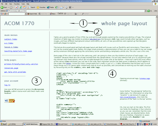
Every page of this site is laid out in the same way, and I am going to show you the skeleton structure of each page. I say "skeleton" because there are a lot of tags omitted from the sample below. You will also need to look at it in conjunction with the relevant style sheet entries, which are included beneath the screen shot at the bottom - these will clarify the exact effect of the various class attributes you can see in the code. Each important section has been given a reference, which applies to the screen shot below. I know this looks complicated, but it really is just a 3 × 2 table. Remember that the best way to work these things out is to ignore table content and style as much as possible, and concentrate on working out the table structure by focussing only on the <table>, <tr> and <td> tags.
<?xml version="1.0" encoding="UTF-8"?>
<!DOCtype... ">
<html... >
<head>
<title>ACOM Web Design
    Site: whole page layout</title>
<link rel="stylesheet"... />
</head>
|
Opening structural tags. (<meta> tags omitted.) |
<body>
<a href="#startcontent" accesskey="2">
<img src="skiplink.gif"
    alt="Click to skip over navigation" />
</a>
<a name="top"></a>
|
Some further "housekeeping" before the table starts. For information on what this "skiplink" is see lecture 6's section on non-visual browsers. Also note the presence of the "back to the top" anchor. |
<table summary="">
<tr>
<td class="leftcolumn">
<h1>Web Design</h1>
</td>
<td class="separator"> </td>
<td class="leftcolumn"> </td>
<td>
<h1>whole page layout</h1>
</td>
</tr>
|
OK, now we start on the table. The first row holds the headings in four columns as you can see: remember that the style sheet classes are detailed below. Note the use of characters to space out empty cells. Number 1 on diagram. |
<tr><td colspan="4">
<hr /<
</td></tr>
|
The second table row is just a separator. Note the use of colspan. Number 2 on diagram. |
<tr>
<td class="leftcolumn" valign="top">
<h4>main menus</h4>
[...links omitted...]
<h4>help pages</h4>
[...]
<h4>your account</h4>
[...]
</td>
|
The third row is the one that really does the work. This is the first column and it contains the link menus to the left of each screen. Note use of valign="top" attribute: browser support for the vertical-align property is still dubious so I still use this attribute. Number 3 on diagram. |
<td class="separator"> </td>
|
Another separator - to produce the vertical rule to the left of the text (see the style sheet entry below) and then... |
<td colspan="2">
<a name="startcontent"></a>
<p>Tables are a good example of
    how HTML has evolved....

[...all content omitted...]

<p>
<a href="#top">Back to the top</a>
</p>
<p>
<a href="lesson4.html">Back to the
     menu for lesson 4</a>
</p>
</td>
|
This is the table cell which does the most work! It contains all the content down to the two links at the end; the same is true on every page. (Note also the "startcontent" anchor - compare this with the "skiplink" above and remember this for the discussion of non-visual browsers. Even more importantly, note the colspan attribute. This row has only three columns compared to the four of the first row. Number 4 on diagram. |
</tr></table>

<p class="notes">Material on this site... </p>

</body>
</html>
|
And that's it. The "grand" table is closed; the copyright notice is the only substantial text outside it and once that's rendered the file is at an end. |
You can't fully understand how this works without looking at the style sheet entries for the relevant tags, so here they are:
table   { width: 100%;
          border-style: none;
          padding: 15px; }

td.leftcolumn
        { width: 33%;
          margin-left: 5px;  }

td.separator
        { width: 1%;
          background-image: url(separator.jpg);
          background-repeat: repeat-y; }
The background image stuff in td.separator won't mean anything to you yet but at least you can see here the use of various widths and some margins and padding.
Although it seems complicated, using tables to lay out a whole page like this is a design technique which imparts a sophistication to your site, particularly if you can use it on every page. I hope this page hasn't scared you off too much; do keep trying to work out what I'm doing in the code, concentrating, if you can, only on the table structure tags (e.g. <table>, <tr> and <td>). I strongly recommend at this stage that you at least try to lay out a page using a table, converting one of your existing simple pages if need be. You only learn web design by practising it; and you now know enough about tables to do some quite sophisticated things with them.
Once you get the hang of tables there are lots of things you can do with them. You may have noticed in the previous section that I used a very thin table cell to get the "vertical rule" to the left of the main text. I used an image to do so but you can do the same with styles (ad hoc or in the sheet). A bonus with either technique is that the rule is always the same height as the text:
WORLD CUP QUOTES: "You'd think if any team could build a decent defensive wall, it'd be China" (Terry Venables) "I notice that Mexico have players called Gabriel, Garcia and Marquez, do you think that means they play in a literary style?" (ITV commentator) "The conditions suited them more than us" (Mark Kinsella after Ireland's rain-drenched win over Saudi Arabia) |
<table summary="">
<tr>
<td style="width: 15%"> </TD>
<td style="width: 2%; background-color: #0000FF">
</td>
<td style="width: 8%"> </td>
<td style="width: 75%">
<p><b>WORLD CUP QUOTES.... (etc.)
...</td>
</tr>
</table>
It's a short step from there to using tables for whole page layout. The principle remains the same - only the scale differs. You might already have looked at the "Mondrian" page. Note that it should retain its structure if and when you resize the browser window or the text. Have a look at the source code to see how it's done. If you can master something like that, the sky's the limit!
Once images enter the picture you can start slotting them into your table cells pretty much wherever you like: although you do need to take account of the size of the image in pixels. See the section in lecture 5 on height and width attributes for more information. (The fact these attributes also appear in tables should suggest the close relationship here.) You also make use of tables in the sophisticated technique known as multipart images; that's a more advanced technique, however, and I wouldn't look at it until you've learnt more about images.
Something I've thought about is whether there's any reason not to design a whole web page based on the idea of horizontal scrolling. Yes, it's seen as bad form - because it's very inconvenient - to have to manipulate two scroll bars in order to see a whole page. But why couldn't pages be based on a sort of "frieze" model? That is, it's the vertical scroll bar which is redundant, because the content never extends down far enough to go beyond the bottom of the screen - rather, it extends off to the right instead. It would have to be a fairly image-heavy site, as you wouldn't be able to uncover text line-by-line, but I'm sure there are occasions when this would work. I've only ever seen one site that comes close to pulling this off: see http://www.showstudio.com. The one disadvantage of this method is that you can't use anchor links to jump across (rather than down) the page.
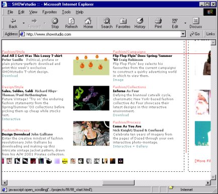
http://www.showstudio.com - note scroll bars
Having said that though we're pretty much done with tables; from this point on it becomes a matter of your experimenting with their possibilities, finding out what you can and can't get away with. Essentially, if you can divide your page, or parts of it, into divisions marked only by horizontal and vertical lines, you can use tables. Doesn't matter how complex the divisions: width, colspan, rowspan and the nesting of tables can usually take care of it. As long as you don't try putting in diagonal, curved or irregular lines, you can use tables. They're powerful, important, and worth spending the time mastering. Just remember to close all your tags!
End of lesson 4.
Material on this site is © Drew Whitworth and ACOM, 2002. Permission will usually be given to reproduce material from this site for non-commercial purposes, if credit is given. For enquiries, e-mail Drew at andrew [dot] whitworth [at] manchester [dot] ac [dot] uk.