Web Design
whole page layout
main menus
help pages
printer-friendly/text-only version
Tables are a good example of how HTML has evolved through people exploring the creative possibilities of tags. The original intention of table tags was merely to produce tabulated text. But because <td> tags could include other tag types, such as images, and have different background colours and widths, all sorts of new possibilities were opened up that designers eventually began to explore.
The lecture discussed good and bad web page layout and dealt with issues such as flexibility and consistency. These topics will not be covered again here. Rather, this page simply presents a demonstration of how you can use a table to lay out a page and by extension (through applying the consistency axiom and building a template) a whole site. The site I use is this one.
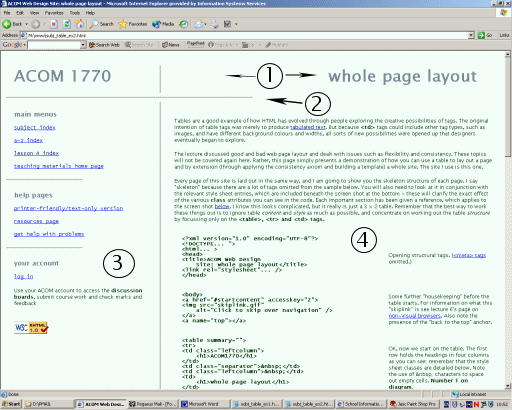
Every page of this site is laid out in the same way, and I am going to show you the skeleton structure of each page. I say "skeleton" because there are a lot of tags omitted from the sample below. You will also need to look at it in conjunction with the relevant style sheet entries, which are included beneath the screen shot at the bottom - these will clarify the exact effect of the various class attributes you can see in the code. Each important section has been given a reference, which applies to the screen shot below. I know this looks complicated, but it really is just a 3 × 2 table. Remember that the best way to work these things out is to ignore table content and style as much as possible, and concentrate on working out the table structure by focussing only on the <table>, <tr> and <td> tags.
<?xml version="1.0" encoding="UTF-8"?>
<!DOCtype... ">
<html... >
<head>
<title>ACOM Web Design
    Site: whole page layout</title>
<link rel="stylesheet"... />
</head>
|
Opening structural tags. (<meta> tags omitted.) |
<body>
<a href="#startcontent" accesskey="2">
<img src="skiplink.gif"
    alt="Click to skip over navigation" />
</a>
<a name="top"></a>
|
Some further "housekeeping" before the table starts. For information on what this "skiplink" is see lecture 6's page on non-visual browsers. Also note the presence of the "back to the top" anchor. |
<table summary="">
<tr>
<td class="leftcolumn">
<h1>Web Design</h1>
</td>
<td class="separator"> </td>
<td class="leftcolumn"> </td>
<td>
<h1>whole page layout</h1>
</td>
</tr>
|
OK, now we start on the table. The first row holds the headings in four columns as you can see: remember that the style sheet classes are detailed below. Note the use of characters to space out empty cells. Number 1 on diagram. |
<tr><td colspan="4">
<hr /<
</td></tr>
|
The second table row is just a separator. Note the use of colspan. Number 2 on diagram. |
<tr>
<td class="leftcolumn" valign="top">
<h4>main menus</h4>
[...links omitted...]
<h4>help pages</h4>
[...]
<h4>your account</h4>
[...]
</td>
|
The third row is the one that really does the work. This is the first column and it contains the link menus to the left of each screen. Note use of valign="top" attribute: browser support for the vertical-align property is still dubious so I still use this attribute. Number 3 on diagram. |
<td class="separator"> </td>
|
Another separator - to produce the vertical rule to the left of the text (see the style sheet entry below) and then... |
<td colspan="2">
<a name="startcontent"></a>
<p>Tables are a good example of
    how HTML has evolved....

[...all content omitted...]

<p>
<a href="#top">Back to the top</a>
</p>
<p>
<a href="lesson4.html">Back to the
     menu for lesson 4</a>
</p>
</td>
|
This is the table cell which does the most work! It contains all the content down to the two links at the end; the same is true on every page. (Note also the "startcontent" anchor - compare this with the "skiplink" above and remember this for the discussion of non-visual browsers. Even more importantly, note the colspan attribute. This row has only three columns compared to the four of the first row. Number 4 on diagram. |
</tr></table>

<p class="notes">Material on this site... </p>

</body>
</html>
|
And that's it. The "grand" table is closed; the copyright notice is the only substantial text outside it and once that's rendered the file is at an end. |

You can't fully understand how this works without looking at the style sheet entries for the relevant tags, so here they are:
table   { width: 100%;
          border-style: none;
          padding: 15px; }

td.leftcolumn
        { width: 33%;
          margin-left: 5px;  }

td.separator
        { width: 1%;
          background-image: url(separator.jpg);
          background-repeat: repeat-y; }
The background image stuff in td.separator won't mean anything to you yet but at least you can see here the use of various widths and some margins and padding.
Although it seems complicated, using tables to lay out a whole page like this is a design technique which imparts a sophistication to your site, particularly if you can use it on every page. I hope this page hasn't scared you off too much; do keep trying to work out what I'm doing in the code, concentrating, if you can, only on the table structure tags (e.g. <table>, <tr> and <td>). I strongly recommend at this stage that you at least try to lay out a page using a table, converting one of your existing simple pages if need be. You only learn web design by practising it; and you now know enough about tables to do some quite sophisticated things with them.
