
Web Design |
fonts and text styles |
|||||
main menushelp pagesprinter-friendly/text-only version
|
what is a font?You can create perfectly attractive web pages without concern for text style. Remember that in the absence of any other information from the style sheet, the browser will look to its own defaults for information about how to render a page, and browser defaults can be perfectly decent-looking. However, you may want a little more control over the look of your site than this. The page on text handling discussed how you can - to an extent - control the size of your text, and we've also considered colour elsewhere. But what about the typeface, or font? On this site, I've overriden the browser default and defined almost all the text (these paragraphs and all the headings) in a font called Lucida Sans Unicode (all fonts have unique names, given to them by their original designer). The exceptions are the links to the left of each page which are in a different font called Lucida Console. Some more font names are given below. (It is just possible that you are seeing a font other than Lucida Sans Unicode: for why this might be, see the section on the font list below.) This, however, is another common font known as Arial. And this is yet another one called Garamond, which is not seen quite so often, but which I think is rather underused as it's quite attractive. All three paragraphs look rather different, particularly the last. Garamond, unlike Arial and Lucida Sans Unicode, is a serif rather than sans-serif font. Serifs are the little lines at the extremities of letters. Fonts without them are called "sans-serif" as sans is the French word for "without". The development of typefaces might seem a very esoteric field of study to most people, but it's quite an art. A good typeface should:
Fortunately, most of these concerns have already been taken care of for you through the long history of typeface design, whether for print or computing. But this does not mean that all fonts are suitable for use on web pages. For instance, this is a font called Impact which is awful, really. It's blocky, and very difficult to read in large doses. An entire site done in this font would be horrible! I mean, ultimately it's up to you, but what do you think of this paragraph? Here are some more fonts:
the font listOver the history of typographic design, literally thousands of fonts have been designed. Fonts are not just random design elements but can give readers a very specific sense of tone and even of time. Compare the following (the reason why this is an image, instead of actual text, will be explained shortly): 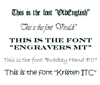 You would not expect to see the last one, whether as a heading or the main text, on a site discussing someone's PhD work in radio astronomy. Nor the first one, come to that. Fonts are therefore important when thinking about the overall tone or feel of a site, particularly if they are prominent (i.e., used in headings). However, it is important that you realise not all fonts will be loaded up into browsers. The reason I rendered the fonts above as an image was that it is very unlikely your browser actually understands them all. Just like when it renders anything else a browser has to know what a font looks like: in other words, what each letter's particular shape and size is meant to be. Although most browsers will understand anything up to forty or fifty fonts this is still a lot less than the number of fonts that exist. If you want to see which fonts your own browser understands, you can have a look - you can also use this to change your default font and other related options, if you didn't already know how to:
Your browser may well understand all five of the fonts given above but then again it may not. (Try others: "Westminster" is pretty obscure, so's "Serpentine".) And this is the point. You cannot depend on any given font being understood by a browser: even some of the more common ones. Whenever you define a font, therefore, you should provide a list of font styles. This list will start with the font style you would most like to see there, but you then follow this primary choice with one of the common ones that resembles it (the fonts given in the table above should work on almost all browsers). End the list with one of the generic names: serif, sans-serif or monospace depending on which font family you want to display. The upshot of all this is that the following text should be created by the tags which follow it: This should be the uncommon font, Franklin Gothic Medium, but you might see Arial And this one should be Sylfaen, but you might see Times New Roman
<p style=" font-family: Franklin Gothic Medium, Arial, sans-serif"> This is another one of those basic techniques which seem, for novices, like an unnecessary extra complication. Oh, that's Drew going off on one of his purist rants again, they think. But I've found this great, funky fun font in which to write my site targetted at 18-21 year olds going off to large it in Eyebeefer so what do I care? Well, funky and fun your font may be but if it ain't loaded up into the browser of the 18-21 year old who's viewing it, and you specify no alternative in the list, you may well get your site viewed in Times New Roman which is neither particularly funky nor fun. It's certainly not appopriate for a site on that subject. Remember that with web design you just don't know exactly what platform (browser set-up) your page will be viewed on. The key is flexibility. Sure, there will be an "optimum" appearance for your page - your personal ideal, if you like. That's all well and good. But you always need to think about how your page will appear if it's being viewed by someone whose screen size, browser type, available fonts and so on don't match your ideal. Defining a font list is an important aspect of all this. defining text stylesNow you have had an introduction to this aspect of web design, how do you actually go about it? Remember that as I've said, if you really don't care how your text appears, you can just start coding tags and leave it entirely up to the browser to decide on the style of these tags. But at the very least you should probably define a colour for your text, and while you're doing that you might as well decide on a font family (e.g. sans-serif or serif (don't use monospace for an entire page or site)). The place to do this, as ever, is in the style sheet. Probably the best place to define your "base" text style is in the definition of the <p> tag. This site defines its <p> tags (and its <li> tags as well) as follows (I've removed a couple of properties for clarity, as we haven't come across any need for them yet):
p, li { font-family: "Lucida Sans Unicode", Verdana, Arial, sans-serif; These are, in the end, the three characteristics of web page text: its colour (here a very dark green), its typeface (Lucida Sans Unicode, as stated - but note the list, just in case) and a (relative) size. Remember that you can leave any or all of these up to the browser to define. However, the more information you supply here, the more you can be sure that your page will be seen as you intended it to be, or at least, at the closest possible approximation. The best way to learn about font definition is to set up an entry for your <p> in your style sheet and then experiment with various values. playing around with these definitions will give you good practice in both text handling and style sheets. | |||||
Material on this site is © Drew Whitworth, 2005 Permission will usually be given to reproduce material from this site for non-commercial purposes, if credit is given. For enquiries, e-mail Drew at andrew [dot] whitworth [at] manchester [dot] ac [dot] uk.