This will probably make more sense when I demonstrate it in the lecture. But what I want to do here is show you the order in which the browser checks for style information. This is known as the cascade. As water cascades down until it finds a stable position, so a browser will "cascade" through a series of steps to try and establish where its style information is to come from (and it does this for every single tag):
The browser applies its own, "default" style sheet |
If the user has altered the browser's default settings, these are applied |
If there is a style sheet, these override default settings |
If styles are defined in the document header then these override the style sheet on that page |
Finally, if any style attributes are defined within tags, then these are always applied. |
Incidentally, this is why it is very rare to see anyone defining simple tags like <b> or <i> within style sheets, although you could if you wanted to (you might want to make all italicised text red as well, for example: like I did just then).
There's another way in which styles "cascade", however. Certain tags can "inherit" properties off other tags. I don't want to go into too much detail here - as it may confuse further those who are already struggling a bit - but more detail is on the style sheet reference page. But basically, if tag X is nested inside tag Y, the likelihood is that properties defined in Y will also apply to X. For example, the background colour of a page is usually defined in the style sheet definition of the <body> tag. Normally, paragraphs share the general background colour of the page. But you don't need to define the background colour in the definition of the <p> tag or any other tag if you don't want it to change, because all these other tags are nested within the <body> tag and therefore inherit its background colour. More is said about this on the style sheet reference page and also in the sections about block-level and inline tags (2.5 and 2.6).
I know this is difficult stuff, particularly as we've yet to look in any detail at most tags. Often it is not necessary to worry about it. Sometimes, however, you cannot work out why a bit of text looks the way it does. Some style information which you thought you'd provided has not appeared. Your tags are not rendering as you expected. The aim of this section is to point out that every bit of style information comes from somewhere, whether down one cascade or the other. If something's not looking as you expect, are you sure you're not looking at a browser default? Or the style of a "superior" tag in the inheritance hierarchy?
That's it for this page. Do try out the practical examples in the lecture, as I've said, and then go on to the remainder of this lesson's teaching materials which give you some more definite examples of the use of styles. They may seem difficult, but they're not once you get the hang of them, and in any case comprise an essential part of learning to design for the web.
2.2 RGB codes (colours)
Section 2.1, and the lecture, illustrated the idea of applying styles in two main ways: through applying typefaces or fonts, and second by applying colours to the text or the background of the screen. I said that I would not go into detail in the lecture about how fonts or colours worked; that is the job of these teaching materials. Fonts have a section to themselves (2.4), although you should first read the section which covers some more general information about the handling of text (2.3). Colours are dealt with here.
The proper way to define colours on a web page is by defining what is known as an RGB code. One of the online reference pages contains a "Dulux"-style colour chart, and if you look at it you'll see these codes are all six characters long and preceded by a hashmark character (#). This character can usually be found near the Enter key, to the right side of the keyboard. (Some browsers allow you to get away with missing off the #. However making this mistake can stop your page working in other browsers so you should always remember to include it.) The characters in the codes are all digits (0-9), or the letters a-f. What does this all mean?
Codes are actually a combination of three two-character codes, where:
The first two define the amount of red in the colour: |
... the middle two define the amount of green: |
... and the final two the amount of blue. |
| |
|
|
This is why these codes are known as red-green-blue or RGB codes.
Each part of the code takes a value of between 0 and 255. 0 is the complete absence of the colour and 255 complete saturation. Because we are talking about light here, and not paint, the colours are additive rather than subtractive. Mixing all the colours gives you white, not black (or muddy brown) as with paint.
However, there is another complication. These are not decimal values: decimal being the base 10 counting system we use everyday. Instead they are hexadecimal (or "hex"). This counts in base 16. When you add 1 to 9 in the decimal system, the units column fills up and we overspill to the tens, giving us 10. But the units column in hex can take more than 9. We use the letters a-f to represent the "digits" 10-15. Adding 1 to f now fills up the column, so we get 10 in hex; which equals 16 in base 10. Here are some other equivalents:
Decimal | Hex | Decimal | Hex |
12 | c | 100 | 64 |
20 | 14 | 153 | 99 |
31 | 1f | 154 | A0 |
50 | 32 | 200 | c8 |
75 | 4b | 255 | ff |
Colours are recorded in this way because 255 is the largest number that can be stored in one byte (a unit of computer memory which corresponds to eight bits: a bit is the digit 0 or 1). 255 is 2 to the power 8, minus 1, or 11111111 in the binary system.
All this may seem rather confusing and to tell the truth it is not something you should worry too much about. It is often sufficient just to learn the codes of a few important colours, and tweak them from there. Have a look at the colour chart if you haven't already done so, and see how the colours are put together, particularly simpler codes like yellow (#ffff00) or the various shades of gray (if all three codes are the same value, e.g. #c0c0c0, the colour comes out as a monochrome shade).
All the colours on the colour chart can also be defined by the name shown alongside them. So the RGB code "#ffff00" and the name "yellow" are identical. When you see a name like "lightseagreen" do note that you need to type it just like that, with no spaces. There are only about 140 defined names, though, whereas there are over 16,777,000 possible RGB colours! (The exact number is 256³, or 256 × 256 × 256.)
Let's just recap how to apply all this knowledge. If you remember, in the lecture we defined the <p> tags on the page Blue.html to appear in blue text instead of the black of the browser default. The code for that particular blue was #00008b (remember the order: red - green - blue). The style sheet property which defines the colour of text is color (remember to use the American spelling). Therefore the style sheet definition we created in cool.css - the style sheet used for the blue page - looked like this (the text size and font family have been removed for clarity):
p { color: #00008b; }
And the background colour which we defined for the <body> tag was a pale beige. And that's what you do - pick your colours, and define them wherever necessary: usually the style sheet, but sometimes style attributes. Or, you rely on the browser default. It's the same with any aspect of style.
It is, of course, important that you define a readable combination of colours. Please think through and test out the colour combinations you use. Blue background, dark green text, orange links; these might all sound fine on their own, but are terrible when put together. Bright backgrounds are, generally, a bad idea; black backgrounds and white or yellow text tend to appeal to Slipknot fans but to be honest aren't that great either. Be subtle, rather than bold. If you want bright colours on your page, do it with images. The best thing to aim for is a good contrast between the colour of text and the background colour. And also be aware that there are colour-blind people out there (some 10% of all men - and that's not a sexist comment, colour blindness is very rare in women) who struggle to distinguish red from green. Having green main text and red links is not a helpful combination for these people and once again, means your site will be difficult or impossible to use for a substantial number of visitors.
2.2.1 appendix: web-safe colours
Some very old monitors cannot render all 16.78 million colours; even newer monitors may, for some reason, have problems (usually this is due to the settings in the Control Panel of Windows rather than the monitor, but this is a moot point). To respond to this limitation, there is a subset of the complete range of colours known as the web pallette. This is a set of 216 colours which are made up only of combinations of the following hexadecimal digits:
00 33 66 99 cc ff
Therefore, #cc6699 is a web-safe colour (it's a kind of dusty pink), so is #00ff33 (a bright green).
If an older monitor tries to view a non-web-safe colour one of two things may happen. Either the monitor will try and "dither" the colour; that is, approximate it by "speckling" together two colours it can handle. Often this looks OK. Sometimes it looks awful. Or, the computer might simply shift the specified colour to the nearest web-safe colour. Again this is usually not a problem, but it can occasionally lead to drastic changes: and if text and background are both non-web-safe, you might find them shifting to a hard-to-read combination, where on newer monitors, it was perfectly clear.
It used to be the case that designers of a web page were recommended only to use web-safe colours. You may also notice that if you use Dreamweaver, the colour palette only offers web-safe colours in the first instance. However the great majority of computers are now set up to show the complete pallette, which is why I've mentioned this only as an appendix. However, it is worth, as part of the development process for your site, having a look at how it appears when you reset your monitor to show only 256 colours. (Go to the Windows Control Panel and choose "Display" to do this.) If it looks awful, find a close web-safe colour (particularly for page backgrounds) and you will be fine.
2.3 how text is handled
Before we have a proper look at how to apply tags and styles to format your text on screen, let's review two things we looked at in the lecture. Both are to do with web design's inherent flexibility.
Web design is not like print design. With print, you can exactly specify some things like the size of the page and the text, margins, where images go, and so on. The printer then creates a template from which all the hard copies are created, and which should therefore be identical. Print is therefore inflexible: but in some ways this actually makes designing for print easier than designing for the web, especially if using a computer (programs like Microsoft Word take care of most of this stuff for you).
This kind of rigor is not built into HTML. Remember that HTML defines the structure of a page, but not its style or layout. If these latter things are not defined in style sheets, they are left to the browser to sort out, and that means they are taken out of the designer's hands. In fact some things are entirely beyond the control of the designer, like the size of the reader's monitor, or whether the browser window is maximised or not. As a designer you have to know how browsers handle the issue of text size, and how they deal with breaks and spaces (and why this is done). The lecture noted some points but we'll expand on them slightly here.
2.3.1 text size
We will talk on other pages about the colour and typeface of web page text, but here let us look at the issue of size. This can be a tricky problem for students of web design as sometimes browsers seem not to define the size of text at all. The way to understand this is to look for the first time at a distinction which is important in web design: that of relative versus absolute sizes.
One of the style sheets which we looked at in the lecture (a version of which you should have saved on your M: drive, so you can play around with it after reading these pages and test out the things you've learnt) included the following:
p { font-family: Garamond, Times, serif;
    color: #000000;
    text-size: 130% }
Concentrate only on that last property. It's obviously describing the size of the text within <p> tags, but what does 130% mean? 130% of what? And you can see on the same sheet that <h1> tags had the same property, only now the size was 200%. Again: of what? Of the same thing?
Yes, both values refer to the same thing. Browsers have a certain default text size built into them, like they have defaults for everything else. What the style sheet definition above does with size is say, in effect, "Dear browser, please render all text within <p> tags in the font Garamond, the colour dark blue, and a size equal to what you've got defined as your default text size." (And with <h1> tags it's "twice as large as the default".) You're therefore defining a size relative to something else. Any time you see a size defined as a percentage (and it will come up on other occasions later), that's a relative size.
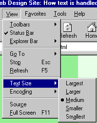
But - sorry - it's not quite as simple as that. For a start, the browser default may be changed by the user. If you weren't aware of how to do this, try it now. The method varies depending on the browser you are using. In IE, go through the View menu at the top of the screen, then Text Size, as shown below. Choose one of the options and see what happens.
On Mozilla you can do it on the keyboard, by pressing the Ctrl key simultaneously with either the + or - key, to decrease or increase the text size respectively. Unlike IE, Mozilla has no upper or lower limit here. Finally, Opera has a "Zoom" box, to the bottom right of the menus at the top of the screen, which can be used to render the web page at any size, compared to the default (100%). This is what I meant when I said that sometimes text size is a very vague phenomenon.
 |
OK, I've tried that on this site and I can resize the text, but on a lot of commercial sites I visit it either doesn't work at all or only works on small parts of the page, like headings.
Yup. That's because the designers of those pages have not used relative sizes. Instead they've defined the text size in what are called absolute sizes. These are sizes defined not as a percentage of another value (e.g. the browser default), but as a specific and constant number of units. (There are a great many of these units: see the style sheet reference page for details.) However, when you use absolute values, browsers' ability to resize the text is removed. Read on for why this is not a good thing. |
Absolute size values have their uses, but their overuse for defining text sizes is bad web design. Since the WWW took off is that a lot of people with a training in print graphic design have moved into work on the WWW. Many are excellent designers, but are still hidebound by their training in print design, where the proportions of things on the page, and how text size relates to headings and images and so on, are important and fixable.
But by using absolute text sizes you are deliberately breaking one of the key principles of the WWW; flexibility. This is a particular crime with very small text (8pt or less). Not everyone has 20/20 vision! KLM's site is one that has removed visitors' ability to resize the text: http://www.klm.com/uk_en/ (there are many others, though). OK, there's good contrast between the text and the background, but it's very small. And while I know that most people following this course are fresh-faced, bright-eyed 20-year-olds or thereabouts, close-range eyesight does deteriorate with age (hence reading glasses and all that). It is no harder to create small text but keep it relative than it is to make it absolute; and it is better design to do so.
(NB: The browser Opera will always let you resize the text even on pages with absolute links; it lets you resize images as well. You could go to the KLM site in Opera and try it - unfortunately, however, the page does not work in Opera. Not bad going for the national airline of one of Europe's more prosperous countries. I will laugh at some other major, commercial design disasters in lesson 6.)
One more thing needs saying about relative sizes. I've been referring to them as being relative to the browser default. But note that if you have some text within a tag that has, say, the style sheet property text-size: 80%; and that tag is nested within another tag which also has the property text-size: 80%;, then the text will actually be rendered at 80% × 80% × the browser default, or 64% of the default.
2.3.2 breaks and spaces
Another thing we saw in the lecture was that when you resized the browser window (as long as you did not make it very narrow), all the text of the page was still visible. This is because it is the browser's job to decide where to break the lines of text, not the designer's. The breaks between the lines can theoretically appear anywhere, and will change depending on the size of the window and the size of the text. Therefore, line breaks and spaces in the HTML file are ignored. Anywhere you actually do want a line break - and the most obvious need for this is to break text up into paragraphs - you must use tags.
The following are ignored by web browsers when they appear in HTML:
- line breaks or empty lines
- multiple spaces: more than one space in succession is treated as only one space
This can confuse people who aren't expecting it. If the code looks like the following:
   I'm feeling rather  s p  a
                                c
                                    e
                                       d   out today...
... the browser will display:
I'm feeling rather s p a c e d out today...
For a sort-of way round this, have a look at section 2.10 below. But it's better just not to think about having to design your pages with gaps like this in the first place; this is why you very rarely see web pages with the first line of paragraphs indented, like this one - as, frankly, it's rather a pain, despite being a common layout technique with print.
2.4 fonts
2.4.1 what is a font?
You can create perfectly attractive web pages without concern for text style. Remember that in the absence of any other information from the style sheet, the browser will look to its own defaults for information about how to render a page, and browser defaults can be perfectly decent-looking.
However, you may want a little more control over the look of your site than this. Section 2.3 discussed how you can - to an extent - control the size of your text, and we've also considered colour above. But what about the typeface, or font?
On this site, I've overriden the browser default and defined almost all the text (these paragraphs and all the headings) in a font called Lucida Sans Unicode (all fonts have unique names, given to them by their original designer). The exceptions are the links to the left of each page which are in a different font called Lucida Console. Some more font names are given below. (It is just possible that you are seeing a font other than Lucida Sans Unicode: for why this might be, see the section on the font list below.)
This, however, is another common font known as Arial.
And this is yet another one called Garamond, which is not seen quite so often, but which I think is rather underused as it's quite attractive.
All three paragraphs look rather different, particularly the last. Garamond, unlike Arial and Lucida Sans Unicode, is a serif rather than sans-serif font. Serifs are the little lines at the extremities of letters. Fonts without them are called "sans-serif" as sans is the French word for "without".
The development of typefaces might seem a very esoteric field of study to most people, but it's quite an art. A good typeface should:
- have clear, consistently-proportioned letters
- lead the eye easily from letter to letter and word to word
- have smooth edges, rather than jagged, when looked at on screen (and/or on paper, if the text is designed to be read in that medium)
- be appropriate for the general style of the publication (serif fonts have a more "formal" feel: compare the typefaces of, say, The Times and Sun newspapers).
Fortunately, most of these concerns have already been taken care of for you through the long history of typeface design, whether for print or computing. But this does not mean that all fonts are suitable for use on web pages.
For instance, this is a font called Impact which is awful, really. It's blocky, and very difficult to read in large doses. An entire site done in this font would be horrible! I mean, ultimately it's up to you, but what do you think of this paragraph?
Here are some more fonts:
|
Sans-serif fonts
Arial
Century Gothic
Comic Sans MS
Tahoma
Verdana
|
Serif fonts
Bookman Old Style
Garamond
Georgia
Times New Roman
|
These are monospace fonts; letters are all the same width. These are usually used with the <pre> tag (see 2.9) although as I've already noted I've used one for the links on the left of these pages.
Courier New
Lucida Console
|
2.4.2 the font list
Over the history of typographic design, literally thousands of fonts have been designed. Fonts are not just random design elements but can give readers a very specific sense of tone and even of time. Compare the following (the reason why this is an image, instead of actual text, will be explained shortly):
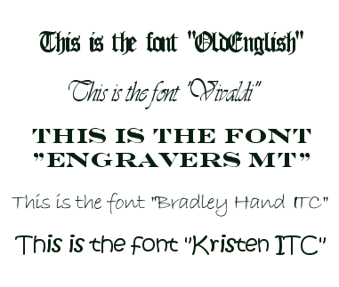
You would not expect to see the last one, whether as a heading or the main text, on a site discussing someone's PhD work in radio astronomy. Nor the first one, come to that. Fonts are therefore important when thinking about the overall tone or feel of a site, particularly if they are prominent (i.e., used in headings).
However, it is important that you realise not all fonts will be loaded up into browsers. The reason I rendered the fonts above as an image was that it is very unlikely your browser actually understands them all. Just like when it renders anything else a browser has to know what a font looks like: in other words, what each letter's particular shape and size is meant to be. Although most browsers will understand anything up to forty or fifty fonts this is still a lot less than the number of fonts that exist. If you want to see which fonts your own browser understands, you can have a look - you can also use this to change your default font and other related options, if you didn't already know how to:
- In IE, go to Tools - Internet Options - Font (unfortunately this will only work on a home PC - this is another one of those things ISS have disabled on the university network).
- In Opera, press Alt+P, go to the Fonts and Colours option, and click on a "Choose" button
- In Mozilla, go to Tools - Options - Fonts and Colours.
Your browser may well understand all five of the fonts given above but then again it may not. (Try others: "Westminster" is pretty obscure, so's "Serpentine".) And this is the point. You cannot depend on any given font being understood by a browser: even some of the more common ones.
Whenever you define a font, therefore, you should provide a list of font styles. This list will start with the font style you would most like to see there, but you then follow this primary choice with one of the common ones that resembles it (the fonts given in the table above should work on almost all browsers). End the list with one of the generic names: serif, sans-serif or monospace depending on which font family you want to display.
The upshot of all this is that the following text should be created by the tags which follow it:
This should be the uncommon font, Franklin Gothic Medium, but you might see Arial
And this one should be Sylfaen, but you might see Times New Roman
<p style=" font-family: Franklin Gothic Medium, Arial, sans-serif">
This should be the uncommon font, <i>Franklin
Gothic Medium</I>, but you might see <i>Arial</i>
</p>
<p style=" font-family: Sylfaen, Times New Roman, serif">
And this one should be <i>Sylfaen</i>, but you might see
<i>Times New Roman</i>
</p>
This is another one of those basic techniques which seem, for novices, like an unnecessary extra complication. Oh, that's Drew going off on one of his purist rants again, they think. But I've found this great, funky fun font in which to write my site targetted at 18-21 year olds going off to large it in Eyebeefer so what do I care? Well, funky and fun your font may be but if it ain't loaded up into the browser of the 18-21 year old who's viewing it, and you specify no alternative in the list, you may well get your site viewed in Times New Roman which is neither particularly funky nor fun. It's certainly not appopriate for a site on that subject.
Remember that with web design you just don't know exactly what platform (browser set-up) your page will be viewed on. The key is flexibility. Sure, there will be an "optimum" appearance for your page - your personal ideal, if you like. That's all well and good. But you always need to think about how your page will appear if it's being viewed by someone whose screen size, browser type, available fonts and so on don't match your ideal. Defining a font list is an important aspect of all this.
2.4.3 defining text styles
Now you have had an introduction to this aspect of web design, how do you actually go about it? Remember that as I've said, if you really don't care how your text appears, you can just start coding tags and leave it entirely up to the browser to decide on the style of these tags. But at the very least you should probably define a colour for your text, and while you're doing that you might as well decide on a font family (e.g. sans-serif or serif (don't use monospace for an entire page or site)). The place to do this, as ever, is in the style sheet.
Probably the best place to define your "base" text style is in the definition of the <p> tag. This site defines its <p> tags (and its <li> tags as well) as follows (I've removed a couple of properties for clarity, as we haven't come across any need for them yet):
p, li { font-family: "Lucida Sans Unicode", Verdana, Arial, sans-serif;
color: #003300;
font-size: 80%; }
These are, in the end, the three characteristics of web page text: its colour (here a very dark green), its typeface (Lucida Sans Unicode, as stated - but note the list, just in case) and a (relative) size. Remember that you can leave any or all of these up to the browser to define. However, the more information you supply here, the more you can be sure that your page will be seen as you intended it to be, or at least, at the closest possible approximation.
The best way to learn about font definition is to set up an entry for your <p> in your style sheet and then experiment with various values. playing around with these definitions will give you good practice in both text handling and style sheets.
2.5 block-level tags
Text formatting tags form the largest subset of HTML tags. They are themselves divided into two main groups: block-level tags (the subject of this section) and inline tags (2.6).
The distinction matters because you need to be careful which tags you can nest within others. Basically:
- you can nest any inline tag within another inline tag
- you can nest any inline tag within any block-level tag (indeed, you must always nest inline tags within block-level ones)
- but you should not nest a block-level tag within an inline tag
- and nor should you nest a block-level tag within another block-level tag. (The one exception is with the <div> tag, discussed at the end of this page.)
Block-level tags are so called because they apply formatting to an entire block of text. In other words, whatever is between block-level tags will be separated from other text by blank lines. (You can vary how wide these blank spaces are by defining style sheet properties known as margins and padding, but we won't come to them properly until lecture 4.) The most common block-level tags are <p> tags and headings, and I discuss both in detail below: some of the more obscure block-level tags are then listed at the end.
2.5.1 <p> tags
<p> stands for Paragraph. It is the most ubiquitous of the text formatting tags - possibly of all tags. If you view the source code of this page, or any of the pages on this or the sample site, you'll see that the tag starts most of the lines of text.
Correct text formatting uses <p> tags rather than expecting the line breaks and spaces in the plain text file to do the work. There are examples of this in the online version of this page although they are difficult to transfer to print. However you can clearly see the distinct paragraphs of text here, and each is enclosed by <p> tags.
2.5.2 headings
Basically, you should define all your separate blocks of text with <p> tags unless you want a bit of text to do a very specific job. The most obvious one of these jobs is to turn some text into a heading. Headings are the next most common block-level tags. Actually, rather than being a single tag they are more like a "family" of six tags. Heading tags are numbered from 1 to 6, with 1 being the largest, and 6 the smallest: indeed, heading styles 5 and 6 are often rendered smaller than normal text! Though the number looks like an attribute, it isn't: therefore, being part of the tag name, the number should also appear in the closing tag. Hence, the six tags are <h1>, <h2> and so on down to <h6>.
In the lecture we defined the <h1> tag in the style sheet. I hope by now you are getting the idea of how all this works. You can either stick with the browser's default style (as in that pop-up window with all six heading tags) or choose your own and redefine one or more of the properties.
Some other comments: don't confuse headings with the <head> tag, nor with page titles (1.9). Titles appear in the blue bar at the top of the screen. Headings appear in the main browser window, being part of the page body. You can put headings anywhere you like, as well - you are not restricted to having them only at the top of text, or used as headings for subsections (though that's how I've used them on this site). Note also that the search engine Google will give a higher ranking to words found in heading tags.
On the other hand if you think this a good reason to make all your text into headings, please don't! Proper headings give a page structure, and some of the more sophisticated browsers can make proper use of them: in Opera, for instance, you can type S to skip to the next heading, and W to skip back one. Used properly and well, therefore, headings can provide both visual and structural depth to your page.
2.5.3 other block-level tags
We've already seen one other block-level tag: <blockquote> (trivia fans might like to note that this is the longest single tag name). That defaulted to rendering the text with a wider left-hand margin. Use it for, well, what it says really - rendering long quoted passages from other authors. A similar block-level tag is <address> (try it to see what it does). As ever, you can override the browser default style with your own.
 | WARNING!: please don't do what a lot of students on this course do and start using <blockquote> all over the place, simply because it was used as an example in the lecture. It has a specific job - formatting quotations. My use of it in the lecture was not intended to demonstrate some kind of emotional need to this tag which can be fed by its repeated inclusion in your course work... |
The last block-level tag is <div>. <div> doesn't actually have any intrinsic formatting of its own. But it's quite a useful tag if you want something to happen on your page that applies not only to text but to images and tables as well. For example, I have styled <div> tags on this site as follows:
div { text-align: center; }
As I said at the top of this page, <div> tags are the exception to the rule that you should not nest block-level tags within other block-level tags. Here are two pieces of text enclosed within <p> tags, but the second is nested within a <div> tag as well:
A random sentence.
What's actually happened here is that the <p> tag has inherited a property (that of being centre-aligned) from the <div> tag. This probably seems a bit obscure, and is, really: but it's a useful thing to remember.
Technically the table formatting tags are block-level tags too but I am not going to introduce them at this stage. They have an entire lecture devoted to them: lecture 4.
2.6 inline tags
The previous section noted, first, that block-level tags mostly caused blank spaces to open up between the blocks. It also noted that you should not normally nest block-level tags within one another.
Inline tags, on the other hand, are so called because they cause the text within them to continue to appear "in line" with the rest of the text as it appears in the source code. The first word of this paragraph is an example. <i> is an inline tag, and so is <b>. They can happily be nested within one another. Note also that inline tags are always nested within block-level tags.
| What about underlining? I use Word a lot and you always see the three together in the toolbar: bold, italic and underline.
True, but underlining is not recommended for use on web pages and you might like to think for a moment about why this is. (Hint: what does the word "underlining" now resemble?). For emphasis on web pages, stick with bold or italic. In fact the <u> tag has been officially deprecated, or withdrawn from the official XHTML 1.0 specification (one of the reference pages of this site lists other deprecated tags). |
Inline tags are fairly numerous and I've listed the rest below. Most are used only rarely, although we will come across them now and again, such as when we discuss non-visual browsers in lesson 6. Note however that the <a> tag is an inline tag - and the majority of lecture 3 is devoted to that one.
<acronym> |
Enclose acronyms or abbreviations in this tag, and use the attribute title to provide a full version of the acronym. Why? Well, try it with this one - hover your cursor over this acronym (unless you're using Netscape 4 or some other older browser where it won't work): BHAFC. Really why? Because Google can now index the full version of the acronym as well as the acronym itself, because non-visual browsers can "read out" your acronyms in full, because it makes your pages easier to use, and because it's an example of full text mark-up. Incidentally the code for that acronym looks like this:
<acronym title="Brighton and Hove Albion
Football Club!">BHAFC</acronym>
|
<big> |
Makes the text one font size larger; this text has been enclosed in <big> tags. |
<cite> |
Denotes a citation or reference. Usually rendered in italic. |
<code> |
Denotes a sample of computer code, rendered in a monospace font, like this. |
<em> | Denotes emphasised text. Usually rendered in italic. |
<small> |
Perhaps unsurprisingly, the opposite of <big> as with this text. |
<span> |
This is the inline equivalent of <div>. It has no inherent formatting of its own, but ad hoc style definitions can be applied to it either in a style sheet or via style attributes. If you want a one-off passage in another font, for example, you could do it with this code: <span style="font-family: Garamond, Times, serif; font-size: 100%;">another font</span>. <span> is also often seen with the class attribute so it makes a reappearance in lecture 4 when we talk about style sheet classes. |
<strong> |
Strongly emphasised text. Usually rendered in bold. |
<sub> |
Subscripted, or below-the-line text, like the 2 in CO2. |
<sup> |
Superscripted, or above-the-line text, like the 2 in E=mc2. You might notice on both these tags that the browser's line spacing is slightly thrown out, which is an argument against using them too liberally. |
Are all these really necessary? They do give you opportunities to apply several different styles to your web page text without worrying about style attributes or style sheet classes, but be careful here. Remember that HTML is more about defining structure than style, and that's why many of these tags exist (as well as the more obscure block-level ones like <address>). If you have a citation in your document, then enclosing it in <cite> tags means that text-processing software knows it's a citation. What style it appears in is irrelevant to this kind of structural mark-up. Those who go on to do the Web Design option on Electronic Publishing and XML will find out more about this sort of thing: others with some time to spare may like to look at ACOM's Electronic Publishing teaching materials.
2.7 <br /> and <hr /> tags
I am describing these these two tags on the same page because they are similar in one important way. Neither need a closing tag. This is not just some arbitrary decision. Most of the other tags we've seen so far are formatting passages of text (more accurately, they are formatting "strings" of characters). These two tags, however, place objects on the page. Hopefully the distinction here will be clearer by the end of this page. Do note that it won't break a page if you put a closing tag where none is required, but you might as well save yourself a bit of typing.
If you recall, the <link> tag was another tag which did not need a closing tag. The reasons why are a little different, and let's not split hairs about them. However, what's worth noticing is that the XHTML 1.0 standard obliges designers to place a slash / at the end of single tags (i.e., tags with no closing tag). It's the same with <br /> and <hr /> tags and I'll habitually refer to them with the / in place to remind you.
Saying that the <br /> tag places an "object" on the page might seem a little confusing, but that's what it is. It inserts a line break, like
this one. Or indeed, this
one. In the first instance, there was a <br /> before the word "this", in the second case it came after the "this".
The point is that you don't always want to break passages of text with a fully blank line, as happens with block-level tags like <p>. The <br /> tag is your answer here. However, don't use it indiscriminately: it's lousy design to use it in place of the <p> tag, as some people do. OK, it gives you line breaks, but because it doesn't enclose text, you're still basically defining one big paragraph and this places limitations on the ways browsers can either style or process your page. But <br /> definitely has its uses. It's quite good for applying padding at the top and bottom of pages or table cells, and you'll see a few of them on every page of this site. You can also use them to provide "spoiler space", which means, ensuring that some information which some people might not wish to read is hidden out of sight below the bottom of the visible page when loaded. You know, things like who Keyser Soze is, that sort of thing. The <br /> tag never takes attributes and there would be no reason at all to define any properties for it in a style sheet.
The <hr /> tag places a rather more visible object on the page; a horizontal rule. Here's one:
There is at least one these on each page of this site, at the top (under the "Web Design" heading) and the virtual lectures have two each. Unlike its cousin the <br /> tag, you can define styles for <hr /> tag, and this site's are defined as follows:
hr { width: 50%;
text-align: left; }
width is a bit confusingly named as it actually specifies the length of the rule. The word is used because it relates to the width of the page. You can give this a value in pixels, or a percentage value, relative to page width. (As I've already said with regard to text, you are recommended to use relative values unless you have a very good reason not to.) To define the thickness of the rule, use height. With height you may as well use absolute units as this is far less of a problem when resizing the browser window. You can also change the colour of rules (use color and an RGB code). All of these can be defined either in the style sheet or as ad hoc styles for individual rules.
You might be thinking it'd be nice to have a vertical rule or <vr /> tag. You're right, it would be - but there isn't one. So you might be wondering how I get the vertical rules which appear, for example, to the left of the text you're reading now. The answer is that I simulate them with tables, but that's for later (lesson 4).
2.8 lists
The small family of tags which produce bulleted and numbered lists are very useful. You use them to produce effects like this:
Simple Sweet & Sour Prawns
Ingredients (serves 2):
- 200g prawns
- 1 medium onion
- 2 cloves garlic
- half a green pepper
- 3 tbsps tomato puree
- 1 veg or chicken Oxo cube
- 1 teaspoon Five Spice powder
- ½ cup boiling water
- soy sauce
- 1 tablespoon brown sugar
- 2 teaspoons white wine vinegar
Method:
- Crumble the Oxo cube and sprinkle the Five Spice powder into a small saucepan, cover with the boiling water, stir, and place on a very low heat.
- Add the tomato puree and stir through.
- Add a generous amount of soy sauce - about 10 shakes of the bottle - the sugar, and the vinegar. Stir through, then taste - small quantities of extra sugar and vinegar can be added to balance sweetness and sourness. Let the sauce warm through while preparing the other ingredients.
- Chop the onions, garlic and pepper.
- Heat some oil in a wok on a high heat - sesame oil is best but veg or olive oil will do. Toss in the prawns and the chopped onions, garlic and pepper and stir vigorously for a minute or two.
- Pour in the sauce and stir through. Take off the heat straight away.
- Serve with rice or noodles, and prawn crackers.
Both types of list are shown here. The first is a bulleted list or, officially, an unordered list. The second, the numbered list, is properly known as an ordered list. Both are created with two tags working in tandem. By the way, it's hard to say whether list tags are block-level or inline. They have features of both and it's almost best to think about them as a third, separate group of text formatting tags.
Each list, as a whole, is bounded by the main list tag: <ul> and <ol> respectively. Then each list item is then bounded (in both cases) by <li> tags. The code for the first list (most items omitted for clarity) therefore looks like this:
<h3>Simple Sweet & Sour Prawns</h3>
<p>Ingredients (serves 2):</p>
<ul>
<li>200g prawns</li>
<li>1 medium onion</li>
...and so on...
<li>1 tablespoon brown sugar</li>
<li>2 teaspoons white wine vinegar</li>
</ul>
The code for the second list is identical in structure only here the <ul> tags are replaced by <ol> ones. Note the way the text is formatted on screen, with a paragraph indent, as well as the tags just providing the bullets or numbers.
Closing </li> tags are often omitted, but shouldn't be as this can cause style sheet formatting to fail. You are always safer putting closing tags in.
Style sheet formatting of the <li> tag is usually shared with that of the <p> tag, although it doesn't have to be. This is an opportune moment to highlight the way in which you can apply formatting to more than one tag. The style sheet entry for both these tags in this site's style sheet looks like this:
p, li { font-family: "Lucida Sans Unicode", Verdana, Arial, sans-serif;
color: #003300;
font-size: 80%;
margin-left: 20px;
margin-right: 15px; }
You can define styles for <ul> and <ol> as well, but remember the idea of inheritance. <li> tags are nested within these other two tags so there is no need to define styles on both. In practice I find it is best to define the appearance of list text in the style definition of the <li> tag, and use style definitions on the other two tags only to define the appearance of the bullets. You can do this with a property, list-style-type. For details see the style sheet reference page. In fact you can also use small images or icons as list bullets: there is an example at the top of lecture 5 (the yellow stars). Again, see the style sheet reference page (and don't try this until you've found out more about images anyway).
Finally, you can use an attribute called start if you want to make your ordered lists start at something other than 1. It's quite straightforward: just do something like this: <ol start="5">. This is structural information so you can't do this with styles but must use the attribute.
2.9 the <pre> tag
The <pre> tag is technically a block-level tag, but is also something of a cheat. Having said that browsers do not recognise line breaks and multiple spaces in your HTML code, here is the exception. Any code between <pre> tags has all breaks and line spaces honoured.
In these examples, the same code has been repeated twice. The first list is enclosed within <p> tags and the second one is enclosed in <pre> tags.
Marks:
  Dave Smith - 65%           Carol Walker - 71%        John Harper - 38%
  Pat Stephenson - 44%       Zaeed Badawi - 55%        Alexander McKenzie - 55%
  Alison Jackson - 49%       Andy Burgess - 70%
Marks:
Dave Smith - 65% Carol Walker - 71% John Harper - 38%
Pat Stephenson - 44% Zaeed Badawi - 55% Alexander McKenzie - 55%
Alison Jackson - 49% Andy Burgess - 70%
View the source code of this page to see what I'm going on about. (Just as a reminder: in Internet Explorer or Netscape, right-click over some text then select "View Source" - in Opera, press Ctrl+F3.)
It's difficult to know what to say about the <pre> tag. Some web design books, including Niederst's Web Design in a Nutshell, discourage its use by warning that text within will always be displayed in a monospace font such as Courier New. And this in fact shows the only real advantage of the <pre> tag, which is that because in a monospace font all letters occupy the same width, simple tabulated text is therefore quite easy to produce. However it's a little ugly to look at (although it's usually the convention to represent computer code in this kind of font - as on this site).
However, Niederst is actually wrong, at least as far as IE is concerned. You can easily change the font back to a more attractive-looking one by nesting other tags inside the <pre> tag, such as <span> tags (see the section on inline tags). You can even have links included in pre-formatted text.
This may seem to make the points about browsers and text handling seem rather redundant. It is true that if you have preformatted text, you may have problems when you resize the browser window (try it, and have a look at the text above). But that seems the argument of a purist. I am sure some of you are now thinking that you can forget all this nonsense with tags and just format your whole page in <pre> tags.
Trust me though - <pre> tags are not the cop-out they seem to be. You will have big problems if and when your web pages are viewed on different screen resolutions or window sizes. All in all, <pre> tags, by ignoring the issues mentioned elsewhere in this lesson, just exacerbate the problems; they are crude and nasty. Purism it may be, but there are good reasons for it! They are best used if you want to produce simple tables with the minimum of fuss. Beyond that it's best to forget they're there.
2.10 special characters
There will be times on a web page when you will want to display characters which are not available on the keyboard. For instance, how would you code the following? If you think it's easy, try it! (Note for football fans only: yes, I appreciate there's some weird time warp thing going on here.)
Result: FRANCE (1)1 (Cissé 27) GERMANY (1)2 (Völler 16, Matthäus 73).
Or, as another example, what about this pithy little sentence which we saw back in virtual lecture 1?
¿Que?
If you want to use any symbol on a web page which does not normally appear on the keyboard you need to use special characters: officially known as character entities. Rather than typing the letters from the keyboard as normal, you need to insert, in the HTML, a code with the following format:
&code;
If you forget either the & (ampersand) or the ; (semicolon) you'll quickly realise your error as you won't see the desired symbol on the page.
For clarity I have not listed all available special characters here. Neiderst's Web Design in a Nutshell has a complete list: I have also provided you with a large sample on the special characters reference page (available, like all reference pages, through the resources page). The rest of this page discusses a few general points about special characters rather than trying to be an exhaustive list.
The following list does not cover all the circumstances in which you might need special characters, but it's got most of them:
- mathematical or other symbols such as © µ ¶ ½ ±.
- letters with accents or diacritical marks such as À í Ü, or letters from old English or other languages like Þ Æ ß. For these, particularly the diacritical marks, the codes follow a logical pattern. Following the ampersand you have the letter in question, in either upper or lower case, then the accent you want: acute, grave, circ(umflex), tilde, ring, cedil(la - for the letter c only), uml(aut) or slash (for the letter o only). Complete the code with the semicolon. The full list is on the reference page.
- currency symbols like ¥ € £. UK web designers are better off using the code rather than typing the £ sign straight from the keyboard. In a non-UK computing environment, the ASCII code can have other uses. It can therefore render as something else (often the hashmark, #) on a page being read by a non-UK computer. £, however, works properly on all computers.
There are also three special cases to be aware of. First of all come the codes < and >, which produce these < > characters respectively. The reason you need special characters for these should be pretty obvious - not least for this site, where on several occasions I want to display things such as <i>. What I'll do now is actually type in the characters themselves; and you can see what happens. In fact it's not even valid XHTML 1.0 to use the characters < and > on their own: you must always use the codes. (Let's turn those italics off, shall we?)
The next special case is the & character, which you sometimes need to use in order to avoid confusion with these special character codes themselves (a kind of recursion...). Again, you are obliged to use & even if all you want is the symbol.
The final special case, and a very useful one, is the character. This does nothing more than insert a space, known as a nonbreaking space (hence ). Remember that you can't simply pad out your HTML with spaces, if for whatever reason you want multiple spaces to appear. This character, however, always renders as a space - so this gap, for example, has been created with five consecutive characters. These are also useful for padding out otherwise empty table cells: see lesson 4 for more details.
End of lesson 2.
Material on this site is © Drew Whitworth and ACOM, 2002. Permission will usually be given to reproduce material from this site for non-commercial purposes, if credit is given. For enquiries, e-mail Drew at andrew [dot] whitworth [at] manchester [dot] ac [dot] uk.