Seasonality and Immunity

Note: This blogpost was conceptualised in mid-2021, and should be public late in 2023. With the problems going on at 𝕏 (formerly Twitter), it's struck me that putting any such content on a website that I control probably has its advantages, so I hope to use this site more going forwards.

Spring being pushed, with displacement z from equilibrium

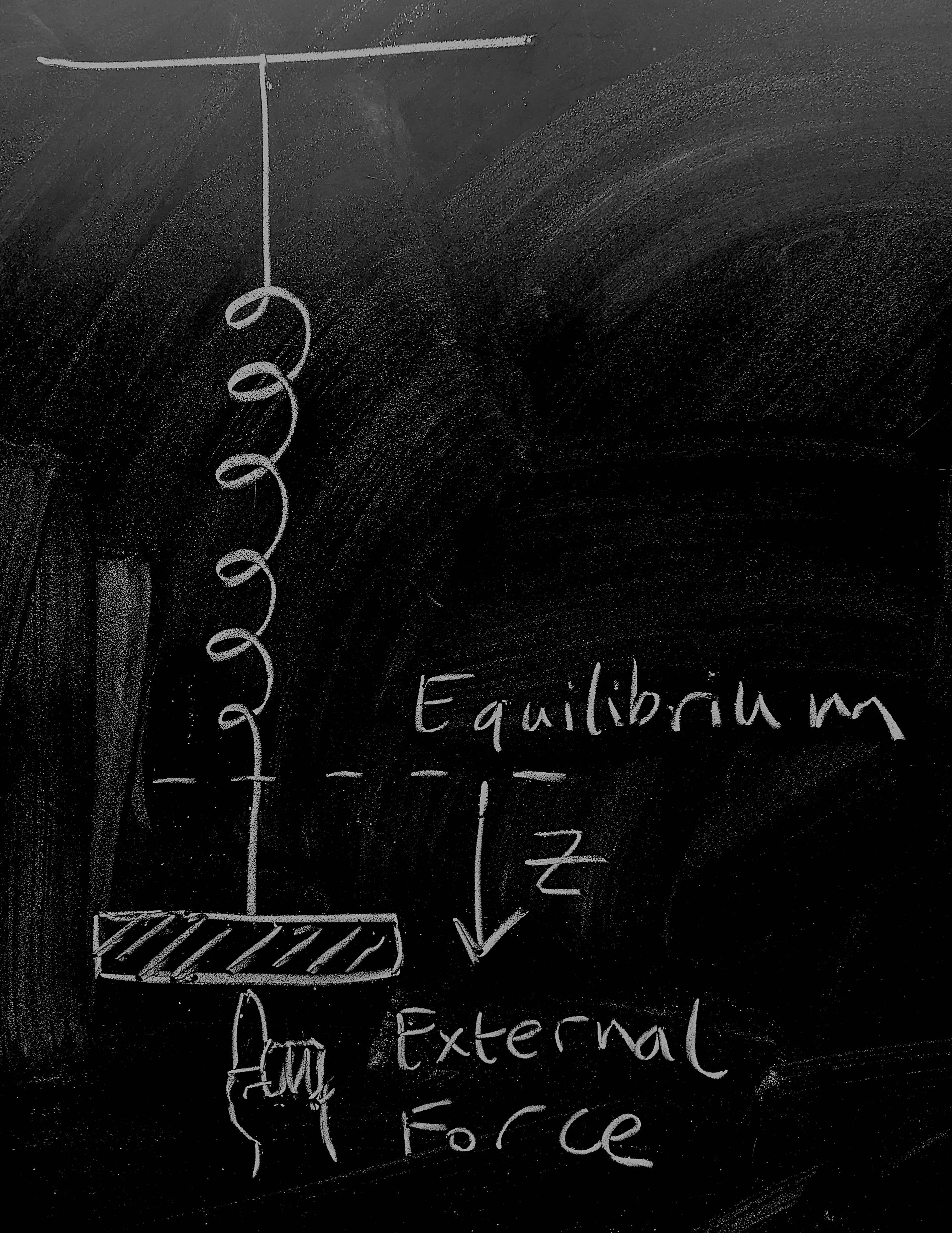
So let's start by considering a weight on a spring as pictured - this is going to give us a physical 'model' of disease dynamics for an endemic infection. The weight on the spring is a distance \(z(t)\) from the point at which the system would be at rest. There are three forces acting on the weight:

  • The spring pulls it towards equilibrium, to a first approximation, proportionally to its spring constant giving a force contribution \(-k z\);

  • As the weight moves, friction dissipates kinetic energy giving a force contribution \(-\nu \dot{z}\);

  • A human is pushing at the weight giving a time-dependent force contribution \(\varphi(t)\).

Now, dredging up our high-school physics we remember that Newton's equation is \(F = ma\). Noting that acceleration is the second derivative of position so that \(a = \ddot{z}\) and combining the three force contributions above we get \[-kz - \nu \dot{z} + \varphi(t) = m \ddot{z}\, .\] Dredging still further, we might remember that momentum is \(p = m\dot{z}\), which gives us dynamics \[\dot{z} = \frac{1}{m} p \, , \qquad \dot{p} = -kz - \frac{\nu}{m} p + \varphi(t) \, . \qquad \mathrm{(1)} \]

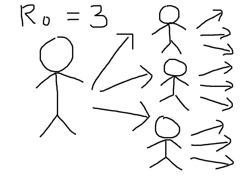
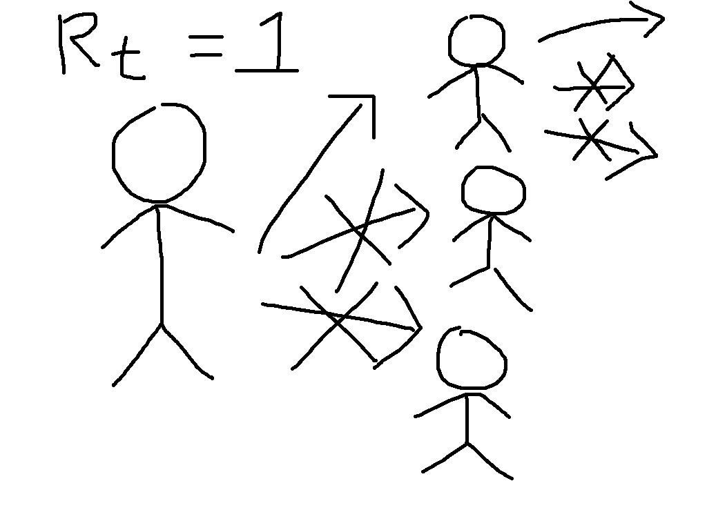
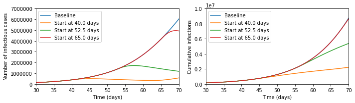
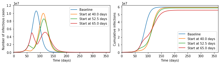
Next, let us consider an SIRS model with forcing, \[\dot{S} = \omega R - \beta(t) S I \, , \quad\ \dot{I} = \beta(t) S I - \gamma I \, , \quad \dot{R} = \gamma I - \omega R \, .\] This models a system where individuals move from susceptible to infections upon contact with other infectious individuals, then recover, and after that immunity wanes and they become susceptible again. The rate \(\beta(t)\) depending on time is supposed to capture different exogenous events: schools opening and closing; new vaccines; new variants; policy changes; and all sorts of other complexity. If you want to experiment with these equations numerically, check out this Jupyter notebook that I make available on GitHub.

This set of equations does not have a general closed form, but we can look for an approximate one using the Ansatz \[S(t) = S_* + \epsilon x(t) \, , \quad\ I(t) = I_* + \epsilon y(t) \, , \quad R(t) = N - S(t) - I(t) \, , \quad \beta(t) = \beta_* + \epsilon \phi(t) \, .\] We want this to correspond to a fixed point of the dynamical system when \(\epsilon = 0\), leading to the equations \[0 = \omega (N - S_* - I_*) - \beta_* S_* I_* \, , \qquad\ 0 = \beta_* S_* I_* - \gamma I_* \, .\] These have a solution when \(S_* = N, I_* = 0\) that is unstable if the disease can go endemic, i.e. when \(\mathcal{R}_0 = \beta_*/\gamma > 1 \); the other fixed point is when \(S_* = 1/\mathcal{R}_0\), which I hope to blog about later. The expression for the expected number of infectives \(I_*\) at endemicity is more complex; feel free to derive it for fun! For our purposes here, we are interested in what we obtain at first order in \(\epsilon\), which gives us \[\dot{x} = - \omega x - \omega y - \beta_* x I_* - \beta_* S_* y - \phi S_* I_* + \mathcal{O}(\epsilon^2) \, , \qquad\ \dot{y} = \beta_* x I_* + \beta_* S_* y + \phi S_* I_* - \gamma y + \mathcal{O}(\epsilon^2) \, . \qquad \mathrm{(2)} \]

OK, so take a breath. Now, with a bit of work, we can write both equations (1) and (2) (neglecting quadratic terms in \(\epsilon\)) above in the form of a two-dimensional vector differential equation \[\dot{\mathbf{v}} = \boldsymbol{J} \mathbf{v} + \mathbf{F}(t) \, , \qquad \mathrm{(3)} \] where \(\mathbf{v}\) is a vector containing the dynamical variables - \((z,p)\) for the spring and \((x,y)\) for the SIRS model - \(\boldsymbol{J}\) is a matrix depending on rate constants, and \(\mathbf{F}(t)\) is a vector function of time. Some readers will note that the details of the versions of (3) derived from (1) and (2) are not quite the same, but also that equation (3) takes the same structure under the linear transformation \[\tilde{\mathbf{v}} = \boldsymbol{T} \mathbf{v} \, ,\quad \tilde{\boldsymbol{J}} = \boldsymbol{T}\boldsymbol{J}\boldsymbol{T}^{-1} \, ,\quad \tilde{\mathbf{F}} = \boldsymbol{T} \mathbf{F} \, . \] They might also have fun trying to work with (3) via matrix integrating factor, Eigensystem analysis, or maybe Fourier transform.

So, that was quite fiddly (although not much beyond high-school level mathematics apart from the last bit). But the TL;DR is this: imagine all the complexity that you can generate by bouncing a weight up and down. If your taps line up just right with the how the spring behaves, you can get regular oscillations, but it's not difficult to make the weight jump irregularly all over the place. And this is exactly what we can see with an endemic disease: there's no guarantee that oscillatory behaviour will be regular or predictable.

Now, for many diseases that are better established, we do indeed see relatively regular annual peaks, although predicting the exact timing and height of these even for very well studied diseases like influenza is not currently possible. But most experts think that the relative regularity of influenza compared to COVID arises because the exogenous forces are mainly annual events like school holidays, people moving in and outdoors with the weather, and maybe even a direct bio-physical impact of the weather, with evolutionary events generally having a less dramatic impact on disease transmission than they do for COVID.

Because evolution is hard to predict, it's not clear that COVID will become more like influenza. Or even that it would be a good thing if it did. The purpose of this post, however, was to help explain why its unpredictability is at least somewhat predictable.

Why Zero is so Hard

The post on herd immunity on this blog discussed mitigation policies. Since then, the world has moved on somewhat, and many people are talking about long-term suppression of COVID-19, so how long might that take?

Suppose we have \(N\) current COVID infections, the reproduction number is \(R\), the duration of infection is \(T\) and we want to know the time \(t\) until the probability that there are zero cases is \(p\).

If we model this as a Markovian birth-death chain, then the analytical result for the time at which the given probability of extinction is reached is: \[t(p,N,R) = \frac{T}{R-1} \ln\left( \frac{p^{1/N} - 1}{R p^{1/N} - 1}\right) \; . \]

Results from this equation are shown in the Figure if we take 10 days from infection to recovery; unfortunately, we need years with the reproduction number less than one to get appreciable probabilities of of extinction. Of course, the Markovian birth-death chain is too simple to be a realistic model of COVID. In particular:

  • More infection happens several days after infection than in the initial days, introducing additional delays;

  • Some population subgroups may have an effective reproduction number above 1;

  • There will be imported cases from outside;

  • There is variability in individual susceptibility and infectiousness;

  • Contact patterns are complex and heterogeneous.

These will influence the time to zero cases in different ways; but the 'inconvenient truth' is that it takes an extremely long time to get to zero cases even if \(R\) can be kept below one indefinitely.

Times until the a given probability of extinction

Times until the a given probability of extinction as a function of the initial number of cases and the reproduction number. Contour lines correspond to 1, 2, 3, 5 and 10 years.

Modelling Herd Immunity

The current coronavirus outbreak (COVID-19) has raised questions about herd immunity, social distancing measures, and the relationship between these. In particular, at time of writing the following Tweet has thousands of retweets and likes.

I think that this presents an incomplete picture of the policy considerations.

Before herd immunityAfter herd immunity

To see why, let us start by defining the most important concept in epidemic modelling, the basic reproduction number \(R_0\). This is equal to the average number of infections caused by a case early in the epidemic, so that for \(R_0 = 3\), the early transmission tree might look something like the cartoon on the left. This exhibits the exponential growth that is so worrying at present. We have first one case, then three, then nine, then 27, then ...

Now suppose that immunity has been built up, either through vaccination or by illness followed by recovery, so that two thirds of people are immune. This means that each case will have three contacts that would have caused infection in the absence of immunity, but on average two of these will be immune and so the situation looks more like the cartoon on the right. We say that the reproduction number is reduced from its basic value to \(R_t = 1\).

While the individuals in the cartoon with a crossed out arrow pointing towards them are literally immune, the people that they would have infected benefit from herd immunity. They can be infected if exposed, but will not be. This is particularly beneficial to the people who are particularly vulnerable to the disease, who might die if they catch it. The general formula for herd immunity is that when over \((1 - (1/R_0))\times 100\%\) of the population is immune, then the epidemic will start to die out.

Now suppose we simulate a more realistic scenario. The Python code for this is at the bottom of this post, and it is much simpler than the models that are typically used to guide policy, but captures the basic phenomena of interest. In particular, we suppose that we can reduce transmission through social distancing measures like closing schools and workplaces, but that this is only possible for three weeks. This represents the fact that the costs of not educating children and not doing other activities can become quite large over time, and in some cases can lead to levels death and illness that could exceed those due to the unchecked epidemic. Running the epidemic model with these interventions gives the following results for cases at a given moment and total cases over time.

../output_5.png

It seems that the Tweet was right - look at the difference the early intervention makes! But now let us zoom out of the graph; then the picture looks like the below.

../output_6_0.png

In fact, the later intervention dramatically reduces the burden on the healthcare system, cutting in half the maximum numbers ill and potentially needing treatment at any one time, and significantly reduces the final number infected, which the earlier interventions fail to do.

The reason that this happens is that social distancing measures do not lead to herd immunity, so once they are lifted the epidemic starts again. In the absence of a vaccine, it is therefore meaningless to speak about whether a policy 'aims' to get herd immunity or not, since every country in the world will reach herd immunity unless it is able to implement social distancing for an indefinite period of time.

What mitigation policies should aim to do, therefore, is to reach herd immunity with the minimal human cost. This will be extremely difficult, and at every stage we will be dealing with large uncertainties. I would not want to be the person who ultimately made the policy decisions. But to say that early interventions are always better is incorrect.

# Pull in libraries needed
%matplotlib inline
import numpy as np
from scipy import integrate
import matplotlib.pyplot as plt
# Represent the basic dynamics
def odefun(t,x,beta0,betat,t0,t1,sigma,gamma):
    dx = np.zeros(6)
    if ((t>=t0) and (t<=t1)):
        beta = betat
    else:
        beta = beta0
    dx[0] = -beta*x[0]*(x[3] + x[4])
    dx[1] = beta*x[0]*(x[3] + x[4]) - sigma*x[1]
    dx[2] = sigma*x[1] - sigma*x[2]
    dx[3] = sigma*x[2] - gamma*x[3]
    dx[4] = gamma*x[3] - gamma*x[4]
    dx[5] = gamma*x[4]
    return dx
# Parameters of the model
N = 6.7e7 # Total population
i0 = 1e-4 # 0.5*Proportion of the population infected on day 0
tlast = 365.0 # Consider a year
latent_period = 5.0 # Days between being infected and becoming infectious
infectious_period = 7.0 # Days infectious
R0 = 2.5 # Basic reproduction number in the absence of interventions
Rt = 0.75 # Reproduction number in the presence of interventions
tend = 21.0 # Number of days of interventions
beta0 = R0 / infectious_period
betat = Rt / infectious_period
sigma = 2.0 / latent_period
gamma = 2.0 / infectious_period

t0ran = np.array([-100, 40, 52.5, 65])

def mylab(t):
    if t>0:
        return "Start at " + str(t) + " days"
    else:
        return "Baseline"

sol=[]
for tt in range(0,len(t0ran)):
    sol.append(integrate.solve_ivp(lambda t,x: odefun(t,x,beta0,betat,t0ran[tt],t0ran[tt]+tend,sigma,gamma),
                              (0.0,tlast),
                              np.array([1.0-2.0*i0, 0.0, 0.0, i0, i0, 0.0]),
                              'RK45',
                              atol=1e-8,
                              rtol=1e-9))
plt.figure(figsize=(10,3))
plt.subplot(1,2,1)
for tt in range(0,len(t0ran)):
    plt.plot(sol[tt].t,N*(sol[tt].y[3] + sol[tt].y[4]).T, label=mylab(t0ran[tt]))
plt.xlim([30,70])
plt.ylim([0,7e6])
plt.xlabel('Time (days)')
plt.ylabel('Number of infectious cases')
plt.legend()
plt.subplot(1,2,2)
for tt in range(0,len(t0ran)):
    plt.plot(sol[tt].t,N*sol[tt].y[5].T, label=mylab(t0ran[tt]))
plt.xlabel('Time (days)')
plt.ylabel('Cumulative infections')
plt.legend()
plt.xlim([30,70])
plt.ylim([0,1e7])
plt.tight_layout()
plt.show()
plt.figure(figsize=(10,3))
plt.subplot(1,2,1)
for tt in range(0,len(t0ran)):
    plt.plot(sol[tt].t,N*(sol[tt].y[3] + sol[tt].y[4]).T, label=mylab(t0ran[tt]))
plt.xlim([0,tlast])
plt.ylim([0,1.2e7])
plt.xlabel('Time (days)')
plt.ylabel('Number of infectious cases')
plt.legend()
plt.subplot(1,2,2)
for tt in range(0,len(t0ran)):
    plt.plot(sol[tt].t,N*sol[tt].y[5].T, label=mylab(t0ran[tt]))
plt.xlabel('Time (days)')
plt.ylabel('Cumulative infections')
plt.legend()
plt.xlim([0,tlast])
plt.ylim([0,6.2e7])
plt.tight_layout()
plt.show()

Semester 1 2018

This table gives a rough idea of where I was in Semester 1, 2018; I'm putting it here mainly in case I need to re-use the HTML.

09:00 10:00 11:00 12:00 13:00 14:00 15:00
 
MON
 
  Statstics and Machine Learning 1
Lecture
Simon Building: 4.47
    Statstics and Machine Learning 1
Computer Class
Ellen Wilkinson: B3.3
 
TUES
 
      SQUIDS
Seminar
Frank Adams 1
     
 
WEDS
 
  Multivariate Statistics
Lecture
University Place 3.213
IM(PA):CT!
Seminar
Frank Adams 1
     
 
THURS


FRI
 
Multivariate Statistics
Lecture
University Place 3.214
Multivariate Statistics
Tutorial
University Place 3.214
Office Hours
(11.30-12.30 guaranteed)
Alan Turing Building 1.114
Calculus and Vectors
Group 14 Supervision
Alan Turing Building G.108
  Calculus and Vectors
Group 38 Supervision
Alan Turing Building G.221A

Opportunities in Manchester

Mathematical Epidemiologists 2018

There are various opportunities to work in areas related to Mathematical Epidemiology in Manchester at present - a recent meeting of our lively and growing group is shown, please get in touch if you're interested!

PhD:

Understanding and Mitigating Against Organ Damage from Radiotherapy using Statistical Learning from Large Cohort Data (Deadline Friday 16 November) is a PhD programme looking at methods for cancer radiotherapy data with the world-leading group at the Christie Hospital.

Alan Turing Institute PhD Programme - Lorenzo Pellis, Ian Hall and I are Alan Turing Institute Fellows and can support applications to this scheme.

Postdocotral:

Dame Kathleen Ollerenshaw Fellowships (Deadline 23 November) are 5 year postdoctoral positions leading on to tenure.

Faculty:

There are also two open Faculty positions: Lecturer, Senior Lecturer or Reader in Applied Mathematics and Lecturer in Mathematical Finance / Mathematical Statistics (Deadline 11 January).

Caffeine in Pregnancy, Weak Identifiability, and Working with the Media

A recent Paper in BMJ Open deals with the question of maternal caffeine intake and childhood obesity.

I worked with the Science Media Centre to produce a Press Release in which I made the comment:

"This study makes the headline claim that in a population of over 50,000 mother-child pairs, caffeine intake is positively associated with risk of childhood obesity. Let us make a ‘back of the envelope’ calculation on one of the outcome measures using the cup of instant coffee per day as a measure of the mother’s caffeine intake.

If we take 100 children whose mother group had the lowest caffeine intake (1 cup or less) then at age three, around 11 will be obese; in the next group (1-4 cups) there will be one additional obese child (12 in total); in the next (4-6 cups) there will be an additional two (14 in total) and in the group with highest caffeine intake (6 or more cups) there will be an additional three (17 in total).

The main problem with the study is that maternal caffeine intake is strongly correlated with other relevant factors, and so these should be controlled for. In the authors’ statistical analyses, the ‘best fit’ models they’ve used suggest around half of the additional cases of obesity in children of age 3 are explained by caffeine rather than, say, calorie intake of mothers. But since the caffeine and calorie intake are correlated, the existence of a ‘best fit’ model with equal weighting on both means we actually can’t say whether a model looking at just calorie intake of mothers would be an equally good explanation of child obesity. It also says nothing about whether including a new explanatory measure, such as the child’s calorie intake, would change the model.

As such, the evidence provided in the study for a causal effect is extremely weak and the statement from the authors that 'complete avoidance might actually be advisable' seems unjustified, particularly when we consider the effects that such a restriction might have on wellbeing of mothers."

This story was quite widely covered, but most papers took the same approach as iNews and only quoted my main conclusion, but not the reasoning.

So let's consider a simple exaple that exhibits the main problem, in particular the following contingency table. This is much smaller than the original study, but the same phenomenon is exhibited by larger populations with more explanatory factors:

Caffeine Intake

Low

High

Calorie Intake

Low

Healthy

Overweight

Healthy

Overweight

63

7

3

2

High

Healthy

Overweight

Healthy

Overweight

2

3

5

15

Note that 68% of the high caffeine group is overweight, while only 13% of the low caffeine group is, but we note that calorie intake may be an issue so let us perform logistic regression as the authors did, letting \[\mathrm{Pr}(\mathrm{Overweight}) = 1/(1+ \mathrm{exp}(-\beta_0 - \beta_1 \times \mathrm{HighCalorie} - \beta_2 \times \mathrm{HighCaffeine})) \mathrm{ ,}\] where \(\beta_0\) is the intercept, \(\beta_1\) is the log odds due to calories and \(\beta_2\) is the log odds due to caffeine. Setting the intercept at its maximum likelihood value, the maximum likelihood values for the other parameters are shown as the cross below, which attributes roughly equal importance to the two factors:

Likelihood surface

Behind this cross is a shaded region with intensity equal to the likelihood of different parameter combinations - and we note that there is still a reasonable amount of shading in the area where \(\beta_2 \approx 0\). This is a special case of a general phenomenon called weak identifiability, and it is something I've done a bit of work on - there are various ways to deal with this, but its presence is the reason that evidence for a causal effect is weak in the original study.

Visualising the Wishart Distribution

This semester, I have been teaching Multivariate Statistics, and one isse that comes up is how to think about the Wishart distribution, which generalises the \(\chi^2 \) distribution. This has probability density function

$$ f_{\chi^2_k}(x) = \frac{1}{2\,\Gamma\!\left(\frac{k}{2}\right)} \left(\frac{x}{2}\right)^{\frac{k}{2}-1} {\rm e}^{-\frac{x}{2}} . $$

To visualise this at different degrees of freedom \(k \), we use the following Python code.

%matplotlib inline
import numpy as np
import scipy.stats as st
import matplotlib.pyplot as plt
from mpl_toolkits.mplot3d import Axes3D
np.random.seed(42)
Sig1 = np.array([[1,0.75],[0.75,2]])
n=1000
x = np.linspace(0, 10, 1000)
plt.figure(figsize=(8,4))
colors = plt.cm.Accent(np.linspace(0,1,4))
i=0
for k in (1,2,5,10):
    c = st.chi2.pdf(x, k);
    plt.plot(x,c, label='k = ' + str(k), color=colors[i],linewidth=3)
    i += 1
plt.xlim((0,10))
plt.ylim((0,0.5))
plt.xlabel('x')
plt.ylabel('f(x)')
plt.legend()
../output_2_1.png

The Wishart emerges when we make \(k \) observations each with \(p \) variables; the sampling distribution for the covariance matrix of these data if the population is multivariate normal is Wishart and has probability density function

$$ f_{\mathcal{W}_p(k,\boldsymbol{\Sigma})}(\boldsymbol{V}) = \frac{\mathrm{det}(\boldsymbol{V})^{\frac{k - p - 1}{2}}}{2^{ \frac{k p}{2} } \mathrm{det}(\boldsymbol{\Sigma})^\frac{k}{2} \Gamma_p\!\left(\frac{k}{2} \right)} \exp\left( -\frac12 \mathrm{Tr}(\boldsymbol{\Sigma}^{-1} \boldsymbol{V}) \right) . $$

In general, this cannot be visualised, but for the \(p=2 \) case, one option is to pick random numbers from this distribution and then produce a three-dimensional scatter plot of these. The code and results below show that this can be seen as behaving somewhat like the chi-squared distribution that it generalises as the degrees of freedom \(k \) are increased.

x=np.zeros(n)
y=np.zeros(n)
z=np.zeros(n)
for i in range(0,n):
    M=st.wishart.rvs(2,scale=Sig1,size=1)
    x[i]=M[0][0]
    y[i]=M[1][1]
    z[i]=M[1][0]
fig = plt.figure(figsize=(8,5))
ax = fig.add_subplot(111, projection='3d')
ax.scatter3D(x,y,z, marker='o', c=z, cmap='seismic')
ax.set_xlabel('V11')
ax.set_ylabel('V22')
ax.set_zlabel('V12=V21')
ax.set_xlim((0,30))
ax.set_ylim((0,70))
ax.set_zlim((0,30))
plt.tight_layout()
../output_3_0.png
x=np.zeros(n)
y=np.zeros(n)
z=np.zeros(n)
for i in range(0,n):
    M=st.wishart.rvs(5,scale=Sig1,size=1)
    x[i]=M[0][0]
    y[i]=M[1][1]
    z[i]=M[1][0]
fig = plt.figure(figsize=(8,5))
ax = fig.add_subplot(111, projection='3d')
ax.scatter3D(x,y,z, marker='o', c=z, cmap='seismic')
ax.set_xlabel('V11')
ax.set_ylabel('V22')
ax.set_zlabel('V12=V21')
ax.set_xlim((0,30))
ax.set_ylim((0,70))
ax.set_zlim((0,30))
plt.tight_layout()
../output_4_0.png
x=np.zeros(n)
y=np.zeros(n)
z=np.zeros(n)
for i in range(0,n):
    M=st.wishart.rvs(10,scale=Sig1,size=1)
    x[i]=M[0][0]
    y[i]=M[1][1]
    z[i]=M[1][0]
fig = plt.figure(figsize=(8,5))
ax = fig.add_subplot(111, projection='3d')
ax.scatter3D(x,y,z, marker='o', c=z, cmap='seismic')
ax.set_xlabel('V11')
ax.set_ylabel('V22')
ax.set_zlabel('V12=V21')
ax.set_xlim((0,30))
ax.set_ylim((0,70))
ax.set_zlim((0,30))
plt.tight_layout()
../output_5_0.png

Mathematics of Memes

Models of epidemics can be adapted to consider the spread of internet Memes - for more information see the University Press Release. Below is a figure showing some of these Memes 'in the wild'! We hope that the work will be possible to extend to more substantial health-related behaviours, but Memes provide a relatively pure signal of the kind of social influence that must be accounted for in such contexts, and as such are a good way to develop methods.

Memes considered in the paper

I also recently gave a talk at the local Galois Group (undergraduate mathematics) on the work:

Operationalising Modern Mathematical Epidemiology

This month Liz Buckingham-Jeffery is joining me and Tim Kinyanjui to complete the team for the EPSRC-funded project Operationalising Modern Mathematical Epidemiology, which is a Healthcare Technologies Impact Fellowship I hold (picture of us all below). The project is about development of some recent ideas at developed by mathematical scientists to generate benefits in the healthcare system. We have non-academic partners from three major Manchester hospitals (Central Manchester, North Manchester and the Christie), Public Health England's national Real-time Syndromic Surveillance group, and a data analytics firm Spectra Analytics. The first papers from this project are starting be be submitted, and we have an ambitious programme of research and impact-related activity over the next couple of years to ensure that the potential benefits to population health from theoretical developments are realised.

Me, Liz and Tim