
Web Design |
margins, padding and borders |
||||||||||||||||||||||||||
main menushelp pagesprinter-friendly/text-only version
|
One of the things you often want to do with tables is to put more space between the cells than browsers normally allow. Here are two examples. The first is rendered entirely as the browser decides, but in the second, I've added some style information - the exact nature of which is the subject of this page.
Whether you think that's an improvement is neither here nor there - I was overdoing it a bit but I hope it illustrates what is possible. Basically, the enhancement of the second table was done with three as-yet-unmentioned style sheet properties: margins, borders and padding. Margins, padding and borders are things that all block-level tags have, whether these be paragraphs, whole tables or table cells, minor tags like <blockquote> or the entire page body. All of these are treated like "boxes". More precisely, they are a series of boxes, one inside the other, like Russian dolls. For example, table cells (<td> tags) are contained within table rows (<tr>) which are contained within tables (<table>). But table cells may themselves have paragraph tags within them (<p>) and/or images. To complicate things further, every one of these block-level elements is itself composed of four "boxes". The first is the content, which is usually text but may be an image or a series of tags. Around the content come three other boxes, which from the inside out are padding, border and margin. See the diagram: 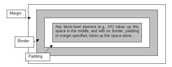 Defining what form the margin, padding and border take is a matter of style. As with everything else stylistic, the browser has its own ideas about how it's going to render these things. Most of the time, it defaults to not assigning any values to these things at all (there is one significant exception which I will mention below). In other words, things are usually rendered without border, padding or margin, as the first table showed. But you can define all of these things if you want, whether as ad hoc styles or to apply to every instance of a tag. (Note that background elements, whether colours or images, will extend out through the padding but are "stopped" by the border: the margin is always empty space (though will of course reflect the background of more "senior" page elements such as the <body>). To further complicate matters, padding, borders and margins can also be applied to only some of the four sides of a box. Or, you can define the property with different values for each of the four sides (the order being top-right-bottom-left, if specified all in one tag). Note that the "subdividing" properties given below are not yet supported by all browsers and you are safer using the second method: that is, four different values in one property. In all cases, values can be specified in length units, a percentage of the element's overall width, or as auto, which the browser calculates based on other elements of the page. I know all this sounds complicated but the sample code given below should make things a bit clearer, and these properties do give you a lot of control over the spacing of your page. For a list of available length units, see the section in the style sheet reference page. margin subdivided as: margin-top, margin-right, margin-bottom, margin-left. Defines the amount of margin around the element, outside the border.
    h1 {margin: 15px}

    h1 {margin: 0px 15px 0px 15px}

    h1 {margin-top: 0cm;
        margin-left: 1.5cm;
        margin-bottom: 0cm;
        margin-right: 1.5cm;}
padding subdivided as: padding-top, padding-right, padding-bottom, padding-left. Defines the amount of padding between the element and the border.
    p.special {padding: 10px}

    p.indent {padding-top: 0pt;
              padding-left: 18pt;
              padding-bottom: 3pt;
              padding-right: 0pt;}
border-width subdivided as: border-top-width, border-right-width, border-bottom-width, border-left-width. As well as the usual units of length this can also take the values thin, medium or thick. See below for a couple of examples. border-color Not subdivided, but as the example below shows, can still have different values for each side; remember the order is top-right-bottom-left. Takes an RGB colour code or colour name. border-style As with border-color, not subdivided but can still have different values for the four sides. There are several different styles, which you might like to play around with: none | dotted | dashed | solid | double | groove | ridge | inset | outset. Examples of border properties:
    p.highlight {border-style: ridge;
                 border-color: red;
                 border-width: medium;}

    h1 {border-style: none none double double;}
border-spacing and border-collapse In HTML 4.01 there was a useful attribute, cellspacing. This could be used to space out all the cells of a table by a certain amount. In XHTML 1.0 you shouldn't use attributes for this kind of thing: border-spacing is the replacement style sheet property and can be defined for the <table> tag. If you want to make absolutely sure the cells of a table are joined together (as on the Mondrian page), include border-spacing: 0px;. You can also try border-collapse: collapse; which says to the browser (and this is obscure!), "if two borders adjoin each other then treat them as one border". The default is border-collapse: separate;. This might seem obscure but when it comes to using multipart images in tables you will certainly have need of it. You may never use these properties, or do so only rarely. But add these to the other things you now know how to do with block-level elements - define backgrounds, width and so on - you start to realise that you have a lot of control over how your page appears. If you use relative widths, particularly for larger page elements, you can even apply this control across a range of window sizes. In case you were wondering what combination of margins, padding and borders were used earlier to render the second version of that table, it's probably simplest to view the source code. This is quite a complicated example but as ever the trick is not to try and copy it but adapt these techniques to your own requirements. Practice will show you what can and cannot be easily done. | ||||||||||||||||||||||||||
Material on this site is © Drew Whitworth, 2005 Permission will usually be given to reproduce material from this site for non-commercial purposes, if credit is given. For enquiries, e-mail Drew at andrew [dot] whitworth [at] manchester [dot] ac [dot] uk.