Web Design
Lesson 10: Printer-Friendly version
As with the other similar pages on this site, this page is designed to be easily printed out and read offline, away from the computer. If you are trying to follow this lesson online you will find it much more convenient to return to the full lesson 10 menu.
Contents
- 10.1 opening new windows
- 10.1.1 why do this?
- 10.1.2 the target attribute
- 10.1.3 JavaScript methods
- 10.2 the frameset document
- 10.2.1 the frameset document
- 10.2.2 <frameset> tags
- 10.2.3 <frame> tags
- 10.3 the <noframes> tag
- 10.4 links in frames
- 10.5 inline frames
- 10.6 menu bars and site maps
- 10.6.1 general points
- 10.6.2 using forms
- 10.6.3 site maps
10.1 opening new windows
10.1.1 why do this?
So far, everything you've found out to do has worked with one crucial limitation - no matter where you go, what you open and how glorious it looks on the eye, it's all taken place within one window. By now, however, you've surely noticed that this site often delivers its information through two separate windows: the main one, and the "sample" window where many of the sample sites, and external links, open up. How is this done? There are two ways, one simple, one trickier but more sophisticated. Both are described on this page. The simple way is through the target attribute (10.1.2); the more complex way through the use of a JavaScript event (10.1.3).
Please remember the discussion in the virtual lecture regarding how and when to do it. Overdoing the opening of new windows can be pretty irritating for the user. It is always a good idea to warn the user that they are about to open a new window, or that a file will open in an already-open window instead of the current one. I try to do this as much as I can on this site and it is a good habit to get into.
10.1.2 the target attribute
This is the easy way. All you do is add a new attribute, target, into the <a> tag, as follows:
clicking on <a href="http://www.leeds.ac.uk/acom/"
     target="sample">this link</a>
target="sample" says to the browser that the intended destination (that is, the target) of this link is a browser window designated "sample". The important thing is that if no such browser window exists, the browser will open a new window, and give that window the specified name. Therefore, the first time you come across a link with target="sample" (or any other given name), it will cause a new window to open. On all subsequent occasions, as long as that window remains open, the link will work in that window rather than the original window.
Note that you can also specify target="_blank" (and yes, you do need the underline character). This always opens a new browser window. The disadvantage with target is that you get no control over the size or appearance of this new window - that can be achieved by using JavaScript, as shown next.
target also has an important role to play in the manipulation of links in frames - see 10.4 for details.
10.1.3 new windows with JavaScript
This cannot be demonstrated on paper, for obvious reasons - you might like to look at the online version of this page (http://www.leeds.ac.uk/acom/webdesign/materials/subj_newwindows.html#js) for an example using the our old friend, the "South America" image map from lecture 7.
Basically, you can open new windows using JavaScript onclick, whether in ordinary links (<a> tags) or, in the example, in <area> tags. The code looks a little complicated, but that's just because there are a lot of properties, giving you a lot of control over the appearance of the window. As with other similar events we've encountered so far, you can easily use it without knowing much about how JavaScript works.
As an example, here's Colombia's <area> tag. As on some other occasions, I have had to split this tag up to fit it on the screen, but please note that when and if you write such a tag yourself, the onClick event needs to be typed without spaces or line breaks. It might end up wrapping in Notepad because of the size of the window, but don't type any breaks.
<area shape="poly" alt="Colombia" href="#here"
  coords="20, 60, 57, 75, 66, 40, 38, 22"
  onclick="window.open('colombia.html','','width=500,height=530,
  left=100,screenX=100,top=100,screenY=100')" />
The shape, coords and alt attributes remain the same. However, the href attribute has been turned into a "dummy". The anchor called "here" is at exactly the same place as the map, so the browser does not move when the new window is opened. Be aware that now the opening of the new page is a separate thing to actually following the link; technically there's no reason why you couldn't open a new window and take the user somewhere entirely different in the existing window, which you couldn't do with target.
The opening of the new page is now provoked by the onclick event. window.open, the "event handler", is self-explanatory. Note the punctuation around the properties which follow; the order of the three "first-level" parameters (marked by the 'single quotes') also cannot be changed, though the order of the values within the third paramater can be.
The first paramater is the name of the file to be placed in the new window. This could be a URL for an external link. The second parameter - here left empty, but we still needed the quotes - would be the name of the window. Just as with the target attribute you can give a new window a name, and all subsequent references to that name will cause the link to open in the new window (the names of windows can be used in both this way and via target). There's clearly no point using special targets such as "_blank" here, however, as opening a new window is what we're doing anyway.
The third parameter contains a list of values which define the size and appearance of the new window. Some I've used in the example, but others I haven't - they are listed here as well so you can play around with them:
- width, height: the dimensions of the window in pixels. Remember that some space may be taken up by scroll bars, menu bars and so on.
- left, screenX, top, screenY: the distance of the top left corner of the new window from the top left corner of the screen, in pixels. There are two sets of attributes here because this is one of those irritating occasions where you need different attributes to do the same task in Netscape and IE. left and screenX are equivalent, defining the horizontal displacement of the window; top and screenY define the vertical placement.
- toolbar, menubar, scrollbars: in each case the default is no. Set to yes to give your window a toolbar, menu bar or scroll bars respectively. (Note the plural nature of the last one.)
- resize, resizeable. My web design book says you should use resize here but an ACOM student in 2001-2 (credit - Leo Seelig) pointed out that he could only get resizeable to work. Try both - it may be another browser inconsistency. Anyway, what it/they does/do is allow the user to resize the new window you've created. The default is no. It's probably best to always include this, as even though you might think you've defined the size of your new window very precisely, and why should anyone want to change it?, someone might always change the text size. If you do this with the new windows which open from the image map above, you'll see the problem with not including it.
I must say this one more time. Don't get too much into the habit of opening new windows willy-nilly. Remember that users can always do it for themselves, even with an ordinary link, and that the arrangement of the user's screen and desktop is always best left up to them. But where there's a point, well-used new windows can still provide a powerful impact.
10.2 frameset documents
10.2.1 frameset documents
The virtual lecture showed you how you can use frames on your web site. This page and the next couple discuss the practicalities. I won't continue to mention the various background issues which came up in the lecture - accessibility, appropriateness, etc. - but don't forget them.
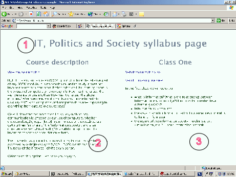
The thing that most confuses people working with frames for the first time is the relationship between the various files involved. Whenever you are looking at a browser window that uses frames there are at least three documents involved, but of these, only two are strictly visible. The "invisible" document is known as the frameset document, and despite its invisibility, is the only one that really matters, when dealing with frames.
It is the frameset document that defines the layout of the frames within the window. It defines where the "lines" are to be drawn between each frame, and what these frames will contain in their initial state. The "visible" HTML files are then "slotted in" to the framework (an appropriate term here) sketched out in the frameset document, to produce your complete window. The best way to think about this is as follows:

- this is a file called ext_topbar.html
- this is a file called ext_description.html
- this is a file called ext_class1.html
The whole window can be considered as ext_frame.html.
You must remember that the "visible" files are, in all respects, just ordinary HTML files. They could be viewed in the normal way; there is nothing about them that requires them to be viewed from within the frameset. But then again, you must remember that unless and until you "break free" from the frameset, you are always looking only at the frameset document. That is why, as you may have noticed while browsing round that example "mini-site", the URL never changed from http://www.leeds.ac.uk/acom/html/ext_frame.html no matter how many times you followed the links. You were merely "replacing" different portions of the overall frameset.
The handout for the virtual lecture gave you the code of ext_frame.html in its entirety. There's not a great deal to it, as you can see. The three unfamiliar tags - <frameset>, <frame> and <noframes> - are discussed in 10.2.2, 10.2.3 and 10.3 respectively. Beyond the obvious suggestion that you go on and read those sections, there's not a great deal more to say about the frameset document. They all look more or less as shown above: with the frameset document being "invisible", there's no point putting any real content there. (This is why it is particularly important that you use <meta> tags in frameset documents, if using them as the front page of your site, otherwise search engines have no content to actually latch on to.) Treat framesets as what they are - layout information only.
10.2.2 the <frameset> tag
These tags are used to define the "breaking-up" of the browser window. In other words, they define where the lines are drawn between the separate frames. <frameset> is one of the more complex HTML tags, and needs some careful attention.
Frameset documents have a document header that in all respects appears the same as for other pages. However, they don't have a <body> tag. Instead, following the closing </head> tag come one or more <frameset> tags. These have several uses, and the attributes which apply to each will be introduced in due course, but the most important - and complex - use of the tag is to define where the "divisors" between frames will be drawn. To do that you use one or both of the attributes rows or cols.
Using rows in a <frameset> tag tells the browser that you want to divide the window horizontally, cols says you want to divide it vertically. The values taken by these attributes then define where you want the division to occur. Values come in one of three forms:
- Absolute pixel values. <frameset rows="250, 400"> says that you want to divide the screen horizontally - the top frame will always be 250 pixels high, the lower, 400 pixels high. If the window is not big enough to contain these frames you will have to scroll to see the whole page. See below for more examples (this advice applies throughout this section).
- Percentage values. Refer to the total available width. <frameset cols="60%, 40%"> will divide the screen vertically in a ratio of 6:4, whatever the screen and/or window sizes.
- The asterisk. The asterisk basically says, "take what's left". <frameset rows="250, *">, therefore, is a bit better than the first example above, as while the upper frame will remain fixed at 250 pixels high, the lower can vary depending on the screen size. But note that you can have more than one asterisk: if this happens, the browser will use them to divide up the remainder into however many equal portions. So <frameset rows="250, *, *"> would result in three horizontal "slices", the latter two being the same size: equal to (roughly) 2 / (the screen height in pixels - 250). (I say "roughly" because things like the bottom and top bars also occupy pixel space).
We're not done yet though! There are even further levels of complication. Firstly, you can have rows and cols specified in the same <frameset> tag. This will divide the screen up into a grid - check out the example screen shots below. But you might have noticed that the virtual lecture's example used three frames, not two or four. How was this done?
The answer is to first divide the screen into two horizontally, then take the lower frame and divide that into two vertically. This was done by nesting the <frameset> tags. (One reason <frameset> tags require a closing tag is because of this possibility.) You might have already noticed that from the virtual lecture handout , when I reproduced the whole code for ext_frame.html. I won't repeat it again here, but once again, look below for examples.
Once the divisions are defined, of course, the next step is to fill them. This is done with <frame> tags. Frames are generally filled left-to-right, top-to-bottom; the best comparison is with the order you'd see <td> tags in a table. But once again I'd suggest you have a look at the examples below. In the end, if you get it wrong, you'll soon realise the order they were supposed to appear in.
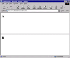
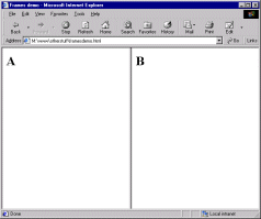
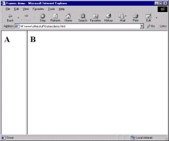
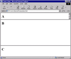
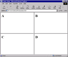
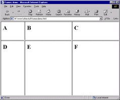
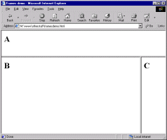
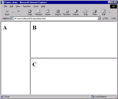
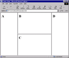
EXAMPLES. Note that in each case the screen shot has been taken from a fairly small browser window. I have only used relative sizes (percentages or the asterisk) in the examples, as they are meant to show the relationship between rows, cols and <frame> rather than anything more precise in layout terms. Look at the screen shot's floating caption (alt attribute) for a fuller explanation of what's going on. (Opera users: toggle images on and off.) In each case I've shown only the <frameset> tags, but remember that real frameset documents have document headers as well. I've also left frame borders in for clarity, but note that they can be removed: details follow this table.
<frameset rows="*, *"
  <frame src="a.html">
  <frame src="b.html">
</frameset>
|
 |
<frameset cols="*, *">
  <frame src="a.html">
  <frame src="b.html">
</frameset>
|
 |
<frameset cols="15%, *">
  <frame src="a.html">
  <frame src="b.html">
</frameset>
|
 |
<frameset rows="15%, 60%, 25%">
  <frame src="a.html">
  <frame src="b.html">
  <frame src="c.html">
</frameset>
|
 |
<frameset rows="*, *", cols="*, *">
  <frame src="a.html">
  <frame src="b.html">
  <frame src="c.html">
  <frame src="d.html">
</frameset>
|
 |
<frameset rows="25%, *" cols="20%, *, *">
  <frame src="a.html">
  <frame src="b.html">
  <frame src="c.html">
  <frame src="d.html">
  <frame src="e.html">
  <frame src="f.html">
</frameset>
|
 |
<frameset rows="25%, *">
  <frame src="a.html">
  <frameset cols="*, 15%">
    <frame src="b.html">
    <frame src="c.html">
  </frameset>
</frameset>
|
 |
<frameset cols="*, 75%">
  <frame src="a.html">
  <frameset rows="*, *">
    <frame src="b.html">
    <frame src="c.html">
  </frameset>
</frameset>
|
 |
<frameset cols="*, 50%, *">
  <frame src="a.html">
  <frameset cols="*, *">
    <frame src="b.html">
    <frame src="c.html">
  </frameset>
  <frame src="d.html">
</frameset>
|
 |
I think that gives you enough to go on, don't you?
There's still more to say about the <frameset> tag though - we're not yet at the end of the possible attributes! You can also include the following:
border="n" where n is the thickness of the border, in pixels, between all frames in the frameset. (If you've turned borders off via frameborder, this attribute is of course irrelevant.)
bordercolor="rgb code or colour name". Fairly obvious. Older browsers don't recognise this attribute.
frameborder. One of those irritating attributes where Netscape and IE recognise different values. Even more irritatingly, IE changed from one to another - but the official HTML spec may force it to change back! The only answer is to include both values in your <frameset> tags. The first tag, therefore, turns borders on, the second turns them off...
<frameset rows="*, *" frameborder="yes" frameborder="1">

<frameset rows="*, *" frameborder="no" frameborder="0">
Unwieldy though this is, I'm afraid at the current time you've no choice but to do it this way.
framespacing="n" where n is a number of pixels of additional space between frames. Only works in IE.
OK, that finally is it. Despite the length of this section the <frameset> tag, at a very basic level, is quite simple to use. It offers a lot of depth and control in dividing up your page, though. As usual, practice should improve your understanding and use of it.
10.2.3 the <frame> tag
The <frameset> tag defines the layout of the frames within the browser window. Nested within the <frameset> and </frameset> tags, the <frame> tags then define the content and appearance of these sub-divisions. As before, the way it does so is with attributes.
The important thing to remember is that a <frame> tag does not permanently set the content of the frame. Rather, it defines that frame's initial contents. So, when the first page of this site was loaded, its contents were as indicated in the screen shot I showed you earlier. You can easily return to the code for this page, given on the virtual lecture handout, to see how the <frame> tags are used to set these initial states. I'll discuss the scrolling attribute below. src, as for images, defines the location of the frame content - unlike with images, however, it isn't obligatory. It's possible to leave a frame empty.
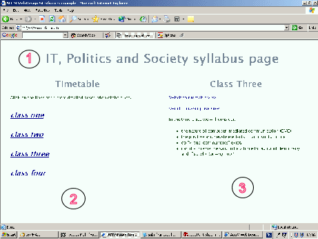
Now, as you navigated through that mini-site, it was as if the src attributes for each of those frames was, when certain links were followed, "replaced" by whatever was specified in the href attributes of those links. This generally happened in the main window. So if, for instance, you clicked first on the "view timetable" link and then on "class three", the files in the main window updated, so that what resulted was as follows:

- this is still ext_topbar.html
- this is now ext_timetable.html
- this is now ext_class3.html
The other attribute involved in this process is name. As we've seen at other points in this course, you can name many objects or features on web sites, and frames are another one. As will be discussed in the links and frames section (10.4), the name is how frames are identified in links. The name can be anything you want, though as usual it's best to avoid words that you know have another meaning in HTML (e.g., tag names, attribute values like "yes", and the like). You can see how the names above are relatively descriptive, which helps you remember what's going on (and don't think you'll always be the person involved in maintaining your site - so it's helpful for others too).
There are some other attributes available within the <frame> tag. Some, such as bordercolor and frameborder, are much more reliable when included in the <frameset> tag so have been treated there. The others are as follows:
- marginwidth, marginheight: in each case these set two values at opposite sides of the frame, e.g. marginwidth does left- and right-hand sides, marginheight top and bottom. Some designers want a value of zero to ensure that all content is placed flush against the edges of the frame but Netscape doesn't let you go below a 1-pixel margin. Still, what's a pixel between friends, eh?
- noresize: You will have noticed on the example page that you could click and drag on the borders between the frame to resize them. Adding this attribute (which, incidentally, is one of those attributes where you need to repeat it in the value, i.e. noresize="noresize") to the <frame> tag would disable this facility. Although it might seem preferable to you, the designer, that those pesky users don't mess up your carefully weighted and aesthetically pleasing proportions, do remember that those proportions might in fact obscure content, if the screen or window sizes differ. Personally I think this is safer left off. Users rarely resize frames unless you give them cause to in the first place. Preventing them from doing so seems petty.
- scrolling: Takes the values of yes (scroll bars will always appear in the frame whether or not content overflows the available space), no (they never appear even when content overflows) or auto (it depends on whether content overflows or not). The default is auto.
10.3 the <noframes> tag
In my opinion, a lot of the debate about whether frames are very useful or a big pile of horse manure could be invalidated if only designers would remember the existence of the <noframes> tag and use it properly. After all, that's what it's there for.
The tag goes in the frameset document and its contents will be ignored by browsers that can display frames. On the other hand, the contents will be displayed by those browsers which for whatever reason, can't display frames. The idea is that you place some text in the tag which firstly explains that the page the user is trying to view uses frames and then, ideally, directs them to a "frameless" version of the page. So for the page in the virtual lecture, which has served throughout as the sample, the <noframes> tag was set up as follows:
<noframes>
<h3>Welcome to the Drew's Web Design Site</h3>
<p>This is a sample page for the lesson on frames. It uses frames, which your browser does not support. A frameless version of the page is available at <a href="ext_frameless.html">ext_frameless.html</a>.</p>
</noframes>
ext_framelesss.html is just a version of the "mini-site" rendered in the normal "template". OK, I could easily sort that out by simply following the pattern of the rest of this site, rather than having to redesign things completely. But, in the end, if you are designing your site with frames you do have a responsibility, somewhere along the line, to think about making it accessible to the greatest number of users. And that means proper use of the <noframes> tag and designing a non-frames version of the site. This doesn't have to be as all-singing, all-dancing as the framed version (or no-one'd use frames at all) - usually, the main text "window" rendered on its own is sufficient.
Trouble is, most people think of the <noframes> tag as an added annoyance, or a legacy from Web prehistory. But frameless web browsing is more common than you'd think - following hyperlinks from within Word documents, for instance, may fail if the page being linked to is framed. Those creating their pages in HTML editors almost always fail to include them, simply because the editors don't make it at all obvious how to produce the tag. But it isn't difficult, and like the alt attribute, is an oft-neglected courtesy that, by including it, adds far more to the usability of the site than would be expected from the effort expended. Nor can one forget the law about accessibility - and without <noframes>, your site is simply unusable by anyone using non-visual or text-only browsers (see lesson 6).
In the example note the nesting of other tags within the noframes message, and also some description of the page content. This is to assist search engines in indexing your page: as discussed in the virtual lecture.
10.4 links in frames
The full power of frames is exploited via the use of links. More specifically, a link displayed in one frame causing a file to open in another. This is a more straightforward task than you might think.
The first important thing is to ensure you have given your frames a name - via the name attribute in the <frame> tag. It doesn't matter (within reason) what that name is, as long as you reference it in the relevant link.
Link tags (whether <a> or <area>, image or text) that work in this way are just ordinary links in terms of the way they are formatted. They adopt whatever style is specified in the style sheet and they have an href attribute that specifies which file to open. What they do have s an additional target attribute. If you recall, we've already met this attribute when we opened new windows (10.1). Importantly, I showed you how you could use it to get links to open in named browser windows that could then be referred to by subsequent links.
Getting links to open in a named frame is exactly the same as getting them to open in a named browser window. Effectively, the frame becomes a "window" in its own right. You simply include a target="frame name" in the link. As an example, take this link, from the example page's menu bar...
<a href="ext_class1.html" target="right">class one</a>
"right" is the name allocated to that particular frame in the frameset document. Were there no such named frame, the browser would have opened ext_class1.html in a new browser window and called that "right". As it is, though, the named frame exists, so that's where the new file is loaded.
If you omit the target attribute from any link (which is, of course, the normal state of affairs) it will open in the frame in which the link is located. In the example, the link to ext_timetable.html from ext_description.html does not have a target attribute.
I've already mentioned one possible special target, that being _blank. Another one is very important here: _top. I render the following paragraph with plenty of emphasis to make sure you follow this advice...
If using frames, all external links should have target="_top" included!
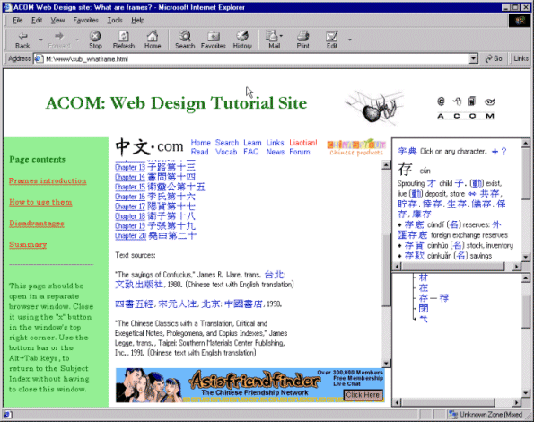
What does this do and why so important? What it does is open the linked file in the whole browser window, superseding the frameset. It's the target you use when you've had enough of your frames and want to return to the un-framed world. It is extremely important that you remember to include target="_top" in all external links. Look at what would happen if I'd omitted it from the external links, then tried to use them (this is from an older version of this site, but the message remains the same):

I hope the reasons why this is such poor practice are obvious. Firstly you "trap" the browser inside your frameset, no matter how far out into the Web they then surf. Secondly - and there have been legal actions over this in some cases - you risk a plagiarism or breach of copyright charge, as it can look, from some angles, as if you're trying to make out the other site is somehow a part of yours. Avoid all complications, and follow the emphasised advice above.
There is another special link, target="_parent", which works by stepping up one level of nested frames. I've never had cause to use it, but at least now you know it's there.
One additional trick to bear in mind is how to get a link to change the contents of two frames at once. The following solution comes from Niederst's Web Design in a Nutshell, pp. 222-3, via http://www.webmonkey.com. The first solution is simpler, but only works if you want to change the frame in which the link is located along with the usual method of changing a second frame. Use target to update the different frame as usual, but add a JavaScript onclick event to update the current frame at the same time. In the example below, newcontent.html will open in the frame named "maintext", and newmenu.html will open in whichever frame the link text, "Click for update" is located (its exact name is irrelevant in this method):
<a href="newcontent.html"
      onclick="window.self.location='newmenu.html'"
      target="maintext">Click for update</a>
To open new content in two (or more) frames that do not include the frame in which the link is located, you need the following script in your document header. The italicised names need replacing with the names of the two windows in question. Note that "toolbarURL" and "mainURL" are not "dummy" names - OK, they don't actually have to be that, but they don't depend on information in the frameset. They act as "holders" for information passed to this script via the <a> tag, as you'll see.
<script language="JavaScript">
<!--
   function changePages (toolbarURL, mainURL)
   { parent.toolbar.location.href=toolbarURL;
     parent.main.location.href=mainURL; }
-->
</script>
Then, the <a> tag looks like this, where newtoolbar.html represents the new file to be loaded into the frame named "toolbar", and newmain.html... well I'm sure you get the point.
<a href="javascript:changePages ('newtoolbar.html', 'newmain.html');">
That's it! Do read the advice on using frames well sprinkled throughout the rest of this lesson, and remember, whilst navigation is not the sole use of frames - indeed, it's best to use them in much more sophisticated ways - it is links which really make frames work, whether these are strictly "navigation" links or not. So do be aware of how to make them work properly.
10.5 inline frames
The basic principle of inline frames is the same as with "ordinary" frames: a part of the browser window is "framed" separately from the rest, and a different file can be displayed within it. But rather than simply drawing partitions across the screen, inline frames are actually displayed in a scrolling window, or box. Best illustrated by example I think, so see below - although it's obviously not possible to show you the full interactive possibilities on a paper version of this page.
Like the frames techniques we've already looked at, inline frames are not perfect. They must be used with full consideration for those who might not be able to see them, which means your providing alternative ways for those users to access the information. In the case of inline frames this is even more important as at present time these are supported only by some browsers, namely Internet Explorer and Opera. Netscape doesn't support this tag at all. However, they are included in recent HTML standards and technically this means that all future browsers should support it (though having said that, the status of target is problematic - serious web designers need to keep an eye on this sort of thing). Also, with not too much consideration, you can easily allow for those users who can't see the tag, even if you won't get the full singing-and-dancing effect.
Inline frames do not need frameset documents but can be simply placed in the usual flow of HTML with a tag, <iframe>. See this example:
That's an entirely separate file called 2001.html. Nifty, huh? (Particularly when combined with active links, which we'll look at below.) Not hard to do either: here's the code:
<iframe height="200" scrolling="auto" src="2001.html" width="80%">
<p>Your browser does not support the <iframe> tag so
it is not possible to illustrate this example. Sorry.
To see the file being displayed go here:
<a href="2001.html">2001.html</a>
</p>
</iframe>
Note first of all the use of the alternative text inside the <iframe> tag - it's this that explains why <iframe> has a closing tag, as otherwise you might think there's no need for one. Please use this facility properly if you're using inline frames, just as you should with the <noframes> tag (see 10.3 above).
Here are the available attributes for <iframe>
- align: takes values of left, right and center and aligns the frame on the page or, more specifically, within whichever page element it rests. Left or right alignment should (in theory) allow text to flow round the sides of a frame, as shown below.
- frameborder: default is 1, which renders the frame with a border as you've seen above: 0 turns this off.
- height: Specify the height of the frame in pixels, as you've seen: or as a percentage of the window size.
- marginheight and marginwidth: specifies a space, in pixels, inside the frame between the frame edges and frame contents.
- name: names the frame for reference by targeted links, as you can see below.
- noresize: prevents users from resizing the frames. As with "real" frames though, I wouldn't use this: if somebody really wants to resize your frame, they've probably got a good reason.
- scrolling: takes the same values of yes, no and auto. (Incidentally, I had problems in older versions of IE with the constant appearance of the horizontal scroll bar, but I think this bug has now been fixed.)
- src: The clearly important link to the contents of the frame.
- width: an absolute (pixels) or relative (%) width for the frame.
As with "real" frames, the true power lies in making the <iframe> interactive. This is just done with target attributes pointing at the <iframe>'s name in the same way as we've already seen. Piece of cake, really. In addition, if readers can't see the inline frame but can still see the links above, they can still view the content; the files will just open up in a separate window.
You might already be thinking that it'd be possible to render the "inner" page in exactly the same style (font, background colour etc.) as this "outer" one, change the colour of the scroll bar as well, and have an almost seamless integration of that page onto this one. The possibilities are then just limited by your imagination. True... and it does seem to me that inline frames have a lot of potential for page layout. I've only just started experimenting with them myself, but I can see the possibilities here - try http://www.leeds.ac.uk/acom/webdesign/materials/ext_mondrian_inline.html. Or, for a published example, have a look at http://www.funeralforafriend.com/juno.html. However, I do note that this site has no content within the <iframe> tag and is therefore not accessible.
But a couple of caveats. Note that <iframe> may not be considered a link by Google, which may mean that content "inside" the inline frame is never given a high ranking by that popular search engine. I honestly don't know whether it is or not, but it is always safer to have a proper link unless you've a very good reason to do otherwise. If Google doesn't see <iframe> as a link then it has no reason to consider the content of the inline frame important. And you must always remember to have some other way of looking at the frame content. Ensure you've looked at your page on as many browsers as possible to check it still works even without the inline frame. <iframe> is one of those tags that get people very excited when they first see them, but in the end, it may look flashy, but content is still content, however it's presented.
10.6 menu bars and site maps
10.6.1 general points about menus
I have always believed that links are the second most important bit of a web site. (The most important is, and will always be, the actual text.) Links are the one unique aspect of the communications medium that is the WWW. They are what turn your disconnected pages into a site, and they are what turn all the disconnected sites out there into the truly worldwide web of interconnected information. As described in the printed booklet for Web Design, they're far from a perfect implementation of the idea of hypertext - but they're a start, and therefore, they should be concentrated on by all web designers.
The question is, how should links best be presented? In the ideal hypertext document, they would appear dotted through the text, where ideas presented on other pages were being referenced. But there is a lot to be said for collecting links in one place as well. (These are not mutually-exclusive alternatives - you can easily do both in the same site.)
A site with a lot of external links would benefit from bringing them together on a "links page". This makes things easier for the user - it also makes things easier for you, the author. External links need maintenance, as other pages often go out of commission. If your links are all in one place, that task is made easier.
But it is also helpful to have internal links collected together for each particular page on your site. As described in the printed booklet, the structure of your site is an important factor in its usability. Deciding which page links to which, and why, can make the difference between a helpful site and a confusing one. Here is where the menu bar comes into its own. Menu bars make it clear to the reader where they can go from any given page. They guide the user, and do so subtly as well. And there are many different ways to create menu bars, with each having the potential to attract the reader's attention. You saw a menu bar at the top of this page: another, similar mode of presentation would be to use a list, like this:
- general points
- using forms
- site maps
This might all seem a bit unexciting, but don't underestimate it. The advantage of retaining text-based menu bars as opposed to image-based ones is that you know these will still be visible under text-only conditions. So for all it might seem tempting to craft lovely graphic buttons or rollover images to highlight your links, this can often be the safest method. And much of the most famous graphic design (such as the Bauhaus) was far more interested in text, symbols, lines and layout than pretty pictures. Think about it...
Of course, many sites do have menus created from images: the front page of the Leeds Uni site being an example (the "About" and "For" menus). You may, or may not, decide to include rollovers in such a menu. The ultimate determinant of whether you do this or not should come down to the issue of usability. When designing your image-based links and menu bars, always ask yourself, does this make my site easier and friendlier to use?. Visual impact does matter - image-based links stand out from surrounding text. They therefore add emphasis to that most unique characteristic of the Web, the document's links to other points in cyberspace. But as always, if used gratutiously or without thought for the end user, they will more likely obscure and confuse. Tempting though it is to start spreading buttons and other image-links all over your sites, do always sit and think about these issues beforehand.
10.6.2 using forms
Form buttons and drop-down menus (selection boxes) can both be exploited to vary your presentation of links. With buttons, What we want to do is add an onclick event which causes the browser to load another page. Add the event as shown underneath to a button, and bingo, you've done it. These are actually more robust than image links, as you don't actually need to download an image to make them work; no need to worry about those browsing with images turned off, then. The main disadvantage is that, as you can see, it's quite hard to control the size of the buttons with any precision, and therefore to get a tidy-looking page.
<form action="">
<input type="button" value="Multiple windows"
onclick="window.self.location='subj_newwindows.html'">
</form>
Drop-down menus are a little more complex, but not that bad. However, they do make the link unusable by anyone using a keyboard to browse; in other words, to those who cannot use a mouse for whatever reason. You must supply other means of reaching the content if using this method.
You use a selection box in this case. In the HTML below it should be pretty obvious where you put the actual links - the rest of the code needs to stay as is. Note that the "onChange" JavaScript event in the long second tag should not be broken between two lines like this but should be entered in a continuous string of characters. I had to break it below to make this page fit on the screen, but ensure you glue the line back together in your code.
<form action="">
<SELECT name="jumpto"
onChange='window.location.href=this.form.jumpto.options
[this.form.jumpto.selectedIndex].value'>
<option selected="selected">Link Menu...</option>
<option value="subj_newwindows.html">Multiple windows</option>
<option value="subj_frameset.html">The frameset document</option>
<option value="subj_noframes_tag.html">The <noframes> tag</option>
<option value="subj_framelink.html">Links in frames</option>
<option value="subj_iframe.html">Inline frames</option>
</select>
</form>
A few observations, which may be obvious but I'll make them anyway - first note that you can use this for any type of link: internal, external, anchor or whatever. Secondly, note that you can change the link showing in the "window" when the menu is first seen by moving the "selected" attribute in that list of <option> tags. The first, "dummy" option does not have to be there either, but is easy to remove (or indeed put back in). Make sure your readers know that the menu is a list of links. As links are not often presented like this they may not realise, so be very clear about it.
Quite a few sites these days are starting to use drop-down menus to present links, but these are usually programmed with Java (a fully-fledged Web programming language of which JavaScript is a relative). The disadvantages of Java are that, first, it's difficult, and second, not all browsers are set up to view it. This method isn't so sophisticated, and its appearance can't be tailored so easily. But it's pretty simple, and even quite antiquated browsers should be able to cope with it. However, as noted, there is always the problem of keyboard-only browsing which must be accounted for.
10.6.3 site maps
This is very much a section under development. What I mean by that is that I've not really investigated this topic thoroughly, and nor do I think that it's discussed in any systematic way in the web design literature. I'm therefore open to suggestions here and/or knowing about any useful examples you might have seen yourself.
When you play an adventure game, no matter whether it's computer-based (Half-Life has to be the all-time classic here) or something like Dungeons and Dragons, exploring the "labyrinth" is part of the fun. On the other hand, being lost in a big, unfamiliar city is no fun at all. In each case, a map will help your wanderings enormously - as of course will big signs saying "This Way To The Dragon's Lair!" (or similar).
A good menu, and clear and helpful links, should act as the "signposts" of a web site. But there's no reason why you can't provide visitors with a map of the whole terrain as well. In effect, that's what the Subject Index and A-Z Index on this site are - particularly the latter. A site map shows the whole site at once, so people know what's there before they start browsing.
This idea may strike you as rather pointless, for two reasons, both of them quite valid:
- "My site's only got half-a-dozen pages!" In that case all you need is a well-crafted menu. A site map would only seem necessary on large sites where a single menu would be too unwieldy.
- "If I'm going to all the bother of following your three-click rules and thinking about my site's structure in such detail why should people need a map?" Another good point. But sometimes people arrive at a site wanting very specific information. Your site's particular structure may just not quite match their needs. For example, this site is basically designed to be read in order from lecture 1 to lecture 10. But if someone arrives wanting a little bit of information on, say, the <area> tag but isn't familiar enough with the site (or indeed the tag) to know straight away that it's a part of lesson 7, they might rather have a different index - a map, in effect - that tells them how to get straight there. And that's why the A-Z Index exists. What a nice guy I am.
As to how you might best provide such a map - well, I'm open to suggestions. The worst way to do it would be to use a graphics package to draw a fantastically complex diagram of all the pages and links and then simply plonk that somewhere on your site: a classic case of "information as an image". At the very least you need to make the map active, that is, allow people to use it to jump straight to a given page.
Here's an example, for instance: a map to a small fan site devoted to a random celebrity (note that not only is the celebrity purely hypothetical, so's the site):
Miles P. Walrustitty Site Map |
|---|
Front page |
Further information
Photo gallery
List of links |
Miles P. Walrustitty - his life His childhood in Wetwang
Busking - the early days
The Moldovan National Opera
The Aubergine Scandal
Grand Old Statesman |
Miles P. Walrustitty - his works The Movement of Oysters
Selected Ambivalent Works
Concert O
Anarchopink | Miles P. Walrustitty - collborations The Limp Bizkit Sessions
The Lost Dannii Minogue Tribute |
Doing a map like this, incidentally, might not be a bad idea for you as a designer... it could show you when your structure is illogical, and get you thinking about your site in systematic terms. It might also serve as a useful list of all the pages, so when you come to do updates, you remember them all.
Google has quite a good site map at http://www.google.co.uk/sitemap.html. Google also offers another possibility here, the site search facility, but I must admit that despite trying for a while I have never been able to get this to work. Reports welcome: perhaps I am missing something obvious.
End of lecture 10.
|
