This worksheet is based on the fifth lecture of the Statistical Modelling in Stata course, created by Dr Mark Lunt and offered by the Centre for Epidemiology Versus Arthritis at the University of Manchester. The original Stata exercises and solutions are here translated into their R equivalents.
Refer to the original slides and Stata worksheets here.
Linear models in Stata R
Based on Section 1.6 of the original handout.
Linear models are fitted in R using the lm function. The syntax for this command is
model1 <- lm(response ~ covariates, data = mydata)where response is the y-variable, covariates are the x-variables and model1 is the name of the variable where you choose to store the model. The optional data argument indicates the data frame in which the variables are stored as columns (if they are not globally accessible objects in their own right).
The formula interface allows for additive terms, inclusion and exclusion of intercepts, offsets and interaction effects, but you do not need to worry about those, yet.
Fitted values from a regression model can be obtained by using the fitted function. Typing
varname <- fitted(model1)will create a new variable called varname, containing the fitted models of the model model1.
There are several other methods available for retrieving or calculating variables of interest. For example, the function predict will compute predicted values for new data. If no new data are provided, it returns the fitted values, optionally with confidence/prediction intervals.
predict(model1, interval = 'confidence')The function sigma extracts the residual standard deviation, \(\hat\sigma\), from a fitted model.
sigma(model1)Understanding R output
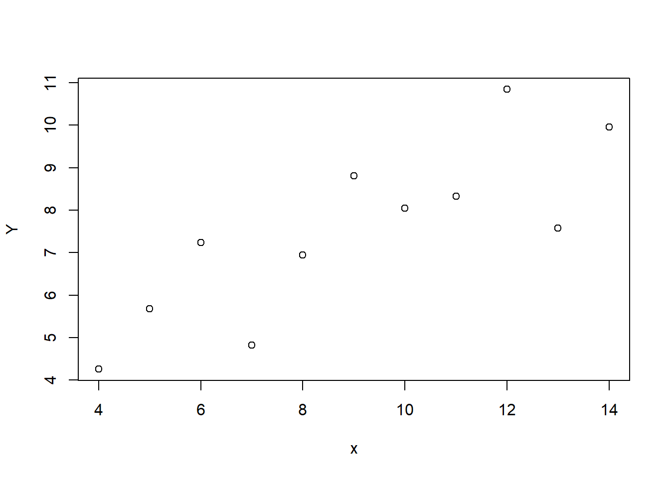
In this section, we are going to use R to fit a linear model to the following data.
| \(x\) | \(Y\) |
|---|---|
| 4 | 4.26 |
| 5 | 5.68 |
| 6 | 7.24 |
| 7 | 4.82 |
| 8 | 6.95 |
| 9 | 8.81 |
| 10 | 8.04 |
| 11 | 8.33 |
| 12 | 10.84 |
| 13 | 7.58 |
| 14 | 9.96 |
Assuming these data are stored in a data frame called regdata, we first visualise with
plot(Y ~ x, data = regdata)
The following syntax produces the same result.
with(regdata, plot(x, Y))This scatter plot suggests that \(Y\) increases as \(x\) increases, and fitting a straight line to the data would be a reasonable thing to do. So we can do that by entering
model1 <- lm(Y ~ x, data = regdata)
Then we can use summary to print some useful results from this model, such as estimates of the coefficients and their standard errors.
summary(model1)
Call:
lm(formula = Y ~ x, data = regdata)

Residuals:
     Min       1Q   Median       3Q      Max
-1.92127 -0.45577 -0.04136  0.70941  1.83882

Coefficients:
            Estimate Std. Error t value Pr(>|t|)
(Intercept)   3.0001     1.1247   2.667  0.02573 *
x             0.5001     0.1179   4.241  0.00217 **
---
Signif. codes:  0 '***' 0.001 '**' 0.01 '*' 0.05 '.' 0.1 ' ' 1

Residual standard error: 1.237 on 9 degrees of freedom
Multiple R-squared:  0.6665,    Adjusted R-squared:  0.6295
F-statistic: 17.99 on 1 and 9 DF,  p-value: 0.00217
To perform an analysis-of-variance (Anova) test, we use the anova function on the model.
anova(model1)
Analysis of Variance Table

Response: Y
          Df Sum Sq Mean Sq F value  Pr(>F)
x          1 27.510 27.5100   17.99 0.00217 **
Residuals  9 13.763  1.5292
---
Signif. codes:  0 '***' 0.001 '**' 0.01 '*' 0.05 '.' 0.1 ' ' 1
However, it is not appropriate to interpret these results until the model assumptions have been verified! See the next section.
From the summary output, we infer that the model equation is \[\hat Y = 3 + .5 x.\] There is enough information in the output to calculate your own confidence intervals for the parameters, but you can also do this explicitly with the confint function.
confint(model1)
                2.5 %    97.5 %
(Intercept) 0.4557369 5.5444449
x           0.2333701 0.7668117
For prediction intervals, you can use the predict function. For instance, a predicted value and 95% prediction interval for at \(x = 0\) is given by
       fit        lwr     upr
1 3.000091 -0.7813287 6.78151
and the confidence interval is the same as the output from confint for (Intercept) as shown above.
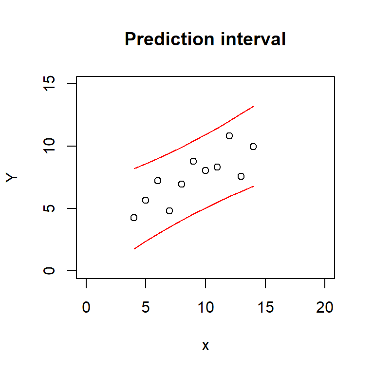
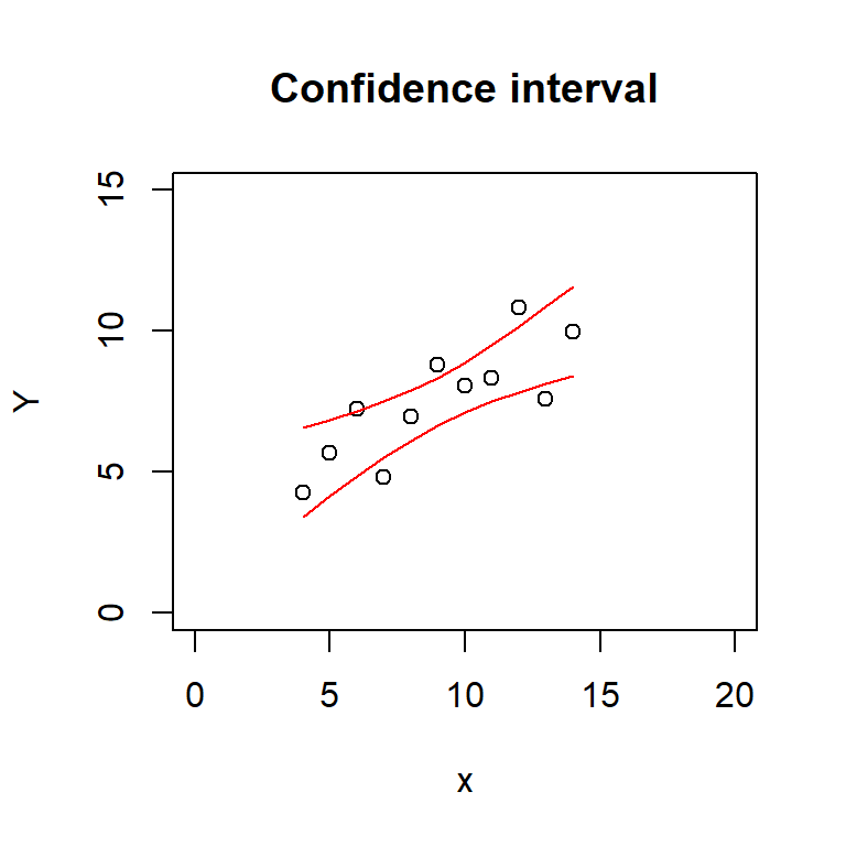
To plot the prediction and confidence intervals, we can use code like the following.
pred_interval <- predict(model1, interval = 'prediction')
conf_interval <- predict(model1, interval = 'confidence')

plot(Y ~ x, data = regdata, main = 'Prediction interval',
     xlim = c(0, 20), ylim = c(0, 15))
lines(regdata$x, pred_interval[, 'lwr'], col = 'red')
lines(regdata$x, pred_interval[, 'upr'], col = 'red')

plot(Y ~ x, data = regdata, main = 'Confidence interval',
     xlim = c(0, 20), ylim = c(0, 15))
lines(regdata$x, conf_interval[, 'lwr'], col = 'red')
lines(regdata$x, conf_interval[, 'upr'], col = 'red')
There are slightly less tedious ways to produce these plots in ggplot2. In fact, confidence intervals are standard functionality within geom_smooth. Prediction intervals you need to compute yourself (use the pred_interval from above) and then either draw a pair of geom_lines for the lower and upper bounds, or a shaded geom_ribbon area to match the look of geom_smooth.
library(ggplot2)
ggplot(regdata) +
  aes(x, Y) +
  geom_smooth(method = lm, se = TRUE) +
  geom_point() +
  ggtitle('Confidence interval')
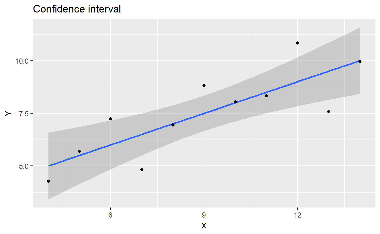
Figure 1: Confidence interval plotted with ggplot2
ggplot(regdata) +
  aes(x, Y) +
  geom_ribbon(data = as.data.frame(pred_interval),
              aes(regdata$x, y = fit, ymin = lwr, ymax = upr),
              alpha = .2) +
  geom_smooth(method = lm, se = FALSE) + # se = FALSE: draw the line only
  geom_point() +
  ggtitle('Prediction interval')
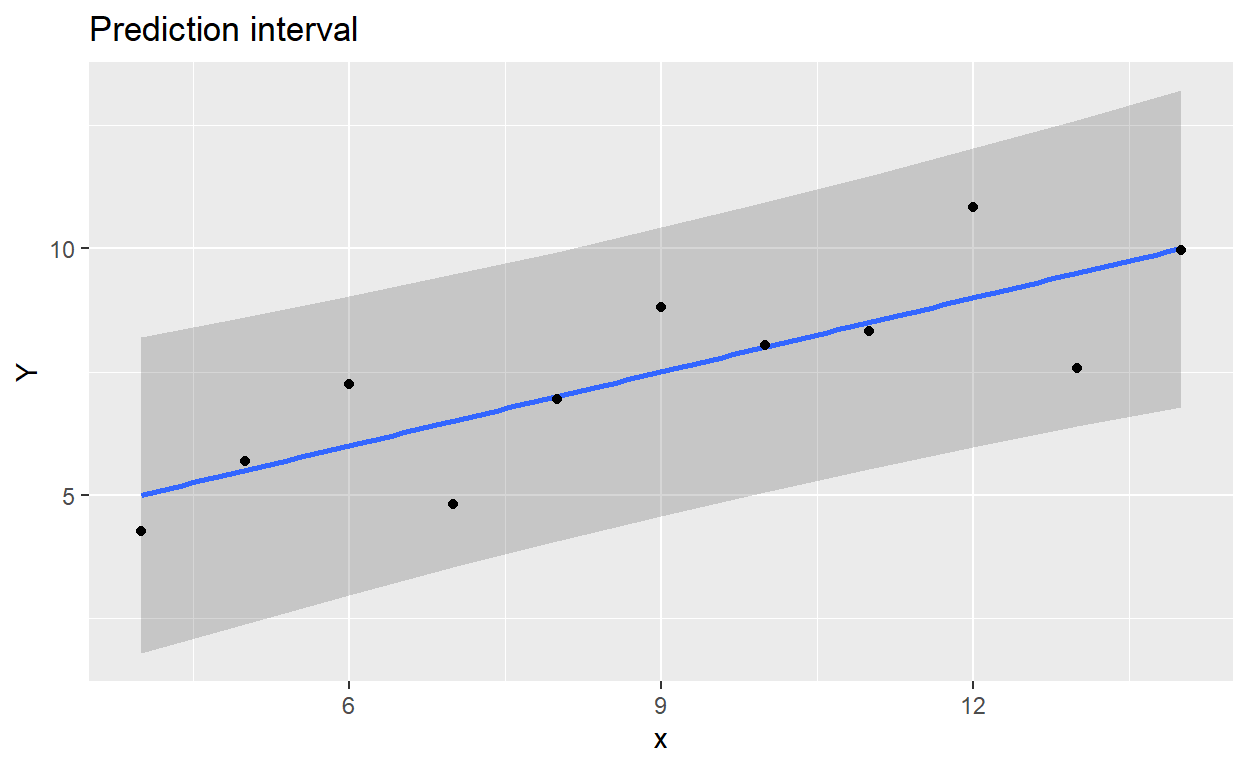
Figure 2: Prediction interval plotted with ggplot2
Diagnostics
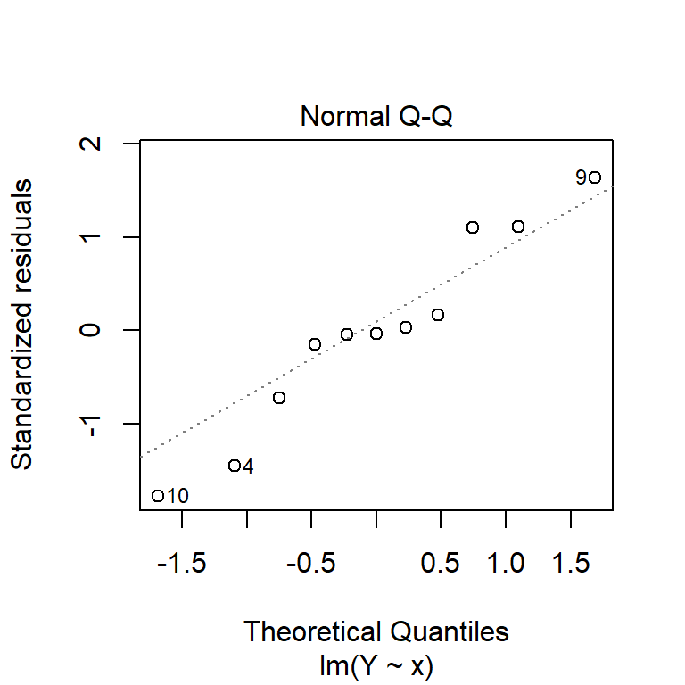
By default, the plot function, when applied to a linear model object, produces four residual diagnostic plots. The first two are the most pertinent: a plot of residuals against fitted values, and a Normal quantile–quantile plot. These can be used to test the assumptions of constant variance, linearity of coefficients and normality of the residuals.
plot(model1, which = 1:2)
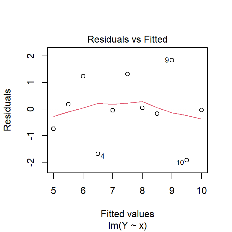
You can also produce these manually, using the residuals function to extract residuals from the model.
plot(fitted(model1), residuals(model1), main = 'Residuals vs. fitted values')
abline(h = 0, lty = 2)

qqnorm(residuals(model1))
qqline(residuals(model1), lty = 2)
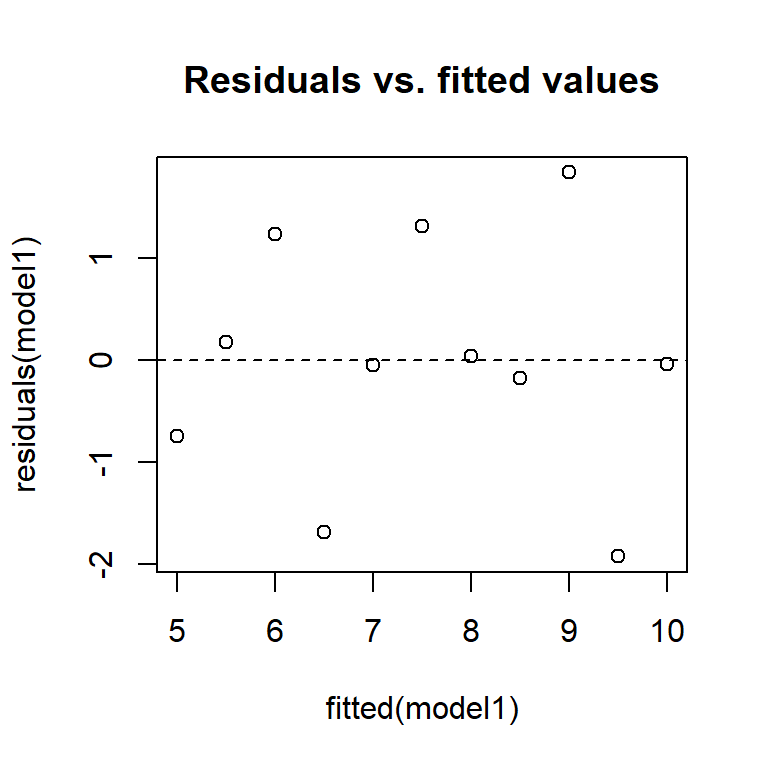
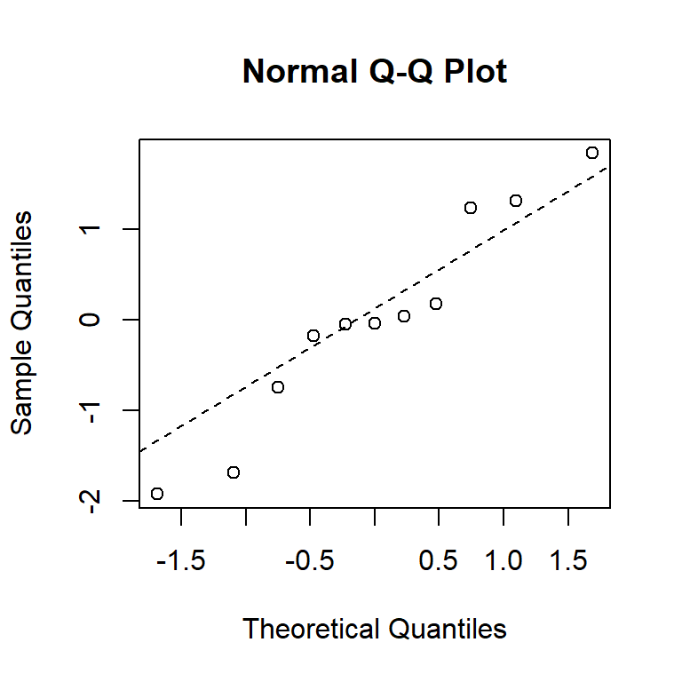
From these diagnostic plots, we can conclude that the residuals of the model in the previous section appear to be approximately normally distributed with constant variance.
Linear models practical
Fitting and interpreting a linear model
Anscombe’s quartet data are built into R.
data(anscombe)
Reproduce the scatter plots from the handout by entering
plot(y1 ~ x1, data = anscombe,
xlim = c(0, 20), ylim = c(0, 15))
plot(y2 ~ x2, data = anscombe,
xlim = c(0, 20), ylim = c(0, 15))
plot(y3 ~ x3, data = anscombe,
xlim = c(0, 20), ylim = c(0, 15))
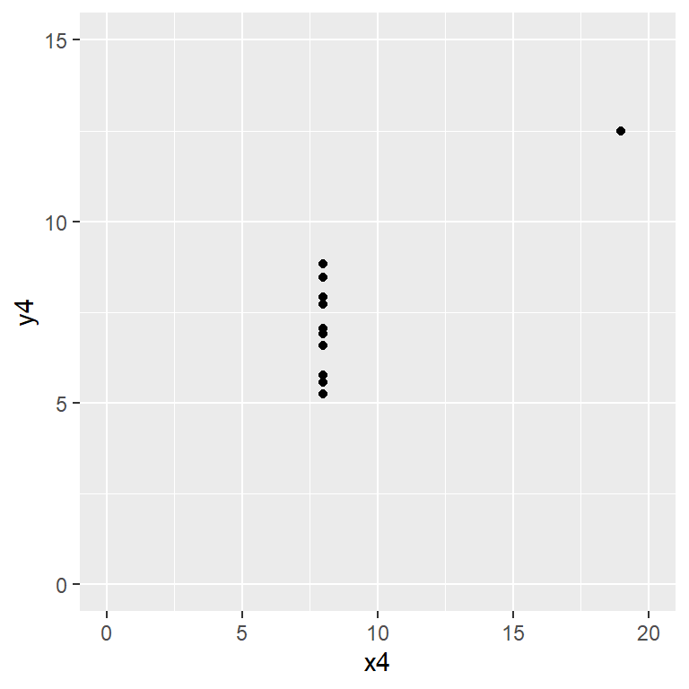
plot(y4 ~ x4, data = anscombe,
xlim = c(0, 20), ylim = c(0, 15))
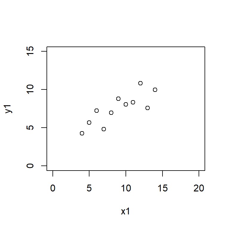
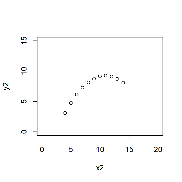
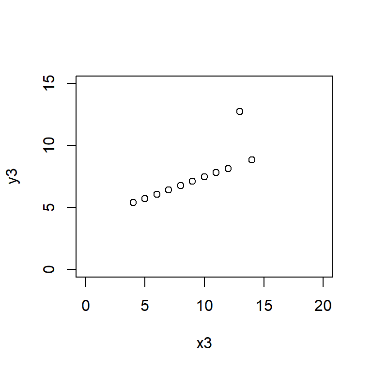
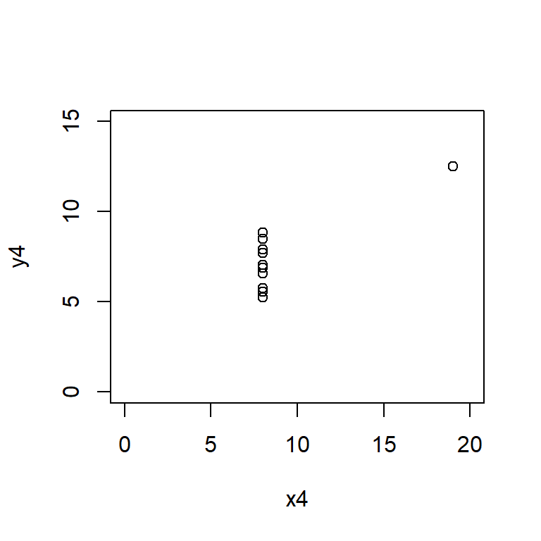
Here the xlim and ylim define the bounds of the \(x\) and \(y\) axes, ensuring that all four plots are drawn on the same scale.
Or if you are more of a ggplot2 fan:
library(ggplot2)
ggplot(anscombe) + aes(x1, y1) + geom_point() + xlim(0, 20) + ylim(0, 15)
ggplot(anscombe) + aes(x2, y2) + geom_point() + xlim(0, 20) + ylim(0, 15)
ggplot(anscombe) + aes(x3, y3) + geom_point() + xlim(0, 20) + ylim(0, 15)
ggplot(anscombe) + aes(x4, y4) + geom_point() + xlim(0, 20) + ylim(0, 15)
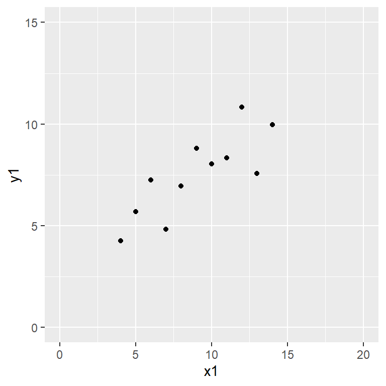
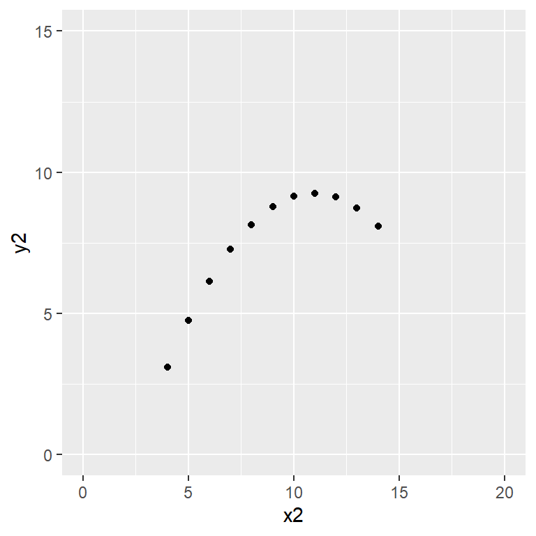
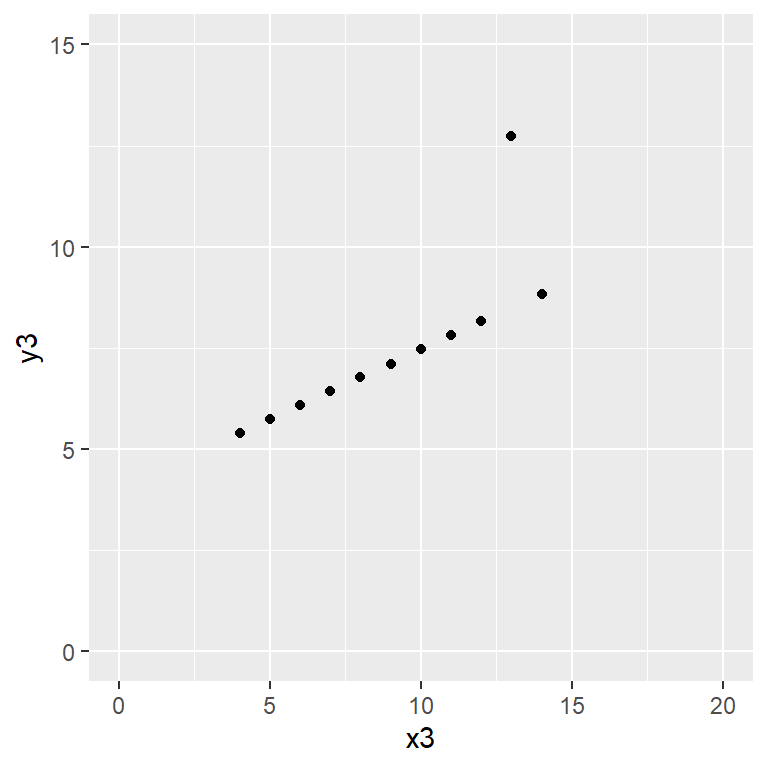
Satisfy yourself that these datasets yield (approximately) the same linear regression model coefficients:
Automobile data
The mtcars dataset included with R is somewhat equivalent to the auto dataset included with Stata. It is not actually the same (the Stata data is from 1978 and the R data set is from 1974) but very similar. For consistency, let’s load the Stata dataset.
auto <- foreign::read.dta('http://www.stata-press.com/data/r8/auto.dta')
Is fuel consumption associated with weight?
We regress miles per US gallon, mpg, against weight in lbs, weight, using
fuel_model <- lm(mpg ~ weight, data = auto)
Checking the assumptions of the model,
plot(fuel_model, which = 1:2)
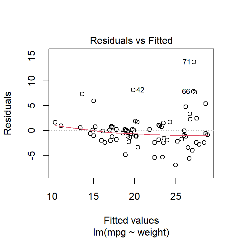
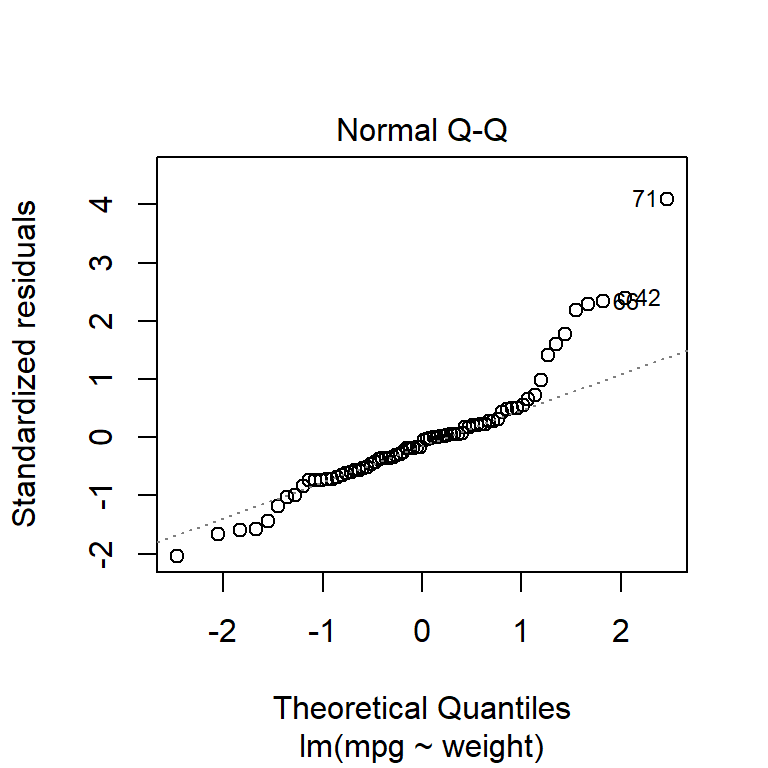
it appears that the residuals are approximately normally distributed and the variance is constant (except perhaps some very heavy, fuel-guzzling cars at the top end).
From the model summary output,
summary(fuel_model)
Call:
lm(formula = mpg ~ weight, data = auto)

Residuals:
    Min      1Q  Median      3Q     Max
-6.9593 -1.9325 -0.3713  0.8885 13.8174

Coefficients:
              Estimate Std. Error t value Pr(>|t|)
(Intercept) 39.4402835  1.6140031   24.44   <2e-16 ***
weight      -0.0060087  0.0005179  -11.60   <2e-16 ***
---
Signif. codes:  0 '***' 0.001 '**' 0.01 '*' 0.05 '.' 0.1 ' ' 1

Residual standard error: 3.439 on 72 degrees of freedom
Multiple R-squared:  0.6515,    Adjusted R-squared:  0.6467
F-statistic: 134.6 on 1 and 72 DF,  p-value: < 2.2e-16
there appears to be a statistically-significant relationship between weight and fuel consumption: as weight increases, fuel economy gets worse.
What proportion of the variance in mpg can be explained by variations in weight?
The coefficient of determination, \(R^2\), is not a very good indicator of model fitness. Nonetheless, it is
or equivalently
summary(fuel_model)$r.squared
[1] 0.6515313What change in mpg would be expected for a one pound increase in weight?
coef(fuel_model)['weight']
      weight
-0.006008687
A reduction of 0.006 miles per US gallon.
What fuel consumption would you expect, based on this data, for a car weighing 3000 lbs?
We can calculate the predicted value and associated 95% prediction interval using the following code.
       fit      lwr      upr
1 21.41422 14.51273 28.31572
A confidence interval may not be really appropriate here, unless we were looking at a specific car already in the dataset that weighed 3000 lbs.
Would it be reasonable to use this regression equation to calculate the expected fuel consumption of a car weighing 1000 lbs?
No. Look at the data.
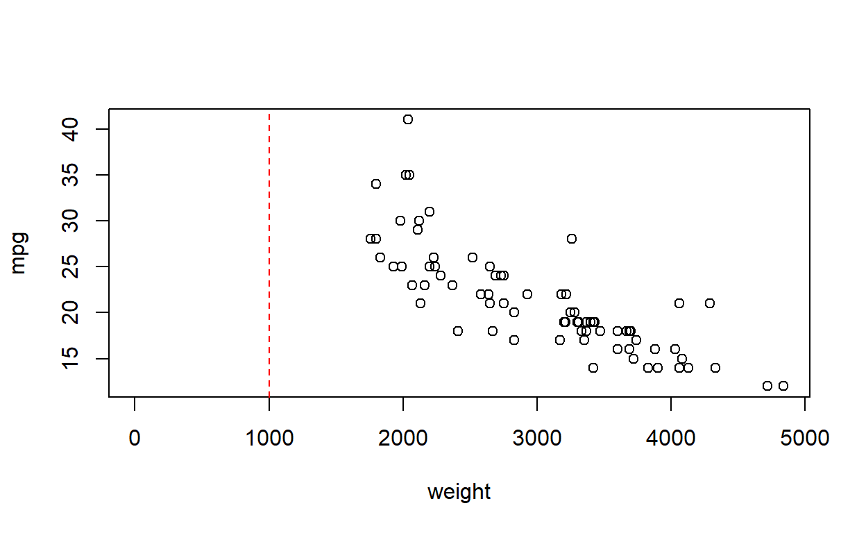
A car weighing 1000 lbs (half a US ton) is well outside the reference range of the data, and would involve (rather an heroic level of) extrapolation.
Diagnostics
Constancy of variance
Load the dataset constvar.csv, which is simulated data generated for this practical.
constvar <- read.csv('constvar.csv')
Perform a regression of y on x, using lm(y ~ x). Is there a statistically significant association between y and x?
Call:
lm(formula = y ~ x, data = constvar)

Residuals:
    Min      1Q  Median      3Q     Max
-2.2626 -0.8959 -0.2572  0.3595  8.0098

Coefficients:
            Estimate Std. Error t value Pr(>|t|)
(Intercept)   1.5996     0.1827   8.755 3.23e-13 ***
x             2.6768     0.6296   4.251 5.84e-05 ***
---
Signif. codes:  0 '***' 0.001 '**' 0.01 '*' 0.05 '.' 0.1 ' ' 1

Residual standard error: 1.629 on 78 degrees of freedom
Multiple R-squared:  0.1881,    Adjusted R-squared:  0.1777
F-statistic: 18.07 on 1 and 78 DF,  p-value: 5.838e-05
Calculate standardised residuals using the function rstandard. Compute fitted values using the function predict. Hence, or otherwise, produce a graph of standardised residuals against fitted values.
plot(fitted(const_model), rstandard(const_model),
     xlab = 'Fitted values', ylab = 'Standardised residuals')
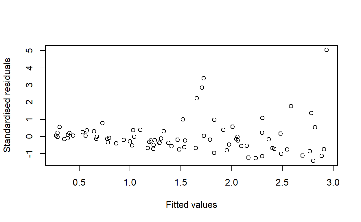
Would you conclude that the variance is constant for all values of \(\hat y\), or is there any evidence of a pattern in the residuals?
The variance appears to increase with \(x\).
Confirm (or disprove) your answer to the previous question.
According to the Stata documentation, the hettest command performs the Breusch–Pagan (1979) and Cook–Weisberg (1983) tests for heteroscedasticity.
There are packages for doing this in R, but as a statistician I had never heard of either of these tests before and am not inclined to use such apparent black-box-like functions unquestioningly, especially when it is so easy to do it by hand.
The test in Stata is as simple as fitting an auxiliary simple linear regression model of the squared residuals against the covariate. The test statistic is the coefficient of determination of this auxiliary model, multiplied by the sample size, and it has distribution \(\chi^2\) with \(p-1 = 1\) degree of freedom. In R, we can do this as follows:
constvar$resids2 <- residuals(const_model)^2
aux_model <- lm(resids2 ~ x, data = constvar)
test_stat <- summary(aux_model)$r.squared * nrow(constvar)
pchisq(test_stat, df = 1, lower.tail = FALSE)
[1] 0.008701766The test statistic was 6.88. And the \(p\)-value was less than 1%. To verify our calculation, we use the function bptest from the lmtest package.
# install.packages('lmtest')
lmtest::bptest(const_model)
    studentized Breusch-Pagan test

data:  const_model
BP = 6.883, df = 1, p-value = 0.008702
The test statistic and \(p\)-value are the same as above. Hence we reject the null hypothesis that the residuals are homoscedastic.
Produce a residual vs fitted value plot. Would this plot give the same conclusion that you reached in the previous question?
I think this question is redundant, as we already plotted (standardised) residuals against fitted values above. Unless it is just to demonstrate the Stata function rvfplot. But here are the various plots from plot.lm:
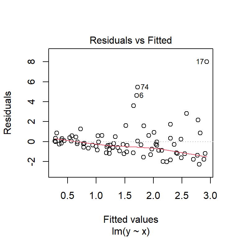
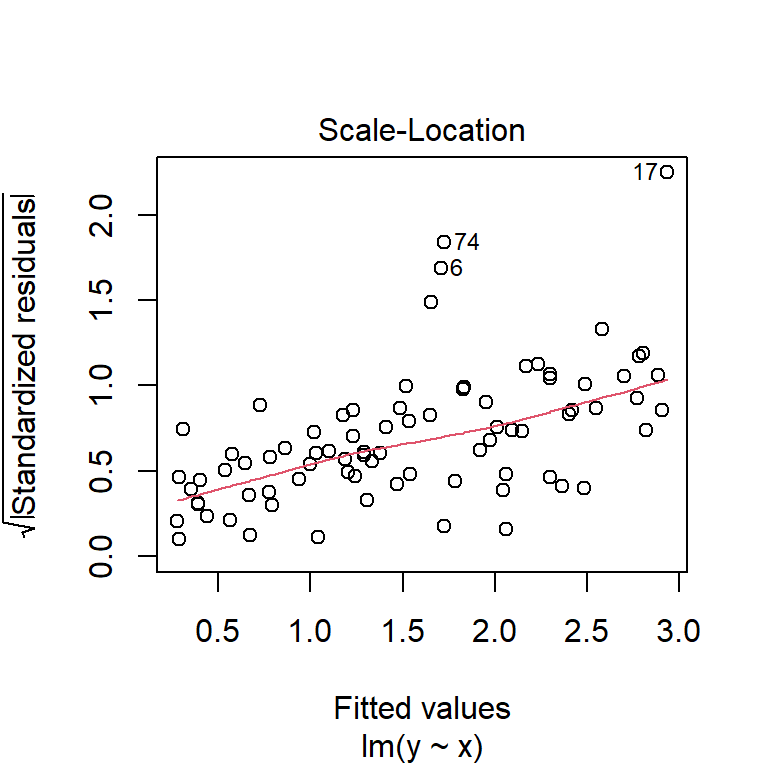
We can see variance is increasing with \(x\), as before.
Logarithmic transformation
Use the command logy <- log(y) to generate a new variable equal to the log of y. Perform a regression of logy on x with the function call lm(logy ~ x). Compute the new standardised residuals and fitted values with the functions rstandard and fitted (or predict). Produce a plot of the standardised residuals against the fitted values.
Is the variance of the residuals constant following this transformation?
constvar$logy <- log(constvar$y)
log_model <- lm(logy ~ x, data = constvar)
plot(fitted(log_model), rstandard(log_model),
     xlab = 'Fitted values',
     ylab = 'Standardised residuals')
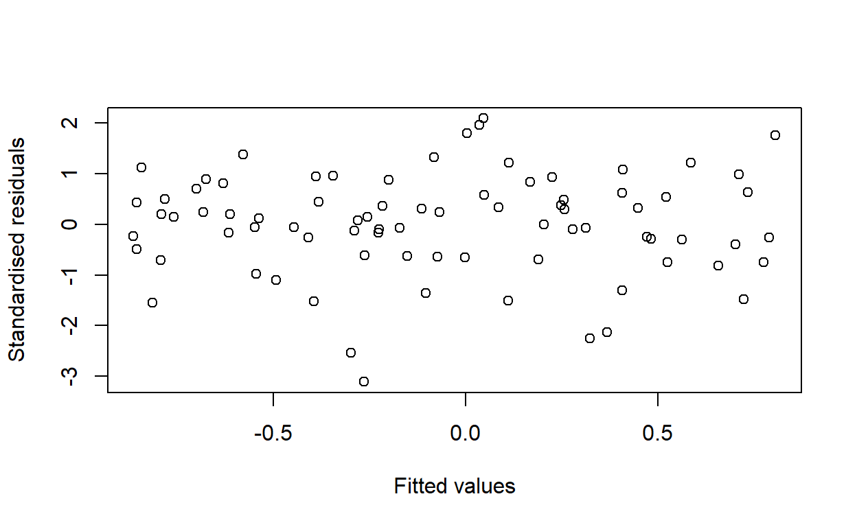
Yes.
Confirm your answer to the previous question with an appropriate hypothesis test.
lmtest::bptest(log_model)
    studentized Breusch-Pagan test

data:  log_model
BP = 0.39455, df = 1, p-value = 0.5299
Large \(p\)-value, so no evidence to reject the null hypothesis that the residuals, under the new model, are homoscedastic.
Confirming linearity
Use the data wood73.csv. This is simulated data to illustrate the use of the CPR plot.
wood73 <- read.csv('wood73.csv')
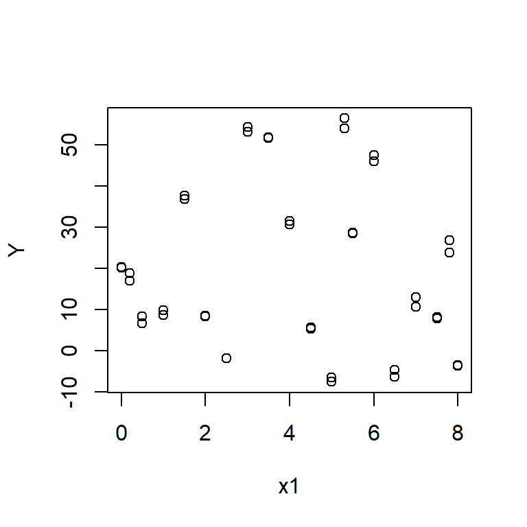
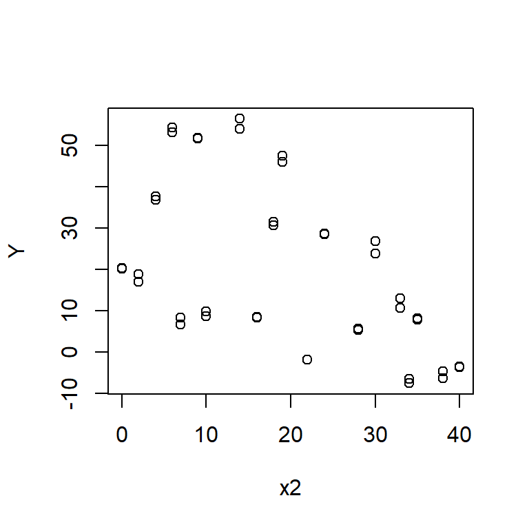
Plot graphs of Y against x1 and Y against x2. Do these graphs suggest a nonlinear association between Y and either x1 or x2?
Fit a model of Y against x1 and x2 with the function call lm(Y ~ x1 + x2).
wood_model <- lm(Y ~ x1 + x2, data = wood73)
Produce component+residual plots for x1 and x2 with the function crPlot (or crPlots) from the car package. Do either of these plots suggest a non-linear relationship between Y and either x1 or x2?
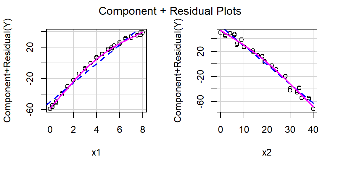
Component + residual plots are also known as partial-residual plots. The plot for x1 looks non-linear.
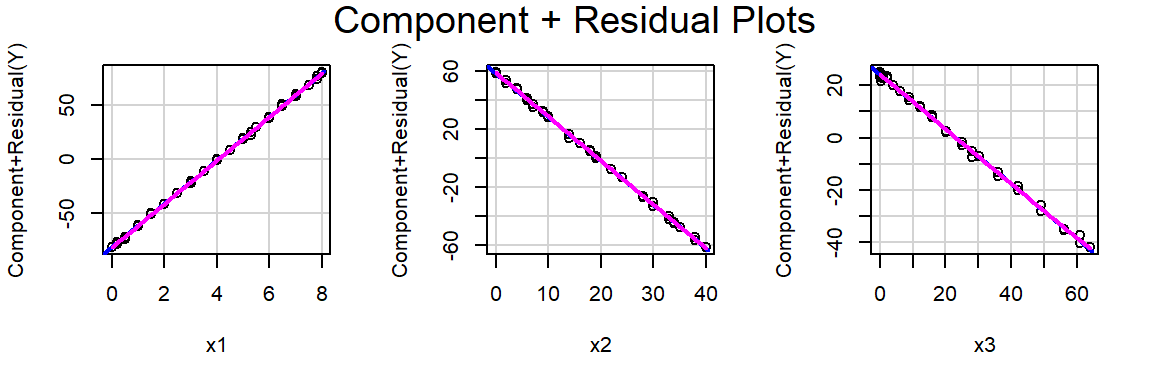
Create a new variable, x3, equal to the square of x1. Include x3 in a regression model. Is x3 a statistically significant predictor of Y?
Call:
lm(formula = Y ~ x1 + x2 + x3, data = wood73)

Residuals:
    Min      1Q  Median      3Q     Max
-2.4141 -0.4770  0.1232  0.6053  1.8190

Coefficients:
            Estimate Std. Error t value Pr(>|t|)
(Intercept) 20.00627    0.39014   51.28   <2e-16 ***
x1          20.31001    0.24587   82.61   <2e-16 ***
x2          -3.00741    0.02506 -120.01   <2e-16 ***
x3          -1.03800    0.02748  -37.77   <2e-16 ***
---
Signif. codes:  0 '***' 0.001 '**' 0.01 '*' 0.05 '.' 0.1 ' ' 1

Residual standard error: 0.9801 on 36 degrees of freedom
Multiple R-squared:  0.9978,    Adjusted R-squared:  0.9976
F-statistic:  5455 on 3 and 36 DF,  p-value: < 2.2e-16
Produce a CPR plot for x1, x2 and x3. Is there still evidence of non-linearity?
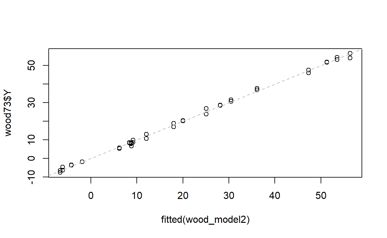
Use the function predict or fitted to calculate fitted values for Y. Plot Y against its expected value. How good are x1, x2 and x3 at predicting Y? Is this what you expected from the value of R2 from the regression?
Outlier detection
Use the dataset lifeline.csv.
lifeline <- read.csv('lifeline.csv')
This data was collected to test the hypothesis that the age to which a person will live is governed by the length of the crease across the palm known as the ‘lifeline’ in palmistry. The age at which each subject died is given by age, and the length of their lifeline (normalised for body size) is given by lifeline.
Perform a regression of age on lifeline. Is there a significant association between age at death and the length of the lifeline in this dataset?
Call:
lm(formula = age ~ lifeline, data = lifeline)

Residuals:
     Min       1Q   Median       3Q      Max
-27.7070  -8.5522  -0.2346   7.9924  28.0354

Coefficients:
            Estimate Std. Error t value Pr(>|t|)
(Intercept)   97.155     11.372   8.544 3.36e-11 ***
lifeline      -3.272      1.203  -2.719  0.00909 **
---
Signif. codes:  0 '***' 0.001 '**' 0.01 '*' 0.05 '.' 0.1 ' ' 1

Residual standard error: 13.27 on 48 degrees of freedom
Multiple R-squared:  0.1335,    Adjusted R-squared:  0.1154
F-statistic: 7.393 on 1 and 48 DF,  p-value: 0.009087
Plot age against lifeline. Are there any points that lie away from the bulk of the data? If there are, are they outliers in age, lifeline or both?
plot(age ~ lifeline, data = lifeline)
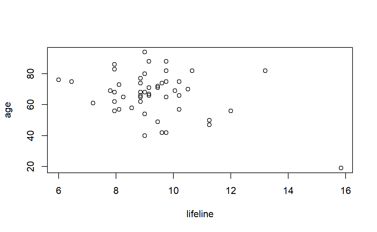
Are there any points in the above graph that you would expect to have undue influence on the regression equation?
The point in the bottom right (which is the 1st observation in the dataset) has high influence.
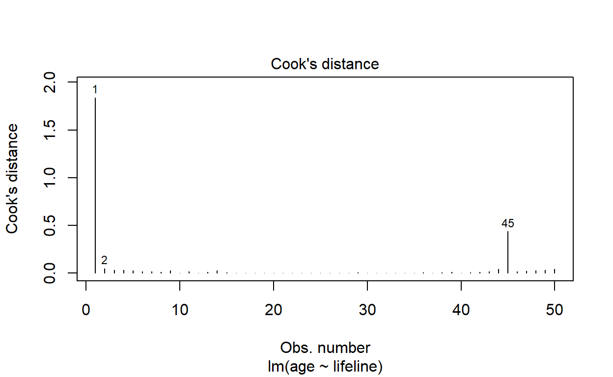
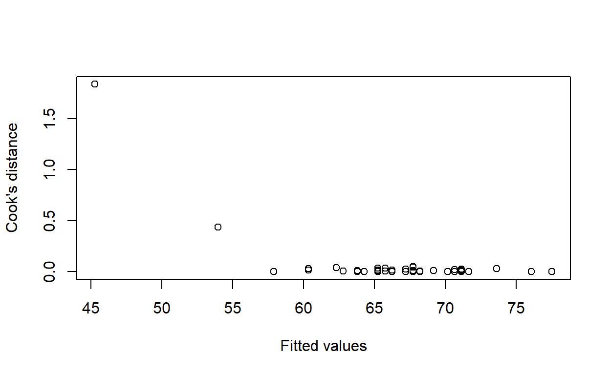
Calculate Cook’s distance for each observation with the function cooks.distance. Calculate the expected age at death for each observation with the function fitted. Plot Cook’s distance against expected age at death. Do any observations have an unusually large Cook’s distance?
We can determine this very quickly using the 4th residual diagnostic plot produced by plot.lm, as follows:
plot(life_model, which = 4)
Or we can produce the requested plot by hand.
plot(fitted(life_model), cooks.distance(life_model),
     xlab = 'Fitted values', ylab = 'Cook\'s distance')
Identify the observation with the largest Cook’s distance. Rerun the regression excluding that point. How does removing this point affect the regression?
largest_cd <- which.max(cooks.distance(life_model))
life_model2 <- lm(age ~ lifeline, data = lifeline[-largest_cd, ])
summary(life_model2)
Call:
lm(formula = age ~ lifeline, data = lifeline[-largest_cd, ])

Residuals:
    Min      1Q  Median      3Q     Max
-27.825  -8.676   0.021   6.793  26.175

Coefficients:
            Estimate Std. Error t value Pr(>|t|)
(Intercept)   77.083     13.126   5.872  4.2e-07 ***
lifeline      -1.029      1.416  -0.727    0.471
---
Signif. codes:  0 '***' 0.001 '**' 0.01 '*' 0.05 '.' 0.1 ' ' 1

Residual standard error: 12.51 on 47 degrees of freedom
Multiple R-squared:  0.01111,   Adjusted R-squared:  -0.009928
F-statistic: 0.5281 on 1 and 47 DF,  p-value: 0.471
Notice the effect of lifeline on age is no longer statistically significant.
Repeat the above analysis removing the two most influential points. Does this change your conclusions about the association between age at death and length of lifeline in this dataset?
most_influential <- rank(-cooks.distance(life_model))
life_model3 <- lm(age ~ lifeline, data = lifeline,
                  subset = most_influential > 2)
summary(life_model3)
Call:
lm(formula = age ~ lifeline, data = lifeline, subset = most_influential >
    2)

Residuals:
     Min       1Q   Median       3Q      Max
-27.5662  -7.8769   0.2645   6.5185  26.4338

Coefficients:
            Estimate Std. Error t value Pr(>|t|)
(Intercept)   87.885     14.321   6.137 1.81e-07 ***
lifeline      -2.258      1.561  -1.446    0.155
---
Signif. codes:  0 '***' 0.001 '**' 0.01 '*' 0.05 '.' 0.1 ' ' 1

Residual standard error: 12.26 on 46 degrees of freedom
Multiple R-squared:  0.04349,   Adjusted R-squared:  0.02269
F-statistic: 2.091 on 1 and 46 DF,  p-value: 0.1549
There is still no significant effect.
What is your conclusion about the association between age at death and length of lifeline in this dataset?
There is no association.
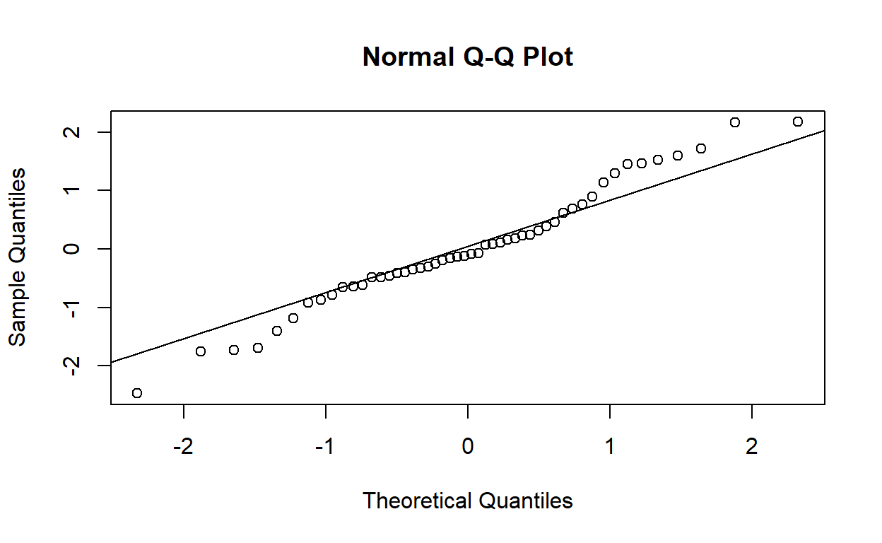
Confirming normality
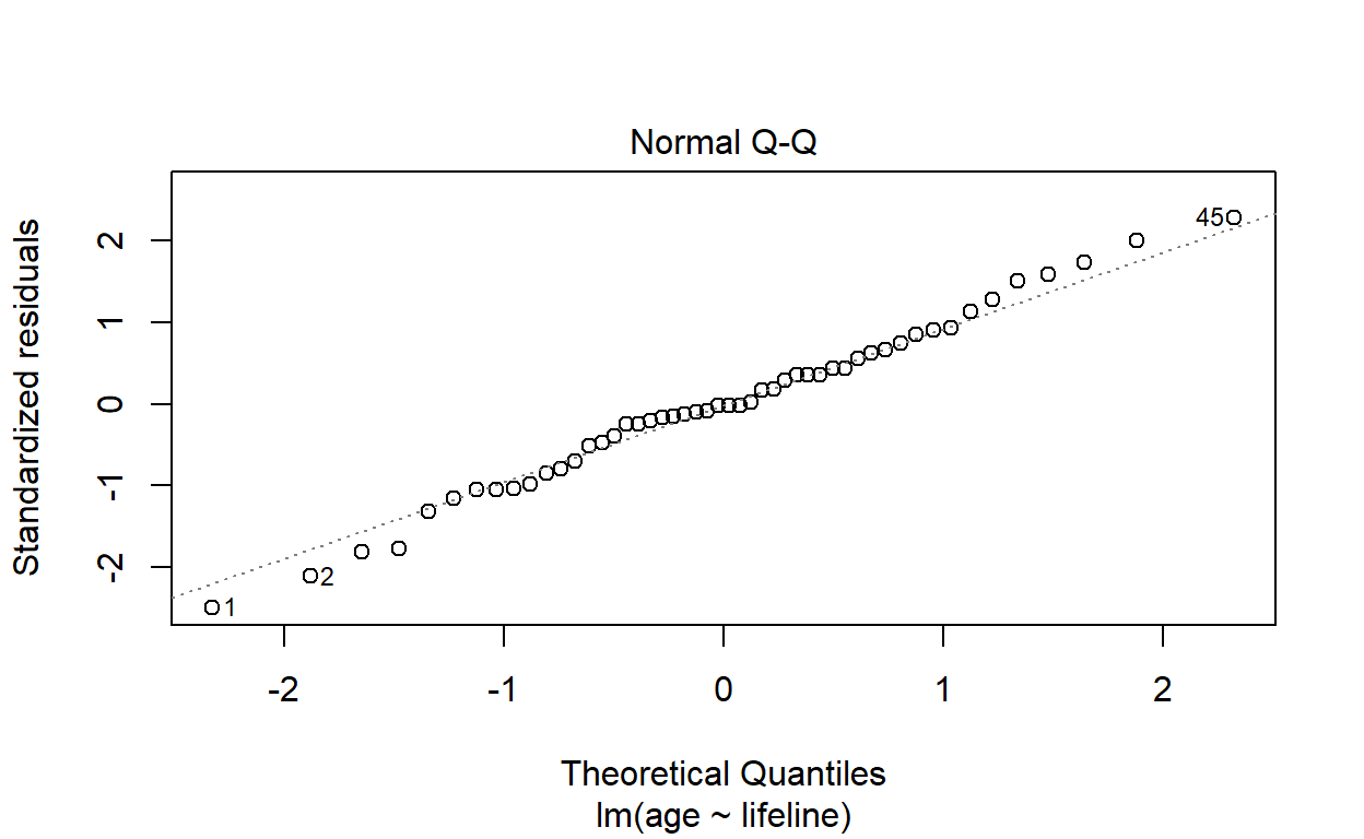
Look back at the lifeline model including all of the original observations.
Draw a normal quantile–quantile plot of the standardised residuals. Do the plotted points lie on a straight line? Are there any observations that do not appear to fit with the rest of the data?
Using the built-in residual diagnostic plotting function:
plot(life_model, which = 2)
Or by hand:
Confirm your answer to the previous question by formally testing for normality of the residuals with the function shapiro.test. Do the residuals follow a normal distribution?
shapiro.test(rstandard(life_model))
    Shapiro-Wilk normality test

data:  rstandard(life_model)
W = 0.99041, p-value = 0.9553
Yes, the standardised residuals follow an approximately normal distribution.
Complete example
This example uses hsng.csv, a dataset consisting of data on housing in each state in the USA taken from the 1980 census. The variables we are particularly interested in are rent, the median monthly rent in dollars; faminc, the median annual family income in dollars; hsng, the number of housing units; hsngval, the median value of a housing unit; and hsnggrow, the percentage growth in housing. We are going to see if we can predict the median rent in a state from the data we have on income and housing provision.
hsng <- read.csv('hsng.csv')
Initial regression
Use a function call of the form
housing_model <- lm(rent ~ hsngval + hsnggrow + hsng + faminc, data = hsng)
to fit a linear model predicting median rent from the other four variables.
How many observations are used in fitting this regression model?
nrow(hsng)
[1] 50As we might expect, since there were fifty states in the USA in 1980.
How many of the predictor variables are statistically significant?
summary(housing_model)
Call:
lm(formula = rent ~ hsngval + hsnggrow + hsng + faminc, data = hsng)

Residuals:
    Min      1Q  Median      3Q     Max
-27.069  -5.370  -1.102   4.963  24.166

Coefficients:
             Estimate Std. Error t value Pr(>|t|)
(Intercept) 1.616e+01  1.371e+01   1.179   0.2447
hsngval     4.964e-04  1.576e-04   3.150   0.0029 **
hsnggrow    6.458e-01  9.883e-02   6.535 5.00e-08 ***
hsng        2.320e-06  9.387e-07   2.472   0.0173 *
faminc      8.586e-03  8.816e-04   9.738 1.19e-12 ***
---
Signif. codes:  0 '***' 0.001 '**' 0.01 '*' 0.05 '.' 0.1 ' ' 1

Residual standard error: 11.51 on 45 degrees of freedom
Multiple R-squared:  0.9027,    Adjusted R-squared:  0.8941
F-statistic: 104.4 on 4 and 45 DF,  p-value: < 2.2e-16
Depends on the level of significance desired. All four of them at the 5% level; all except number of housing units at the 1% level; just percentage growth in housing and family income at the 0.1% level.
What is the coefficient for hsnggrow and its 95% confidence interval?
This wording of question seems to suggest that the variable should be referred to hsnggrow in prose, rather than ‘percentage growth in housing’. The former is just a concise way of referring to it programatically. In any case, the parameter estimate and 95% confidence interval are given by:
coef(housing_model)['hsnggrow']
 hsnggrow
0.6458343 confint(housing_model, 'hsnggrow')
             2.5 %    97.5 %
hsnggrow 0.4467803 0.8448883
How would you interpret this coefficient and confidence interval?
For every 1% increase in housing growth, median monthly rent increases by approximately $0.65. We are 95% confident that the true increase in rent falls between 45 cents and 84 cents.
What is the value of \(R^2\) for this regression? What does this mean?
summary(housing_model)$r.squared
[1] 0.902726890% of the variation in median monthly rent between states in 1980 is explained by the covariates in the model.
Constancy of variance
Plot the standardised residuals of the model against the fitted values.
plot(fitted(housing_model),
     rstandard(housing_model),
     xlab = 'Fitted values',
     ylab = 'Standardised residuals')
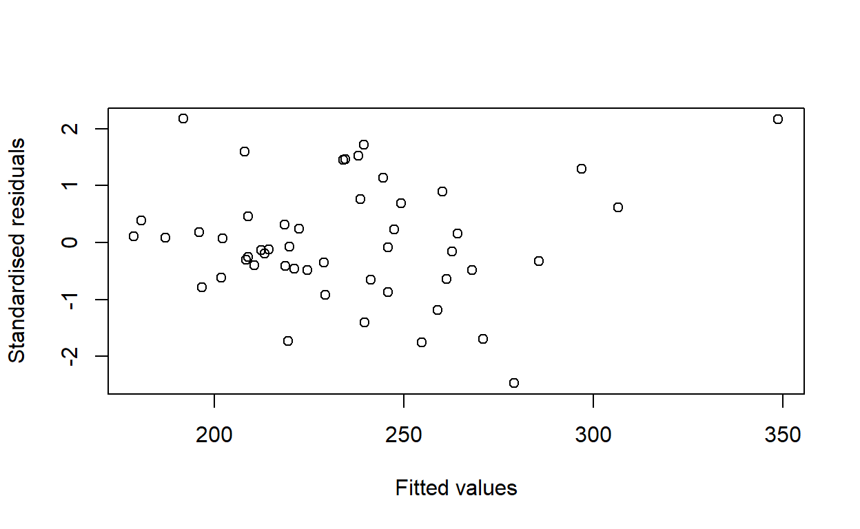
Would you conclude that the variance of the residuals is the same for all predicted values of rent?
Yes. There is no noticeable pattern.
Compare the plot you have just produced to the plot produced by plot.lm. Would you have come to the same conclusion about the constance of variance using this plot?
plot(housing_model, which = 1)
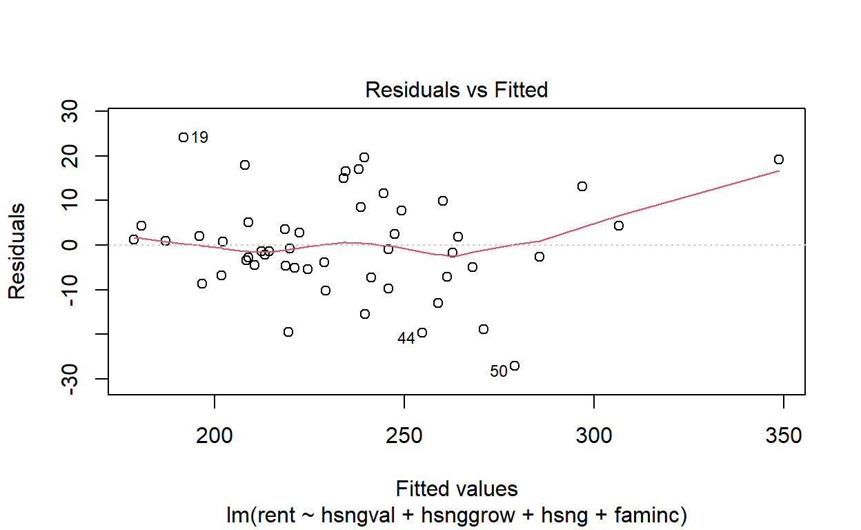
Yes. The plots look very similar.
Linearity
Produce a CPR plot for each of the variables faminc, hsng, hsngval, and hsnggrow, using the function crPlot(s) from the car package.
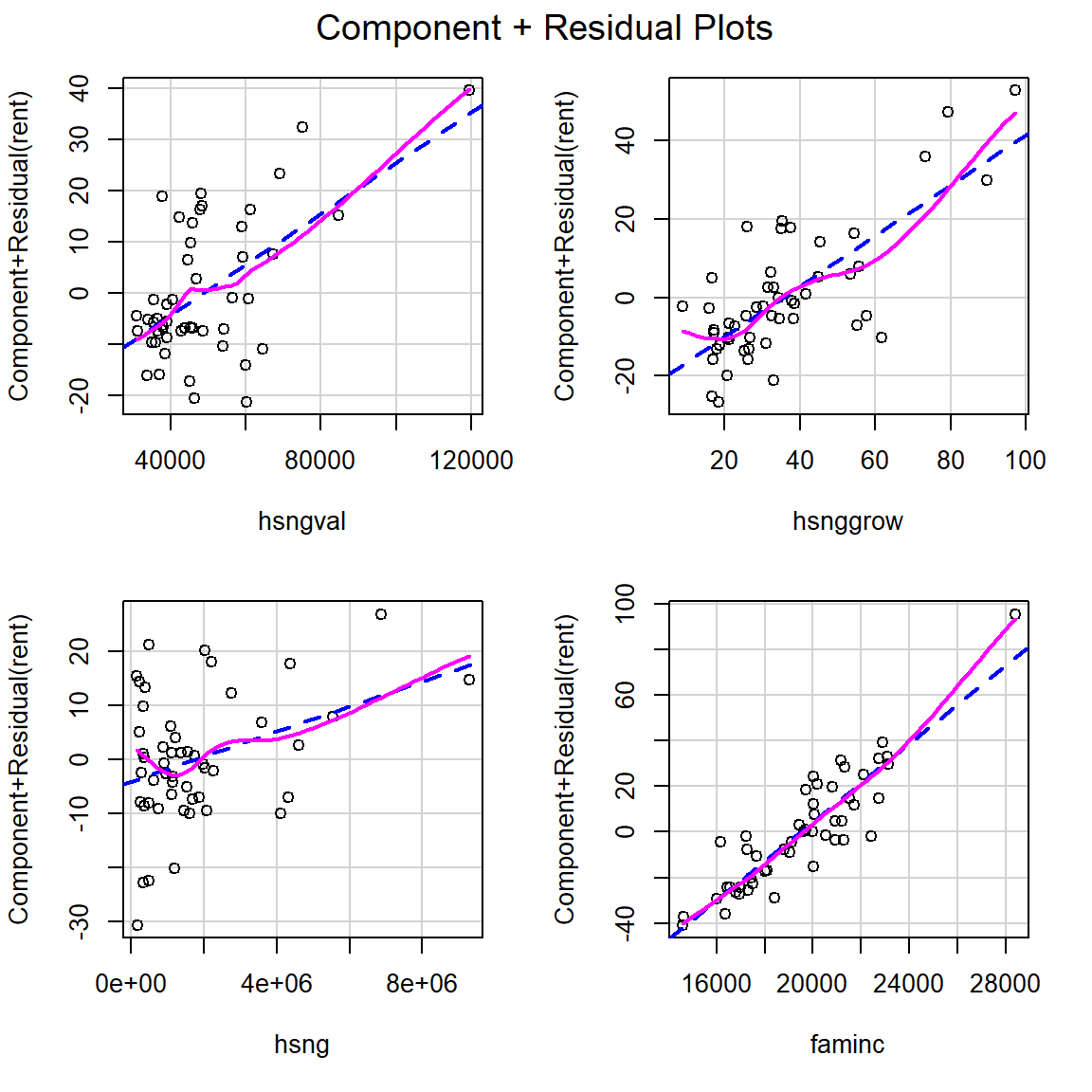
Is there any evidence of non-linearity in the association between the four predictor variables and the outcome variable?
No, they all look pretty linear to me.
Influence
Calculate Cook’s distance for each observation. Plot Cook’s distance against the fitted values.
plot(fitted(housing_model),
     cooks.distance(housing_model),
     xlab = 'Fitted values',
     ylab = 'Cook\'s distance')
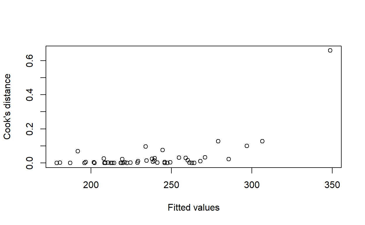
Are there any observations with an unusually large Cook’s distance?
Yes, top-right of the plot.
If so, which state or states?
Graphically, we can plot the names of the states, rather than dots.
plot(fitted(housing_model),
     cooks.distance(housing_model),
     xlab = 'Fitted values',
     ylab = 'Cook\'s distance',
     type = 'n')
text(fitted(housing_model),
     cooks.distance(housing_model),
     labels = hsng$state)
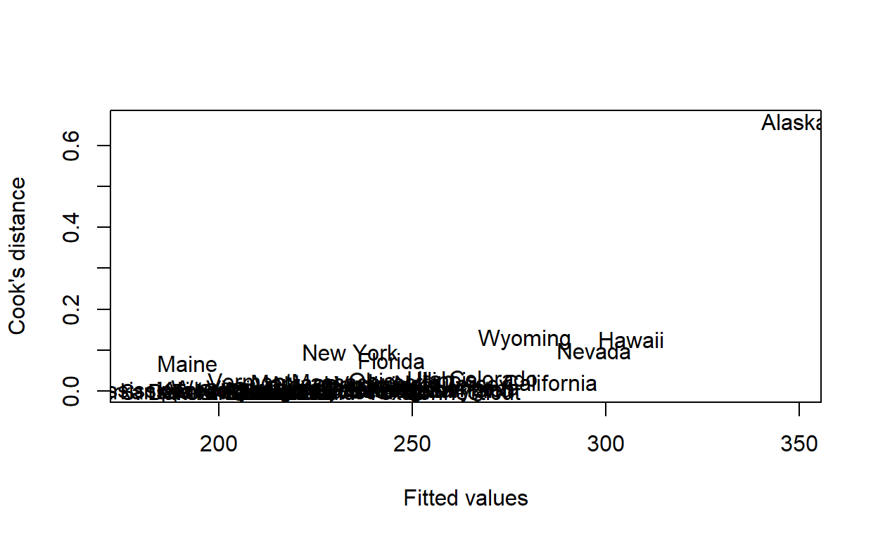
Or, numerically, we just need to find the state with the largest Cook’s distance.
cd <- cooks.distance(housing_model)
hsng[which.max(cd), ]
   state division region    pop popgrow popden pcturban faminc   hsng
2 Alaska  Pacific   West 401851    32.8      7   64.344  28395 162825
  hsnggrow hsngval rent
2 79.26938   75200  368
Rerun the regression analysis excluding any states with a Cook’s distance of greater than 0.5.
Either run lm again, or use update and the subset argument.
housing_model2 <- update(housing_model, subset = cd <= 0.5)
Compare the coefficients and confidence intervals for each of the 4 predictors. Have any of them changed substantially? Are any of them no longer significantly associated with the outcome?
coefficients(housing_model)
 (Intercept)      hsngval     hsnggrow         hsng       faminc
1.615788e+01 4.964412e-04 6.458343e-01 2.320351e-06 8.585539e-03 confint(housing_model)
                    2.5 %       97.5 %
(Intercept) -1.145050e+01 4.376625e+01
hsngval      1.790022e-04 8.138802e-04
hsnggrow     4.467803e-01 8.448883e-01
hsng         4.296223e-07 4.211080e-06
faminc 6.809849e-03 1.036123e-02coefficients(housing_model2)
 (Intercept)      hsngval     hsnggrow         hsng       faminc
3.767935e+01 6.095071e-04 5.591967e-01 2.646940e-06 7.296239e-03 confint(housing_model2)
                   2.5 %       97.5 %
(Intercept) 5.049616e+00 7.030909e+01
hsngval     2.893706e-04 9.296435e-04
hsnggrow    3.536314e-01 7.647620e-01
hsng        8.133944e-07 4.480485e-06
faminc      5.245890e-03 9.346587e-03
They change slightly, but not substantially.
Note. in R, it is not necessary to run the model multiple times like this. Use the function influence and related tools to show the effect of omitting each observation from the original model. For example, this is the effect on each of the parameters of removing Alaska.
  (Intercept)       hsngval      hsnggrow          hsng        faminc
-2.152148e+01 -1.130659e-04  8.663757e-02 -3.265885e-07  1.289300e-03
and the effect on the residual standard deviation:
See help(influence) for more information.
Compare the new fitted values with the old ones in a scatter plot.
plot(fitted(housing_model)[cd <= .5],
     fitted(housing_model2),
     xlab = 'Original dataset', ylab = 'Excluding influential obs.')
abline(a = 0, b = 1, lty = 2, col = 'grey')
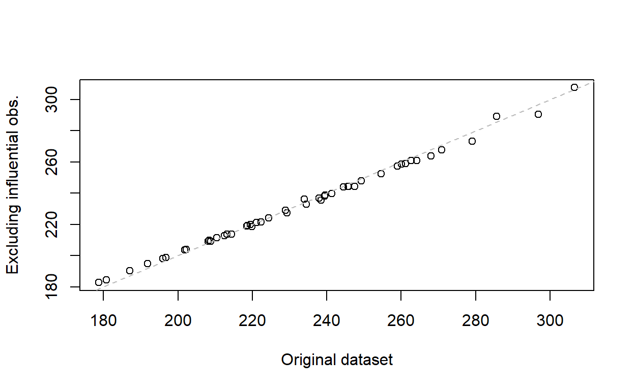
The fitted values are almost the same, so there is no appreciable benefit to excluding the influential values from the model.
Normality
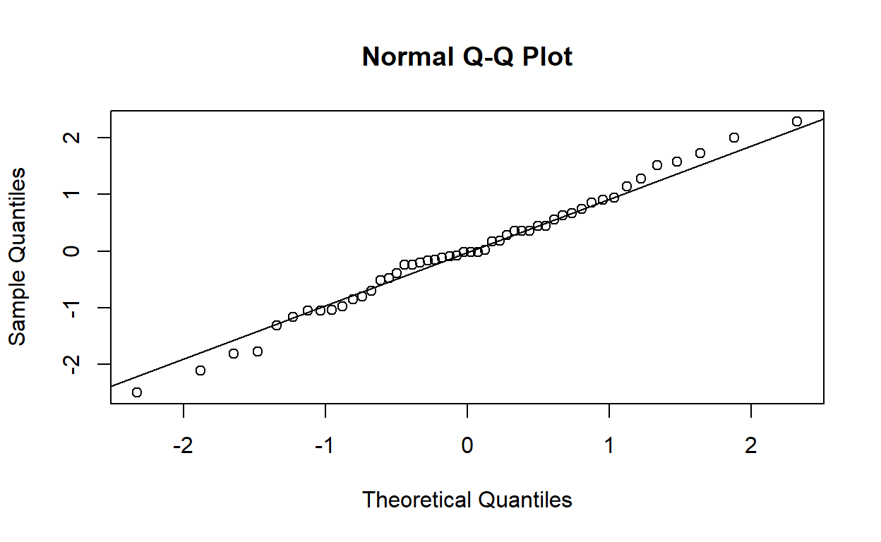
Produce a normal plot of the standardised residuals with qqnorm (and qqline). Do the plotted points lie reasonably close to the expected straight line?
Yes, they lie reasonably close to a straight line.
Perform a Shapiro–Wilks test to verify your answer to the previous question.
shapiro.test(rstandard(housing_model))
    Shapiro-Wilk normality test

data:  rstandard(housing_model)
W = 0.97838, p-value = 0.4858
There is no evidence against the null hypothesis of a normal distribution. The test agrees with the answer above.