|
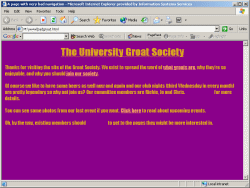
This slide covers some basic points about the visibility and user-friendliness of links. I have illustrated it with two hypothetical front pages for the "Groat Society" site, which you can view using the screen shots on the right. The bad version, at least, is over-exaggerated to make its point but rest assured that there are many web pages which make some or all of these errors! (Note that none of the links on these two pages actually go anywhere.)
To summarise the key points:
- make sure your links are easily distinguishable from the text. The "bad" version compounds its problems here by underlining text which is not a link, making it very difficult to see which parts of the page are active.
- It's OK to pepper links throughout text, but the convenience of your page is greatly enhanced if you collect links together into menus. Ensure these menus are consistently placed on each page: plenty of research has shown that people are easily disoriented in virtual environments and like things to be in the same place each time.
- use meaningful link text. "Click here" is unhelpful and should be avoided.
- always define all pseudo-classes. The bad page has neglected to define a:visited and the browser default is incompatible with the dark background; with the result as you can see.
|