Web Design
Flash and its kin
main menus
help pages
The software company Macromedia - the makers of Dreamweaver - publish a variety of other web design tools. Amongst these are the packages Flash, Shockwave, Director and Fireworks which between them provide an incredible variety of assistance for the professional, multimedia web designer. Between them, they'll also burn a tidy hole in your wallet.
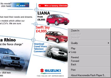
Flash is a package which can produced web-based animations, and here I mean more than just animated .gifs. We are talking now of the sort of animation which appears on the front page of, for example, The authorised Stanley Kubrick site. The site of the car/motorcycle company Suzuki also uses it in a more subtle way, with discreet animations on its images (both links will appear in the second browser window). You will notice that if you right-click on the animated images, the context-sensitive menu which appears will be different to that of "ordinary" images (.gif or .jpg); note the image below.

If you've had a look at that you might be impressed, or you might be left feeling that this is just eye-candy. Both these attitudes are correct. Eye-candy is precisely what it is, but that is of course the point. Attention is a valuable commodity on the Web. Things that move, however subtly, are designed to keep you watching and reading: or to attract your attention if it was wavering. (That's why fruit machines in pubs keep running those endless sequences of lights when no-one's using them.) It is also believed, by the people who use and sell this kind of thing, that an animated introduction like that seen on the Kubrick site is more likely to impress visitors than a static, HTML-only page.
Myself, I'm not so sure about that. (You knew I was going to say that - didn't you?) I wonder how many people actually sit through the whole introduction to the Kubrick site rather than just hitting "Skip Intro" - especially more than once. (And it's also a bit ironic seeing as how Kubrick himself didn't believe in flashy credit sequences, thinking it was far better just to get on with the film.) In fact, if I've done my job properly, I hope I don't even need to point out the potential pitfalls with Flashy animations of this kind:
- added bandwidth; meaning extra download time for, in the end, little added content
- the need for plug-ins; if someone wants to view the animation and their browser doesn't have Flash installed, you are forcing them to download further software which they may not be interested in acquiring. They may not have a PC and/or browser new enough to comfortably cope with the plug-in. Note the link to the top left of the image above, pointing out where the user could download the plug-in - yes, this is a good courtesy to include and as I've said, there's nothing intrinsically wrong with using animations, but if the user is unwilling or unable to download the plug-in then the page is effectively useless. Carefully consider who your site's "target market" is.
- Expense, steep learning curves and difficulties in access: HTML, va Notepad, is universal and cheap. Flash is neither.
Always remember that, as ever, the Flash animation is just extra padding. By all means display your talents and put that animation on your page but don't make it integral to your page. In other words don't impart important information solely with the animation. And in any case always give the option to skip it. To have to sit through a two-minute animation each time you access a page if all you want is someone's phone number is designed to have exactly the opposite effect to that which you intended: e.g., increased visitor numbers.
Nevertheless these are obviously ways in which the budding professional web designer can further enhance their armoury. If you want to know more, visit Macromedia's site in the second browser window.
Back to the menu of other topics
