This worksheet is based on the fifth lecture of the Statistical Modelling in Stata course, created by Dr Mark Lunt and offered by the Centre for Epidemiology Versus Arthritis at the University of Manchester. The original Stata exercises and solutions are here translated into their R equivalents.
Refer to the original slides and Stata worksheets here.
Dichotomous variables and t-tests
Load the auto dataset distributed with Stata by downloading it from the company’s web site. We are going to investigate whether US-made vehicles tend to be heavier than non-US-made vehicles (in 1978).
auto <- foreign::read.dta('http://www.stata-press.com/data/r8/auto.dta')
Are foreign vehicles heavier or lighter than US vehicles?
Fit a linear model with the function call lm(weight ~ foreign).
Call:
lm(formula = weight ~ foreign, data = auto)

Residuals:
     Min       1Q   Median       3Q      Max
-1517.12  -333.41   -12.12   380.38  1522.88

Coefficients:
               Estimate Std. Error t value Pr(>|t|)
(Intercept)      3317.1       87.4  37.955  < 2e-16 ***
foreignForeign  -1001.2      160.3  -6.246 2.62e-08 ***
---
Signif. codes:  0 '***' 0.001 '**' 0.01 '*' 0.05 '.' 0.1 ' ' 1

Residual standard error: 630.2 on 72 degrees of freedom
Multiple R-squared:  0.3514,    Adjusted R-squared:  0.3424
F-statistic: 39.02 on 1 and 72 DF,  p-value: 2.622e-08
From the summary output we can see that non-US vehicles are on average 1000 lbs lighter than those made in the USA. The difference is statistically significant at the 0.1% level.
Fit the above model again, but this time use lm(weight ~ factor(foreign)). Does this make any difference?
No, because foreign is already a factor and R handles these natively.
Check that summary.lm gives the same results as t.test.
Look at the difference between the means and its standard error: are they the same as those obtained by the linear model?
t.test(weight ~ foreign, data = auto)
    Welch Two Sample t-test

data:  weight by foreign
t = 7.4999, df = 61.62, p-value = 3.022e-10
alternative hypothesis: true difference in means is not equal to 0
95 percent confidence interval:
  734.320 1268.093
sample estimates:
mean in group Domestic  mean in group Foreign
              3317.115               2315.909
The test statistics are similar, but for them to be exactly the same as in the summary output, you would need to set var.equal = TRUE, i.e. perform a test that assumes the variances of the two samples were equal. By default, t.test assumes they are different.
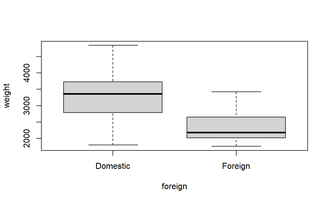
Make box-and-whisker plots for the weights of both the US and non-US vehicles.
Does the variance of weight look the same for the two categories?
In base R graphics:
boxplot(weight ~ foreign, data = auto)
Or in ggplot2:
library(ggplot2)
ggplot(auto) +
  aes(foreign, weight) +
  geom_boxplot() +
  theme_classic()
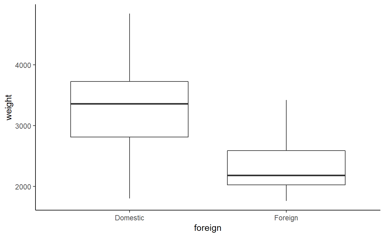
The variance looks like it might be a bit smaller among non-US (foreign) vehicles.
Finally, use a hypothesis test to confirm whether or not the variances are the same.
In Stata you might use hettest, which assumes normality by default. In R, you can use var.test or bartlett.test, which assume normality, or ansari.test and mood.test, which are non-parametric.
ansari.test(weight ~ foreign, data = auto)
    Ansari-Bradley test

data:  weight by foreign
AB = 1038.5, p-value = 0.232
alternative hypothesis: true ratio of scales is not equal to 1mood.test(weight ~ foreign, data = auto)
    Mood two-sample test of scale

data:  weight by foreign
Z = -1.0289, p-value = 0.3035
alternative hypothesis: two.sided
There does not appear to be sufficient evidence to reject the hypothesis that the scales of the two samples are the same. In other words: the variances are not significantly different.
Multiple categories and Anova
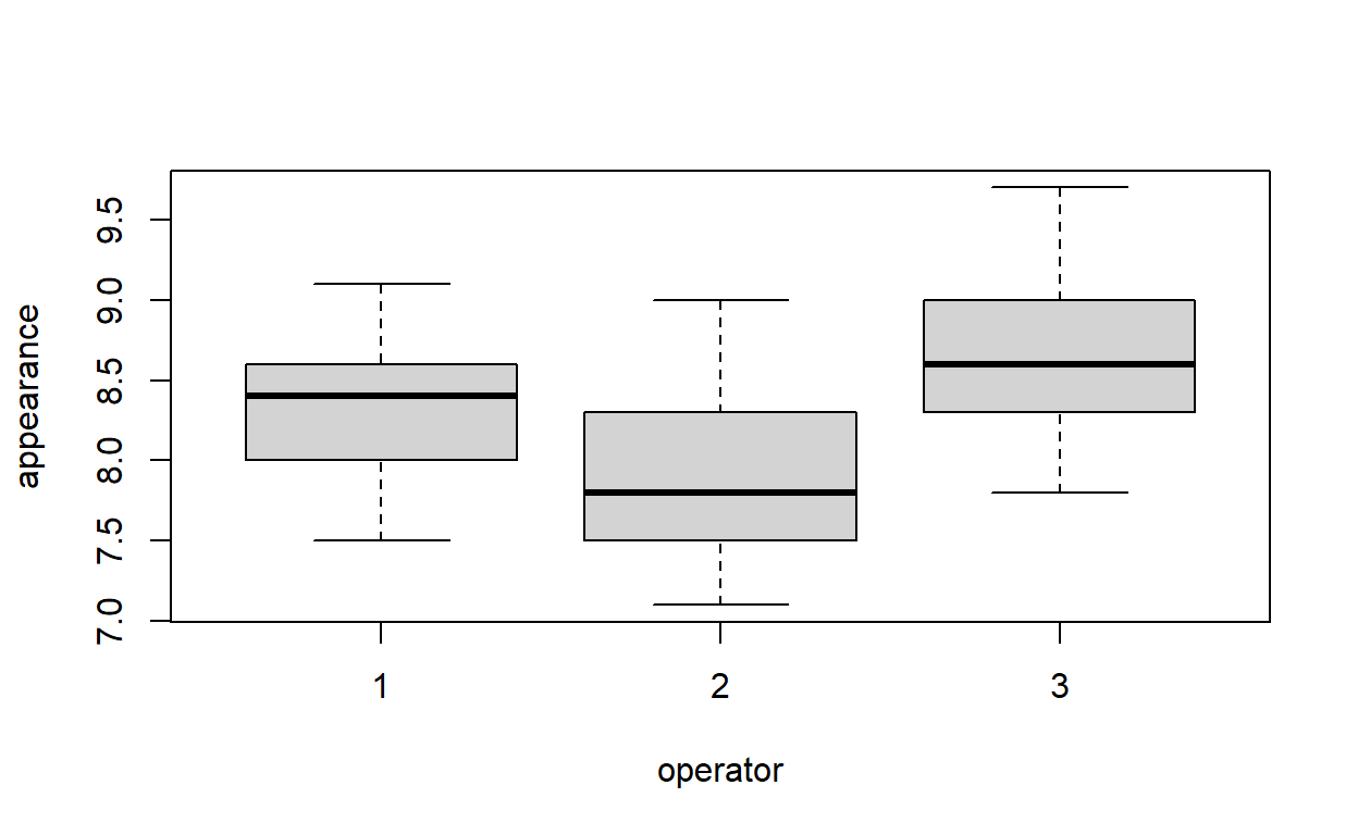
The dataset soap.csv gives information on the scores given to 90 bars of soap for their appearance. The scales are on a scale of 1–10; the higher the score, the better. Three operators each produced 30 bars of soap. We wish to determine if the operators are all equally proficient.
soap <- read.csv('soap.csv')
Produce box-and-whisker plots comparing the appearance scores for each operator.
Which appears to have the highest scores?
boxplot(appearance ~ operator, data = soap)
ggplot(soap) +
  aes(operator, appearance, group = operator) +
  geom_boxplot() +
  theme_classic()
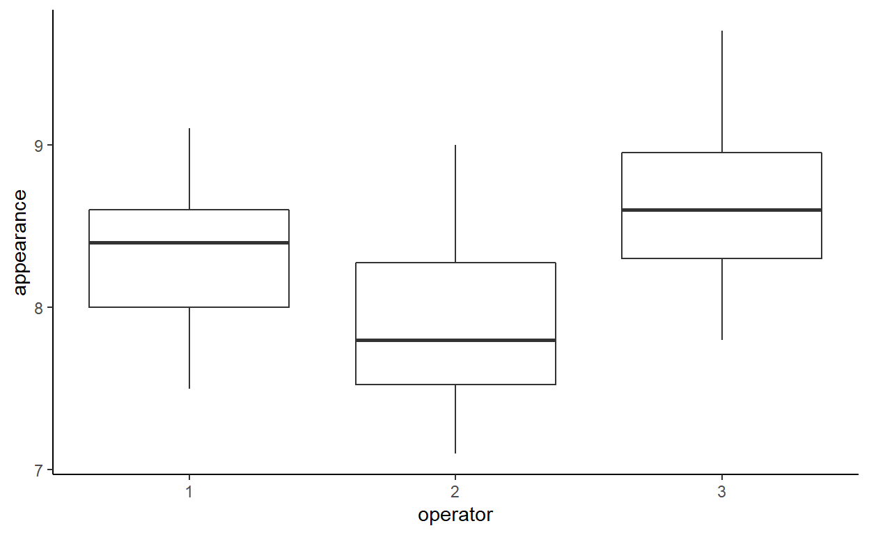
What are the mean scores for each of the three operators?
aggregate(appearance ~ operator, soap, mean)
  operator appearance
1        1   8.306667
2        2   7.896667
3 3 8.626667# A tibble: 3 x 2
operator mean
<int> <dbl>
1 1 8.31
2 2 7.90
3 3 8.63Fit a linear model to the data. Are there significant differences between the three operators?
Make sure that operator is treated as a categorical variable.
soap$operator <- as.factor(soap$operator)
soap_model <- lm(appearance ~ operator, data = soap)
summary(soap_model)
Call:
lm(formula = appearance ~ operator, data = soap)

Residuals:
     Min       1Q   Median       3Q      Max
-0.82667 -0.32667 -0.02667  0.30083  1.10333

Coefficients:
            Estimate Std. Error t value Pr(>|t|)
(Intercept)  8.30667    0.08552  97.136  < 2e-16 ***
operator2   -0.41000    0.12094  -3.390  0.00105 **
operator3    0.32000    0.12094   2.646  0.00967 **
---
Signif. codes:  0 '***' 0.001 '**' 0.01 '*' 0.05 '.' 0.1 ' ' 1

Residual standard error: 0.4684 on 87 degrees of freedom
Multiple R-squared:  0.2962,    Adjusted R-squared:   0.28
F-statistic: 18.31 on 2 and 87 DF,  p-value: 2.308e-07
The parameter estimators are relative to the first operator. Operator 2 and 3 are both significantly different from operator 1, at the 1% level. But the summary output above does not tell us about the differences between operators 2 and 3. Rather than test all the combinations, we can perform an \(F\)-test, using the anova function.
anova(soap_model)
Analysis of Variance Table

Response: appearance
          Df Sum Sq Mean Sq F value    Pr(>F)
operator   2  8.034  4.0170   18.31 2.308e-07 ***
Residuals 87 19.087  0.2194
---
Signif. codes:  0 '***' 0.001 '**' 0.01 '*' 0.05 '.' 0.1 ' ' 1
The operators have significantly different mean appearance scores.
Which operator was used as the baseline for the linear model?
The first operator. You can see this by comparing the (Intercept) estimate with the mean appearance scores calculated earlier.
Perform a hypothesis test for the mean of operator 2. Do you get the same value for the mean as the score you calculated earlier?
There is no equivalent in base R for Stata’s lincomb command, to perform hypothesis tests on linear combinations of parameters. The R package multcomp provides the function glht (general linear hypothesis test) which serves a similar purpose as lincomb. However, we will do the computations by hand.
The linear combination we want to consider, in this case, is \[\beta_0 + \beta_1 = 0,\] where \(\beta_0\) is the intercept or baseline term, and \(\beta_1\) is the difference between the baseline and the mean of operator 2, in the above model.
The mean is \[\mathbf{c}^T \boldsymbol\beta = \pmatrix{1 & 1 & 0} \cdot \pmatrix{\beta_0 \\ \beta_1 \\ \beta_2},\] which yields
as expected.
Calculate the difference in mean score between operators 2 and 3. Is this difference statistically significant?
As in the previous question, we are computing a linear combination. In this case, the equation is \[(\beta_0 + \beta_1) - (\beta_0 + \beta_2) = \beta_1 - \beta_2 = 0,\] corresponding to the linear combination \[\mathbf{c}^T\boldsymbol\beta = \pmatrix{0 & 1 & -1} \cdot \pmatrix{\beta_0 \\ \beta_1 \\ \beta_2} = 0,\] under the null hypothesis. The mean difference is
And the variance of the estimate is \[\operatorname{Var}(\mathbf{c}\hat{\boldsymbol\beta}) = \mathbf{c} \Sigma \mathbf{c}^T,\] where \(\Sigma = \operatorname{Var}(\hat{\boldsymbol\beta})\) is the variance-covariance matrix of the estimated parameter vector \(\hat{\boldsymbol\beta}\). In R,
var_diff <- Cvec %*% vcov(soap_model) %*% Cvec
[1] 0.01462605and the test statistic is \[t = \frac{\mathbf{c}\hat{\boldsymbol\beta}}{\sqrt{\mathbf{c \Sigma c}^T}},\]
which has a \(t\)-distribution with \(n-3\) degrees of freedom. The \(p\)-value is:
pt(t_stat, df.residual(soap_model))
             [,1]
[1,] 1.885438e-08
which is very small, so we reject the null hypothesis—in other words, there is a significant difference between the appearance scores of operators 2 and 3.
Interactions and confounding
The dataset cadmium give data on the ages, vital capacities and durations of exposure to cadmium (in three categories) in 88 workers. We wish to see if exposure to cadmium has a detrimental effect on vital capacity. However, we know that vital capacity decreases with age, and that the subjects with the longest exposures will tend to be older than those with shorter exposures. Thus, age could confound the relationship between exposure to cadmium and vital capacity.
cadmium <- read.csv('cadmium.csv', stringsAsFactors = TRUE)
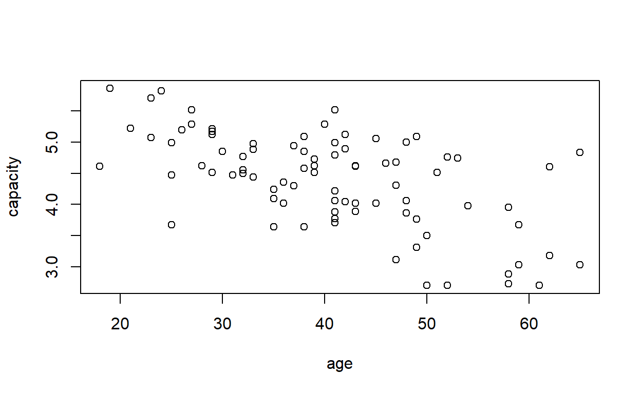
Plot a graph of vital capacity against age, to satisfy yourself that vital capacity decreases with increasing age.
plot(capacity ~ age, data = cadmium)
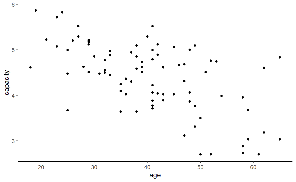
ggplot(cadmium) +
  aes(age, capacity) +
  geom_point() +
  theme_classic()
In case you are not satisfied, fit a linear model (lm) to predict vital capacity from age.
cd_model <- lm(capacity ~ age, data = cadmium)
It would be nice to be able to tell to which exposure group each point on the plot of vital capacity against age belonged.
We can simply plot ages by exposure group directly:
plot(age ~ exposure, data = cadmium)
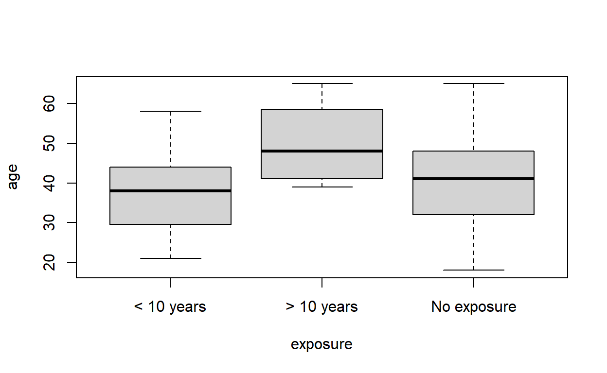
which shows that the group with the highest exposure tend to be older. But we could also do this while keeping the capacity data in the visualisation at the same time.
To understand how we will do this, have a look at the column exposure. It is a factor, which behind the scenes is really a vector of integers with associated names for each value (or level).
levels(cadmium$exposure) # the possible factor levels
[1] "< 10 years" "> 10 years" "No exposure"as.integer(cadmium$exposure) # underlying numerical values
[1] 2 2 2 2 2 2 2 2 2 2 2 2 1 1 1 1 1 1 1 1 1 1 1 1 1 1 1 1 1 1 1 1 1
[34] 1 1 1 1 1 1 1 3 3 3 3 3 3 3 3 3 3 3 3 3 3 3 3 3 3 3 3 3 3 3 3 3 3
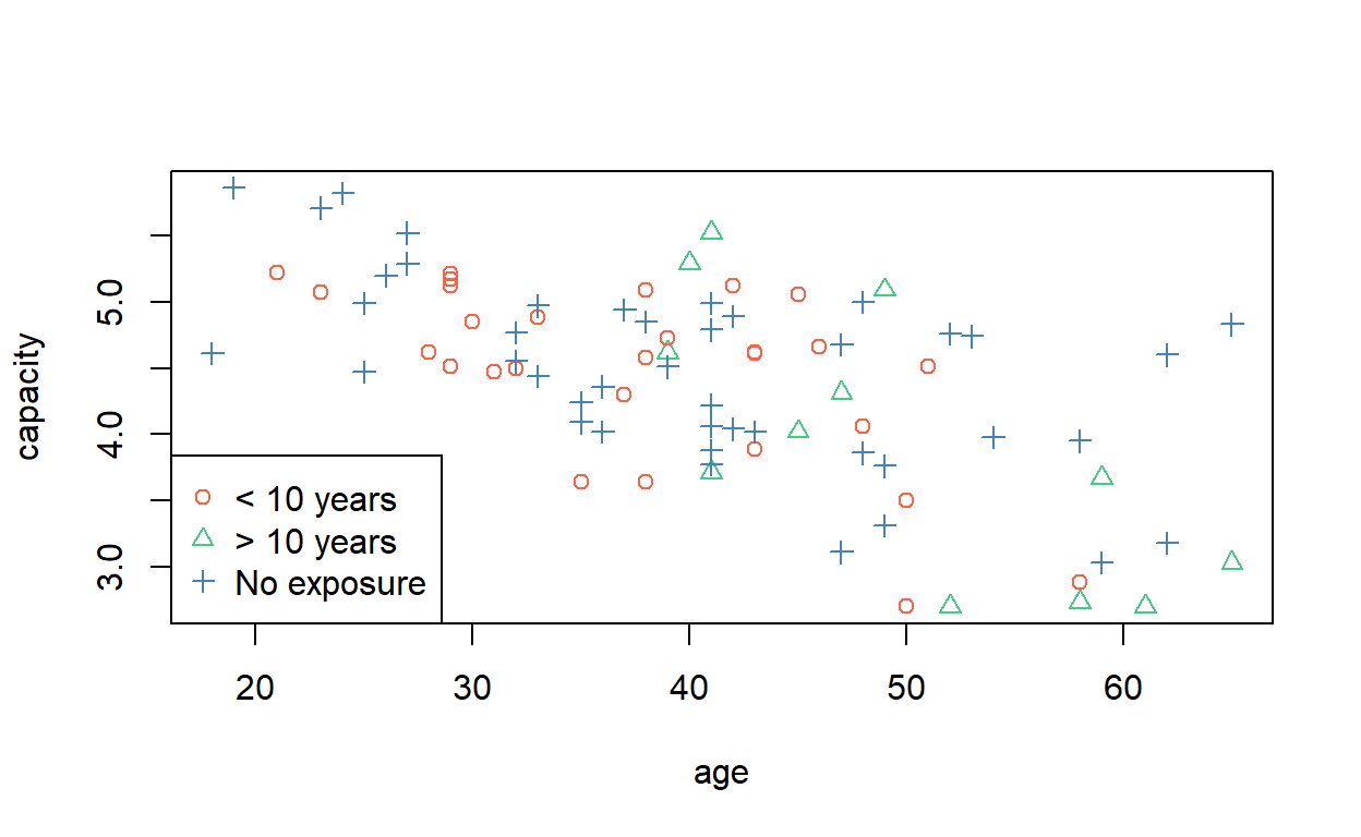
[67] 3 3 3 3 3 3 3 3 3 3 3 3 3 3 3 3 3 3So we can select a colour scheme and then colour and shape each point accordingly. (Try typing c('blue', 'red', 'grey')[cadmium$exposure] into the console and see what you get.)
plot(capacity ~ age, data = cadmium,
     col = c('tomato', 'seagreen3', 'steelblue')[cadmium$exposure],
     pch = as.numeric(cadmium$exposure))
legend('bottomleft',
       pch = 1:nlevels(cadmium$exposure),
       legend = levels(cadmium$exposure),
       col = c('tomato', 'seagreen3', 'steelblue'))
Rather than write out a vector of colours each time, you can assign them to the default colour palette,
and then you can retrieve them by index when making your next plot.
(For a cheat sheet of base R graphical parameters, visit Quick-R.
In ggplot2, these sorts of things are much more straightforward. Legends are added automatically.
ggplot(cadmium) +
  aes(age, capacity, colour = exposure, shape = exposure) +
  geom_point() +
  theme_classic()
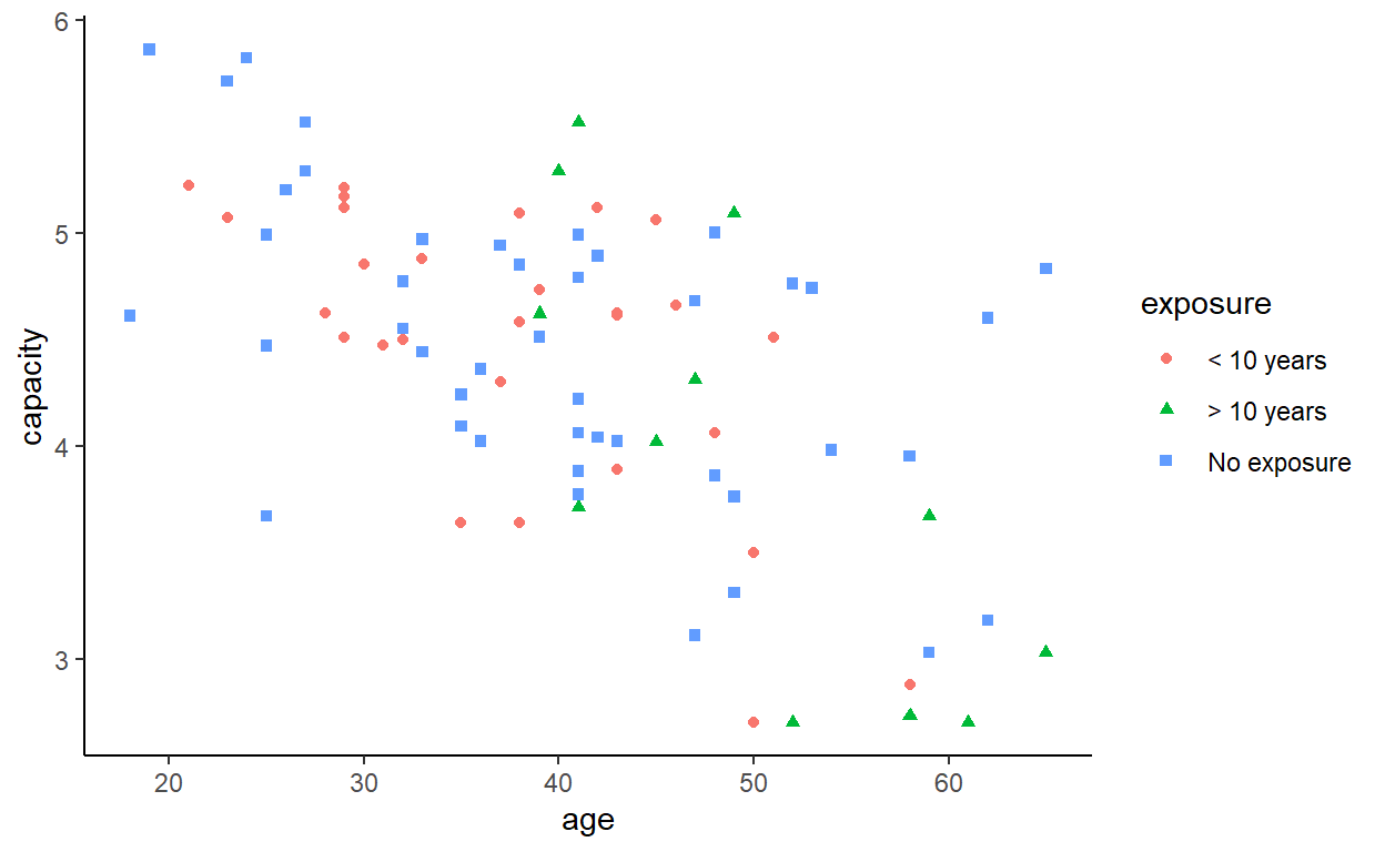
That might be quite hard to read (especially if you are colour blind), so we can also consider a facetted (lattice, trellis, or small multiples) plot.
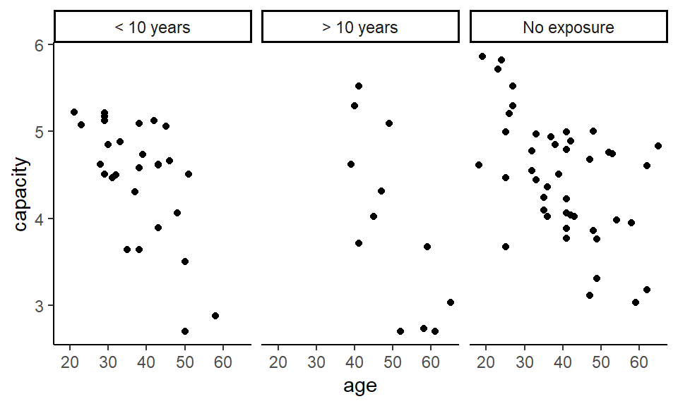
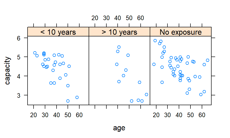
Is there a difference between the three exposure groups in vital capacity?
plot(capacity ~ exposure, data = cadmium)
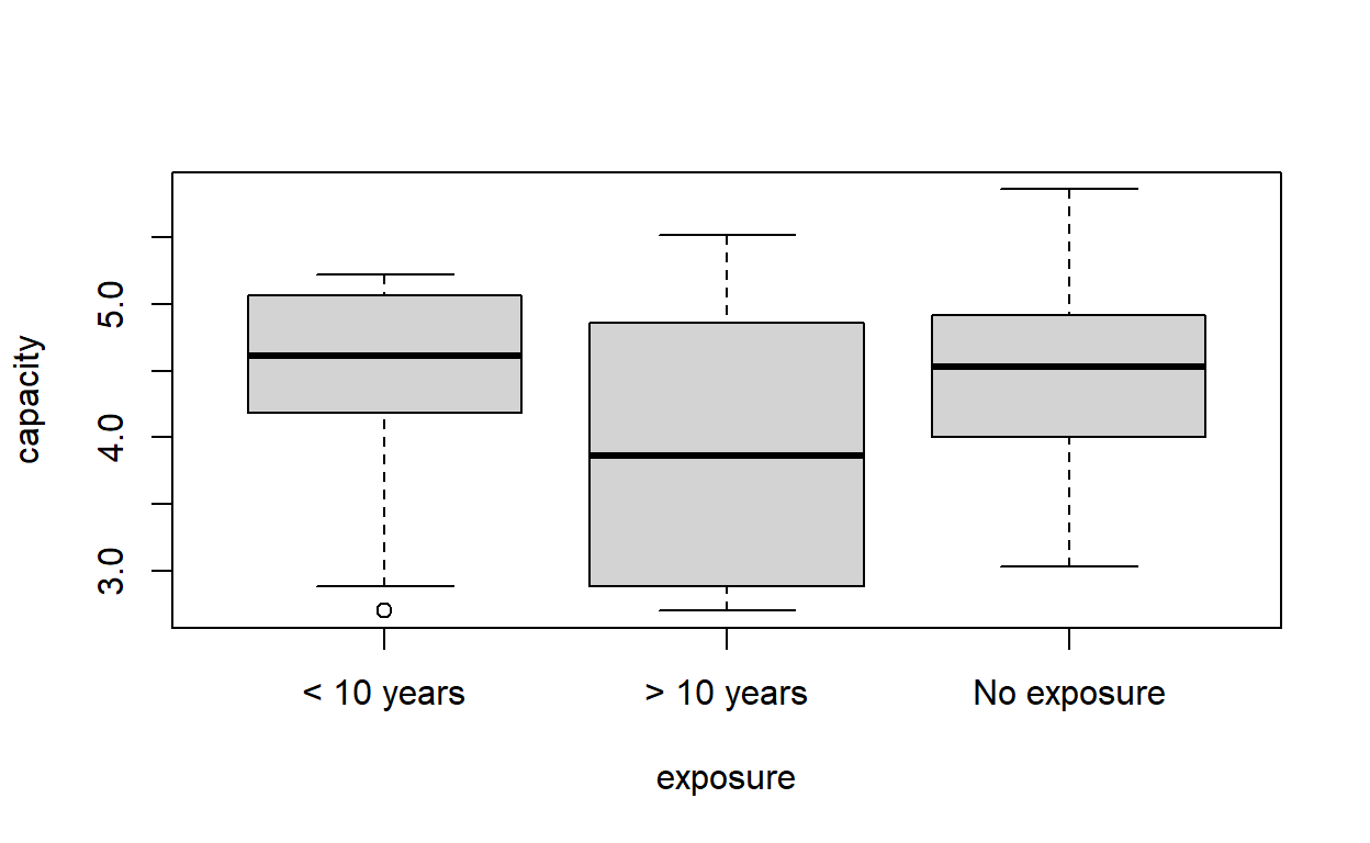
Analysis of Variance Table

Response: capacity
          Df Sum Sq Mean Sq F value  Pr(>F)
exposure   2  2.747 1.37367  2.4785 0.09021 .
Residuals 81 44.894 0.55424
---
Signif. codes:  0 '***' 0.001 '**' 0.01 '*' 0.05 '.' 0.1 ' ' 1
Possibly not. The variance between the groups is not significantly different from the variance within the groups, even before we take age into account.
We have seen that a lower vital capacity in the most exposed may be due to their age, rather than their exposure. Adjust the previous example for age. Now test whether there are significant differences between groups.
Analysis of Variance Table

Response: capacity
          Df  Sum Sq Mean Sq F value    Pr(>F)
age        1 17.4446 17.4446 46.4652 1.594e-09 ***
exposure   2  0.1617  0.0808  0.2153    0.8067
Residuals 80 30.0347  0.3754
---
Signif. codes:  0 '***' 0.001 '**' 0.01 '*' 0.05 '.' 0.1 ' ' 1
It looks like there are no significant differences between the groups.
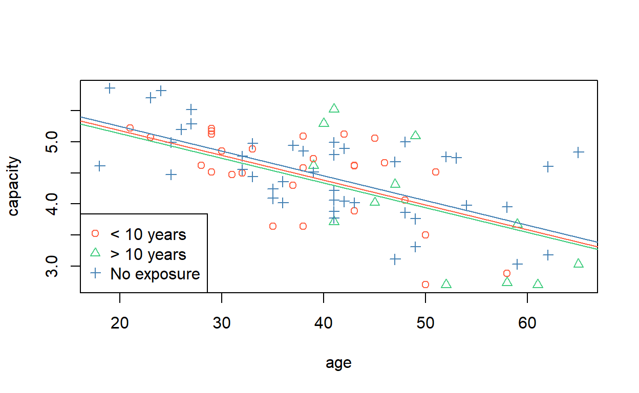
To get a visual idea of the meaning of the previous regression model, we can plot the data with the lines of best fit. In base R graphics, we can use the abline command with the corresponding intercepts and slopes from the vector of coefficients.
# Scatter plot, as before.
plot(capacity ~ age, data = cadmium,
     col = cadmium$exposure,
     pch = as.numeric(cadmium$exposure))
legend('bottomleft',
       pch = 1:nlevels(cadmium$exposure),
       legend = levels(cadmium$exposure),
       col = 1:nlevels(cadmium$exposure))

# < 10 years
abline(a = coef(cd_model3)['(Intercept)'], # baseline
       b = coef(cd_model3)['age'], # slope
       col = 1)
# > 10 years
abline(a = coef(cd_model3)['(Intercept)'] + coef(cd_model3)[3],
       b = coef(cd_model3)['age'],
       col = 2)
# No exposure
abline(a = coef(cd_model3)['(Intercept)'] + coef(cd_model3)[4],
       b = coef(cd_model3)['age'],
       col = 3)
Another way of doing this is to generate two (or more) ages, assign an exposure level, and predict the capacities for those observations. Then draw a line (segment) through the points.
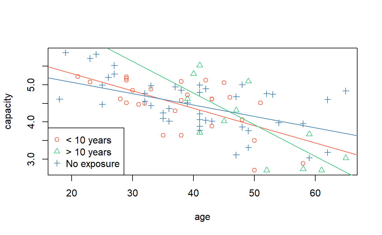
Finally, we wish to test the hypothesis that subjects with high exposure lose their vital capacity quicker as they age, i.e. that there is an interaction between age and vital capacity.
In R, interaction terms are represented by termA:termB. You can specify them explicitly along with the main effects, or you can use the syntax termA*termA, which is shorthand for the main and interaction effects termA + termB + termA:termB. Remember, it is not valid to estimate an interaction effect without also estimating the main effects.
Analysis of Variance Table

Response: capacity
             Df  Sum Sq Mean Sq F value    Pr(>F)
age           1 17.4446 17.4446 49.4159 6.918e-10 ***
exposure      2  0.1617  0.0808  0.2290   0.79584
age:exposure  2  2.4995  1.2497  3.5402   0.03376 *
Residuals    78 27.5352  0.3530
---
Signif. codes:  0 '***' 0.001 '**' 0.01 '*' 0.05 '.' 0.1 ' ' 1
It appears, then, that though the intercepts of the lines are not significantly different, the slopes are—at the 5% level. We can draw them, using similar syntax to before).
coefs <- coef(cd_model4) # to save typing

# < 10 years
abline(a = coefs['(Intercept)'], # baseline
       b = coefs['age'], # baseline slope
       col = 1)
# > 10 years
abline(a = coefs['(Intercept)'] + coefs['exposure> 10 years'],
       b = coefs['age'] + coefs['age:exposure> 10 years'],
       col = 2)
# No exposure
abline(a = coefs['(Intercept)'] + coefs['exposureNo exposure'],
       b = coefs['age'] + coefs['age:exposureNo exposure'],
       col = 3)
In ggplot2, a full model is implicitly fitted when you ask for a geom_smooth line using method = lm.
ggplot(cadmium) +
  aes(age, capacity, colour = exposure) +
  geom_smooth(method = lm, se = TRUE) +
  geom_point()
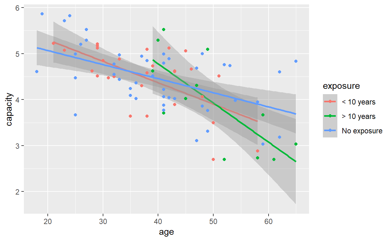
It shows a bit more clearly that, whilst the fitted lines look quite different above, the standard error intervals reveal a large degree of uncertainty in the estimation of their slopes and intercepts, and formal hypothesis testing suggests the effect of exposure group, once age is taken into account, is not statistically significant.
From the regression output, which group has the steepest slope with age and which group has the least steep?
summary(cd_model4)
Call:
lm(formula = capacity ~ age * exposure, data = cadmium)

Residuals:
     Min       1Q   Median       3Q      Max
-1.24497 -0.36929  0.01977  0.43681  1.13953

Coefficients:
                        Estimate Std. Error t value Pr(>|t|)
(Intercept)              6.23003    0.48312  12.895  < 2e-16 ***
age                     -0.04653    0.01244  -3.742 0.000347 ***
exposure> 10 years       1.95341    1.10481   1.768 0.080956 .
exposureNo exposure     -0.54974    0.57588  -0.955 0.342728
age:exposure> 10 years  -0.03858    0.02327  -1.658 0.101397
age:exposureNo exposure  0.01592    0.01455   1.094 0.277170
---
Signif. codes:  0 '***' 0.001 '**' 0.01 '*' 0.05 '.' 0.1 ' ' 1

Residual standard error: 0.5942 on 78 degrees of freedom
Multiple R-squared:  0.422, Adjusted R-squared:  0.385
F-statistic: 11.39 on 5 and 78 DF,  p-value: 2.871e-08
The steepest line is attributed to the group with more than 10 years exposure. The ‘no exposure’ group has the least steep line. (Remember the lines are sloping downwards, so it is the magnitude of the slopes we are interested in.)
Calculate the decrease in vital capacity per year increase in age in the highest exposure group.
coefs['age'] + coefs['age:exposure> 10 years']
        age
-0.08511099
Variable selection
‘Have you read about the vast amount of evidence that variable selection causes severe problems of estimation and inference?’
— Frank Harrell
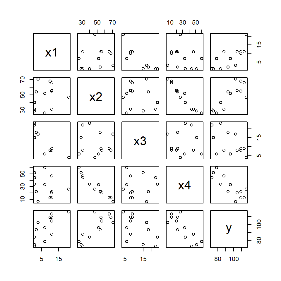
Use the dataset hald.csv. This contains data on the amount of heat evolved as cement hardens, as a function of the proportions of four chemicals in the composition of the cement.
hald <- read.csv('hald.csv')
As a warning of things to come, let’s visualise the data, first.
plot(hald)
Use forward selection to choose a model for predicting the amount of heat evolved.
step(lm(y ~ 1, data = hald),
     scope = c(lower = y ~ 1,
               upper = y ~ x1 + x2 + x3 + x4),
     direction = 'forward')
Start:  AIC=71.44
y ~ 1

       Df Sum of Sq     RSS    AIC
+ x4    1   1831.90  883.87 58.852
+ x2    1   1809.43  906.34 59.178
+ x1    1   1450.08 1265.69 63.519
+ x3    1    776.36 1939.40 69.067
<none>              2715.76 71.444

Step:  AIC=58.85
y ~ x4

       Df Sum of Sq    RSS    AIC
+ x1    1    809.10  74.76 28.742
+ x3    1    708.13 175.74 39.853
<none>              883.87 58.852
+ x2    1     14.99 868.88 60.629

Step:  AIC=28.74
y ~ x4 + x1

       Df Sum of Sq    RSS    AIC
+ x2    1    26.789 47.973 24.974
+ x3    1    23.926 50.836 25.728
<none>              74.762 28.742

Step:  AIC=24.97
y ~ x4 + x1 + x2

       Df Sum of Sq    RSS    AIC
<none>              47.973 24.974
+ x3    1   0.10909 47.864 26.944
Call:
lm(formula = y ~ x4 + x1 + x2, data = hald)

Coefficients:
(Intercept)           x4           x1           x2
    71.6483      -0.2365       1.4519       0.4161
Now use backward elimination. Does this select the same model?
Start:  AIC=26.94
y ~ x1 + x2 + x3 + x4

       Df Sum of Sq    RSS    AIC
- x3    1    0.1091 47.973 24.974
- x4    1    0.2470 48.111 25.011
- x2    1    2.9725 50.836 25.728
<none>              47.864 26.944
- x1    1   25.9509 73.815 30.576

Step:  AIC=24.97
y ~ x1 + x2 + x4

       Df Sum of Sq    RSS    AIC
<none>               47.97 24.974
- x4    1      9.93  57.90 25.420
- x2    1     26.79  74.76 28.742
- x1    1    820.91 868.88 60.629
Call:
lm(formula = y ~ x1 + x2 + x4, data = hald)

Coefficients:
(Intercept)           x1           x2           x4
    71.6483       1.4519       0.4161      -0.2365
Yes, both directions lead to the same model: \[\hat Y = \hat\beta_0 + \hat\beta_1 x_1 + \hat\beta_2 x_2 + \hat\beta_4 x_4.\]
(Choose a model with stepwise election, with the command…)
R performs stepwise model selection by AIC, so this question is not relevant. Unless you want the students to perform stepwise regression via hypothesis tests. This is possible via repeated application of the add1 and drop1 functions.
Produce a correlation matrix for the x-variables using the cor function. What is the correlation between x2 and x4?
cor(hald[, 1:4])
           x1         x2         x3         x4
x1  1.0000000  0.2285795 -0.8241338 -0.2454451
x2  0.2285795  1.0000000 -0.1392424 -0.9729550
x3 -0.8241338 -0.1392424  1.0000000  0.0295370
x4 -0.2454451 -0.9729550 0.0295370 1.0000000cor(hald)['x2', 'x4']
[1] -0.972955Does this help to explain why the different methods of variable selection produced different models?
In this case we fitted via AIC so the results are probably different to whatever Stata’s sw says.
Fit all 4 predictors in a single model. Look at the F-statistic: is the fit of the model statistically significant?
Slightly ambiguous question. The fit of the model compared to what?
full_model <- lm(y ~ ., data = hald)
If the exercise means ‘compared to a null model’, i.e. testing for the existence of regression, then we have
Analysis of Variance Table

Model 1: y ~ 1
Model 2: y ~ x1 + x2 + x3 + x4
  Res.Df     RSS Df Sum of Sq      F    Pr(>F)
1     12 2715.76
2      8   47.86  4    2667.9 111.48 4.756e-07 ***
---
Signif. codes:  0 '***' 0.001 '**' 0.01 '*' 0.05 '.' 0.1 ' ' 1
The \(F\)-statistic is significant, suggesting the full model is a better fit than a null model.
Look at the \(R^2\) statistic: is this model good at predicting how much heat will be evolved?
summary(full_model)$r.squared
[1] 0.9823756Yes, but the \(R^2\) statistic is not necessarily a good way to determine the quality of a model.
Look at the table of coefficients: how many of them are significant at the \(p = 0.05\) level?
This question is extremely dubious. Without specifying a null hypothesis and a corresponding test statistic, it could mean anything.
The desired output can be produced with
summary(full_model)
Call:
lm(formula = y ~ ., data = hald)

Residuals:
    Min      1Q  Median      3Q     Max
-3.1750 -1.6709  0.2508  1.3783  3.9254

Coefficients:
            Estimate Std. Error t value Pr(>|t|)
(Intercept)  62.4054    70.0710   0.891   0.3991
x1            1.5511     0.7448   2.083   0.0708 .
x2            0.5102     0.7238   0.705   0.5009
x3            0.1019     0.7547   0.135   0.8959
x4           -0.1441     0.7091  -0.203   0.8441
---
Signif. codes:  0 '***' 0.001 '**' 0.01 '*' 0.05 '.' 0.1 ' ' 1

Residual standard error: 2.446 on 8 degrees of freedom
Multiple R-squared:  0.9824,    Adjusted R-squared:  0.9736
F-statistic: 111.5 on 4 and 8 DF,  p-value: 4.756e-07
but it would be unwise to draw any conclusions from this. Each of these tests amounts to comparing this five-parameter model with each of the possible four-parameter models induced by dropping just one parameter at a time. But we have already seen that two of the variables are highly correlated. And the visualisation suggests that blind testing may not reveal a great deal of insight.
Polynomial regression
Use the data in growth.csv. This dataset gives the weight, in ounces, of a baby weighed weekly for the first 20 weeks of its life.
growth <- read.csv('growth.csv')
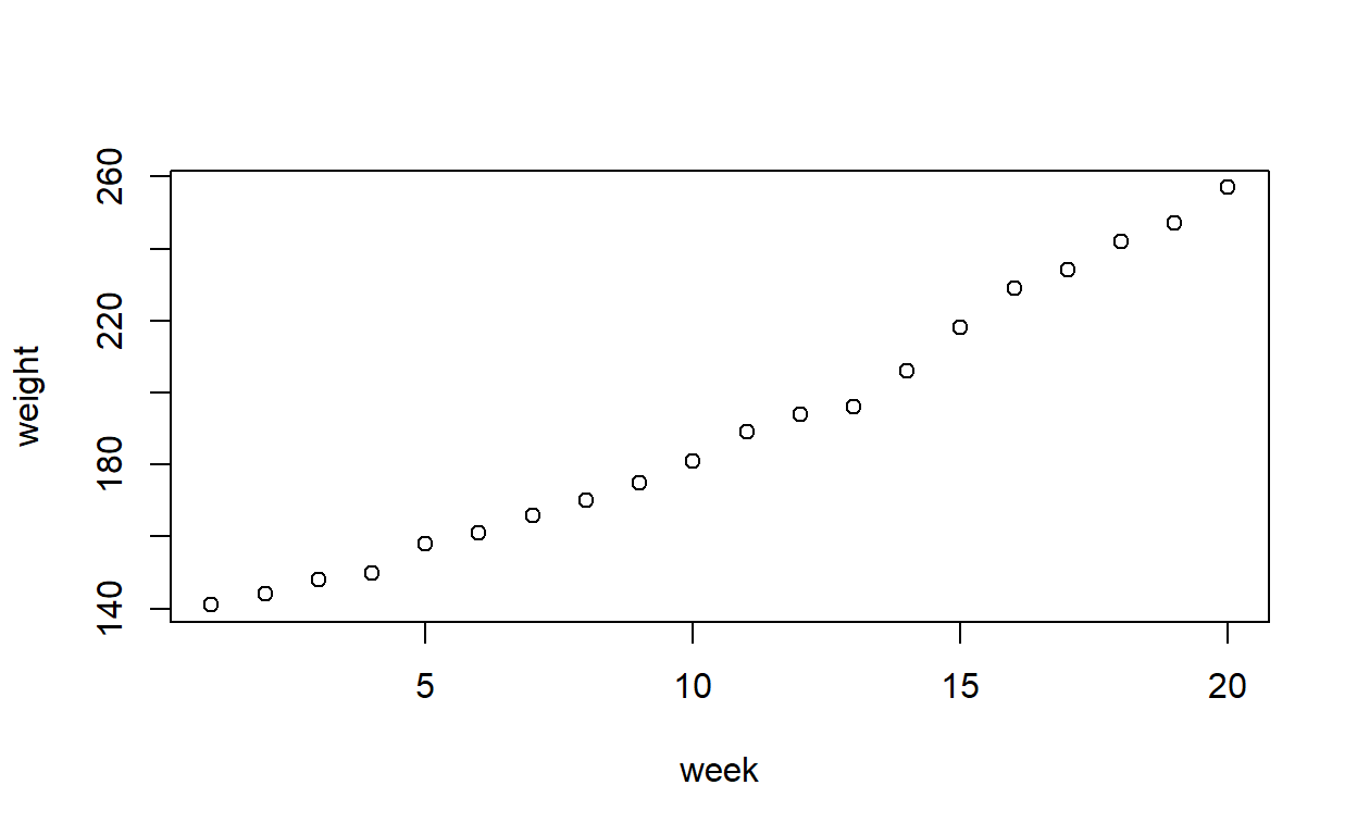
Plot the data. Does the pattern appear to be linear, or is there evidence of non-linearity?
plot(weight ~ week, data = growth)
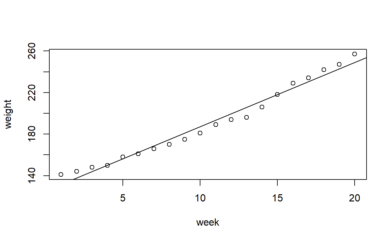
Fit a straight line to the data. Produce a partial residual plot. Does this confirm what you thought previously?
growth_model1 <- lm(weight ~ week, data = growth)
plot(weight ~ week, data = growth)
abline(growth_model1) # Add the line of best fit to the plot
You can produce partial residual plots with crPlot(s) from the car package.
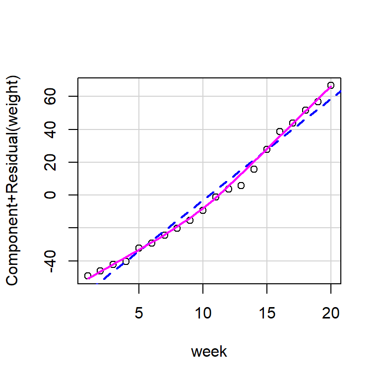
Personally I find these a little bit challenging to read and would consider a plot of residuals against fitted values instead.
plot(growth_model1, which = 1)
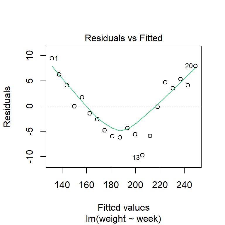
The evidence of non-linearity is much clearer, here.
Fit a polynomial model with the formula weight ~ week + I(week^2), or by creating a new variable equal to week^2 and adding it as a term in the model. Does this improve the fit of the model?
The reason for the I() is that in the formula interface, ^2 has a special meaning (to do with interactions), rather as a mathematical operator (just as + and * have special roles, also).
You can also just create a variable with value equal to the square of the original predictor:
growth$week2 <- growth$week^2
growth_model2a <- lm(weight ~ week + week2, data = growth)
Finally, you can use the poly function to add polynomial terms. By default, it does orthogonal regression; set raw = TRUE to switch that off.
Each of the three forms above yield the same model with the same parameter estimates and test statistics.
summary(growth_model2)
Call:
lm(formula = weight ~ week + I(week^2), data = growth)

Residuals:
    Min      1Q  Median      3Q     Max
-5.2563 -1.0292 -0.1463  1.2048  5.1834

Coefficients:
             Estimate Std. Error t value Pr(>|t|)
(Intercept) 138.20877    1.71609  80.537  < 2e-16 ***
week          2.68018    0.37636   7.121 1.71e-06 ***
I(week^2)     0.16689    0.01741   9.587 2.86e-08 ***
---
Signif. codes:  0 '***' 0.001 '**' 0.01 '*' 0.05 '.' 0.1 ' ' 1

Residual standard error: 2.307 on 17 degrees of freedom
Multiple R-squared:  0.9965,    Adjusted R-squared:  0.9961
F-statistic: 2437 on 2 and 17 DF, p-value: < 2.2e-16summary(growth_model2a)
Call:
lm(formula = weight ~ week + week2, data = growth)

Residuals:
    Min      1Q  Median      3Q     Max
-5.2563 -1.0292 -0.1463  1.2048  5.1834

Coefficients:
             Estimate Std. Error t value Pr(>|t|)
(Intercept) 138.20877    1.71609  80.537  < 2e-16 ***
week          2.68018    0.37636   7.121 1.71e-06 ***
week2         0.16689    0.01741   9.587 2.86e-08 ***
---
Signif. codes:  0 '***' 0.001 '**' 0.01 '*' 0.05 '.' 0.1 ' ' 1

Residual standard error: 2.307 on 17 degrees of freedom
Multiple R-squared:  0.9965,    Adjusted R-squared:  0.9961
F-statistic: 2437 on 2 and 17 DF, p-value: < 2.2e-16summary(growth_model2b)
Call:
lm(formula = weight ~ poly(week, 2, raw = T), data = growth)

Residuals:
    Min      1Q  Median      3Q     Max
-5.2563 -1.0292 -0.1463  1.2048  5.1834

Coefficients:
                         Estimate Std. Error t value Pr(>|t|)
(Intercept)             138.20877    1.71609  80.537  < 2e-16 ***
poly(week, 2, raw = T)1   2.68018    0.37636   7.121 1.71e-06 ***
poly(week, 2, raw = T)2   0.16689    0.01741   9.587 2.86e-08 ***
---
Signif. codes:  0 '***' 0.001 '**' 0.01 '*' 0.05 '.' 0.1 ' ' 1

Residual standard error: 2.307 on 17 degrees of freedom
Multiple R-squared:  0.9965,    Adjusted R-squared:  0.9961
F-statistic:  2437 on 2 and 17 DF,  p-value: < 2.2e-16
Produce a graph of the observed and fitted values.
Unlike the previous sections, the fitted curve is no longer a straight line, so instead we need to plot the fitted points and then join them together.
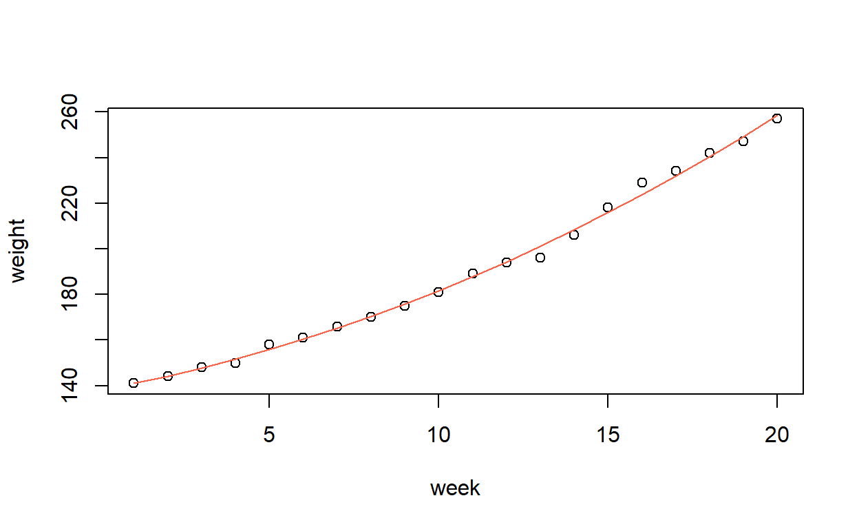
In this case, the week values are all in order, so it is simple. But if they were not, we would have to sort the predictor and then make sure the corresponding fitted values had the same order.
Or, just make an evenly-spaced grid of points and predict values from this. Handy if the observed \(x\)-values were not evenly spaced, or if you wanted your line to extend beyond the range of the data.
plot(weight ~ week, data = growth,
     xlim = c(-5, 25), ylim = c(100, 300))
lines(-5:25, predict(growth_model2, newdata = list(week = -5:25)),
      col = 1)
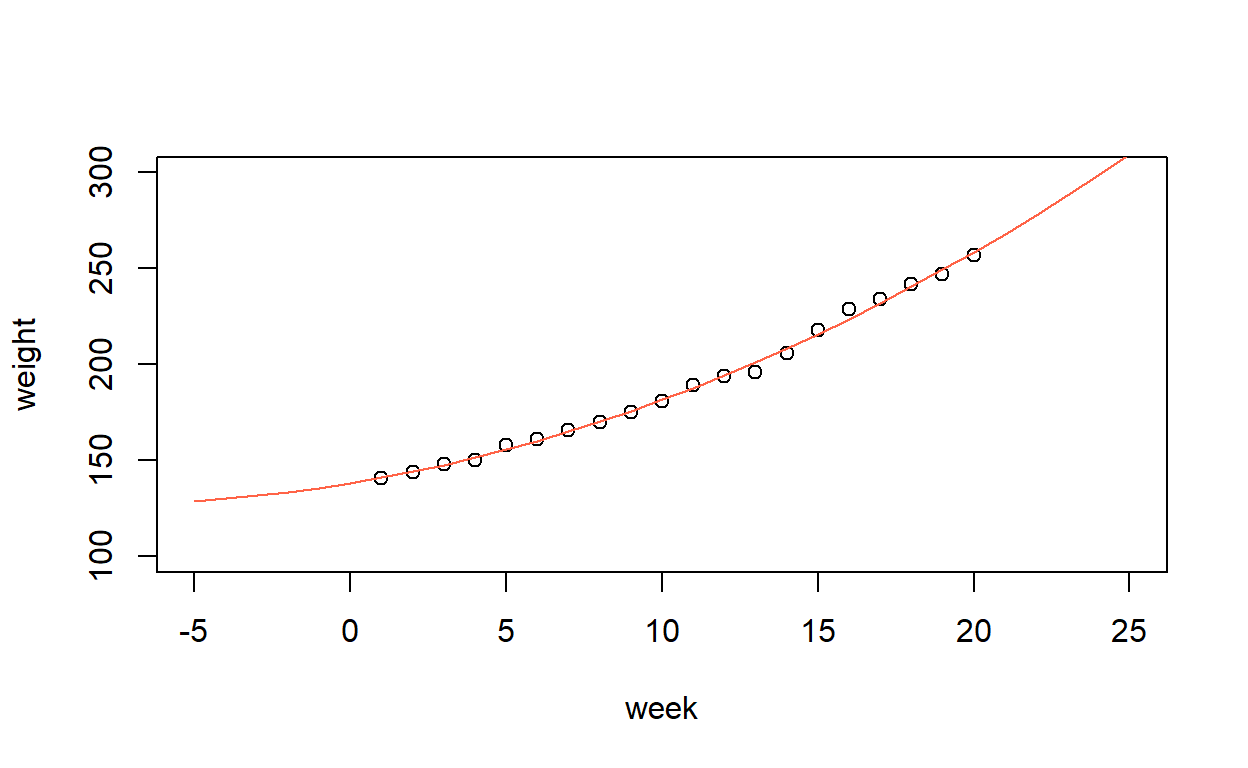
The above is just for demonstration. Of course you can’t have negative weeks!
Continue to generate polynomial terms and add them to the regression model until the highest order term is no longer significant. What order of polynomial is required to fit this data?
Don’t do this. Some form of regularisation must be employed to ensure model complexity does not increase too much. Simple hypothesis tests do nothing to account for this.
The slow in decrease in AIC suggests that the quadratic model (polynomial of degree 2) is the best one to use.
sapply(list(degree1 = growth_model1,
            degree2 = growth_model2,
            degree3 = growth_model3,
            degree4 = growth_model4,
            degree5 = growth_model5),
       AIC)
  degree1   degree2   degree3   degree4   degree5
130.08447  94.93856  96.68276  94.60095  93.87779
As it happens, if we did use hypothesis tests then we would get the same result.
anova(growth_model1, growth_model2)
Analysis of Variance Table

Model 1: weight ~ week
Model 2: weight ~ week + I(week^2)
  Res.Df    RSS Df Sum of Sq      F    Pr(>F)
1     18 579.45
2     17  90.45  1       489 91.909 2.863e-08 ***
---
Signif. codes: 0 '***' 0.001 '**' 0.01 '*' 0.05 '.' 0.1 ' ' 1anova(growth_model2, growth_model3)
Analysis of Variance Table

Model 1: weight ~ week + I(week^2)
Model 2: weight ~ week + I(week^2) + I(week^3)
  Res.Df    RSS Df Sum of Sq      F Pr(>F)
1     17 90.449
2     16 89.299  1    1.1494 0.2059 0.6561
Produce a correlation matrix for the polynomial terms. What is the correlation between week and week^2?
No much of a correlation matrix: it only contains one value!
Would be as well to run:
The poly function, described earlier, anticipated this. We can use the default setting (raw = FALSE) to perform orthogonal polynomial regression.
Call:
lm(formula = weight ~ poly(week, 2), data = growth)

Residuals:
    Min      1Q  Median      3Q     Max
-5.2563 -1.0292 -0.1463  1.2048  5.1834

Coefficients:
               Estimate Std. Error t value Pr(>|t|)
(Intercept)    190.3000     0.5158 368.958  < 2e-16 ***
poly(week, 2)1 159.4953     2.3066  69.147  < 2e-16 ***
poly(week, 2)2  22.1134     2.3066   9.587 2.86e-08 ***
---
Signif. codes:  0 '***' 0.001 '**' 0.01 '*' 0.05 '.' 0.1 ' ' 1

Residual standard error: 2.307 on 17 degrees of freedom
Multiple R-squared:  0.9965,    Adjusted R-squared:  0.9961
F-statistic:  2437 on 2 and 17 DF,  p-value: < 2.2e-16
Compare the correlation of the predictors:
cor(model.matrix(growth_model2)[, -1])
               week I(week^2)
week      1.0000000 0.9713482
I(week^2) 0.9713482 1.0000000cor(model.matrix(growth_orthog2)[, -1])
               poly(week, 2)1 poly(week, 2)2
poly(week, 2)1   1.000000e+00   5.122855e-17
poly(week, 2)2   5.122855e-17   1.000000e+00
and we see the orthogonal terms are, well, orthogonal!