Web Design |
how text is handled |
||||
main menushelp pagesprinter-friendly/text-only version
|
Before we have a proper look at how to apply tags and styles to format your text on screen, let's review two things we looked at in the lecture. Both are to do with web design's inherent flexibility. Web design is not like print design. With print, you can exactly specify some things like the size of the page and the text, margins, where images go, and so on. The printer then creates a template from which all the hard copies are created, and which should therefore be identical. Print is therefore inflexible: but in some ways this actually makes designing for print easier than designing for the web, especially if using a computer (programs like Microsoft Word take care of most of this stuff for you). This kind of rigor is not built into HTML. Remember that HTML defines the structure of a page, but not its style or layout. If these latter things are not defined in style sheets, they are left to the browser to sort out, and that means they are taken out of the designer's hands. In fact some things are entirely beyond the control of the designer, like the size of the reader's monitor, or whether the browser window is maximised or not. As a designer you have to know how browsers handle the issue of text size, and how they deal with breaks and spaces (and why this is done). The lecture noted some points but we'll expand on them slightly here. text sizeWe will talk on other pages about the colour and typeface of web page text, but here let us look at the issue of size. This can be a tricky problem for students of web design as sometimes browsers seem not to define the size of text at all. The way to understand this is to look for the first time at a distinction which is important in web design: that of relative versus absolute sizes. One of the style sheets which we looked at in the lecture (a version of which you should have saved on your M: drive, so you can play around with it after reading these pages and test out the things you've learnt) included the following:
p { font-family: Garamond, Times, serif;
    color: #000000;
    text-size: 130% }
Concentrate only on that last property. It's obviously describing the size of the text within <p> tags, but what does 130% mean? 130% of what? And you can see on the same sheet that <h1> tags had the same property, only now the size was 200%. Again: of what? Of the same thing? Yes, both values refer to the same thing. Browsers have a certain default text size built into them, like they have defaults for everything else. What the style sheet definition above does with size is say, in effect, "Dear browser, please render all text within <p> tags in the font Garamond, the colour dark blue, and a size equal to what you've got defined as your default text size plus 30%." (And with <h1> tags it's "twice as large as the default".) You're therefore defining a size relative to something else. Any time you see a size defined as a percentage (and it will come up on other occasions later), that's a relative size. But - sorry - it's not quite as simple as that. For a start, the browser default may be changed by the user. If you weren't aware of how to do this, try it now. The method varies depending on the browser you are using. In IE, go through the View menu at the top of the screen, then Text Size, as shown below. Choose one of the options and see what happens. 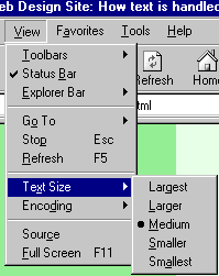 On Mozilla you can do it on the keyboard, by pressing the Ctrl key simultaneously with either the + or - key, to decrease or increase the text size respectively. Unlike IE, Mozilla has no upper or lower limit here. Finally, Opera has a "Zoom" box, to the bottom right of the menus at the top of the screen, which can be used to render the web page at any size, compared to the default (100%). This is what I meant when I said that sometimes text size is a very vague phenomenon.
Absolute size values have their uses, but their overuse for defining text sizes is bad web design. Since the WWW took off is that a lot of people with a training in print graphic design have moved into work on the WWW. Many are excellent designers, but are still hidebound by their training in print design, where the proportions of things on the page, and how text size relates to headings and images and so on, are important and fixable. But by using absolute text sizes you are deliberately breaking one of the key principles of the WWW; flexibility. This is a particular crime with very small text (8pt or less). Not everyone has 20/20 vision! Here's a site that has removed visitors' ability to resize the text: KLM's site (there are many others, though). OK, there's good contrast between the text and the background, but it's very small. And while I know that most people following this course are fresh-faced, bright-eyed 20-year-olds or thereabouts, close-range eyesight does deteriorate with age (hence reading glasses and all that). It is no harder to create small text but keep it relative than it is to make it absolute; and it is better design to do so. (NB: The browser Opera will always let you resize the text even on pages with absolute links; it lets you resize images as well. You could go to the KLM site in Opera and try it - unfortunately, however, the page does not work in Opera. Not bad going for the national airline of one of Europe's more prosperous countries. I will laugh at some other major, commercial design disasters in lecture 6.) One more thing needs saying about relative sizes. I've been referring to them as being relative to the browser default. But note that if you have some text within a tag that has, say, the style sheet property text-size: 80%; and that tag is nested within another tag which also has the property text-size: 80%;, then the text will actually be rendered at 80% × 80% × the browser default, or 64% of the default. Breaks and spacesAnother thing we saw in the lecture was that when you resized the browser window (as long as you did not make it very narrow), all the text of the page was still visible. This is because it is the browser's job to decide where to break the lines of text, not the designer's. The breaks between the lines can theoretically appear anywhere, and will change depending on the size of the window and the size of the text. Therefore, line breaks and spaces in the HTML file are ignored. Anywhere you actually do want a line break - and the most obvious need for this is to break text up into paragraphs - you must use tags. To illustrate this further, look at the first example page. Make sure you use the "View Source" facility to look at the code. Note how the line breaks and spaces in the HTML are simply ignored. Because there are no tags, everything is run together by the browser. (On the page about block-level tags a properly formatted version of this page is provided.) I will repeat the most important points here. The following are ignored by web browsers when they appear in HTML:
This can confuse people who aren't expecting it. If the code looks like the following:
   I'm feeling rather  s p  a
                                c
                                    e
                                       d   out today...
... the browser will display: I'm feeling rather s p a c e d out today... For a sort-of way round this, have a look at the page on special characters. But it's better just not to think about having to design your pages with gaps like this in the first place; this is why you very rarely see web pages with the first line of paragraphs indented, like this one - as, frankly, it's rather a pain, despite being a common layout technique with print. | ||||
Material on this site is © Drew Whitworth, 2005 Permission will usually be given to reproduce material from this site for non-commercial purposes, if credit is given. For enquiries, e-mail Drew at andrew [dot] whitworth [at] manchester [dot] ac [dot] uk.